3.1 Influence of Tomas Maldonado
To understand the importance of semiotics to design and communication Tomas Maldonado needs to be introduced. T.Maldonado contribution was supreme in the evolution of analogical ways of computer thinking. Maldonado was born in Buenos Aires and studied at the art Academy of Fine Arts. He taught at the university of in Hochschule fur Gestaltung Ulm from 1955 – 1967 and became director of the university at 1964. Approach of HfG of Ulm – use computer science not as a tool for geometric design but as a tool for computer design.
The Hochschule fur Gestaltung Ulm, in Germany was found in 1953 and worked till 1968. University was operated during the period of the transitions from industrial society to post-industrial society. Belonged to an era of Nazi and promoted the idea that in democratic society “good design” should be accessible to all.
Observing the goals of mass production, HfG of Ulm University also investigated a scientific approach towards design. Main approach of HfG was to incorporate science and design, to find new possibilities to solve new problems of industrial culture. In the university an initiation of operational view towards design science appeared. Maldonado called it “scientific operacionalism”. The goal of the school was to find a solid methodological basis for the work of design. As followed scientific knowledge, and new methods were used in the search of design problems solutions within an industrialized environment appeared.
Maldonado was a teacher of industrial design and visual communications (semiotics) with an interest towards philosophy of science and technology. When he became the director of the University of Ulm, the curriculum of the University was oriented towards the theoretical part, but with a strong shift to technological design. Given this, works related to productivity and functionality were given more appreciation than stylistic ones. Also with implementation of new subject to curriculum, Maldonado engaged students to interest in the scientific and theoretical philosophy of the time. In addition, subjects such as economics, sociology, operational research, linear programing techniques, cybernetic were added into the university’s curriculum. The most important integration was semiotics.
Integration of semiotics into The Hochschule fur Gestaltung Ulm and European universities curriculum is due to Maldonado initiative. The course he introduced was a combination of the theories of art, science and technology under the Charles William Morris (1901-1979) theory of signs. Morris, who was an American semiotician and philosopher, assumed that all human activities could be analyzed as “a certain type of sign structure”. Morris can be regarded as a founder of modern semiotics and was one of the first to systematize semiotic philosophy. He declared that semiotics, the theory of signs, is needed to establish the link between all disciplines interested in exploring the problem of meaning. He was one of the more important inspirations that Maldonado had. Motivated by the Unified Movement Science, to which Morris belonged, Maldonado chose essential principles for a change in direction of HfG. The base of the new study program was the writings of Morris.
Despite, the main achievement to implement semiotics in the curriculum, Maldonado became the first professor of semiotics in the world. In his opinion semiotics was a tool that helps us to understand, what was happening in the world of information and communication. The idea was to link the process of computerization of communication with the program, not only as a management sign, but as signs and symbols. Next to that, he published definitions of 94 terms in “Terminology Semiotics”. These words meant to be an analytical tool of semiotic language for the study of design and new study program.
In addition, despite theoretical works, Maldonado also developed practical work. He and his colleague Gui Bonsiepe (1934), who is a German designer, teacher and writer, created the symbol system for electronic data processing machines, called Computer System ELEA 9003. Olivetti, the manufacturer of typewriters and computers, produced a computer System ELEA 9003. The task given to Maldonado and Bonsiepe was to develop a new sign system for electronic data processing machines. The idea was that a new system includes a combination of theory and practice. At first, they developed a new system, the way as the alphabet was created; as an inventory of signs. This contained elements that could be combined to represent the various references. The alphabet consisted of two classes of signs: basic signs – to express the nouns (like “disk memory”), and determinatives that stand for adjectives and verbs (“ready”, “compare”). A square was chosen as a base form for the basic signs, while a line was chosen for the determinatives.
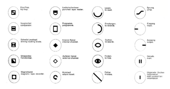
This Maldonado and Bonsiepe symbols system shows a step between alphabet and user interface. The symbols system ELEA 9003 was based on parts of speech. The symbols were very abstract and few forms still remained in the contemporary user interfaces. In my opinion, it is a good example of the process of speech transfer to the navigation system. The graphical decisions were made by parts of speech. The units of the system were represented in square form and process referents in line form. These forms already give a notion of stable object and movement. It was a base for further user interface designs.
The most important achievement of Maldonado was semiotics implication to the University curriculum. In my opinion, the same step needs to be taken today. The rising impact of programing code towards graphic design questions the new curriculum of the future graphic design schools. The analog way of working becomes the rarity and exclusive. Graphic design becomes more influenced by generative design, web and app design. For this reason, the form and function of graphic design is changing very quickly. By its form, design becomes more interactive, user centered and dynamic. Therefore, interaction between person and graphic object becomes closer. Implication of semiotics is necessary in a process of designing, because it establish the link between all disciplines interested in the problem of interaction and navigation.
3.2 Visual metaphors in user navigation
The increasing intricacy of our communication with this world is directly influenced by the complexity of it. Sources for new instruction systems were usage of complex technological products, travelling, getting less personal and becoming more international. The large numbers of instructions were created to find our ways in complex surroundings. Nowadays we use a big range of instructions, from interactive tutorials to tooltip, from safety instruction cards to way of finding signage systems. Within all this fast development, complexity in communications is rising. Expanding complexity of the world implies expanding quantities of communication that then implies complexity of the communication. Despite complexity, language also becomes more metaphorical with an import of technical phrases, color-coded drawings, and multimedia presentations into communication. Metaphorical forms are applied for the purpose of simplification; making it easier to send a difficult message across.
Another big influence on making language metaphorical is internationalization. We are developing more distance marketing that calls out increasing functions per device. In this case, verbal language is not the most efficient tool for communication. As an effect, we see implementation of visuals like: scheme, pictograms, icons, and instructive pictures. These, visual tools, become a part of visual instructive language to make it internationally understandable.
Every visual is an abstraction or an interpretation of the reality that it depicts. In comparison with a photo - pictograms, icons and other visualizations are just abstractions of the reality, because a photo can be just a selection of reality.
Even though, metaphors are abstractions of reality, they help us to navigate in the complexity that arises from using electronic devises. Humans are different from other mammals because they use alphabetical signs, but also because they think metaphorically. They think metaphorically and use metaphors to navigate in the environment. Visual metaphors surround society everywhere. We encounter them while using our laptops, traveling by train, etc. A visual metaphor becomes an invisible communication between environment and us. We let ourselves to be guided by most of the visual metaphors because we are used to them. Similarly, at the moment when we are lost we start looking for them to help us to find a way. This effect works for every situation, if we are using a computer, or if, for example, we are looking for our gates in the airport. Everybody knows that the “wastebasket” icon on the computer screen indicates that we can throw away a document from the computer hard disc by dragging the icon into the wastebasket. The round road sign with red stroke and number in the middle indicates the limit of our speed we are able to reach at that certain part of the road.
To explain the design of visual metaphors and how they need to be designed, one needs to introduce Susan Kare (1954). Kare is a graphic designer and was a member of Mac software design team. She created a well-known user interface icons for Apple Macintosh computer such as “wastebasket” and “happy computer” in 1980s. Kare is also a pioneer of pixel art.

The guiding for creating the icons that she got from Apple at the beginning were: “Your Mom could use it” and “Like arcade games – no manuals”. The icons she was designing had to be user friendly and understandable. The intention was that people would be able to use a computer without looking into the manual.
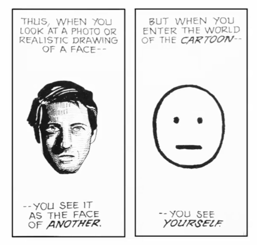
While creating Macintosh (happy) icon she was inspired by ideas of Scott McCloud (1960), an American cartoonist and comics theorist who wrote a book “Understanding Comics”. In his book, he explains why and how a comic book becomes understandable to all. When you make an icon very realistic (in this case a picture of a face) with a lot of details - people see another person, but when you make it cartoonish – people see themselves.

You can see that the design of the icons was well thought trough and described not just the machine it was used for, but also helped to navigate. Design was not just based on a 32x32 pixels grid that she worked on. Icons designed by Karen were a perfect combination of craft and metaphor. These icons are still used in our days with a few corrections. Therefore, icon needs to be symbolic, clear and cartoonish. It should not mislead a user by its graphical form.
To conclude, visual metaphors can benefit user’s experience in a lot of ways. For instance, visual metaphors help a given user to understand the information. By linking abstract form to a concrete thought, one has the easiest way to understand unfamiliar content. For example, Web metaphors and icons, refer to something we know in the physical world and help us to grasp the idea quickly. The reason why metaphors are so effective is familiarity. Metaphors help us to recognize things, by creating familiarities. If we are not able to recognize it, our brain tries to make a sense of the object. For this reason we use patterns to understand and to get an idea of what to expect. By recognizing mental patterns we are able to understand the unfamiliar. In consequence, metaphors trigger our emotions and make our design appealing to people. Most importantly, visual metaphors can motivate a user in action. The action in the Web becomes more engaging and actionable, when we use metaphors we know in a real world. Finally, in this way, metaphors help us to act intuitively.