Responsive Layout
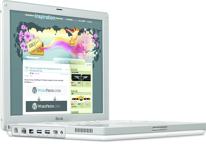
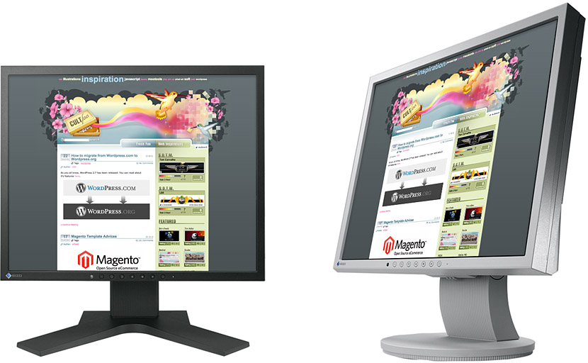
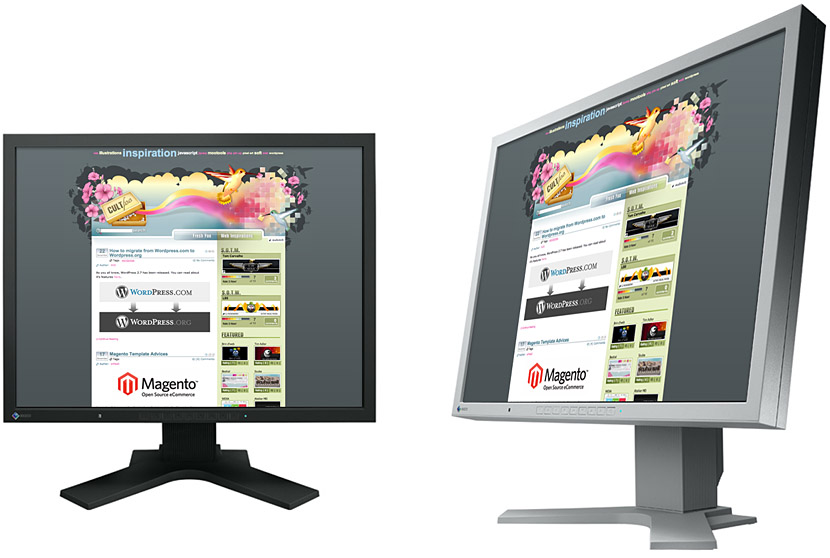
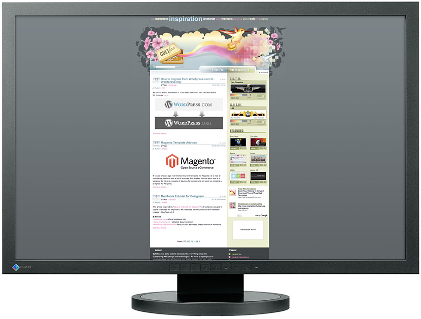
‘The centred layout is as static and conventional as a tombstone’: for a long time (let’s say, 2006–2012) the web focused on websites of 960px wide.
The 960 Grid System is a good example of this CSS aproach. I’ve used it myself: if the margins are the same background colour as the main column, it is not as apparant as in the examples that follow.
Still, the downsides to this approach are clear: users with a very large monitor will have huge swaths of space on the site, whereas users of a very small monitor or a mobile device will have a site that does not fit into the screen.
An initial solution to this problem was to create dedicated versions of a site for mobile applications. But this requires a lot of extra time and resources, and both for Google and for the purpose of sharing on social networks, it is not handy to have multiple webpages that have the same content. An alternative approach comes by the name of Responsive web design, a title donned by Ethan Marcotte in his 2010 A List Apart article. With responsive web design, the design knows how to adapt itself to the device that visits the website, and most importantly to the width of the screen.
The underlying mechanism that makes this possible is a feature of CSS3 known as Media Queries. A media query allows to execute bits of CSS only when a certain condition is met. For example:
/* by default, our headings are pretty large */
h1 {
    64px;
}

/* but when the screen is small (no larger than 480px) */
@media screen and (max-width: 480px) {
    /* we want smaller headings*/
    h1 {
        16px;
    }
}
You might also have noticed that the navigation changes lay-out. On a small screen, it is better on top. On a large screen, we want it to the side. So we say:
@media screen and (min-width: 480px) {
    nav {
        width: 200px;
        float: left;     /* This makes it float to the left of the main content */
        margin-left: 0;
    }
}
Finally, media queries also work for print. In our print version, we don’t want to show the navigation:
@media only print {
    nav {
        display: none;
    }
}
The CSS shown aboved is based on the CSS of this website. You can check out the source files. If you are a student in the class at the KABK, you will have direct access to modify these files.
A website, by the way, needs one addition if you are going to use a responsive CSS as shown above. Somewhere in the top, put:
<meta name="viewport" content="width=device-width, initial-scale=1">
Because so many web designs are made to work around 960 pixels, by default iPhone like phones zoom out to show your design at 960 wide. The META tag tells the phone that it should show the site at the phone’s ‘native’ width (which, for the iPhones up until 5S is 320 pixels).
