Introduction
I believe that writing can be an important tool for understanding the discipline of graphic design. In this thesis, I will attempt to understand why there is almost no public debate on the subject in Norway. Active participation in criticism, not only from the inside but also from the outside of the profession, can lead to significant developments in the field. Anna Craemer wrote on her website about graphic design philosophy: “The newspapers are full of criticism on art, literature, music, cinema, theatre, fashion, architecture, food and, sometimes, even product design. But there is very little writing on graphic design in the public press.”11.Anna Craemer
Philosophy of Design [webpage]
(2014) Is it because there is no interest among the readers, does it have to do with the general understanding of what graphic design is? Is there a need for a debate on graphic design in public media?
What determines the lack of coverage on graphic design in media? It could be a result of: the designers themselves, the projects they work on, the role of advertisement in media, the editors, the journalists, the lack of readers interests, etc. The list is long. Perhaps the answer is to be found in the political system, in the regulations on the use of public space. It might simply be that this debate is by, and for graphic designers only. As Steven Heller wrote: “Maybe graphic design is just so ephemeral that serious criticism has no place. Maybe graphic design simply doesn’t warrant public interest. After all, not all fields and professions are so examined.”22.Steven Heller
“The Small Crit”
Critique (2000) These are some of the questions I will be trying to answer.
To define the factors which affect the issue, I will refer to research from international graphic design history, theory and criticism, to create a background for understanding the situation in Norwegian media. Interviews with Norwegian graphic design historians, journalists, critics and graphic design organizations will be used to set the international references into the context of graphic design criticism in Norway. By looking from different angles, attempting to narrow down what the causes are, I hope to find some possible solutions.
Rick Poynor wrote: “Compared to art or film criticism, the term ‘graphic design criticism’ has an unfamiliar, slightly uncomfortable ring to it. It is one that even the most avid reader of graphic design magazines and books will encounter rarely, if at all.”33.Rick Poynor and Michael Rock
‘What is this thing called graphic design criticism?’
Eye Magazine (Spring, 1995) Graphic design criticism has been debated since the beginning of the 80’s, and one of the first to call for it was Massimo Vignelli, who commented on the lack of engagement with the meaning of graphic design in the Keynote Address (1983). Vignelli focused on the importance of criticism to show designers which direction to go in, because the time had come for designers to stop commenting only on the visual appearance of each others work, and to start investigating why and how projects were made and what motivated them. He wrote: “Without criticism we will never have a profession”44.Massimo Vignelli
‘Keynote Adress’
Graphic History In The Writing
(London: Uk distribution, 2012), p.12, a statement that is surely as valid today as it was back then. What he was calling for was the creation of a cultural structure for the graphic design profession, a structure that would be based on criticism, documentation, theory and technology.
In the years that have passed, graphic design criticism has been keenly debated, and quite often called for in articles written both by designers, historians and journalists. What happened to the criticism? Where did it go? Aslak Gurholt Rønsen said: “It is strange that graphic design, as a subject, is in close contact with letters and language, when nothing is written about it.”55.Interview with Yokoland If anything, it did not turn to the popular media. To be able to demand professional graphic design criticism, or even amateur criticism, we need to define who it should be written for, why it should be written, and what media or platform should be used in the process of communication. Pierre Bernard wrote,“there is no single notion of an approach to what design is or should be: on the contrary, there is a whole panorama of notions and approaches”66.Pierre Bernard
‘My work is not my work’
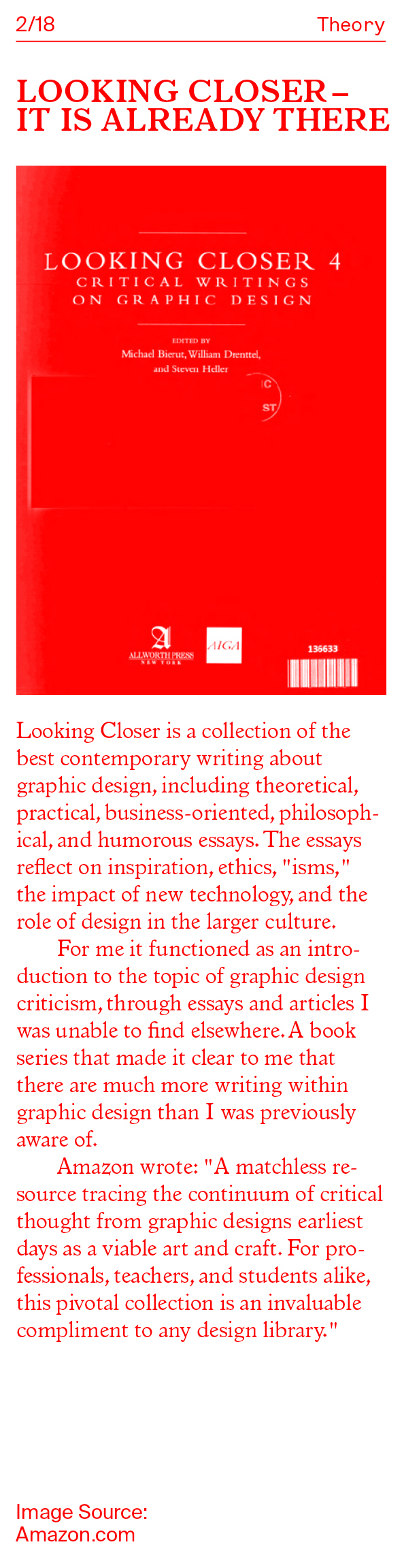
(Baden: Lars Müller Publishers, 2008), p.47, a comment that might well be used to enlighten the situation of graphic design criticism. It is a broad topic with many versions and variations of both content and form. Criticism can be seen as the everyday reviews of products published in daily papers, telling people what they should or should not buy. It can be the moderately long articles about an art-piece, architectural project or about the design of a newly published book. Or it can take the form of carefully executed research-based critical works. The latter being academic, a piece of research, a collection or a history such as the book Graphic History In The Writing by Sara De Bondt & Catherine De Smet– a collection of graphic design history and criticism mostly read by graphic designers themselves.
What is the difference between theoretical, academic criticism and personal opinion (often found in daily papers)? How do we clarify these differences to create a climate where there is room for all of these approaches in mass media? Hudson wrote that freedom lies in the multiplication of opportunities for making real choices – in judgment, in belief, in purpose, in action.77.Hoyt. H. Hudson
‘Educating liberally’
(California: Stanford University Press, 1930), p.7 If freedom is in the opportunity to make real choices, to judge, then the opinionated debate, in this case about graphic design, should arguably be available to the entire public. The question moves away from whether we need it or not, to a question of who should curate graphic design criticism, assuming that it needs a curator. Perhaps it does not. Should this be on the shoulders of designers themselves? Should there be a forum for design critique and design thinking such as KHiOs (Oslo National Academy of the Arts) recently started –but not yet public– forum designkritikk.no?88.As for now, designkritikk.no is a tool for theory-teaching at the MA-programme in design at Oslo National Academy of the Arts: a platform created to expand our teaching to include and involve form-finding, skills and progressive learning styles. At the same time, our idea is to let the forum—though collaboration with people who want to help—evolve to become independent and public. The intention is to cultivate an interest in design-related questions that flow slower than individual projects. In other words, to move from the time of creativity to the process of innovation, the making of new humans and things made new. Or should we have a museum of design criticism led by a curator, a person who runs the discussion, and provides an overview? Peter Bil’ak argues against this notion in his article Graphic Design in the White Cube saying that “Organizing graphic design exhibitions is always problematic: graphic design does not exist in a vacuum, and the walls of the exhibition space effectively isolate the work of design from the real world.”99.Peter Biľak
‘Graphic Design in the White Cube’
Graphic Design in the White Cube, (2006) To exemplify this he compares exhibiting graphic design to the notion of looking at stuffed birds in order to study how they fly and sing. Using this metaphor to reflect on how relevant the context is for graphic design. Perhaps the best approach would be to gather and share. A collective brain is better than an independent one. So, instead of a curator, what we would then need is a collector, an archiver who structures the debate that is taking place, making it visible. The question that becomes important then would be: Who creates the criteria of graphic design criticism?
What is criticism?
“It is interesting how one says ‘good work’. You have this awkward business of what the criteria of judgment are.”1010.Robin Kinross
‘Conversation with Richard Hollis on graphic design history?’
Graphic history in the writing, p.55 It is difficult to decide what good and bad graphic design is because, as mentioned here, we do not have a universal set of criteria to judge by. It is also difficult to determine what the term criticism means. In the English language, there seems to be a better understanding of the word than in Norwegian, where the word kritikk has a bad connotation. Kristina Ketola Bore, a journalist with an MA in design writing criticism, explained this to me: “In Norwegian, we tend to think of it as something that’s just negative, while critique is something that I believe actually has a positive viewpoint, or intention because it is about saying that there is something good about something, or that has the potential to be better because it is, in fact, substantial in some way. And in the more academic world, it’s just a given that having a critical mind-frame is something that you need to have to produce something good.”1111. Interview with Kristina Ketola Bore Martin Braaten, editor of Arkitektnytt also pointed at the different meaning of the word(s) in English and Norwegian: “Or the more snobbish version of critique with q u e, which in a way has a more intellectual approach of writing.”1212. Interview with Arktitektnytt The Oxford Dictionary describes critique as: A detailed analysis and assessment of something, especially a literary, philosophical, or political theory.1313.‘Critique’, Oxford Dictionairy [webpage] The definition here is referring to subjects that are clearly academic, perhaps not for mass media. I find it important to notice that it does not mention the word ‘critical’ in the negative sense. Criticism in general is described as: The analysis and judgment of the merits and faults of a literary or artistic work. It is interesting that this definition also mentions merits; judging what is positive, what has value. Adapting these definitions to graphic design criticism would mean to look at the project, at the context and the usage of it, and analyze what was good, what needs to be drawn into attention, and what should be improved. Graphic design critique then would be a more academic analysis, a more in depth research about a project, or a situation, and the creation of a theory that considers why it is what it is and what implications or benefits that might have.
Looking at the definition of the terms critique and criticism is one thing, understanding what most people read into these two terms is another. “Criticism,” one internationally renowned designer declared, “usually takes the form of the negative and the overly judgmental.”1414.Poynor and Rock
‘What is this thing called graphic design criticism?’
Eye Magazine [webpage] Not so much in the world of art and culture related criticism, but within design. To be critical is often connected with being judgmental. “To be judgmental is to wag a finger and raise the voice, to carp and repress. Called to account in such morally loaded terms, criticism can’t possibly be a good thing. But this is, in reality, a considerable misrepresentation of the critical process when responsibly carried out.”1515.Poynor and Rock
‘What is this thing called graphic design criticism?’
Eye Magazine [webpage] The Oxford Dictionary also wrote that criticism could mean the scholarly investigation of literary or historical texts to
determine their origin or intended form. In the case of graphic design criticism, it can be transferred to looking at the project / product to analyze the origin, the approach taken, the intention, how was it received and what there is to learn.
‘What is this thing called graphic design criticism?’
Eye Magazine [webpage]
What Rick Poynor and Michael Rock try to narrow down here is the terminology problem, criticisms close connection to the verb to criticize, which is often misunderstood as the meaning of criticism. Allan Lustig said “I don’t think it’s a question of good design or bad design!”1717.Alvin Lustig
‘What is a designer?’
Looking closer 3
(New York: Allworth Press, 1999), p.106 It is not about pointing fingers, it is not about scanning projects for flaws and mistakes, though sometimes they should be mentioned. Well-written criticism can be done with the intention of calling into attention good projects that have not been seen, to encourage, to inspire, and yes, also to criticize, in the strictest sense of the word. The latter is important as a constructive element in the development of new directions and ways of thinking within the profession. Anne Burdick wrote: “Through discussion and review we are held accountable to our peers, and as a result words of praise carry greater weight. Constructive criticism should not be something we fear; it should be something we welcome.”1818.Anne Burdick
‘What has writing got to do with design?’
Eye Magazine [webpage]
First published in Eye no. 9 vol. 3 1993 Due to negative connotations to criticism in general, Kristina Ketola Bore suggested another word. She focused on the word reflection in her MA because it is what she thought to be the starting point of any critique. Perhaps the first step towards creating an increased interest and debate around our profession would be to remove the negative connotations and, as Bore did, skip the word criticism. Another writer, Anna Craemer, focuses on what she calls graphic design philosophy. This is without a doubt a tactical approach to open up for new ideas on what criticism should, and could, be defined as.
Graphic Design Criticism in Norwegian media
In Norwegian media today, there seems to be no existing structure for how graphic design criticism should be written, but Martin Braathen drew an outline of how it generally takes shape: “You can often see it in the way that people write criticisms. It is expected that a third is information, a third is perhaps something positive, and then at least a third that includes something critical, where the role of the critic is to say something negative, or ‘this could be a little bit better…’ or something like that.”2020. Interview with Arkitektnytt Another interesting aspect is that there is no given platform on which it can exist. Often when a piece is written on the subject of design in public media, it is in articles where the writer takes on the role of a reviewer, who points out his or her opinion of strengths and weaknesses within the product. “Both literature and art criticism are perhaps the two in Norway that have come the furthest with regards to deeper, critically investigational projects that are not necessarily only about a type of, what should I call it, consumer guidance, which is the simplest form of critique there is. That are about why you should buy it or why you should see this film. Critiques like short consumer guidance reviews.”2121. Interview with Arkitektnytt The review, as a text, is not useless, but do I not believe that this writing style is enough to increase public awareness of the role of graphic design. Neither does Kristina Ketola Bore: “design critique is for me not only about these, kind of, ’reviews’ of something. Design critique can also happen in a written piece that is about looking at a specific tendency or development.”2222. Interview with Kristina Ketola Bore Braathen elaborates this by saying: “Some critiques try to look for an agenda in a piece of work to find out whether it succeeds or not, or looks at deeper, ideological guidelines for things that can also be: ‘don’t look at this building as a building, but as a collection of many things that lead us to why it is the way it is.’ So, it is not necessarily interesting to say anything about whether or not it is good, but rather try to search for these underlying reasons as to why it is the way it is.”2323. Interview with Arkitektnytt Lastly, as Martin Biehl pointed out to me, the problem within the design field (in Norway) is that we do not have individuals with authority who can stand up in society, which perhaps can be seen in the Netherlands, Germany or England in a slightly different way. People who can stand up and say, ’you know what, take it easy guys, this is good’. In countries such as the Netherlands, there are graphic designers with good reputations, whose work is familiar to most of the Dutch people. Graphic designers who, in a way, represent the visual culture of the country, whose voices and opinions are of importance. If not in the daily press, then at least within culture.
Styles of writing most often used, and the reasons
why it is difficult to print serious criticism
‘The small crit’
Thypoteque [webpage]
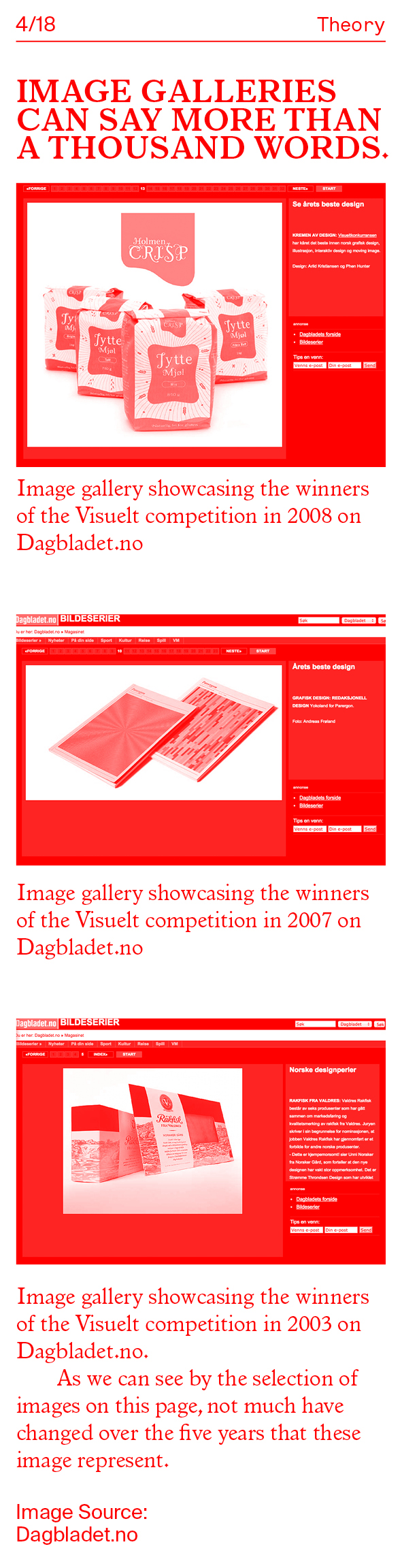
Written pieces on the subject of design are often by journalists who lack experience within the field, and it is rare that they have an opportunity to write more than a few articles on the same topic. This creates a situation where there is a lack of ‘educated’ writers. This is not to say that every writer needs to have an education in the field of critical writing, but we do need writers with an interest, with experience: writers who are able to translate graphic design projects into an understandable narrative for readers of daily newspapers. Often when graphic design is mentioned in a digital Norwegian newspaper, it is presented as an image slideshow instead of as an article. One example of this is the competition hosted by Grafill, an organization for the professions within visual communication, called 'Visuelt'.2525. Visuelt is an annual event for the industry in Norway creative and consists of awards, seminars, prize award, party and exhibition. The aim of the event is to inspire and function as a meeting point for the industry. Several years in a row, the winners have been published online on Dagbladet, a national newspaper, as an image gallery with one caption to fit all of the images. This becomes a visual reproduction solely about the aesthetic of the works in the competition. It could be improved to include a more balanced presentation of the projects, and more importantly, what ideas lie behind the work. This competition would be a good opportunity for the Norwegian media to take interest in the designers, in the profession, in the market, in the process and in the publics reaction. Regarding the redesign of the Norwegian banknotes, Aslak Gurholt Rønsen commented that most of the articles that were published on the competition, which was exhibited at Grafill, did not question much of the content in the designs. In his opinion, the approach of both national and international articles was: “ ‘look at this fantastic Scandinavian design!’. That is not really an interesting topic.”2626. Interview with Yokoland Certainly, Norwegian graphic design needs the positive attention of international press, as a means to build up a national self-confidence, but can we be satisfied with this?
One reason why the articles on competitions such as Visuelt end up as image series can be found in this quote from The Small Crit by Steven Heller: “As a record, competitions are valuable, but as criticism, inclusion and exclusion is not the answer.”2727. Heller
‘The small crit’
Thypoteque [webpage] Perhaps these image galleries are representing exactly this. Another reason could be that “even mainstream journalists with a penchant for graphic design complain that aside from the incidental story about momentary fashionable graphic conceits, it is truly difficult to pitch and get accepted a serious article on graphic design as a cultural force, no less get a critical perspective into print.”2828. Heller
‘The small crit’
Thypoteque [webpage] Why should it be difficult to get an article on graphic design criticism published? During a symposium on the subject of design criticism, at KHiO in May 2014, there was a discussion that raised the same question. Several journalists in the audience claimed that even though they were interested in writing more about design, even graphic design, their editors were not interested in publishing this kind of writing. The question of why editors turn down this content most likely has a combination of answers.
1st. There is the situation where most printed magazines and daily papers in Norway today are dependent on advertisement as an important income. It is a situation where the advertisers, perhaps not directly, control the printed content. “Magazine editors have lost their editorial independence and work for committees of publishers (who work for committees of advertisers).”2929. Tibor Kalman
‘Fuck committees (I believe in lunatics)’
Looking closer 4
(New York: Allworth Press, 2002), p.113 An example of this was how the previous editor of the Scandinavian design magazine, Form, mentioned that over a longer period of time, they had chosen not to publish critical articles. As a way to show respect to the design field, to the writers and to themselves as a design magazine, they collected these articles and published an edition that was dedicated purely to critical writing. As a result of this critical edition most of Form’s big sponsors chose to withdraw. This story suggests that advertising and sponsorship play an important role in the lack of graphic design criticism in daily papers and media today.
2nd. Among the editors of daily papers, and other media, there seems to be a lack of faith in the readers interest and/or capabilities of understanding the topic. “Although recently the graphic design profession has had its share of coverage in the media, usually in the form of trendsetter profiles, never have individual works been singled out for critique in the press in the same manner as a current exhibition, film, or for that matter, advertising campaign.”3030. Heller
‘The small crit’
Thypoteque [webpage] Graphic design mentioned in the newspaper is chiefly sensation based, not considering so much the content of a project, rather showing of its successful creators. A way of angling a story which is easier to sell because it focuses on the people behind. It is feeding the curiosity of the reader. “I think we are always curious about how someone works. We are all a bit voyeuristic, so that is an easy way to tell a story. It is a problem in design writing, because the focus has shifted from the object to the person who produced it, who is usually part of a team.”3131. Interview with Kristina Ketola Bore Another sensation-based way of writing that seems to be quite common in mass media, especially on internet, is focusing on design with special effects. “It’s a very easy way to write about design because you can use these crazy events, like ’3D printing the moon!’ Or these ’bio-technologies that make your sneakers heal overnight!’ This kind of design journalism is becoming more common, and it’s a very easy way of communicating what something is, but it doesn’t necessarily say that much about the field, or how it’s developing, apart from this crazy invention that someone’s done in the name of design.”3232. Interview with Kristina Ketola Bore It results in a writing style that removes the nuances which are important in the development of a critique. “Editors are reluctant to risk alienating the very people who make up their subscription lists, or to commission or publish longer or more challenging pieces of writing.”3333.Poynor and Rock
‘What is this thing called graphic design criticism?’
Eye Magazine [webpage] was one of the comments in a conversation between Rick Poynor and Michael Rock. An interesting comment, and perhaps a true one. Elizabeth Ramsey, also focusing on alienating the reader, said that one of the deficiencies in the art world today is “the improper distribution of media coverage of all the different types of art, and how this alienates a lot of people from becoming interested in art.”3434. Elizabeth Ramsey
‘Media fremmedgjør kunst'
Aftenposten [webpage]
(10.des. 2013) It becomes a question of either alienating people from the subscription lists or alienating them from an interest in art or, in the case of this thesis, graphic design. “I think it is important to understand that only occasionally do new ideas generated in the academy make their way into the media – and thence into the popular realm. Unfortunately, as with its attitude to most things, the media tends to focus on the outlandish, since business-as-usual is not news.”3535.Matt Soar
‘Theory is a good idea’
Looking closer 4, p.133 Reflecting now on the outlandish, as Matt Soar writes. It could mean that what the media found interesting about both the redesign of the passport and the banknotes in Norway was not how and why they were made –as this is business-as-usual– but the fact that these projects were interesting to international media. Suddenly, papers such as The Guardian had their eyes on Norway, on the capability of the Norwegian design community. Bore said “what’s kind of interesting is the articles where I am most critical are not the pieces that are published in Norway, it’s for international media.” She elaborated on this, “There doesn’t seem to be a lot of room to do actual critiques of design in Norway, and there are several reasons for that I think. One thing is that to have that kind of critique in the media, it also needs to exist in the field, I believe.”3636. Interview with Kristina Ketola Bore Her view on the situation suggests that the problem is not necessarily a lack of capability or interests on behalf of the readers, and more that it is rooted within the profession of graphic design in Norway. “It can’t just be in the one place, it needs to be triggered and fueled by something and so, when there are so little critical activities happening in the field itself, it doesn’t lend itself easily to write about it.”3737. Interview with Kristina Ketola Bore Meaning that for criticism, reflection or philosophy of graphic design to grow, the profession itself needs to nurture it somehow. It needs to be made interesting for the field itself. However, it is very individual how graphic designers in Norway regard the state of things. While some clearly feel the lack of communication, discussion and development, others consider it to be an opportunity. In the catalogue for an exhibition in Oslo called 'A Form of History',the writers were of the opinion that “Graphic design is on a search for itself.mIt is searching in the creating of content, at the outer regions of the field of graphic design, and it is searching in history.” It continued asking what the reason for this search could be. Suggesting that it could be related to a need to validate the field, understanding the potential roles of the designer. It rounded off with: “maybe, it is a wish to occupy a clearer position of significance, so that it can more easily become an object worthy of critique.”3838. Kristina Ketola Bore and Maziar Raein
En Form for Historie
(Oslo: Zoom Grafisk AS, 2014), p.3 If this is applied to the field of graphic design in Norway, it would suggest that we are in a period where the attitude towards contributing to the public dialogue might be changing.
3rd. Freelance articles on design criticism are periodicals and not well categorized, they are hard to keep track of and stay updated on. “You have freelancers who write critiques now and then, here and there, in various newspapers or similar. There isn’t a forum for where it can be compared to other things. It isn’t put in an editorial context. The culture editorials generally don’t have much knowledge about design or architecture, for example.”3939. Interview with Arkitektnytt To be able to have a continuous debate there needs to be continuous contributions to the discussion, enough for it to be reasonable to have it gathered within one media output. Poynor stated that: “Occasional paper writing in the course of research is not the same as being a fully fledged critic, writing regularly about a broad range of graphic design subjects, or many different aspects of the same subject.”4040.Poynor and Rock
‘What is this thing called graphic design criticism?’
Eye Magazine [webpage] One of the reasons that writing on the subject of graphic design is so fragmented, is that contributors are often writing as a side-project while devoting most of their time to other aspects of professional life. The people who write the criticism come from many different backgrounds, while surprisingly few graphic designers write themselves. “Another thing with the critique is that it is kind of a secondary occupation that someone goes into while they are studying, or right after, and then they leave it again. So they can’t build up a reputation as someone who has a critical voice which lets the readers get to know them, and that they also get to know their own project in many ways. So there are some of these continuity questions that are central here.”4141. Interview with Arkitektnytt That there is no regular column, or space for it in public media, means that writers don’t get to develop their personal language. The vocabulary for voicing an interest, or a discussion, is limited. “Whatever the discipline, the critic is engaged in a process of interior and exterior discovery, a riskily public dialogue with the subject matter, the readership, and him or herself. Critical positions will inevitably evolve over time, Errors of judgment will sometimes be made. The critic can only learn what is possible by constantly writing.”4242.Poynor and Rock
‘What is this thing called graphic design criticism?’
Eye Magazine [webpage] Writing, as everything else, demands experience to develop, and serious film criticism would be a good example for how graphic design criticism can evolve. Written discourse on film is often followed by readers, both from within and outside of the profession, with different levels of interest and knowledge. Another problem that occurs due to fragmented design criticism is that important articles of interest for discussions are seldom followed up by interviews or replies. “It doesn’t land inside a discussion which makes it possible to catch it properly. How does the conversation appear, how can one increase the design and architecture competence in newspaper editorials so it doesn’t become these singular events?”4343. Interview with Arkitektnytt A situation which leaves it up to the readers who are interested in following up this content, to do the gathering or collecting themselves.
Perhaps it is a direct result of graphic design (history) texts being written by – and for graphic designers only. It reaches only an inner circle of interested readers. That the focus has been too much on ourselves and therefore uninteresting for others. “Searching for values, design looks in the visual places – inwards, never outward.”4444. Andrew Howard
‘A new kind of dialogue’
Looking closer 4, p.32 To explain by showing projects in context of what is going on in the rest of the society, in terms that the broader part of the public can understand, would contribute to both a renewed awareness around the profession as well as giving the fuel needed for graphic designers to understand what values they work for. “What should be self-evident by now is that talking about contemporary design practice draws us inevitably into a wider social discourse.”4545. Andrew Howard
‘A new kind of dialogue’, p.32 It is not possible to draw a clear division between what is related to the “inside” and “outside” of our profession. They are interrelated. Katherine McCoy said: “We have trained a profession that feels political or social concerns are either extraneous to our work or inappropriate” and “design it not a neutral, value-free process”4646. Rick Poynor
‘First things first, a brief history’
Looking closer 4, p.9 The lack of communication might be the reason it is a profession often misunderstood by the general public solely as an advertising tool. Though if we look at the history of graphic design, we can see that the periods in which it blossomed, and took form, often were periods of political turbulence; periods in which graphic design also took the role of opinion-maker, a creator of standards. I am not suggesting that there is one solution, the ideological road, I am merely pointing to the fact that the profession is closely connected to shifts in society, and therefore I believe it needs to let society play a part in the development. “For me, if we’re going to talk about design criticism, I think that it belongs in a bigger media than the trades, and that it needs to sit in the context of other cultural criticisms.”47
47. Interview with Kristina Ketola Bore
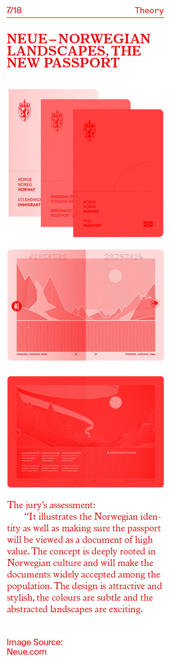
Norway’s new passport – already a design classic?
There have been two noteworthy exceptions to the rule in recent Norwegian media.“If the passport is a symbol of national identity, then the new design for Norway’s travel documents has undoubtedly cemented the country’s reputation as a land of sleek, minimalist beauty.”4848. Will Coldwell
‘Norway’s new passport – already a design classic?’
The Guardian [webpage]
(17th November 2014) This was the introduction to an article in the English newspaper The Guardian about the new design of the Norwegian passports.The Norwegian National Police Directorate have announced the winners of a competition launched in February to find a new design concept for the nation’s passports and ID card. The article continued by introducing the winner, design Studio Neue, and looking into certain details of their design such as the depictions of Norway’s natural landscapes, the illustrations used, the colours and what they signify, the designs UV function and how it transforms the landscapes to show the northern lights in the night sky and so on. Following up the short summary of design details, they used these quotes: “All Norwegians are so connected to nature, it’s a very strong part of our history and defines us as a country,” says Gørill Kvamme of Studio Neue, who explains that the minimal concept came from seeking to find the “essence of something”, and “It represents the vast variety of nature and landscapes you find in Norway (…) which makes it relevant to all of us whether you have always lived there or just received your citizenship”, to explain what ideas was behind their design proposal.
Dagbladet published an article on their website the 31st of October 2014, commenting on the new design of the Norwegian passports.4949.Kristin Sørdalm
‘Dette kunne blitt ditt nye pass’
Dagbladet [webpage]
(1. December 2014) At the introduction of the article were three sentences commenting on why we are re-designing ID-cards, traveling documents and the passports, focusing on the fact that these resources will increase the security of Norwegian passports and ID-cards. The article continued with a paragraph about the current security situation, based on the flaws in the system Norway now has. It ends with a quote from the jury stating why they chose the design by Studio Neue. The quote references an article in another newspaper called Aftenposten. To follow up the trail I continued to the article in Aftenposten to see what they had written about the new passport design, published the same day. Under the title “These are the new passports” Aftenposten’s writer mentioned the security issues, before continuing to write about the new design. The writer introduces that there were five studios that contributed with design proposals in the final round of the competition, and that the winner Studio Neue, won with a proposal called The Norwegian Landscape. This was an improvement on the article in Dagbladet as it included the working title of the project. Where Dagbladet seems to take on a more sensational writing style, focusing on the security issue rather than the redesign, Aftenposten is closer in its attempt to focus on the design itself, referencing the jury and the designers.5050. Kjersti Nipen
‘Dette er de nye passene’
Aftenposten [webpage]
(31.October 2014 )
The jurys comments was:“It both illustrates the Norwegian identity and makes sure the passport will be viewed as document of high value”, and continued: “The design is attractive and stylish, the colours are subtle and the abstraction of the landscapes are exciting. Aesthetically, the landscape motifs have been given a distinctive look. The jury appreciates the simplicity of the solution.” But only in The Guardian did the writer express opinions of his own on the design. Another interesting fact which The Guardian draws, that could not be found in the Norwegian articles, was the link between the redesign of the passports to the redesign of the Norwegian banknotes.
‘Norway’s new passport – already a design classic?’
The Guardian [webpage]
Will Coldwell, the writer in The Guardian, connects two competitions to show how graphic design is progressing in Norway, and through that he attempts to establish that Norwegian design tends to be inspired, or at least have a close connection, to nature. Now there can of course be reasons to disagree with his comments, perhaps question his title “Norway’s new passport – already a design classic?” As an example, Martin Biehl doubted this term. “Taking up this type of concept on a banknote… I think that’s a bit problematic to mention so early. Firstly it must be used. It’s not even finished yet, it’s just sketches. To get a ‘classic’ status, it must be used in a market, in the function it should have, over time, before one can say that it is a classic.”5252. Interview with Grafill This could be the beginning of a debate, but for now, I would be glad if the Norwegian newspapers managed to incorporate this kind of interest in their articles on graphic design.
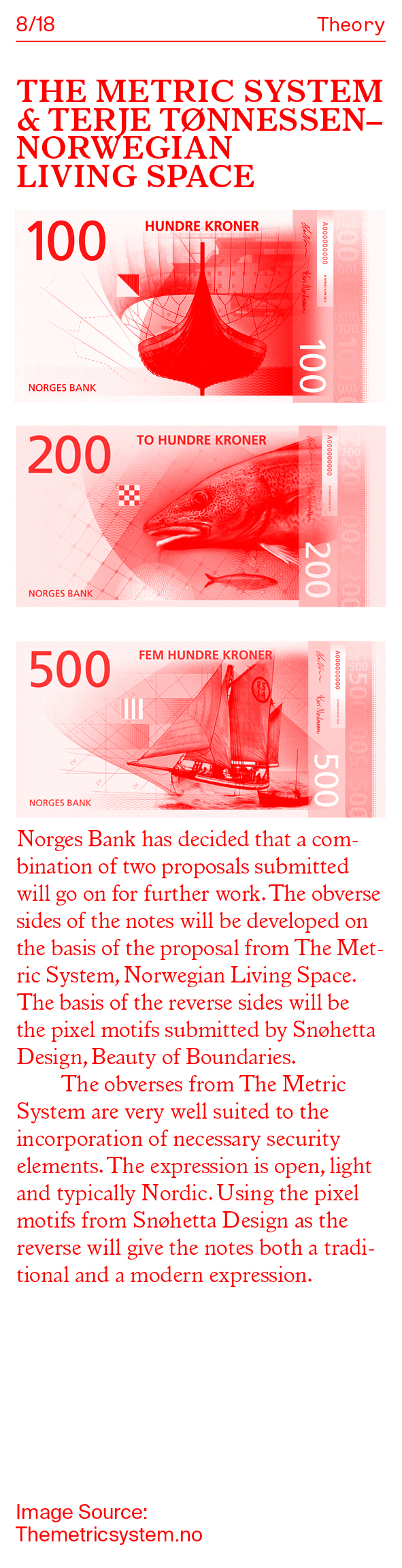
In spring 2014, a competition was held for the design of motifs for the new banknote series. The purpose of the competition was to arrive at a proposal that can be the artistic basis of the new banknote series and communicate the theme “The Sea” in an appropriate manner. The jury wrote that:
‘Press Release, motifs for the new banknote series’
Norges Bank [webpage]
(7th October 2014 )
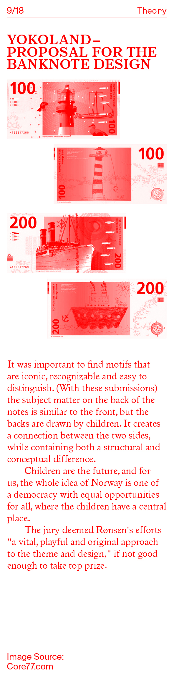
Dagbladet commented on this with one article including seven paragraphs, one image gallery with eight slides and the striking title “This could have been your new banknotes.” After a short introduction of the winning designs, the writer continues to the other proposals. The proposal from Aslak Gurholt Rønsen called The country with the long coast incorporates a sentence describing that the front side has motifs that are classical, while the backside has children’s drawings of the same motifs. The writer continues with a comment from the jury: “a vital, playful and original approach to theme and execution.” What is surprising is how the other six proposals are mentioned. The sub-heading “Containers and seagulls”, sounded promising. But the writer seems content saying that the other participators also worked with coastal motifs, as the competition demanded. “However, with widely differing results” before he sums up by telling the reader that in the image gallery you can see everything from seagulls to containers.5454. Ole Petter Baugerød Stokke
‘Dette kunne blitt dine nye sedler’
Dagbladet [webpage]
(14th October 2014) Rønsen commented on the articles that covered the re-design of banknotes by saying, “In almost all of those cases, there has been no critical debate around the design. It could easily have been, but there is no one who has evaluated. None that I’ve seen.”5555. Interview with Yokoland Either the writer himself had no
interest in it, or he did not have time to find the information necessary. Rønsen continued by saying: “The Norwegian media coverage is a bit like ‘New banknotes!’, conveyed without telling what the designers have thought about this or how it should work. There is no analysis from those who write it. That is what creates idiotic discussions in social media.” A comment that underlines Martin Biehls opinion: “We get amazing reviews worldwide, like these banknotes actually received, but no mention in Norway. Nothing. It is really strange. In Aftenposten (November 2014) I spoke with the journalist and said that now the case really isn’t about the banknotes, the case is really that this has been of major international attention and became an international success, and that Norwegian media have not got it at all. That is what’s the matter.” Referring back to my comments on media’s sensation-based focus, the last time Norges Bank hosted a competition for redesigning the banknotes was over eighty years ago. It was presented as an exhibition at the artists’ union with 12 proposals that were submitted. “Back then, in 1930, it was not something called Graphic Design. Then, it was called ‘visual artist’ or ‘graphic artist’, those who create art with paper.”5656. Interview with Grafill The competition concluded with public debate and criticism, a lot of it, and a complete breakdown of the work. In the end, it was not realised. This is very different to today’s process.
Norges Bank exhibited the competition proposals in Grafill’s premises in Oslo, Rosenkrantz gate 21, from 7 until 26 October 2014. The title of the exhibition was Norway’s New Banknote Series: The Sea. Alongside this exhibition, they also printed a catalogue about the eight proposals, the idea behind them and further information on the verdict of the jury. The catalogue was available on pdf online or in print format, meaning that information was available to any writer willing to look for it, if they understand the Norwegian language. This enhances the need for writers who are willing to do research, to find the information that is available. “It is difficult to criticize when one does not know all the content of a project. The same goes for the banknotes, it can be hard for people outside to see that there are many things that are considered.”5757. Interview with Yokoland What Rønsen here focuses on is how easily design projects can be misinterpreted if there is a lack of background information. Martin Biehl, managing director at Grafill summed this up with one sentence: “There has not been a single review of the exhibition.”5858. Interview with Grafill End of story.
The mere fact that both of these cases were mentioned in mainstream media gives the projects a point in time, suggesting that these designs are indeed of importance to society. By doing so, this writes them into the Norwegian history of graphic design. Robin Kinross asked: “What then might design history be?”, is it only a collection of what we discuss and remember from media and books today? If this is true, it saddens me to say that the Norwegian history of graphic design will be very limited because much of what we might consider as ‘important’ today would then be forgotten. Kinross continued saying “I am inclined to suggest that the term be discarded in favour of ‘design criticism’ (‘design theory’ sounds too forbiddingly remote in our pragmatic context). The point is that history happens anyway, as soon as one starts to ground something in its time and place.”5959. Robin Kinross
‘Design history’s search for identity’
Graphic history in the writing, p.19 So, in order to create a stronger graphic design history in Norway, we need to develop graphic design criticism. The reason is that graphic design criticism is the sole factor which pins the current situation down. The debate, the discussion, and the developments alike. What we put on the agenda today, might be what validates information on graphic design within a Norwegian context today, and in the future.
Why graphic design criticism is important for the profession?
‘Just say no…quietly’
Looking closer 4, p.15
How the profession is supposed to take part in mass media, how it is to be shown in the public domain and how to increase the interest and understanding of the work that graphic designers do, does not have one singular answer. The architectural critic Charles Jencks said “Writing is really an interesting way to approach design because it gives you an area to view, contents, the meaning of things, which is not where most designers come from I have to say, although they used to historically.”6161. Charles Jencks
‘The importance of writing’
Marks on the landscape [webpage] He suggests that we have previously had a stronger tradition for formulating our ideas and thoughts into words, and that doing so is a way of narrating a process. Not only for others to read, but as a tool of understanding it yourself. The imagination is unpredictable and can produce ideas at any time, so it becomes a question of how to create awareness about the importance of capturing ideas and processes.
Anne Burdick wrote: “Writing can feed the profession in two ways: through the challenge of critical analysis and through the exploratory freedom of self-initiated work.”6262. Anne Burdick
‘What has writing got to do with design?’
Eye Magazine Interestingly, she considers the critical analysis also as a challenge for designers themselves, not just for professional writers. It is a statement that might refer to the need of more graphic designers contributing to graphic design criticism. “The history of Norwegian graphic design needs to be uncovered, but it demands several approaches.”6363. Bore and Raein
En Form for Historie, p.3 To be able to understand our national graphic design history it needs to be brought to attention, and discussed. One of these approaches can be through criticism, through analysing, and attempting to put what history we have in different contexts. The reason seems to be that it will help to create a better insight into our profession, the visuals we use, the forms in which we communicate, the theories, the facts, the history and the future. “What is particularly interesting about criticism in general is how different perspectives give rise to different meanings. This has been fully realised in film criticism, for instance; the same film can be fodder for a formal, feminist, psychoanalytic or semiotic analysis, each offering a new way to read the text. Criticism doesn’t yield answers, only opinions, and opinions should be diverse.”6464. Poynor and Rock
‘What is this thing called graphic design criticism?’
Eye Magazine
There is this border between those who are on the outside and those who are on the inside of the profession. An invisible wall based on belonging, understanding or caring? Or perhaps it has to do with what one can call the institution of graphic design. There are many people working to make the profession function, perhaps more than most people know. “Writing has a profound effect on Institution Design, the elaborate apparatus that surrounds design production.”6565. Poynor and Rock
‘What is this thing called graphic design criticism?’
Eye Magazine What can we bring to the discourse in the public domain that increases the interest of the broader readership, so that it will reflect back on the field and highlight how/what we need to evolve? “Even though critiques are perhaps something that can enhance the field to the public, I don’t think that’s the most constructive way to go about it. I think it’s more interesting to try and find it within the context of a larger society, rather than just picking out what’s good or bad about the way something is done”.6666. Poynor and Rock
‘What is this thing called graphic design criticism?’
Eye Magazine
Perhaps that is the discussion that we have internally in the field. Suggesting here that what we, as a field, need to figure out is how to open up to the rest of society. What we need is not an internal discussion on how criticism should be written, but a discussion on how to be more inclusive. “As good as some graphic design criticism is, even the best of it has some way to go before it can equal the most fluent, supple and engaging writing on the other arts. One basic but crucial difference is that these more public subjects attract people whose primary ambition and talent is for writing and who realize this ambition through a medium that fascinates them. Graphic design is not – and may never be? – such a subject. It is a paradox, because without such writers bringing it alive, graphic design stands much less chance of becoming a thing of wider public interest.”6767. Poynor and Rock
‘What is this thing called graphic design criticism?’
Eye Magazine