Abstract
Looking back at my upbringing and daily life in Rotterdam, I realized how much the sight of its streets are a source of inspiration in my work. While studying graphic design, I became intrigued with designs that are designed without a design-strategy; vernacular design. Vernacular is defined as an informal visual- and spoken language that belongs to a specific group of people. It is invented rather than taught. I am curious, what is the role of vernacular design within graphic design and communication?
read more...
In the form of letter to a fellow student I aim to invite the reader to engage with the material. I start by analyzing developments in art and design that led graphic designers to use vernacular in their work. For this I use the International Film Festival Rotterdam (IFFR) poster as a case-study. IFFR has been taking place in Rotterdam each year from 1972 until today. As an event that is leading for the city of Rotterdam and with an archive of over 50 years of posters this seems a perfect documentation of different visual era’s in graphic design. I see that IFFR's campaign aims to motivate people to come to the festival. In this context, vernacular functions as a tool for graphic designers to reach a specific target audience. I notice a pattern of graphic designers reaching towards the vernacular in periods of technical development. Development of and broader accessibility of tools make them to rethink their position as graphic designers.
Through a personal selection of contemporary graphic design projects, I investigate which roles graphic designers take on when they use vernacular for purposes beyond the aesthetic. I see that appropriating mainstream vernacular is a way graphic designers can position themselves as critics in the field. By making evident a vernacular, through documentation and publicizing, graphic designers can take part in celebrating a culture. On a more artistic level, graphic designers can create new and poetic vernaculars by spotting visual languages that happen coincidentally.
In the last chapter I start researching the vernacular of my own surroundings. By sketching with the visual languages used in the storefronts of my street, I realize using vernacular is a way for me to preserve the parts of my surrounding that I feel carry its authenticity.
Introduction
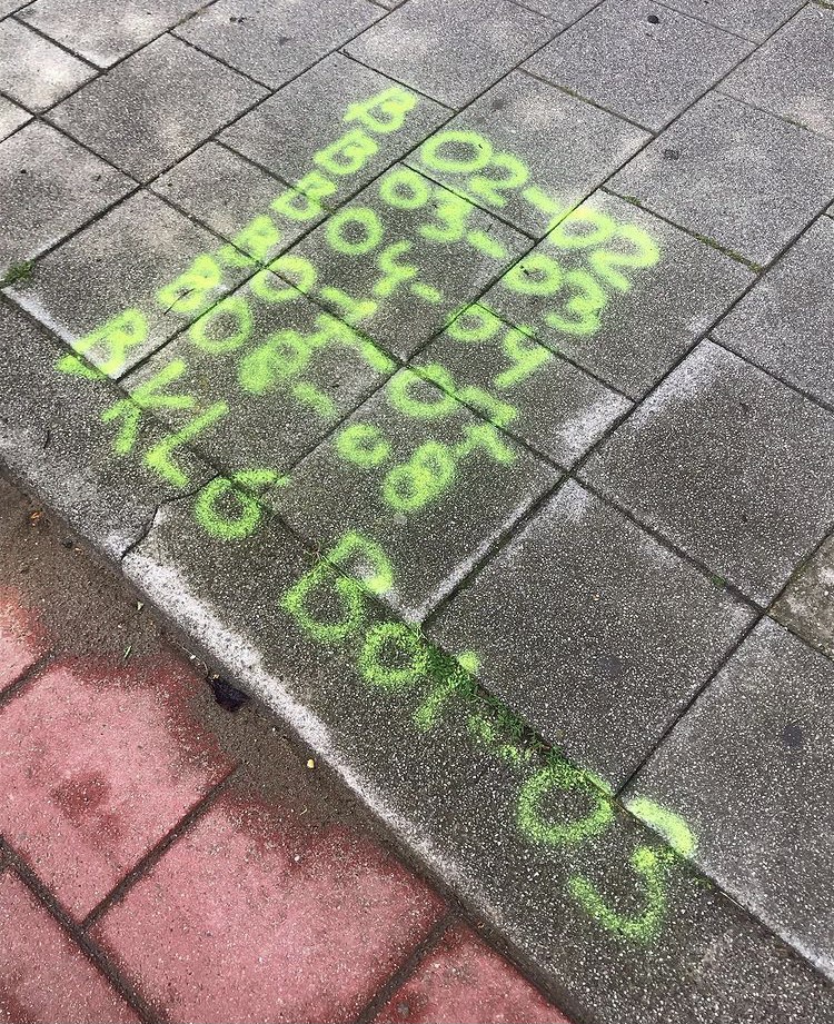
Last week my friend told me: “when I am with you, you constantly see design in things I would never see. For instance the bright yellow numbers construction workers spray paint on the pavement. I wouldn’t even see it, but because you took a picture of it I am seeing it everywhere now”.
Looking back at my upbringing and my daily life in Rotterdam, I realized how much the sight of its streets are a source of inspiration in my work. Here I encounter serendipitous designs everyday, that I keep in an archive on my phone. I am constantly busy looking around me, hunting for little quirks in my surroundings. Things I find please my eye. Because I am a sucker for design. And since you are reading this, I assume you are too. I am writing specifically to a first year graphic design student. In case you aren’t, feel free to explore my thesis all the same.
I welcome you! Not that I am so much above you, I am also just getting started. And I can tell you: the more you learn the more you learn you don’t know anything. This thesis started as an attempt to understand something of graphic design, but failed miserably. It left me with more questions… but we’re in this together!
When I was in your shoes four years ago, I started to notice these serendipitous designs. Looking back I think that was the combination of my voyeurism and learning “How Design Is Actually Done1”. In a surrounding with people who are all great designers - how lucky we both are - I started to become intrigued with designs that don’t feel “designed”; that have a certain rough, unpolished beauty. Designs which were made by people who, most likely, are not designers. Designs that are made vernacular.
In “We’re Here To Be Bad” Tibor Kalman writes “Vernacular is a slang, a language invented rather than taught. Vernacular design is a visual slang. More than that it’s design that is so familiar that we don’t really see it. Seeing the vernacular is seeing the invisible. It is looking at something commonplace - a yellow pencil, a metal folding chair- and falling in love2”. Kalman aims us to look at vernacular design not as an education, nor as a movement or style in design, but rather as a practical approach to designing. It is a direct supply of a design to the question of fixing one’s practical need. Often it is done locally, when a store hires a sign painter to paint their window-glass, or when the construction worker spray paints numbers on the pavement to locate where they placed their underground cables.
But we are training to become professional designers. And it is exactly that paradox that makes vernacular design interesting to us. It has not been given rules, there is no good and no bad. And that is what is good about it. As individuals striving to become great designers, how can we learn from vernacular? Are there ways in which we are able to combine vernacular with strategy, as Hannah Montana would say; the best of both worlds3? I am curious, what is the role of vernacular design in graphic design and communication?
This summer I followed an internship at 75B in Rotterdam, where I had the opportunity to work on this years IFFR campaign. A project in which I saw the vernacular and the design worlds intermingle. IFFR has been taking place in Rotterdam each year from 1972 until today, and over the years has built up a reputation of placing political topics on the agenda. In their 2021-2024 report they write “IFFR manifests itself as a ‘window to the world’, in which Rotterdam and the Netherlands open up to the world, and vice versa. In doing so, the festival offers space for intercultural dialogue and reflection in the city of Rotterdam. It stimulates the expansion of mutual understanding between cultures or the nuancing of existing prejudices - so important in today’s polarized climate4.”As an event that is leading for the city of Rotterdam and with an archive of over 50 years of posters this seems a perfect documentation for us to explore different visual era’s in graphic design.
Personal slang for an education in design↩︎
Kalman, Tibor. ‘We’re here to be Bad’. Print Magazine. New York: Print Magazine. 1990. p.124. ↩︎
DisneyMusicVEVO. Hannah Montana - Best of Both Worlds. Video. Youtube. 2010. ↩︎
Redaction IFFR. Meederjarenbeleidsplan IFFR 2021-2024. Rotterdam: IFFR. 2021. p. 4. ↩︎
Past
Vernacular of the past: a case study of 6 periods of IFFR posters
I chose six designers which I think most interestingly reflect graphic design’s development. Can we detect certain notions that caused graphic designers to turn to the vernacular?
Punk Panthers: Evert Maliangkay
Let’s look at the very beginning of IFFR: the posters designed by Evert Maliangkay. Maliangkay was born in Rotterdam in 1941, where he studied at the Willem de Kooning Academy; graphic design by day, and autonomous art by night5.
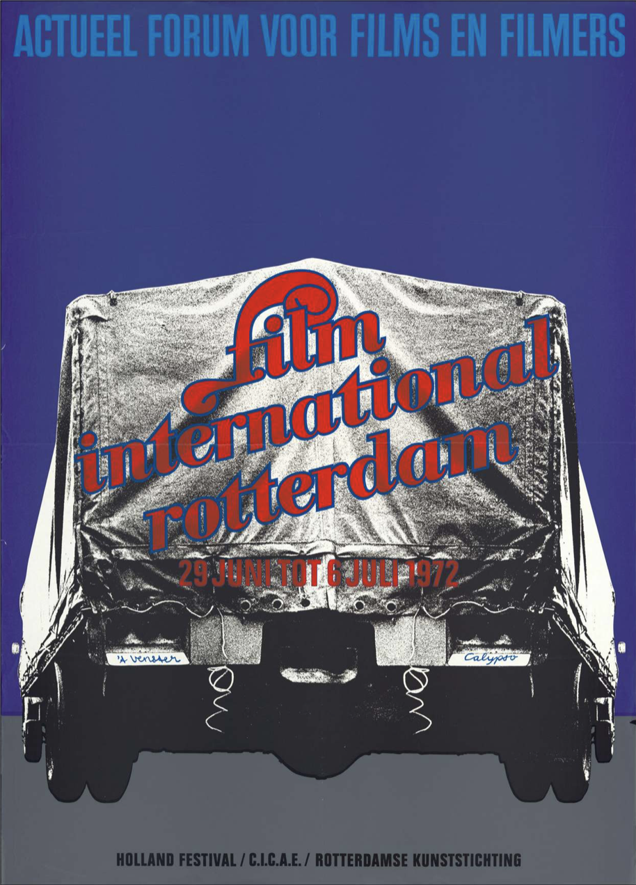
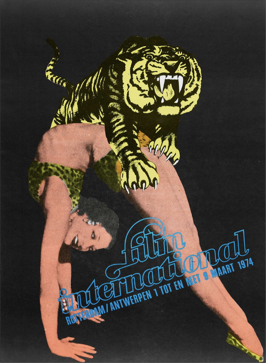
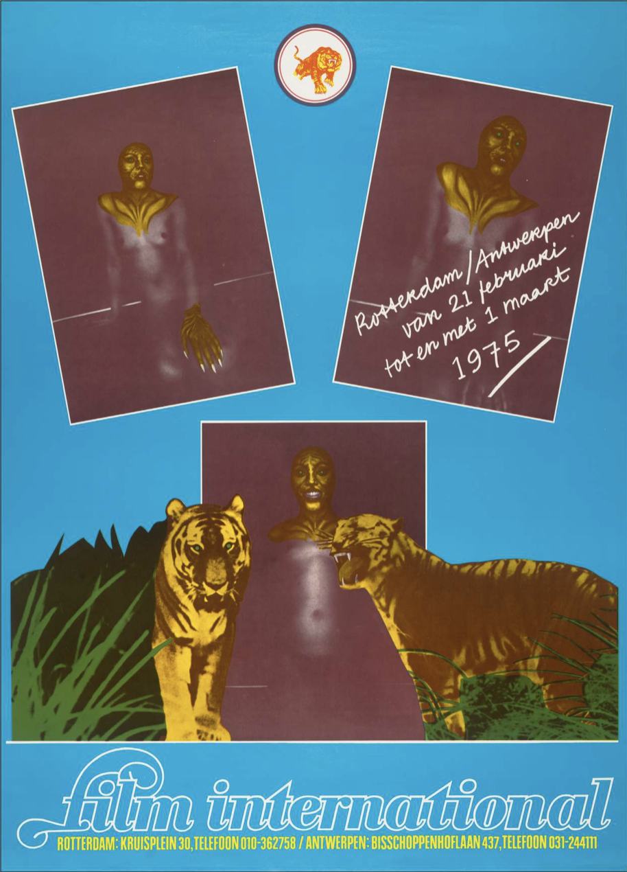
One year before Maliangkay was born, Rotterdam had been bombed. In 1940, during the German Luftwaffe in the Blitz of the Second World War, almost the entire city center was destroyed. This led to the time period of wederopbouw, which is the process of rebuilding and re-organizing a broken city. We will find out how this particular context shaped the work of the emerging designers during those years. When we look at the posters designed by Maliangkay in 1974, what is immediately striking is the use of collage. The collage technique, or more broadly, do-it-yourself (DIY) graphic design, emerged after the Second World War when new technologies had been invented that made the production of construction materials much cheaper. For instance the invention of the photocopier in 19596. Because of easier access to tools and materials, anyone with access could now become an artist or designer. Artists, people, anyone, could now pick up scissors, glue and copy a fancy design. This showed you didn’t need to be a professional to make a great design.
The collage technique was made famous by the punk movement, who picked up this wave of DIY design to make underground zines. The punk movement was a reaction to the period after the war from the youth who wanted freedom, and radically started to rebel against any kind of rules or authority7. Collage technique was one of the visual languages that embodied this break. More precisely: it embodied a breaking with the formal design rules that were set by modernist designers.
Griddy Gust: Gust Romijn
From edition 6 until 10, IFFR's poster has been designed by the Rotterdam artist and designer Gust Romijn. Gust Romijn was trained an architect, but started to work as a sculptor, painter and graphic artist8.
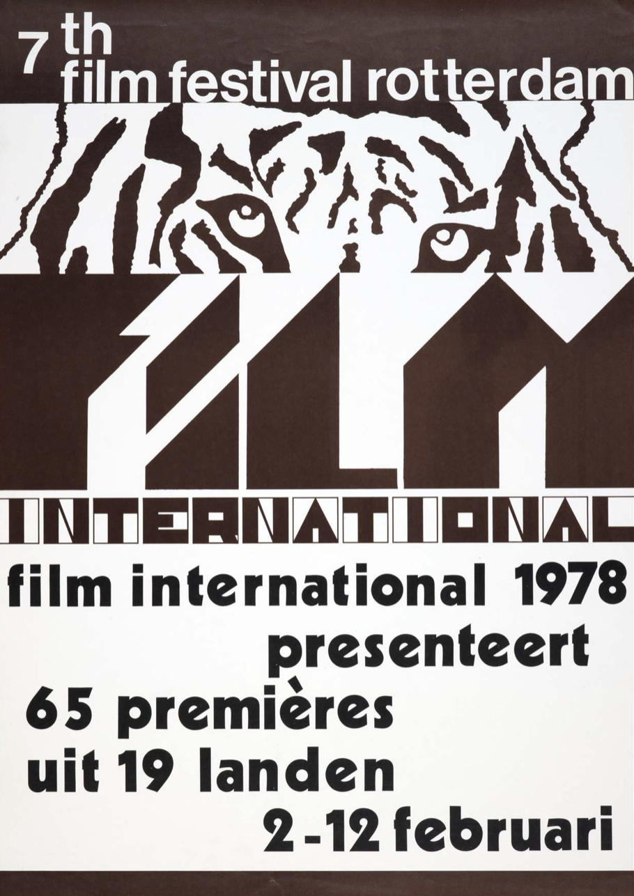
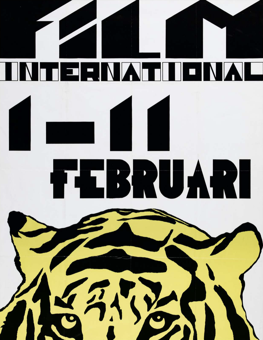
When we compare his posters to the posters designed by Maliangkay, Romijn’s designs look much more structured. That is mainly due to the text placement, that is set in straight lines. This is a clear influence of the use of a grid9, introduced by the modernists.
The modernist movement was a completely different response to the Second World War as we had seen from the punk movement. It was a response in which designers wanted to create clarity and order in the world through design. The design for an organization should have one strategy, so its outings would maintain coherence. One could create coherence by limiting the amount of choices in their design, in this case by using a grid. The grid was a sheet of paper with lines, placed under or on top of the design, on which text, image, and column measurements were decided10.
Another influence of the modernist movement visible in Romijn’s design is the use of less or only monotone color, and the reduction of photographic images to geometric shapes. These new design “rules” not only created coherence but also made it easier for designers to give specific instructions to printers. This gave way for production processes to be mechanized and up-scaled, and that didn’t go unnoticed. Soon large scaled organizations started to hire modernist graphic designers to look at their identity. Service providers like airline KLM or supermarket chain Albert Heijn employed design studios. A new genre in visual culture emerged; corporate identities.
Corporate identities demanded a level of quality and skill that graphic designers (like us) could only learn through a formal design education. Where designers like Maliangkay rebelled against a corporate graphic world by refusing to work with technically developed tools, designers like Romijn kept up with the latest technical developments to be able to work for, or with, corporate institutions.
Rotterdamse Cowboys: Hard Werken
The third folks in line to design IFFR's poster were the members of Hard Werken. Hard Werken was a graphic design collective from Rotterdam, formed in the late 1970’s and became fairly famous in the 1980’s. They consisted out of Henk Elenga, Gerard Hadders, Tom van den Haspel, Rick Vermeulen, Kees de Gruiter and Willem Kars11.
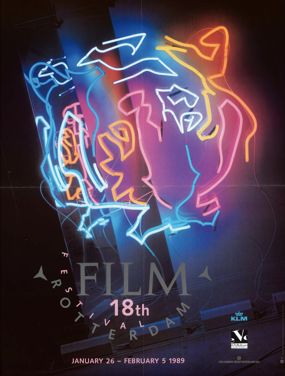
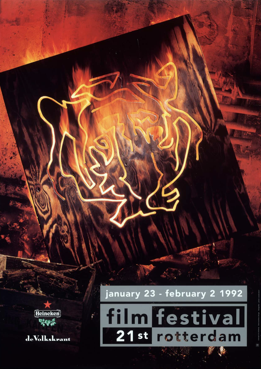
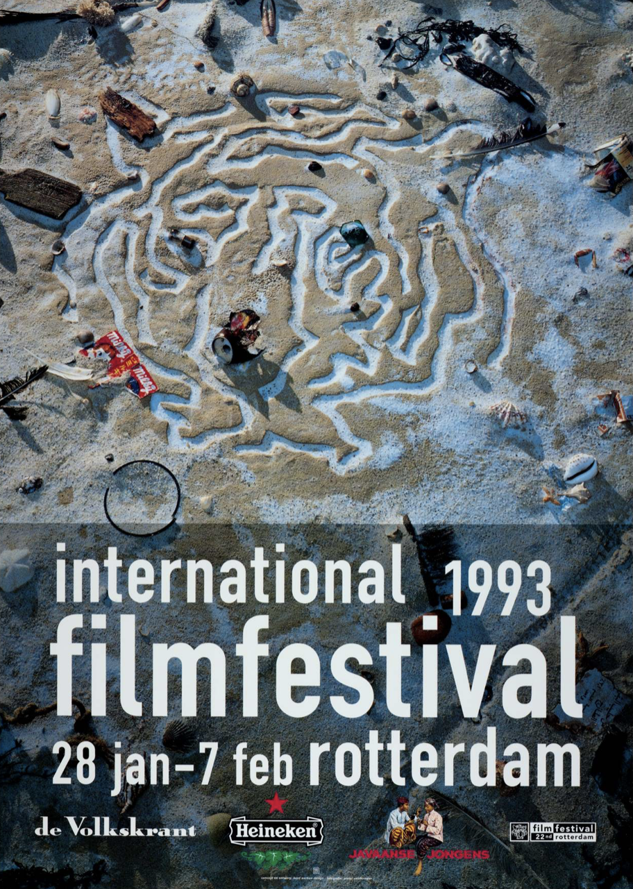
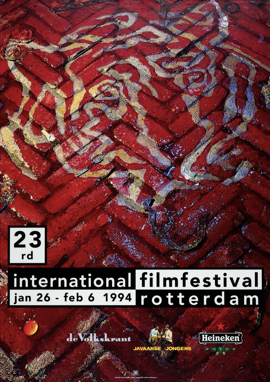
In the designs they made for IFFR from 1986 until 1992, Hard Werken introduced staged photography to the poster. Gerard Hadders in an interview12 says the poster series are inspired by the pre-digital special effects that were used in movies in the 1940’s. The tiger was built into a decor for each poster, which they would photograph into a poster. Different techniques were used: neon, hot metal, a flower bouquet or fake blood on pavement.
Hard Werken identified themselves with the postmodern generation of designers. Postmodernism, as the term indicates, was formed after the modernist movement. More than it could be described as a movement in art, like modernism was, it could be described as a way of thinking about design. Where modernist designers had strong beliefs in the level quality you should achieve with your design, postmodern designers believed anything could be art. They didn’t believe in boundaries between that was seen as “high” and “low” art. Artists like Duchamp, which I don’t doubt you know, presented found objects like a toilet with a plate saying “fountain”, and that was then art. It rocked the art world.
Hard Werken worked with found objects through staged photography. The use of staged photography represents an important part of the postmodernism philosophy. By presenting daily objects in a different context, postmodern designers aimed to imagine a new world within the already existing one. To re-imagine the daily, loose from the structures that bind us to reality. This utopian idea started with the Situationist movement in France, and can well be expressed with the quote <>Sous les pavés, la plage!”. Which loosely translates to “beneath the pavement the beach”, a slogan used in Paris student revolts in May 1968. The slogan expressed the wish to “imagine another world, where other possibilities and alternative ways of being and living existed —beyond the social and political structures that immerse us, beyond the artificiality of living in a the city13”.
At this time, Rotterdam was being rebuilt and growing into a one of Holland’s capital cities. The harbor developed itself to become Europe’s largest seaport, and gave way for large scaled organizations to house there. Within these rapidly changing surroundings, using vernacular was a way for postmodern designers to play with the given of reality. A search for freedom and new visual expressions.
Kisman and the Computer: Max Kisman
From 1996 until 2002, Max Kisman designed the festival poster. Kisman was born in Doetinchem, and studied typography, illustration, animation and graphic design at the AKI in Enschede and the Rietveld Academy in Amsterdam14.
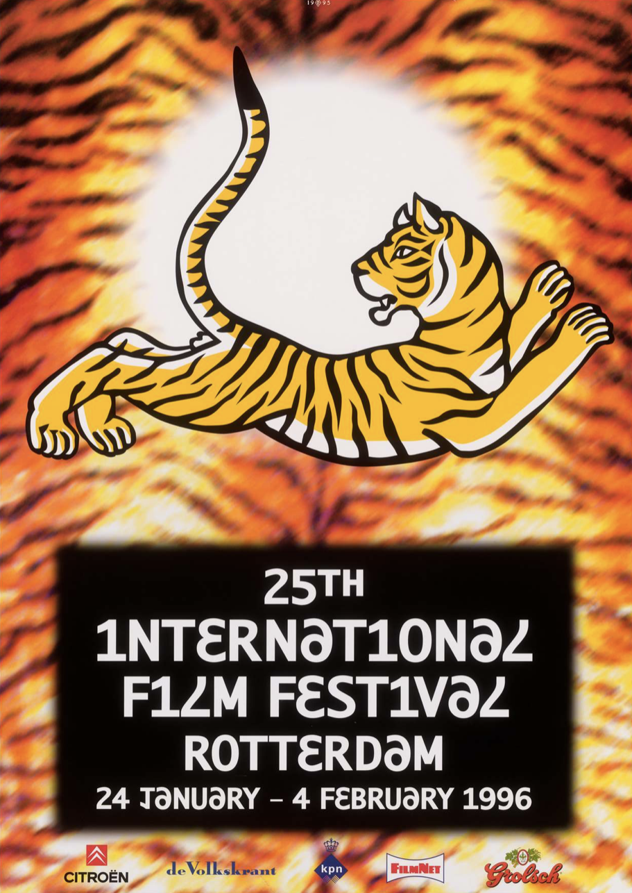
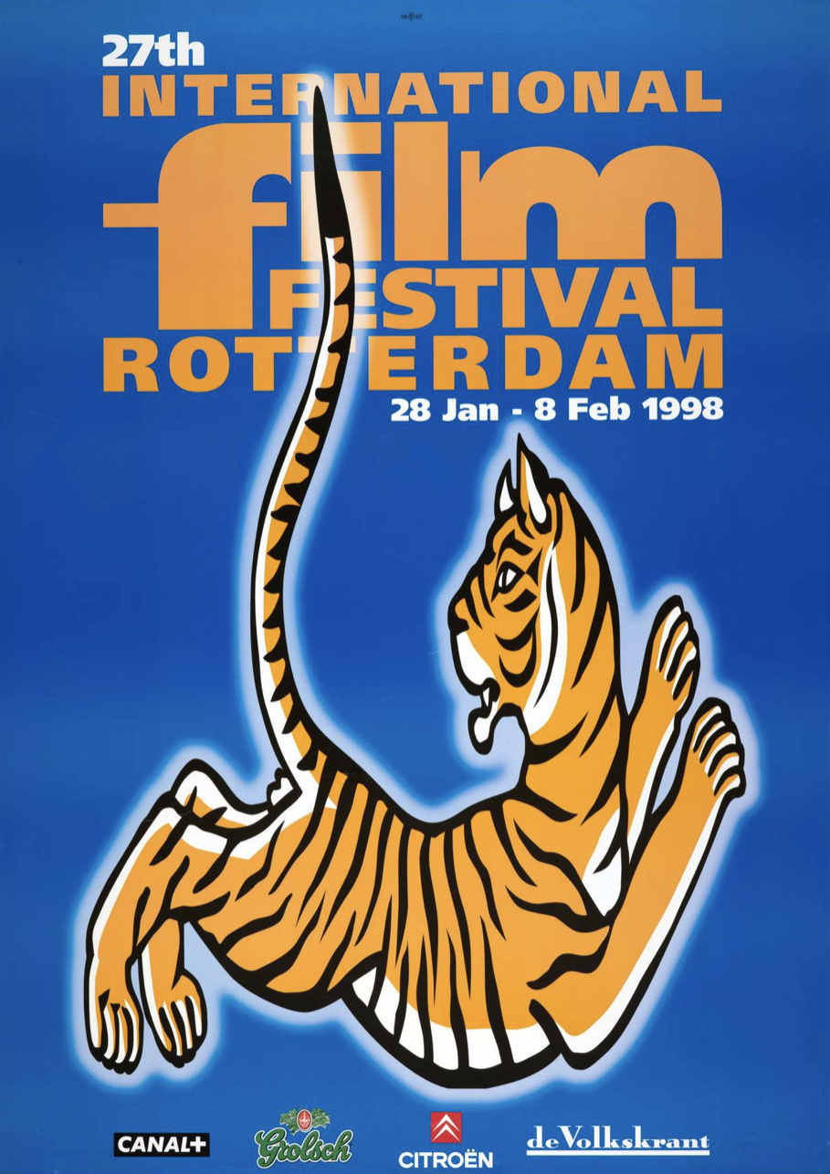
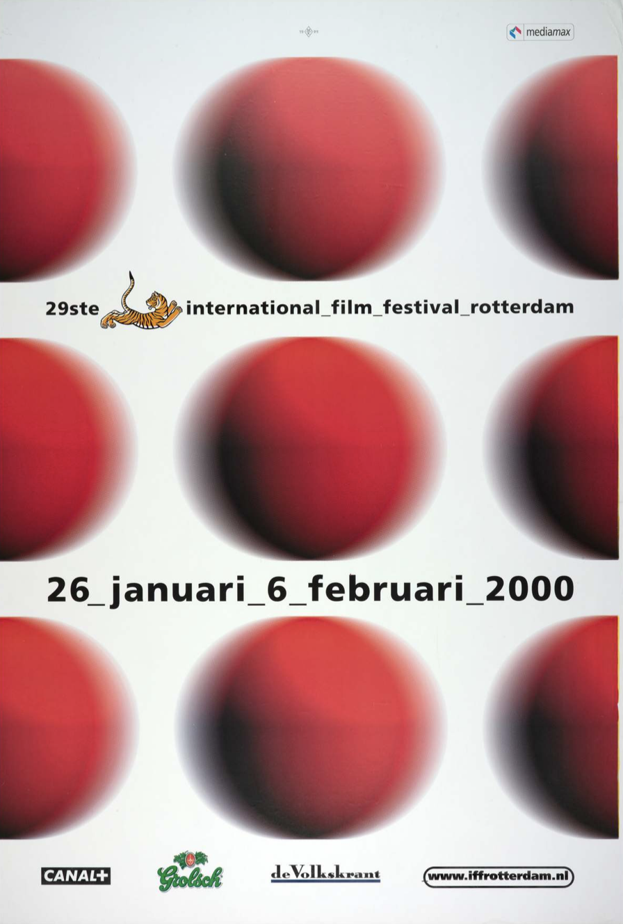
Looking at Kisman’s posters I find it hard to distinguish a use of vernacular. We could even say his poster series take a step away from the vernacular. Kisman was the first to introduce digital effects to the poster, before the computer became broadly accessible. The rise of the personal-computer in the late 1990’s gave way to designers to work with image and text in programs. In Kisman’s words “The introduction of the computer showed that everything is malleable. Manipulable15”. The computer brought upon a new generation of graphic designers that mastered design programs and were able to design basically anything.
Much later when the home computer became affordable for modal incomes, it became a tool for those who could afford a computer and who had the time to learn new skills to be able to design. Now ‘amateurs16’ could reach the same quality work as designers. The level of quality that modernist graphic designers held for the profession, was being challenged. And with that, the idea of the graphic designer as a professional. When more people have access to the same tools that were once exclusive for you as a graphic designer, how could you still differentiate yourself within the discipline?
To Romanticize or not to romanticize: Ontwerpwerk
After Max Kisman, Ontwerpwerk was the first in line to design the IFFR poster. Ontwerpwerk started in 1986 as an advertisement and strategy bureau in The Hague17. Nowadays they are with a team of 40 designers, digital experts and strategists, still operative from The Hague.
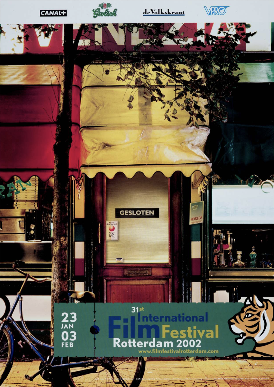
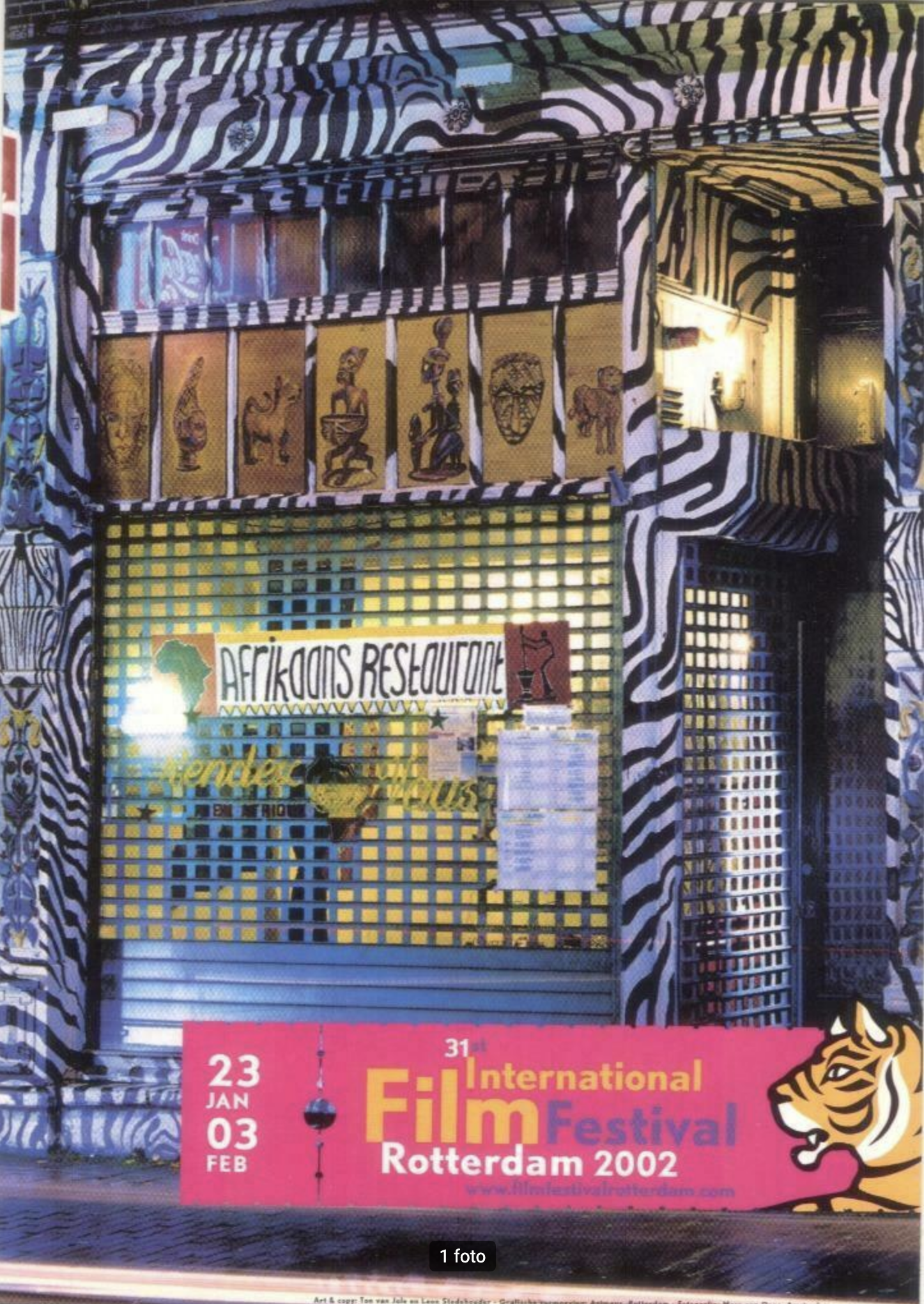
What I find particularly striking is Ontwerpwerk’s posters for the 2002 IFFR campaign. For this edition they chose to showcase a selection of stores and restaurants in Rotterdam with the festival’s information and IFFR's logo by Max Kisman on top. In the first poster Ice Cream parlor Venezia is photographed, and in the second the African restaurant Mamma Essi. Former designer at Ontwerpwerk, Stephan Csikós reckons the idea behind this design was that everyone had to leave their venue because the Film Festival had begun.18,
It is interesting to see these poster compared to Kisman, in which Ontwerpwerk uses vernacular quite literally. This seems like a turning point, similar to the one we had seen before between the work of Romijn and that of Hard Werken. Is this turn the search of the Festival for a fresh voice? Or is this a pattern within the graphic design field? Could the turn to vernacular possibly be a response of graphic designers after periods of technical development? We have seen that technical developments and broader accessibility to tools made graphic designers to rethink their position, to wonder which role they want to take on within the discipline. Of course this is not set in stone, but an ongoing process that enfolds as you develop yourself as designer. I feel Tibor Kalman’s writings could offer us an interesting perspective of a graphic designer with a critical view towards the field: “what is than the point of practicing graphic design? To try and unlearn design. To not design in ways corporations have taught us. And one way to do this, is to look at vernacular design19”.
With their photographs of Rotterdam’s of venues that show different cultural outings, Ontwerpwerk tries to address the inhabitants of Rotterdam through their collective identity. The collective identity that has grown over time to call itself multicultural. Rotterdam’s multicultural identity started to develop when the rebuilt of the city after the Second World War called for extra hands. Many guest workers came to the Netherlands to fill in the demand for work. Many had built a living in the Netherlands, and deciced to stay and became Dutch citizens. Some saw the opportunity to earn an income by opening up small businesses or venues.
These venues are one of the physical manifestations of the visual vernacular of a group people. By photographing them Ontwerpwerk aims to add another layer of cultural meaning to their posters. However, an important side note to the use of vernacular with specific cultural bound meanings- or uses is placed by Cuban designer Ernesto Oroza: “Romanticizing aesthetics that are born from poverty and scarcity should be avoided. Vernacular should not be seen as an aesthetic practice - even though in my opinion it often has beauty - it should be seen as fixing one’s practical need with the tools one has20”. When working with vernacular, I try to be aware of my own position as a white Dutch graphic designer. Even though I have definitely forgot and will forget it many times. I try to contextualize a vernacular, in order to avoid painful missteps that could lead to appropriating or exotifying people whom have a different ethnic background than me.
Done with the schools: 75B
In 2008 design agency 75B took over the identity of IFFR. 75B was founded in 1997 by Robert Beckand, Rens Muis and Pieter Vos, who knew each other from studying graphic design at the Willem de Kooning Academy in Rotterdam. Nowadays the firm is run by Rens Muis and Pieter Vos, still operating from Rotterdam21.
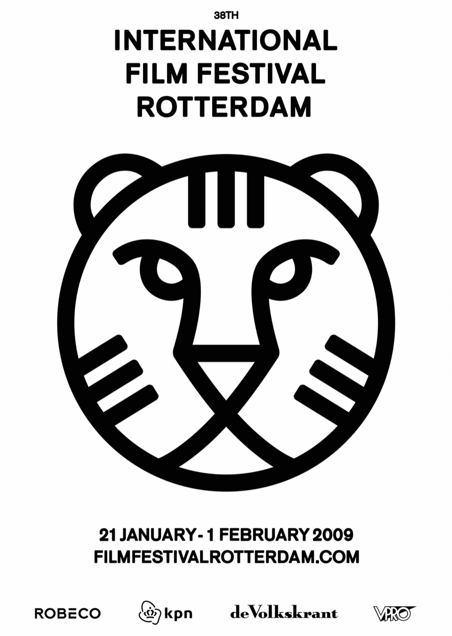
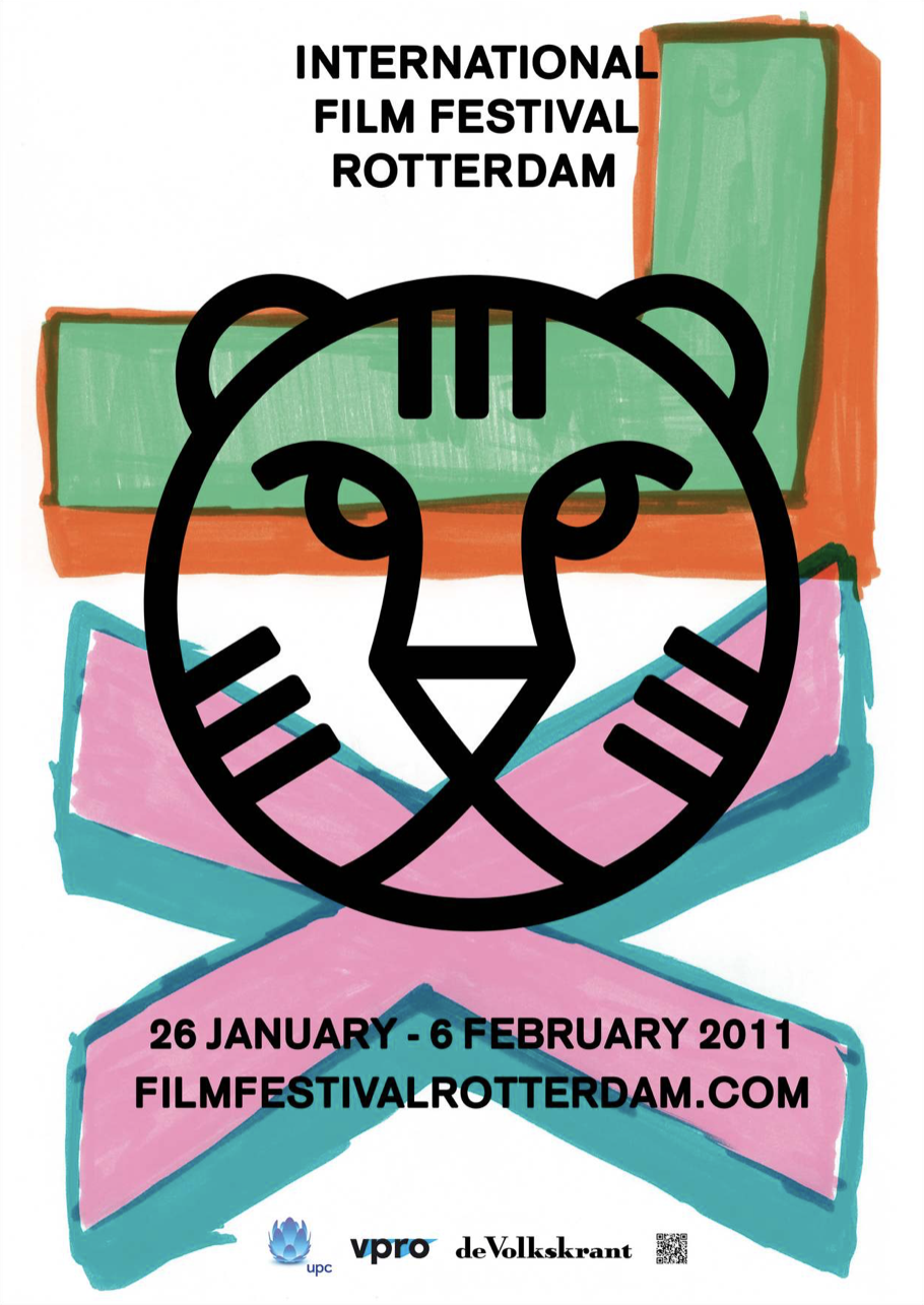
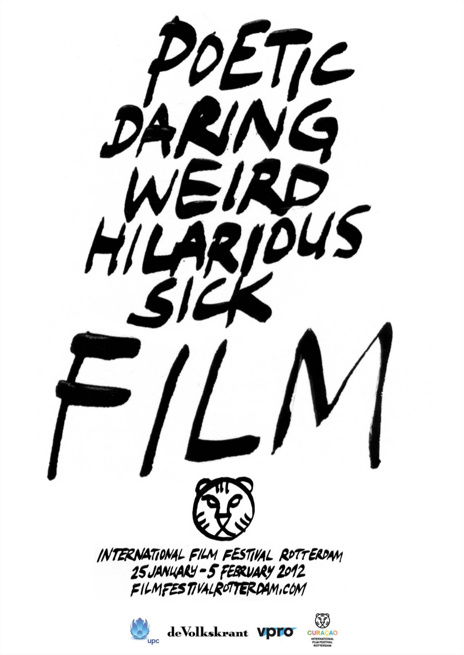
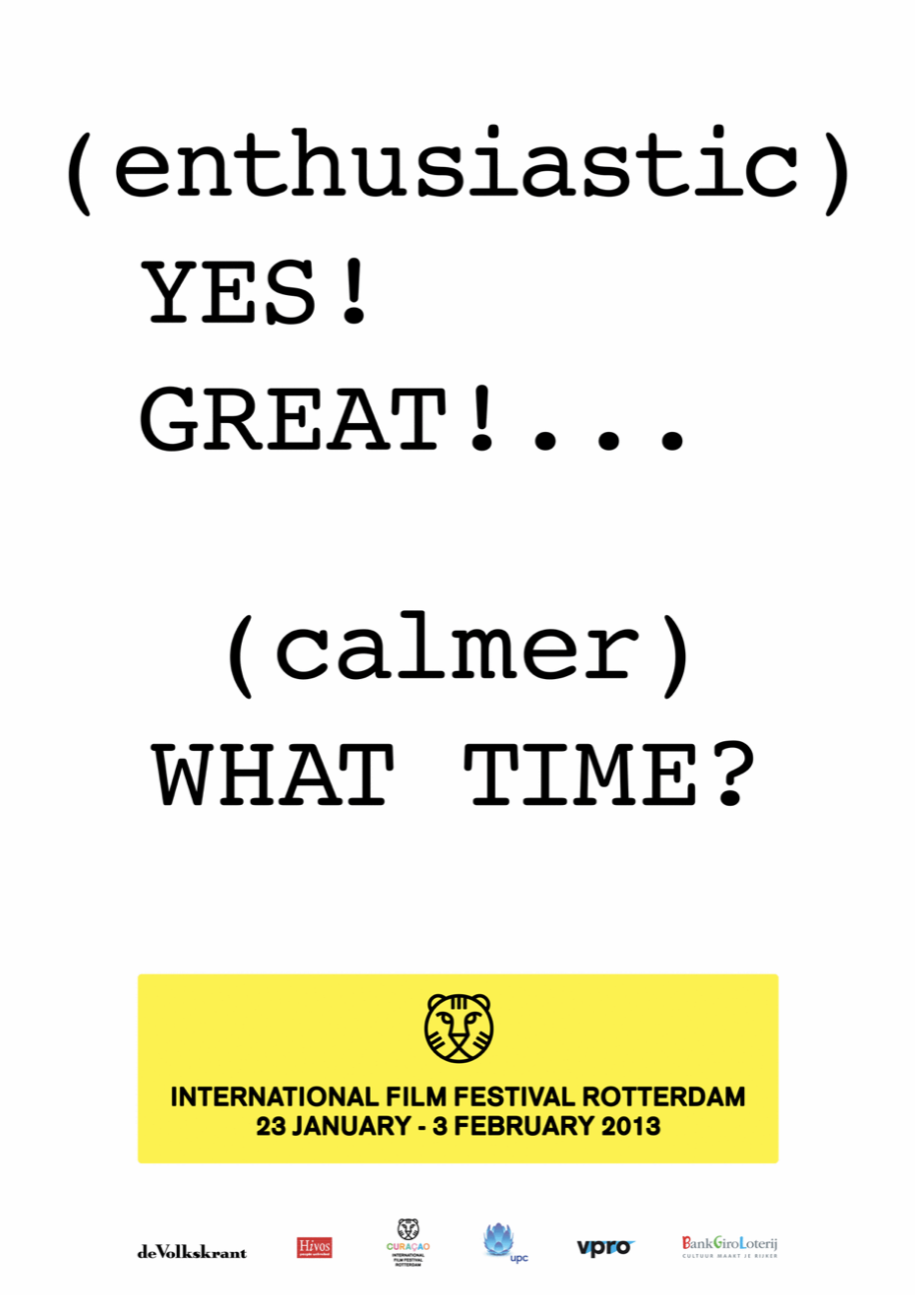
In their second IFFR campaign they introduced the new logo and identity, which is still in use this day.In 75B’s posters we see different visual languages coming together. 75B is creating their own visual languages out of different vernacular aesthetics. The use of handwriting- and drawing is one of the ways in which they try to bring an intimate, playful feel to their posters. What also stands out to me is their 2013 poster series, in which the text they present on their posters indicate a person talking, as if it is a script for a movie. Through these techniques they try to give their campaign, quite literally, a personal voice; a vernacular.
The time in which graphic designers nowadays are operating, is what Florian Cramer calls the “post-digital22’ era. This is the era in which graphic design has become a hybrid of “old” and “new” media. According to Rens Muis “there are no schools in design anymore. You take whatever technique suits your idea, and use it23”. Through expansion of digital techniques such as social-media, we have access and knowledge about many different visual languages. 75B is using techniques that are supported by technology; the type and logo, combined with ones that can not (yet) be reached through technology; the writing of one’s hand.
Van der Kamp, Henk. Maliangkay, Evert Maliangkay.↩︎
Pater, Ruben. Capslock. Amsterdam: Valiz. 2021. p. 331↩︎
Brophy, Philip. The Punk Explosion As Revolution. 2019.↩︎
Redaction Artzuid. Gust Romijn.↩︎
Huygen, Frederike. Modernism: In Print. Eindhoven: Lecturis. 2017. p. 7.↩︎
Hollis, Richard. THE MODERNIST GRID.↩︎
Furnée, Bettina & Horton, Ian. Hard Werken - One For All. Contributors: Russ Bestley, Max Bruinsma, Tony Credland, Frits Gierstberg, Noor Mertens. Amsterdam: Valiz. 2018. p. 20.↩︎
Sturt, Graham. Dutch Design Heroes: Gerard Hadders. 2018.↩︎
Knabb, Ken. Situationist International Anthology (Revised and Expanded Edition). Berkeley: Bureau of Public Secrets. 2007.↩︎
Redaction Beeld en Geluid Wiki. Max Kisman↩︎
Kisman, Max. Interview. Conducted by Charlotte van Alfen, 19 January 2022.↩︎
“The word amateur is often used pejoratively in design. For instance, when design work lacks a certain quality or longevity. The word amateur comes from the Latin amator, which means lover. These passionate roots reveal that amateurs are individuals who enjoy what they do, whether they are being paid or not.” Pater, Ruben. Capslock. “The designer as Amateur”. p. 319-320.↩︎
Redaction Ontwerpwerk. Over Ons. ontwerpwerk.nl. Consulted on 20 January 2022.https://www.ontwerpwerk.nl/over-ons↩︎
Kalman, Tibor. ‘We’re here to be Bad’. Print Magazine. New York: Print Magazine. 1990. p.126.↩︎
Csikós, Stephan. E-mail contact. Conducted by Charlotte van Alfen. 19 January, 2022↩︎
Oroza, Ernesto. Interviews & Writings. 2018.↩︎
Vos, Pieter and Muis, Rens. Arab Spring & Aaron Winter. Rotterdam: Nai010 Uitgevers/Publishers. 2013.↩︎
Cramer, Florian. ‘WHAT IS POST-DIGITAL?’. Aarhus: APRJA Volume 3, Issue 1. 2014. p. 13.↩︎
Muis, Rens. Interview. Conducted by Charlotte van Alfen, 10 January, 2022.↩︎
Present
Vernacular of the present: 5 contemporary graphic designers working with vernacular
One of the main purposes IFFR's campaign fulfills, is to motivate people to attend the festival. We have seen throughout our case-study, that the use of vernacular in this regard has often been one of aesthetics. What happens when vernacular is used for a different purpose? Which roles do graphic designers take on then? Let’s try to find out through this personal selection of contemporary graphic design projects.
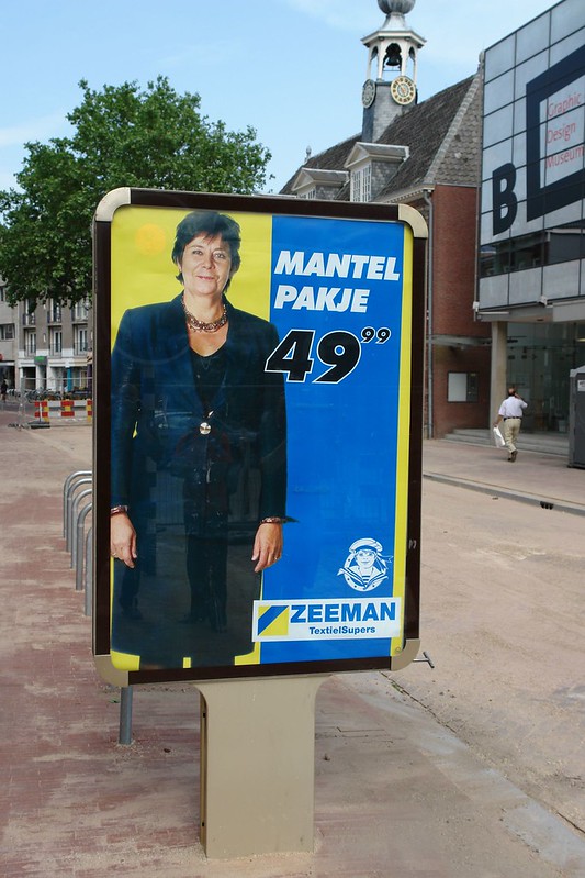
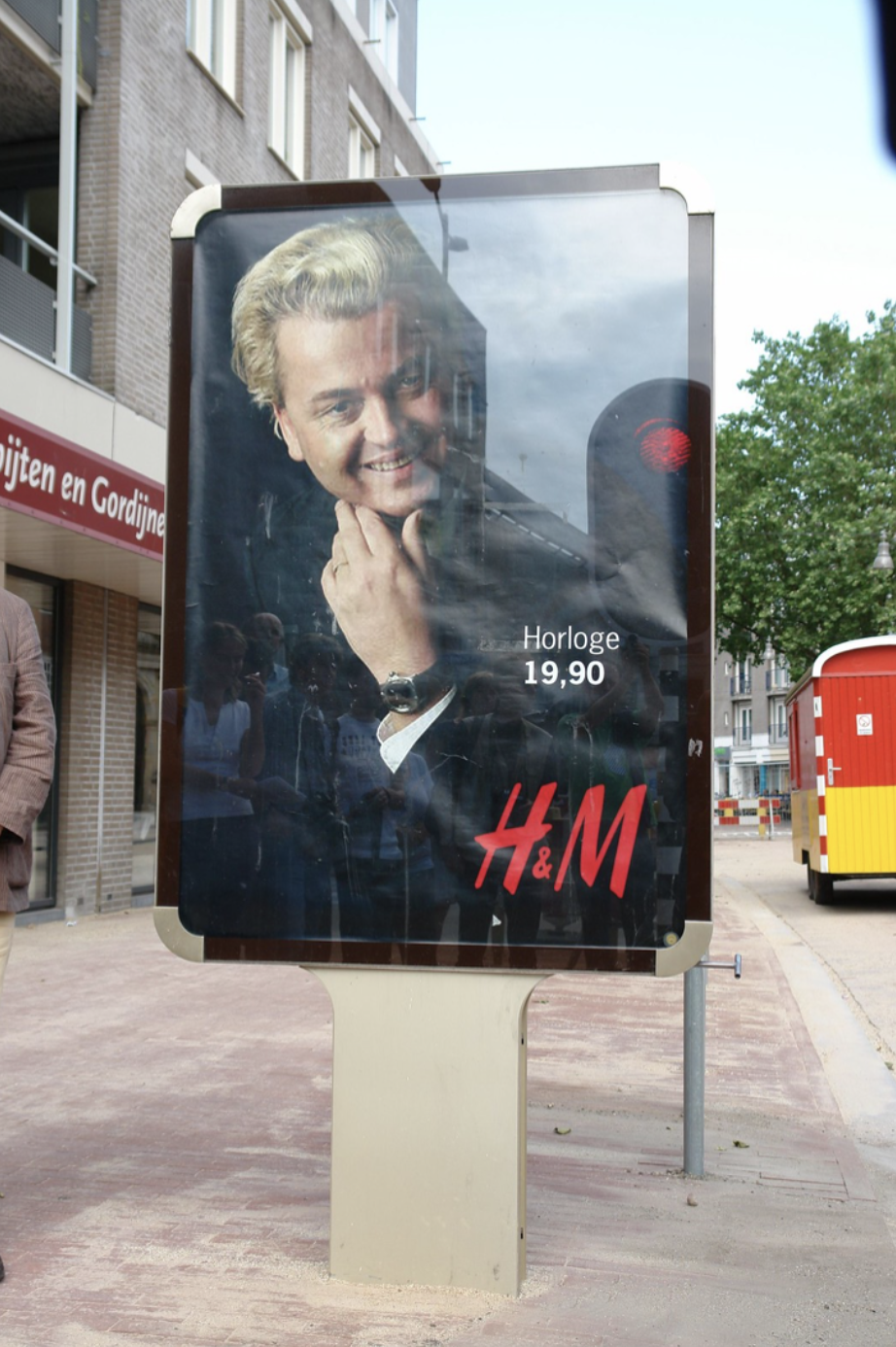
As much as graphic designers can use vernacular to address a specific group, the same can be done but then to criticize a specific group. More specifically: graphic designers can use their position and knowledge of design to detect marketing strategies of (large scaled) organizations, and possibly make other people aware of them. By combining two marketing strategies with opposed goals, 75B turn both communications against itself, creating an ironic message24.
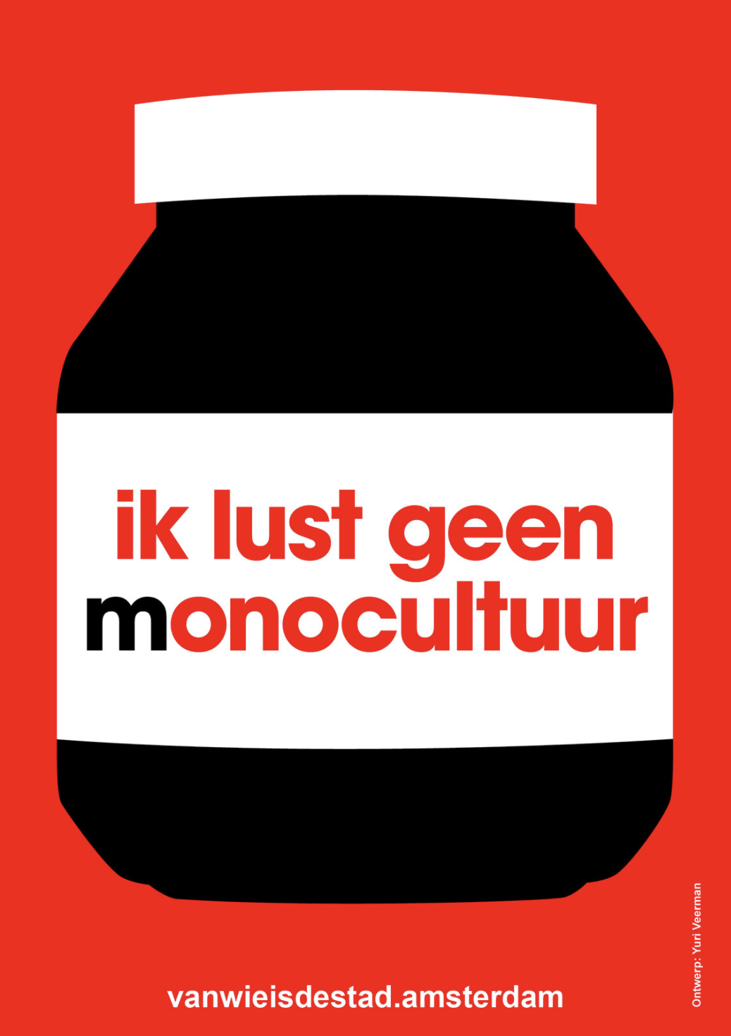
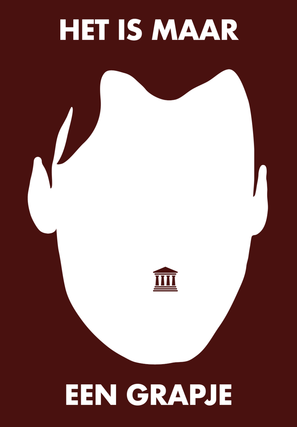
Another graphic designer that takes on the role of critic in designing with vernacular, is Yuri Veerman. Here he uses the visual language of mass manufacturers and political parties to transmit his own messages. By using vernacular that has become mainstream, graphic designers can its familiarity as a tool to attract the attention of their viewer.
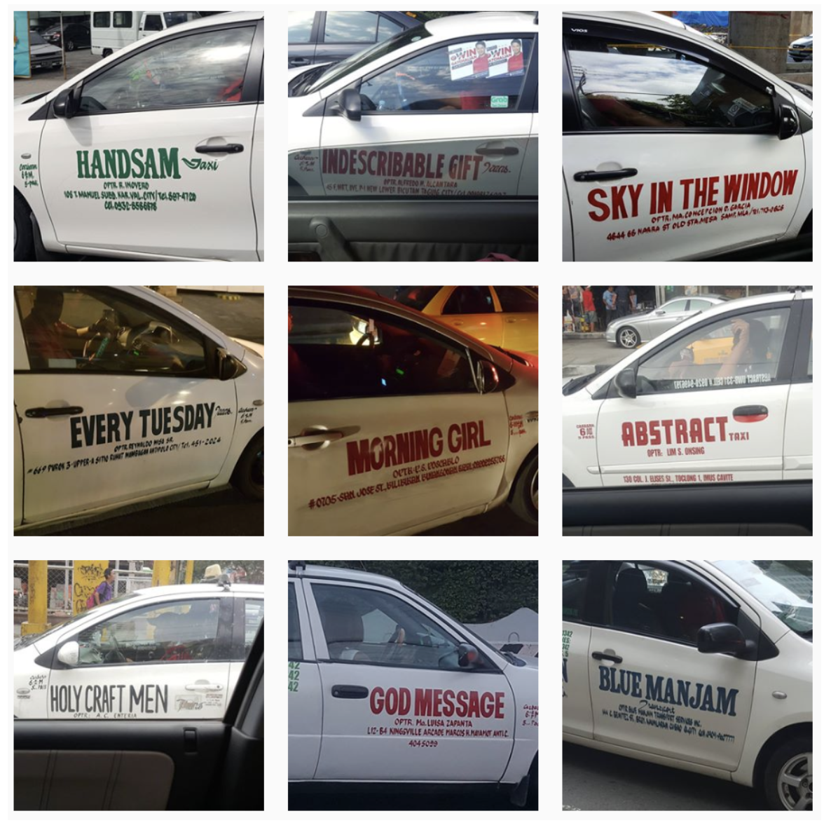
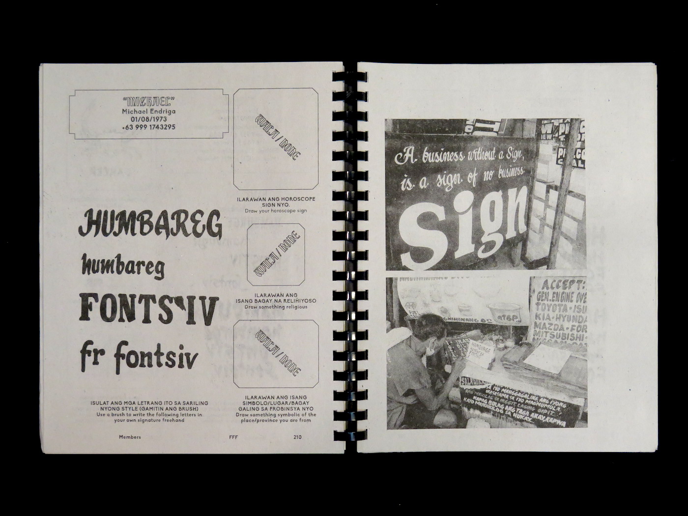
Rather than using vernacular for designing, Hardworking Goodlooking makes a practice out of researching a specific vernacular. They do this by carefully documenting it, and then by working together with local designers, to make small scale publications. Through publicizing, they aim to transmit this knowledge. By making evident a vernacular, as Hardworking Goodlooking does, we graphic designers can play a part in celebrating a culture. Hardworking Goodlooking takes on the role of researcher and collaborator in using vernacular25.
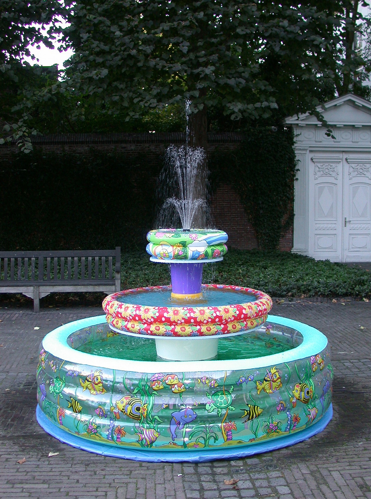
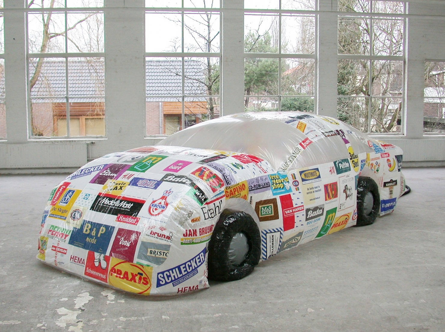
The next designer is working with the physical manifestations of vernacular design. Helmut Smits uses vernacular objects as contemporary found objects. By reshaping their known forms into new objects, he aims to rethink the meaning of those objects in our daily life. Smits takes on a more fine arts approach to working with vernacular.
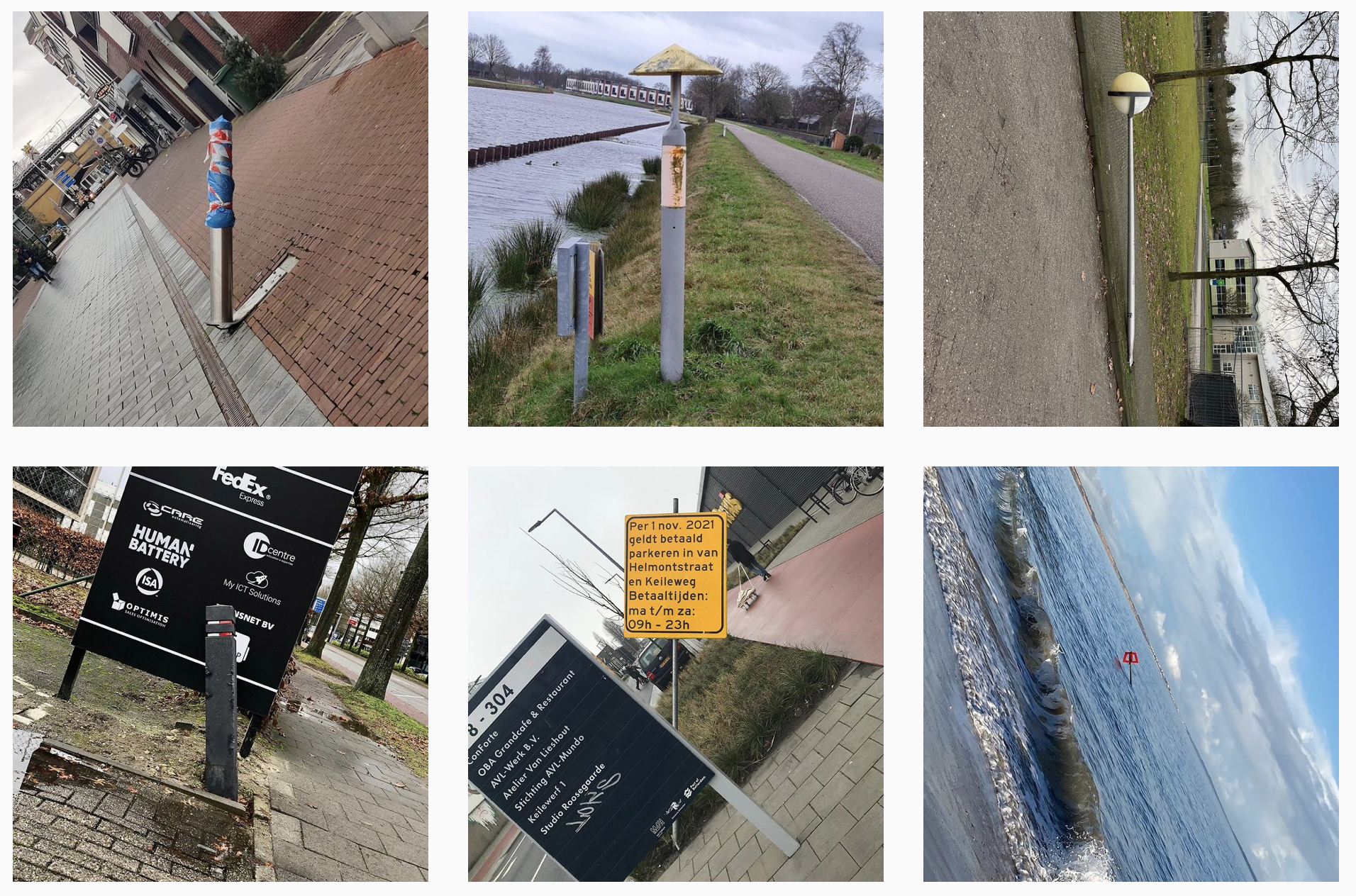
In his project “Scheve Palen” or “Slammed Posts” Onno Blase looks at the street with a poetic eye. He notices a visual language that is coincidental. Blase says “It’s super simple idea and a maniacal project. I hope it brings a smile to your face. I hope it makes you look around more when you’re walking or cycling through your city, and observe what you see26.” Designers like Onno Blase and Helmut Smits transform the daily activity of vision itself into a more self-conscious activity. To not only see the world, but see the beauty, humor or what so ever in everyday things. It is interesting to see in Blase’s project that vernacular has been taking on a digital dimension. By sharing these findings on Instagram, Slammed Posts turned into a collaborative project between Blase and his followers, creating a sense of community. A poetic and communal approach to working with vernacular.
Also known as détournement: turning the meaning of slogans and logos against their advertisers or the political status quo. Source: Debord, Guy. A user’s guide to detournement. Les Lèvres Nues #8.1956.↩︎
Pater, Ruben. Capslock. Amsterdam: Valiz. 2021. p. 334↩︎
Ekker, Jan Pieter and Subasi, Iffet. Naar de foto’s van Onno Blase moet je twee keer kijken; wat staat nou recht en wat scheef?. 2020.↩︎
Future
Vernacular of the future: how about my neighborhood?
While writing this thesis I realized researching vernacular can’t only be done by analyzing the work of designers… I decided to investigate the vernacular of my own surroundings, starting in my neighborhood.
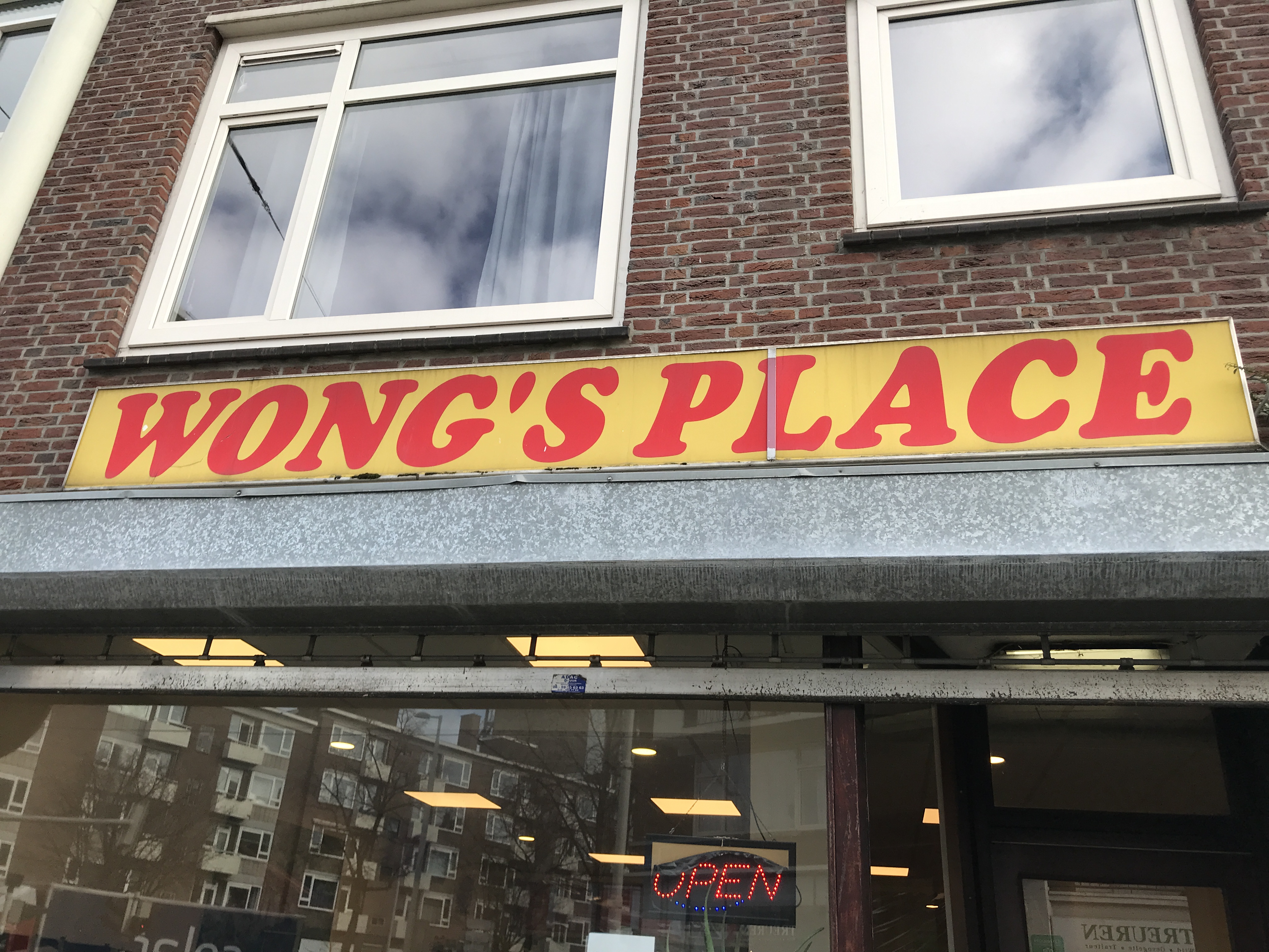
I have been living on the Admiraal de Ruyterweg for almost five years now. I have seen the local bridal store go, and a big, polished Appie27take its place. I have seen the elderly moving out of apartments next to mine, and young, urban, professionals, moving in. The process of gentrification28 has played out before my eyes, and when I imagine my neighborhood in 20 years I only see this developing further. This doesn’t sound so nice does it, hé29?
That is why I started to look at the local places that are still there. The places that bring a sense of identity to my neighborhood.
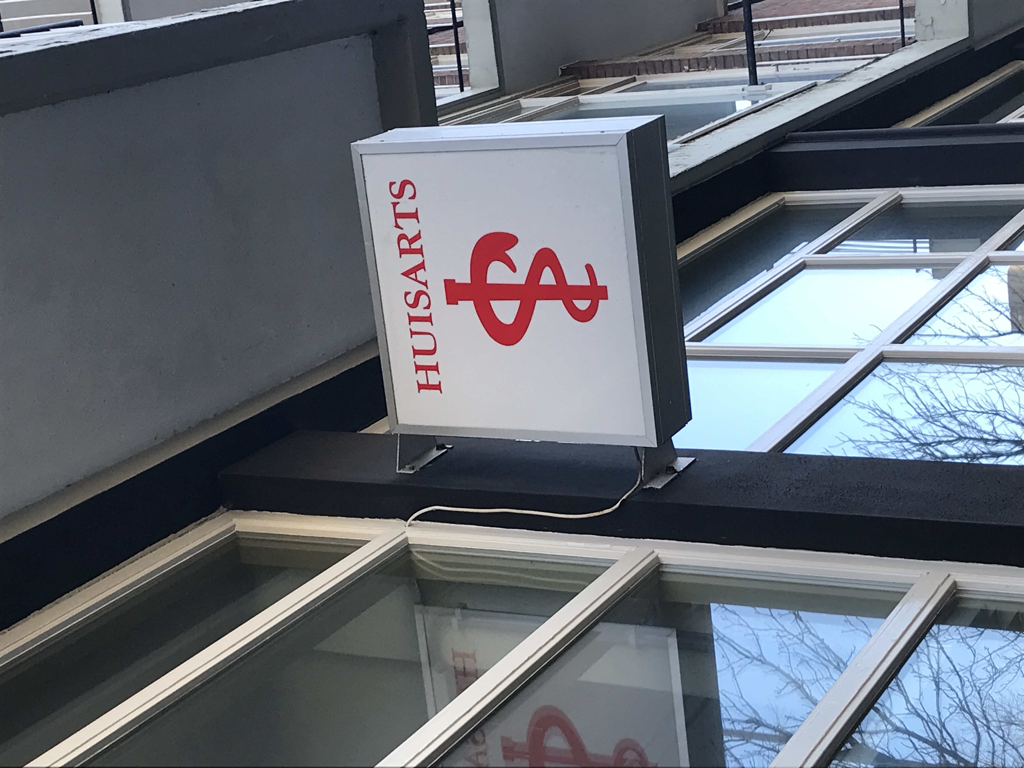
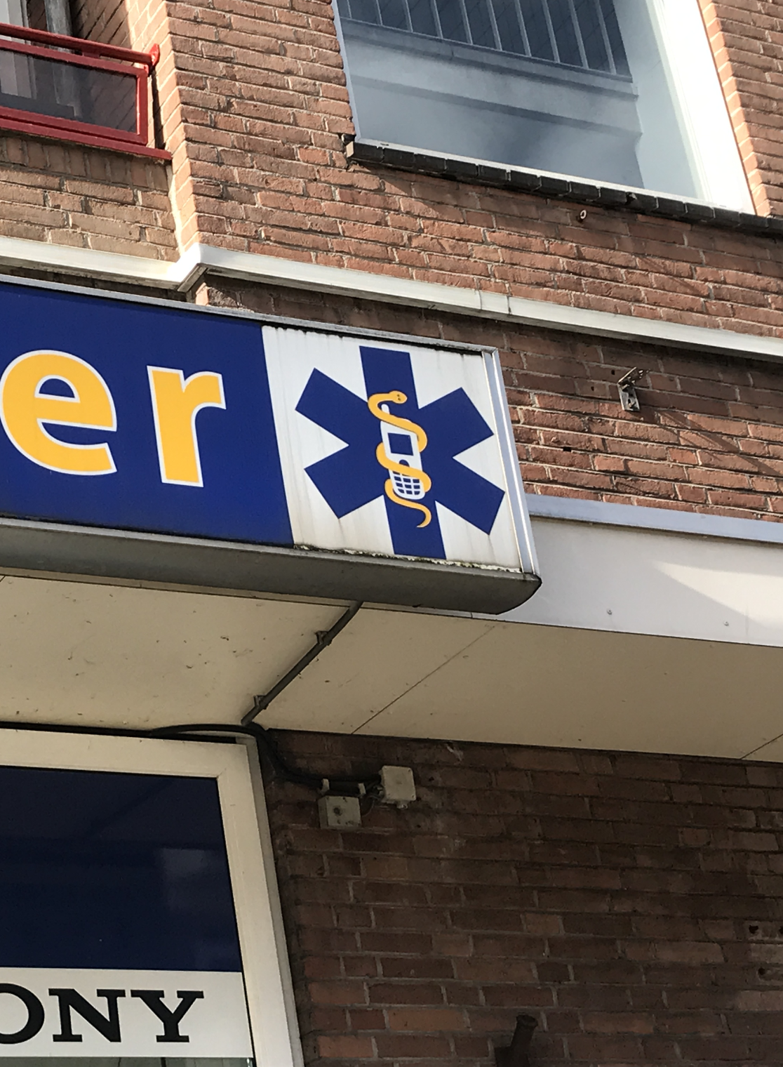
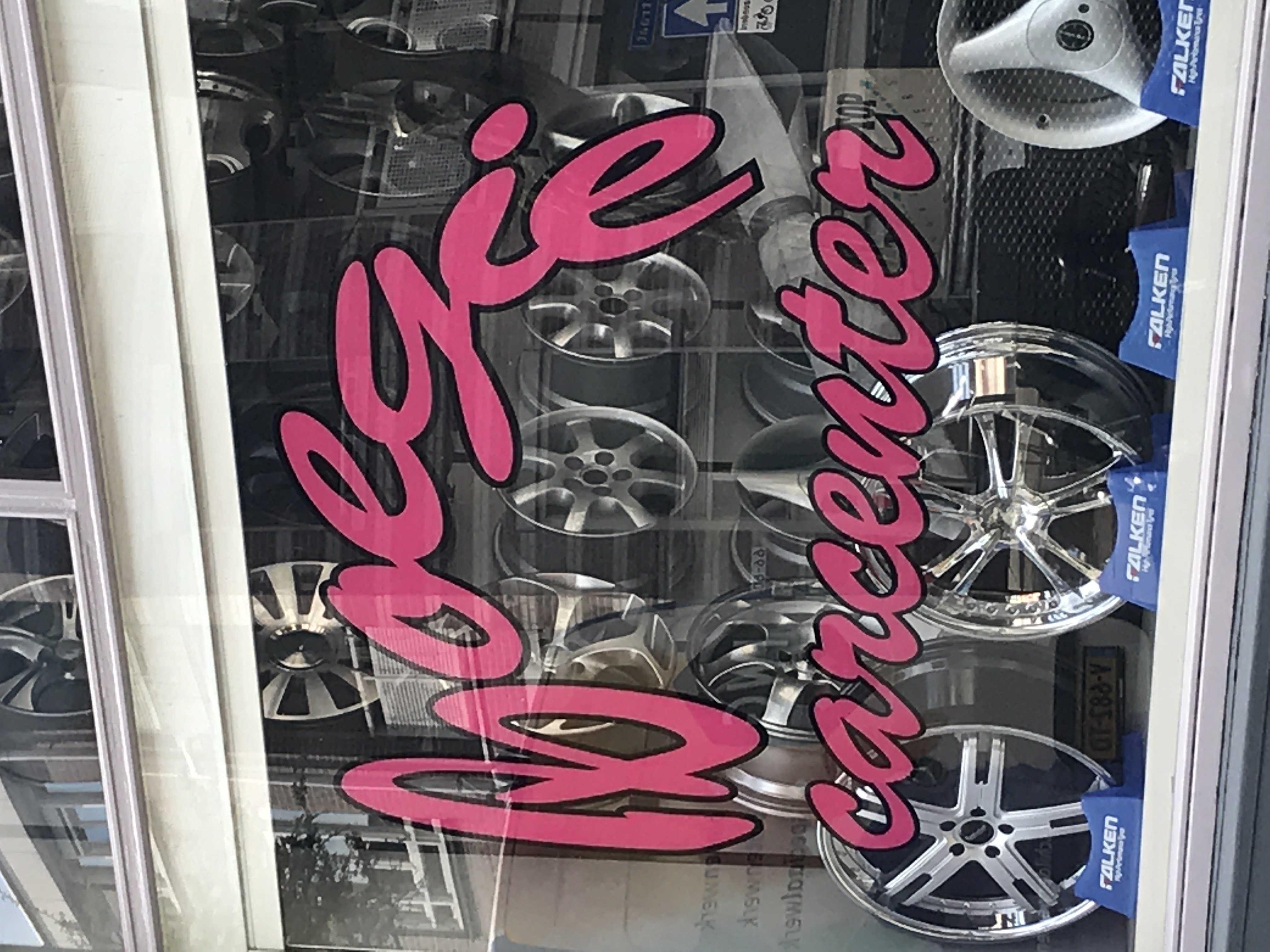
What I found interesting to see in many of the designs of storefronts, is the use of certain symbols, that you could say are universal in their use. I kept spotting these symbols, and it appealed to me that fairly some stores creatively combined different ones. Creating very specific, personal meanings.
I started to sketch with the designs of these window sights, trying to see if I could gain more knowledge over these visual languages by using them myself.
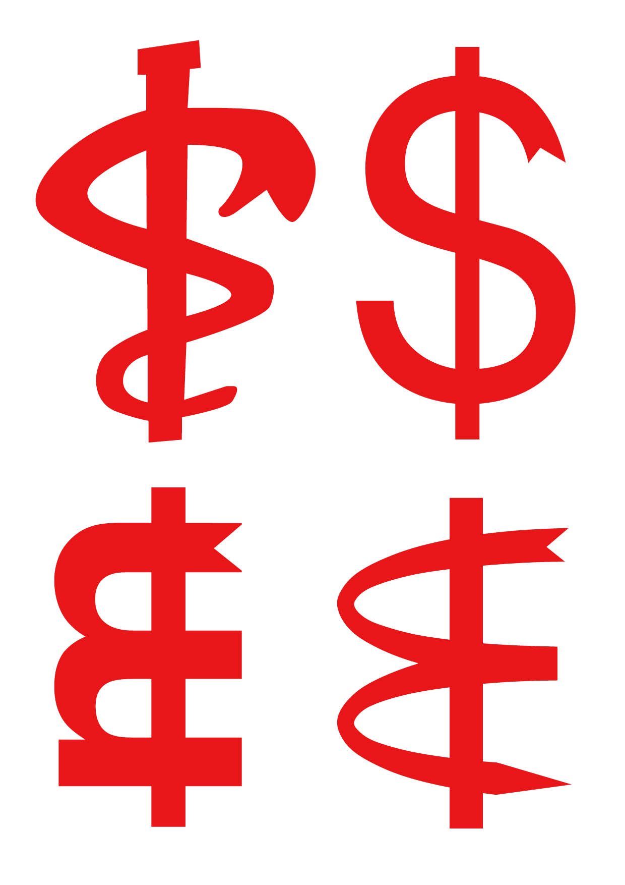
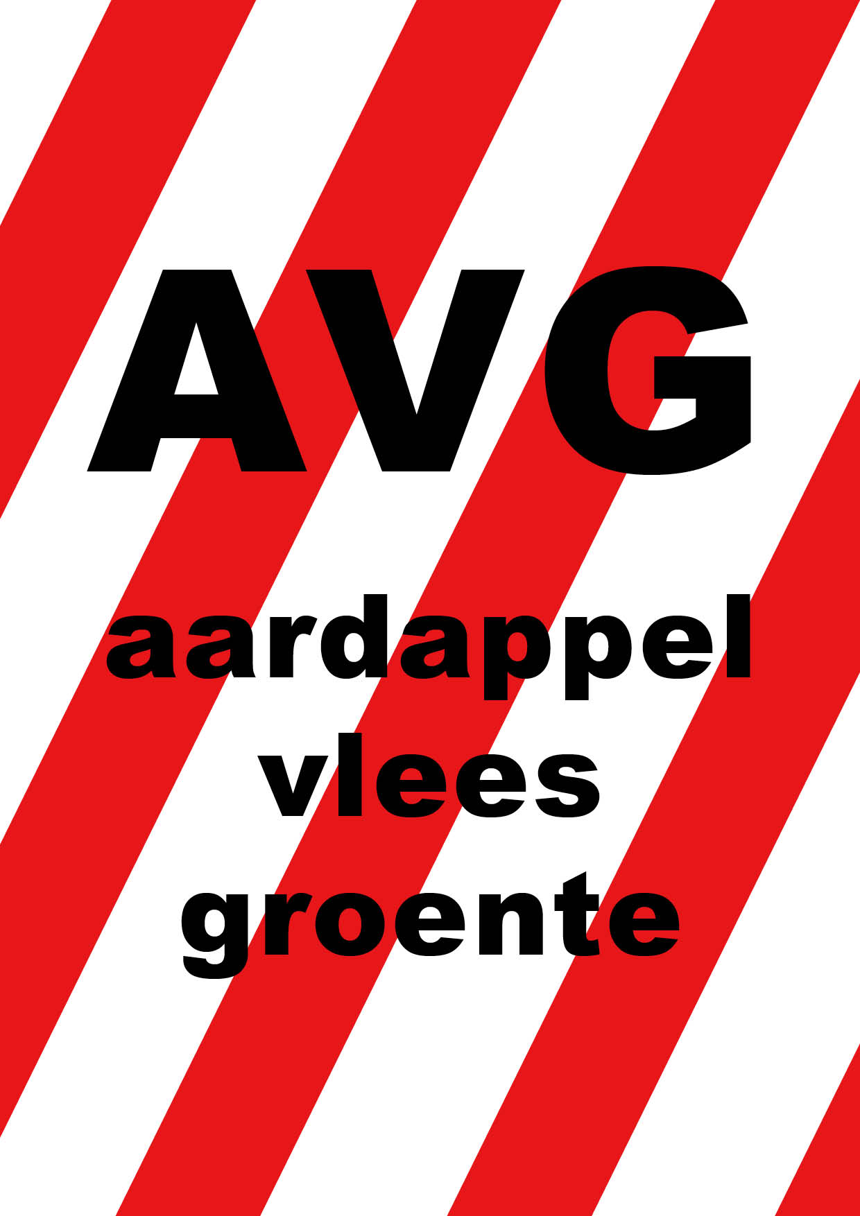
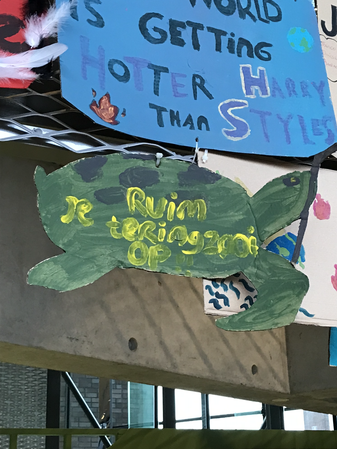
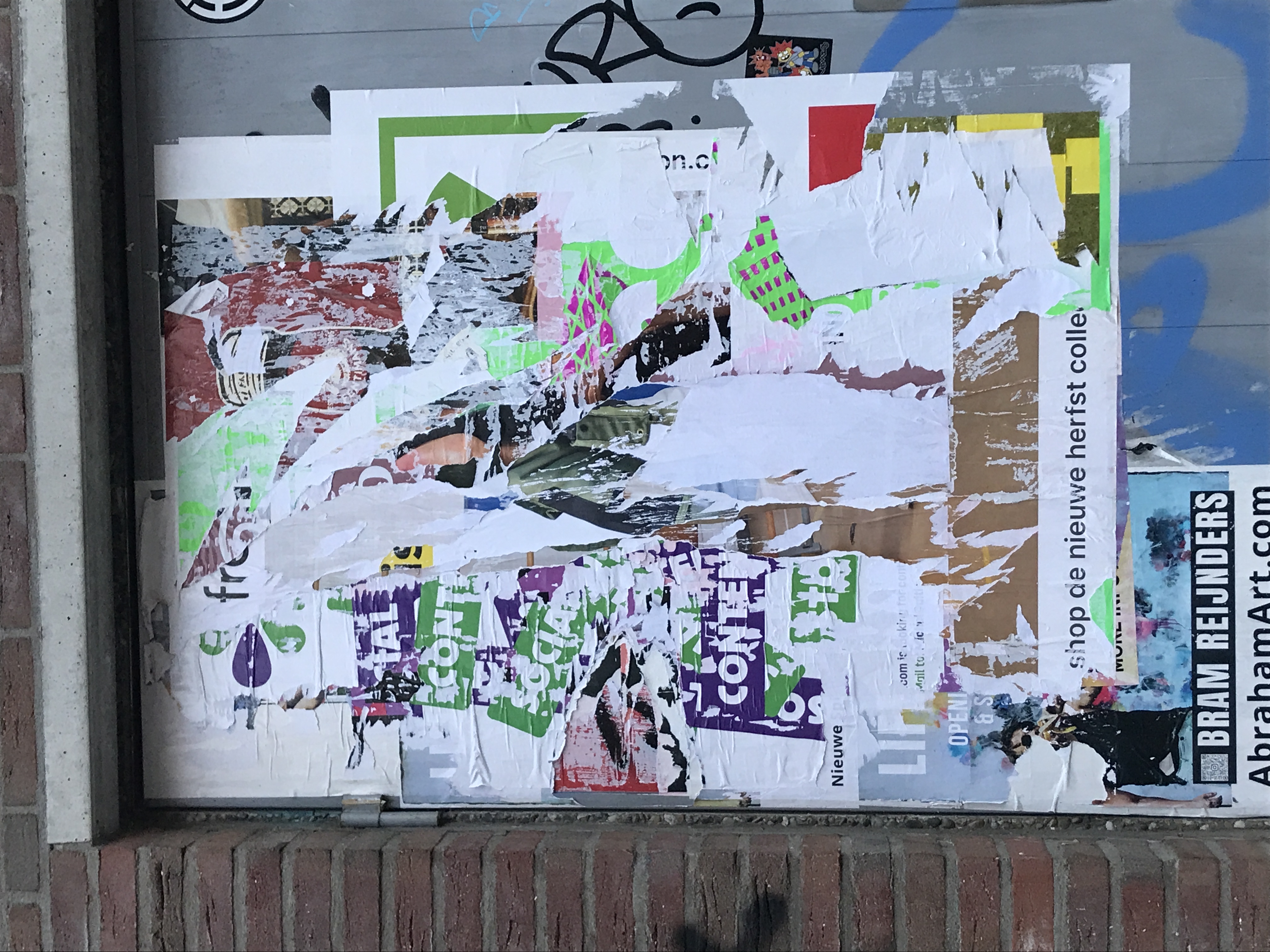
During this process I often thought back to Oroza: “Romanticizing aesthetics that are born from poverty and scarcity should be avoided - it should be seen as fixing one’s practical need with the tools one has”. I felt a bit obliged to make these sketches. With my expensive laptop and my design education, what was I trying to achieve? At first the sketching felt a bit aimless, to be honest. However, when I went back to my Instagram archive, I started to understand. The capturing of small details, quirky edges and smirky stains that I have been doing, are an attempt to understand my surroundings. They are a hunting towards the authentic parts of a place. The parts that give a place its identity.
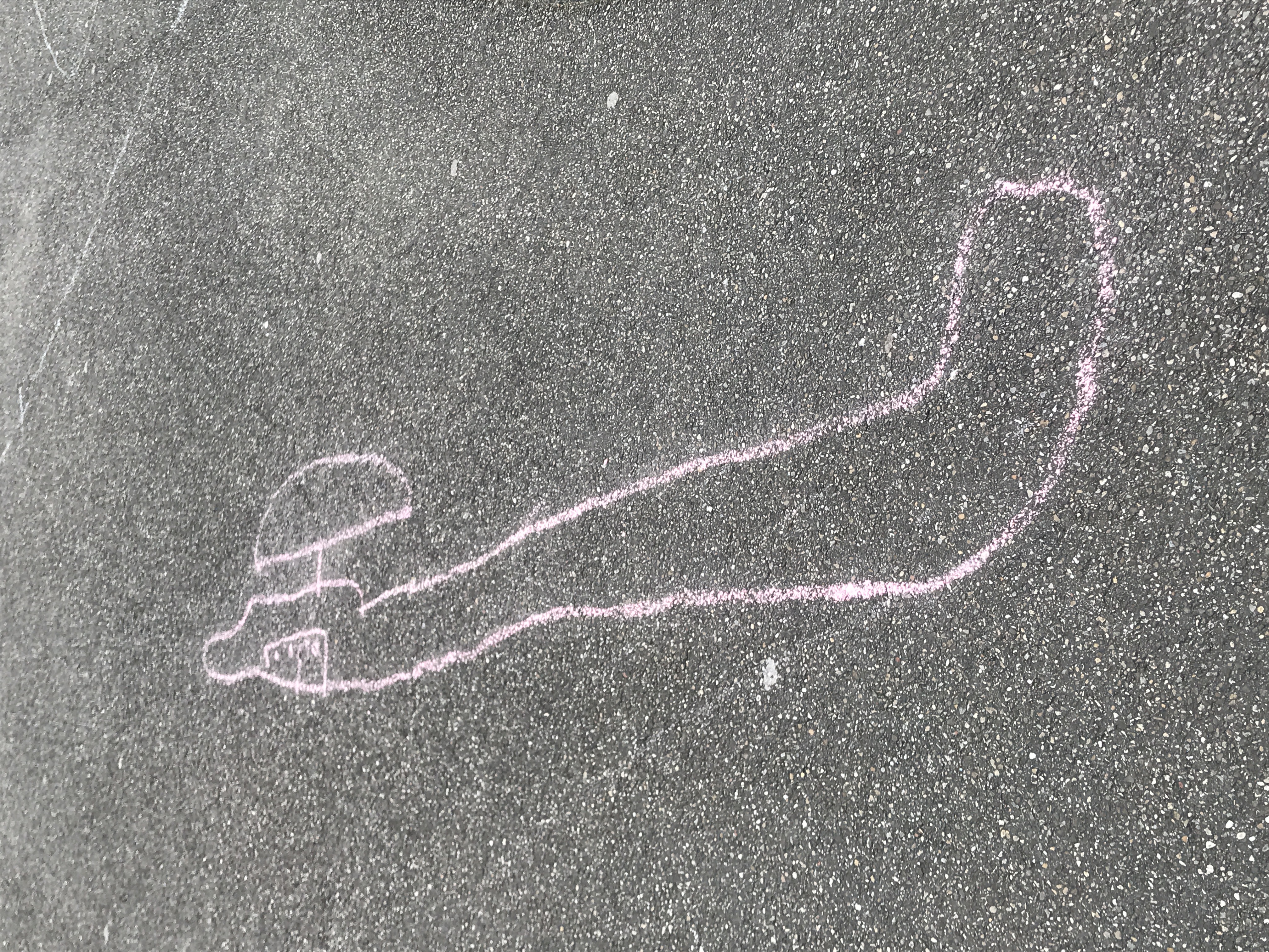
I saw that I especially do it in the places I feel are getting too ‘clean’, like my neighborhood that is getting gentrified or in case of my Instagram, social media platforms that are getting cleaned by algorithms. These subtle changes will unconsciously change your view of the world. What do we lose when an appie replaces the local supermarket? And in 20 years, will I still be able to see spray painted numbers on the pavement, and feel the tingle to design a poster?
Our surroundings are changing so rapidly, but to notice these things is important. It is the first step in lending a voice to your surrounding. These pictures are the evidence of my surrounding speaking to me, let them speak to you.
Dutch vernacular for Albert Heijn↩︎
Gentrification is is the process of renovating or upgrading of a neighborhood to make it attractive to wealthy new residents (usually ‘yuppen’). This process often leads to expulsion of the original inhabitants, often of lower classes, by increase of the property prices and rents. (Source: ‘Gentrification’. Wikipedia.) ↩︎
Dutch vernacular for “right?”↩︎
Conclusion
We’re arriving where we started. With both our interests in a designing as a response to the world around us. By looking, by living, and by making. In the end, vernacular, communication and social relations are inextricably connected. What kind of advertisements do you have in your Instagram feed, what kind of products do you have in your fridge, or even, what kind of texts did you receive today?
Vernacular is all about belonging to a place and to a specific group. Although we have to watch out not to romanticize the use of design that is born out of necessity, we have seen that the use of vernacular is a rich and valuable source within graphic design and communication. What would happen if we would design a vernacular for ourselves? What audience would we belong to? What are the things that are important for you, or me? And what could be the voice of that? As graphic designers, as communicators and creators of identity, we have a role to allow space for the identity of the local. Because for me it’s the little gestures that make me feel like I’m at home. I hope I have inspired you to look around, perhaps in your own neighborhood. And you might even design a poster, who knows! Let’s use our skill. Let’s do what we’re good at, and design something beyond spectacular, made vernacular.
Further reads
*if you are a Dutch speaking student I highly recommend reading the
MORF magazine, collections
of entertaining and accessible design essays.(https://premsela.
hetnieuweinstituut.nl/morf)
Introduction
Redaction IFFR. Meederjarenbeleidsplan IFFR 2021-2024. Rotterdam:
IFFR. 2021. Consulted on 10 December, 2022.
https://cms.iffr.com/sites/default/
files/2021-06/IFFR%20Meerjaren
beleidsplan%202021-2024_
Gemeente_final.pdf
Kalman, Tibor. ‘We’re here to be Bad’. Print Magazine. New York:
Print Magazine. 1990. Consulted on 25 February, 2022.
https://readings.design/PDF/Kalman%
20Tibor%20and%20Karrie%20Jacobs%
20—%20We%27re%20Here%20To%
20Be%20Bad.pdf
DisneyMusicVEVO. Hannah Montana - Best of Both Worlds. Video. Youtube. 2010. Consulted on 20 March, 2022. https://www.youtube.com/watch?v=uVjRe8QXFHY
Vernacular of the past
International Film Festival Rotterdam and Stadsarchief Rotterdam. 50 Posters from the Past. Consulted on 10 December 2021. https://iffr.com/en/IFFR-100/50-posters-past
Van der Kamp, Henk. Maliangkay, Evert Maliangkay [2007396].
kunsthandelhenkvanderkamp.com Consulted on 13 December 2021.
https://www.kunsthandelhenkvander
kamp.com/gallery/index.php?main_
page=product_reviews_info&products
_id=2094&reviews_id=3310
Pater, Ruben. Capslock. Amsterdam: Valiz. 2021.
Brophy, Philip. The Punk Explosion As Revolution. Philipbrophy.com.
Consulted on 13 December, 2021.
http://www.philipbrophy.com/projects
/essaysA/postpunkgraphicdesign/
essay.html
Redaction Artzuid. Gust Romijn. artzuid.nl. Consulted on 13 December, 2021. https://artzuid.nl/kunstenaars/gust-romijn/
Huygen, Frederike. Modernism: In Print. Eindhoven: Lecturis. 2017.
Wim Crouwel Modernist. Dir. Reitsma, Lex. Perf. Crouwel, Wim.
Hilversum: NPO. 2019.
https://www.2doc.nl/documentaires/
series/2doc/2019/oktober/wim-crouwel-modernist.html
Hollis, Richard. THE MODERNIST GRID. Readingdesign.org. Consulted on
20 January 2022. https://www.readingdesign.org/
modernist-grid
Furnée, Bettina & Horton, Ian. Hard Werken - One For All. Contributors: Russ Bestley, Max Bruinsma, Tony Credland, Frits Gierstberg, Noor Mertens. Amsterdam: Valiz. 2018.
Sturt, Graham. Dutch Design Heroes: Gerard Hadders. Medium.com. Consulted on 20 December 2021. https://medium.com/dutch-design-heroes/dutch-design-heroes-gerard-hadders-21b444ed1ab2
Debord, Guy. The Society of the Spectacle. London: Rebel Press. 1992.
Knabb, Ken. Situationist International Anthology (Revised and Expanded Edition). Berkeley: Bureau of Public Secrets. 2007.
Constant. Another City for Another Life. Internationale
Situationniste #3. 1959. Found on Bopsecrets.org. Consulted on 25
February 2022. http://www.bopsecrets.org/SI/3.
constant.html
Redaction Beeld en Geluid Wiki. Max Kisman. wikibeeldengeluid.nl.
Consulted on 20 December, 2021.
https://wiki.beeldengeluid.nl/index.
php/Max_Kisman
Kisman, Max. Word of Image. Contributions: Max Bruinsma, Frans Oosterhof, Jan Middendorp, Gert Staal. Amsterdam: Uitgeverij de Buitenkant. 2013.
Kisman, Max. Interview. Conducted by Charlotte van Alfen, 19 January 2022.
Redaction Ontwerpwerk. Over Ons. ontwerpwerk.nl. Consulted on 20 January 2022. https://www.ontwerpwerk.nl/over-ons
Oroza, Ernesto. Interviews & Writings. ernestooroza.com.
Consulted on 23 February 2022. Ernesto Oroza, interviews & writings
https://www.ernestooroza.com/
category/writings-interviews/
Csikós, Stephan. E-mail contact. Conducted by Charlotte van Alfen. 19 January, 2022
Vos, Pieter and Muis, Rens. Arab Spring & Aaron Winter. Rotterdam: Nai010 Uitgevers/Publishers. 2013.
Cramer, Florian. ‘WHAT IS POST-DIGITAL?’. Aarhus: APRJA Volume 3, Issue 1. 2014. http://lab404.com/142/cramer.pdf
Muis, Rens. Interview. Conducted by Charlotte van Alfen, 10 January, 2022.
Vernacular of the present
Debord, Guy. A user’s guide to detournement. Les Lèvres
Nues #8.1956. Found on Bopsecrets.org. Consulted on 20 December, 2021.
http://www.bopsecrets.org/SI/
detourn.html
Ekker, Jan Pieter and Subasi, Iffet. Naar de foto’s van Onno Blase moet je twee keer kijken; wat staat nou recht en wat scheef?. ad.nl. Consulted on 10 March 2022. https://www.ad.nl/rotterdam/naar-de-fotos-van-onno-blase-moet-je-twee-keer-kijken-wat-staat-nou-recht-en-wat-scheef~a46a4990/
75B. Contribution to mupi exhibition Breda. Flickr.com. 2008.
Consulted on 10 March 2022.https://www.flickr.com/photos/
gdfb/4339807523/in/photostream/
Veerman, Yuri. Van wie is de stad?. yuriveerman.nl. 2018. Consulted on 10 March 2022. https://yuriveerman.nl/Van-wie-is-de-stad
Veerman, Yuri. Thierry. yuriveerman.nl. 2021. Consulted on 10 March 2022. https://yuriveerman.nl/posters
Balaguer, Clara. Archive and publication. hardworkinggoodlooking.com.
2019. Consulted on 10 March 2022.
http://hardworkinggoodlooking.com/
about/
Smits, Helmut. Paddling Pool Fountain. helmutsmits.nl. 2004. Consulted on 12 March 2022. http://helmutsmits.nl/work/nascar
Smits, Helmut. Nascar. helmutsmits.nl. 2004. Consulted on 12 March 2022. http://helmutsmits.nl/work/paddling-pool-fountain
Blase, Onno. Scheve Palen / Slammed Posts. 2011-2020. Consulted on 12
March 2022. https://www.instagram.com/
schevepalen/
Vernacular of the future
‘Gentrification’. Wikipedia. Consulted on 13 March 2022.
https://en.wikipedia.org/wiki/
Gentrification
van Alfen, Charlotte. Char_spot. 2018-2022.
https://www.instagram
.com/char_spot/
Writing guidance by Dirk Vis and coding coaching by Thomas Buxo.
A special thanks to Max Kisman, Rens Muis and Stephan Csikós for enriching me with their knowledge
and to my brother, Faria, Jasmijn and Cami for their excellent (mental) support.