INTRODUCTION 
		My roots
		I’m originally from Iran, where we speak and write in Farsi or Persian which is considered 
		as a poetic language. Historically, Farsi has undergone great changes and can be categorized into 
		the following groups:
		
		1. Old Persian
		2. Middle Persian
		3. Classical Persian
		4. Modern Persian
		The Old and Middle Persian are not the topic of this discussion. But, I would like to have a 
		short review on Classical and Modern Persian.
		
		 Classical Persian: 
		The origin of this language is not very clear. Words have their roots in different languages spoken 
		in various parts of the country but the majority of the words have their roots in Old Persian, 
		Pahlavi and Avesta. They are represented in classical writings and poems. Ferdowsi claims to have 
		gone through great pains for a period of thirty years to preserve this language, which was under 
		pressure from the Arab invaders, and was on the verge of being lost. 
		 It is noteworthy that every country that the Arabs conquered lost its civilization, culture and language 
		and adopted the Arabic language and way of life. It was only Iran that broke the trend and stood against 
		the Arabs and preserved its culture and language and even adopted their own version of Islam by creating 
		Shiaism. 
		 Modern Persian: 
		Language or Farsi (Arabic pronunciation of Parsi) as spoken today consists of a lot of words of 
		non-Iranian origin. Some modern technical terms, understandably, have been incorporated from 
		English, French and German and are recognizable, but Arabic has corrupted a major part of the 
		language by replacing original Parsi words. What Ferdowsi worked so hard to preserve is finally 
		being lost.  
		
		It is assumed that for the Classical and Modern roots of Farsi, the language still is poetic 
		in spite of all historical, political and social changes in Iranian society. 
		Farsi is written from right to left and has different alphabet and sounds than English. Although, 
		historically Persian, English and many other European and Asian languages have a common vocabulary 
		core from a reconstructed ancestor language which linguists have called Proto-Indo European, 
		
[*]
		 
		The Proto-Indo-Europeans were the prehistoric people of Eurasia who spoke 
		Proto-Indo-European (PIE), the ancestor of the Indo-European languages according to linguistic 
		reconstruction. Knowledge of them comes chiefly from that reconstruction, along with material 
		evidence from archaeology and archaeogenetics.
		Source: Wikipedia 


		but in the context of this discussion there is not so much to compare. 
		It appears that in the last hundred years, after the Western Modernism in art and design was 
		accepted in Iran, Iranian graphic design had two different encounters with this issue. 
  First, it eagerly accepted the Western design the way it was, and then, after Post-modernism, it tried 
		hardly to adapt so called Western Design to Iranian visual language by looking for its roots in 
		the past.
  Considering two most important elements of graphic design, image and text, the main 
		source in terms of text was Iranian calligraphy as well as Iranian classic illustration for 
		image. 
  As Reza Abdini, Iranian contemporary graphic designer, emphasizes that Farsi script is 
		the most important element that Iranian designers should refer to.  At least, on the eyes of an 
		intellectual group of designers and artists, using the traditional rules of calligraphy unmixed 
		with Western medium was a wise approach to express and promote themselves in the international 
		design communities. 
		On the other hand, Iranian calligraphy was and perhaps still is one of the most complicated 
		writing systems in the world, regarding the fact of having seven main and totally different 
		scripts and complexity of each one. 
  For this reason together with technological deficiencies, Farsi type design has never had the 
		same process of evolution from calligraphy to movable metal type, or better to say from old to 
		new techniques, as it’s seen in western type design. 
  So, the first Farsi typefaces were adapted to Latin type press machines. But among those typefaces, 
		there were a few which had some hints of Iranian classic calligraphic features and ironically 
		they were the most used ones by designers. 
 
 	Although, these movable Farsi letters looked like their calligraphic ancestors in terms of 
		contrast, justification feature (“Kashida”, “extended”, “stretched”, “lengthened”), punctuation 
		marks, etc. Nevertheless, it was a drop in the ocean compared to the classics, the main feature 
		of Farsi calligraphy, the soul and whole appearance was lost, the bigger image was gone. 
		Reza Abedini claims that in the past 100-150 years, Iranian eyes have been getting lazy by letters, 
		declining from multiplex baseline sentences to one Western-like baseline, falling from an 
		aesthetically complex forms to one thread of boxes of letters and words and the same goes for each 
		letter and word, from having many multiple forms based on their positioning beside other letters 
		in the word and even the surrounding words to one definite, predetermined form for each letter.
 
		Typography, design and language has always been an interesting issue for me, but it has happened 
		so often to hear this comment by other designers and teachers that I make it too complicated and 
		difficult when it comes to typography and letters. The titles I make are not readable or at least 
		too complicated to read. I assume that there must be two main reasons for this issue:
		
		- My roots as an Iranian designer, used to deal with a complicated language and writing system 
		which doesn’t mean that Latin based languages are simple in terms of typography, but are different 
		than what I’m used to.  
		- My concurrence with Reza Abedini’s idea that the readability of the letters does not depend on 
		their forms, but several other factors are involved, such as the whole counter-shape of the 
		words apart from the form of the letters, the period we live in, our literacy rate and knowledge 
		about language (for instance poetry, literature, etc), psychology of letters and our vocabulary 
		of words. 
		I think that the aesthetics derived from the above reasons must be a good symptom of the fact that 
		I never was interested in 60's International Typographic movement and subsequently too enthusiastic 
		about using sans-serif typefaces. Perhaps, that kind of aesthetics  which will be explained more 
		and deeper in the next chapters  encouraged me to the designers like David Carson, at least in its 
		initial point, I found 90's Western graphic design language much closer to the soul of Iranian 
		calligraphy in terms of dealing with the form and meaning of text. 
		Furthermore, my constant passion for poetry was a provocative for me to refer to some certain 
		domains of design and art, such as Persian old calligraphy, Middle Ages art, 20th century text art 
		in the west and so on, looking for a poetic way of dealing with design, art and language. A 
		platform in which the relationship between text and image, form and meaning/concept becomes such 
		strong that none of those components has a meaning without others.  
 
 THOUGHT 1 
Technology, letters, habits
		In the introduction, I briefly mentioned two different encounters that Iranian designers had 
		with Western technological improvements in the last century. Basically, this happened in all 
		parts of the world in which Farsi/Arabic writing system was used and designers had to upgrade 
		their works with the most recent technological achievements. 
		We know that the type-setting machine originally was made for Latin-based writing systems that 
		use separate letters. We also know that the first Farsi/Arabic typefaces were made in European 
		countries such as Germany, France and Netherlands. However, apart from the origins of Farsi/Arabic 
		typefaces, I would like to concentrate on the twenties century when Middle-Eastern designers got 
		the chance to use typesetting machines and make the typefaces by their own, although there were 
		some difficulties.
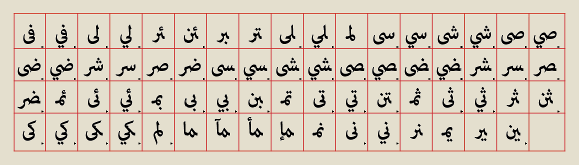
		Farsi/Arabic writing system had to adapt its features to the mechanism of Latin-based typesetting 
		machines. Therefore, the first encounter happened and that was to accept Western system with its 
		all advantages and disadvantages. Perhaps, the biggest advantage of this adaption was that 
		designers could move forward simultaneously with the technological developments and the visual 
		language derived from the achievements of the time which we can consider as a gain. 
		
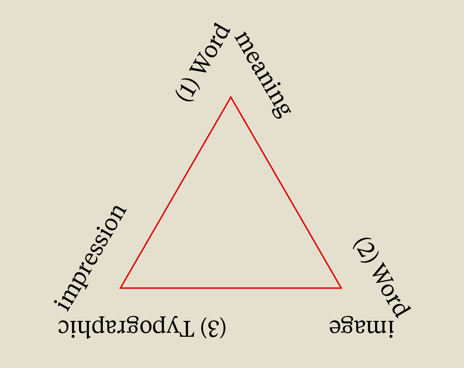
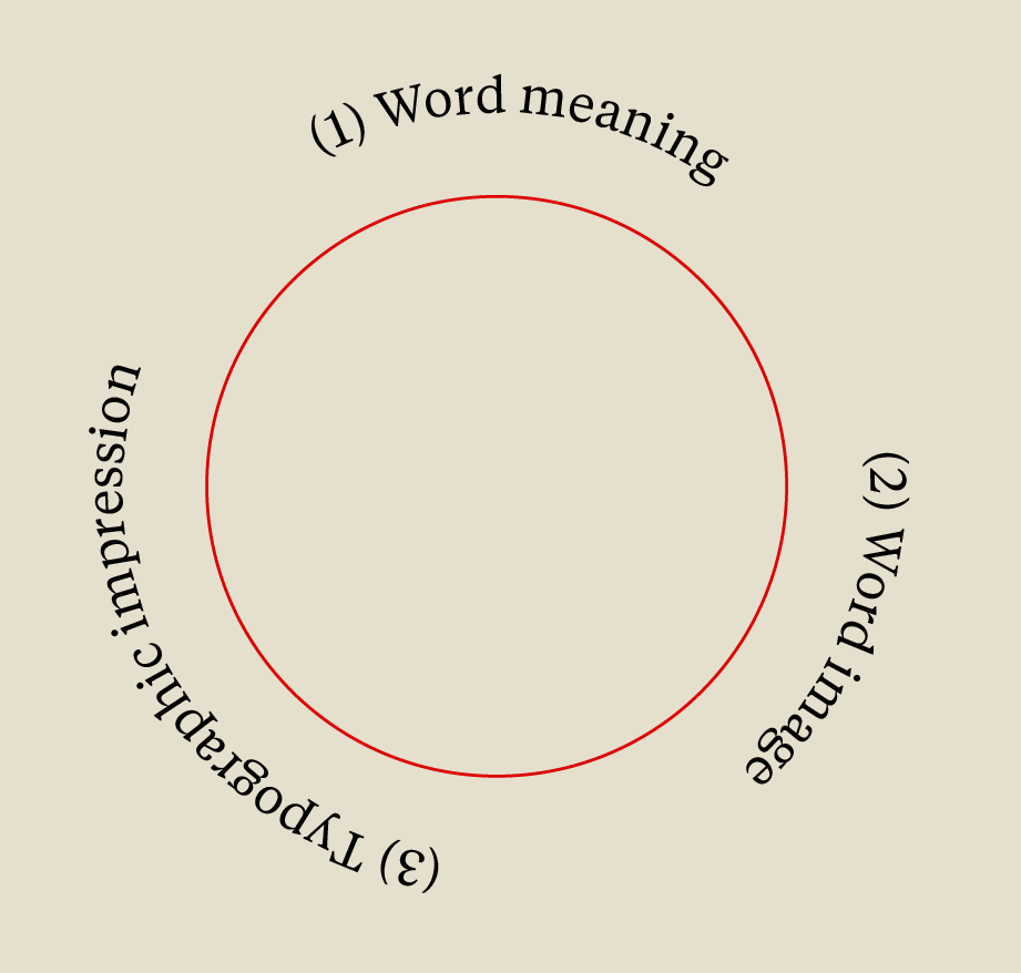
 But on the other hand, the losses of this gain were more significant.  In order to understand 
		these losses better, we need to have quick look at the most basic differences between Farsi/Arabic 
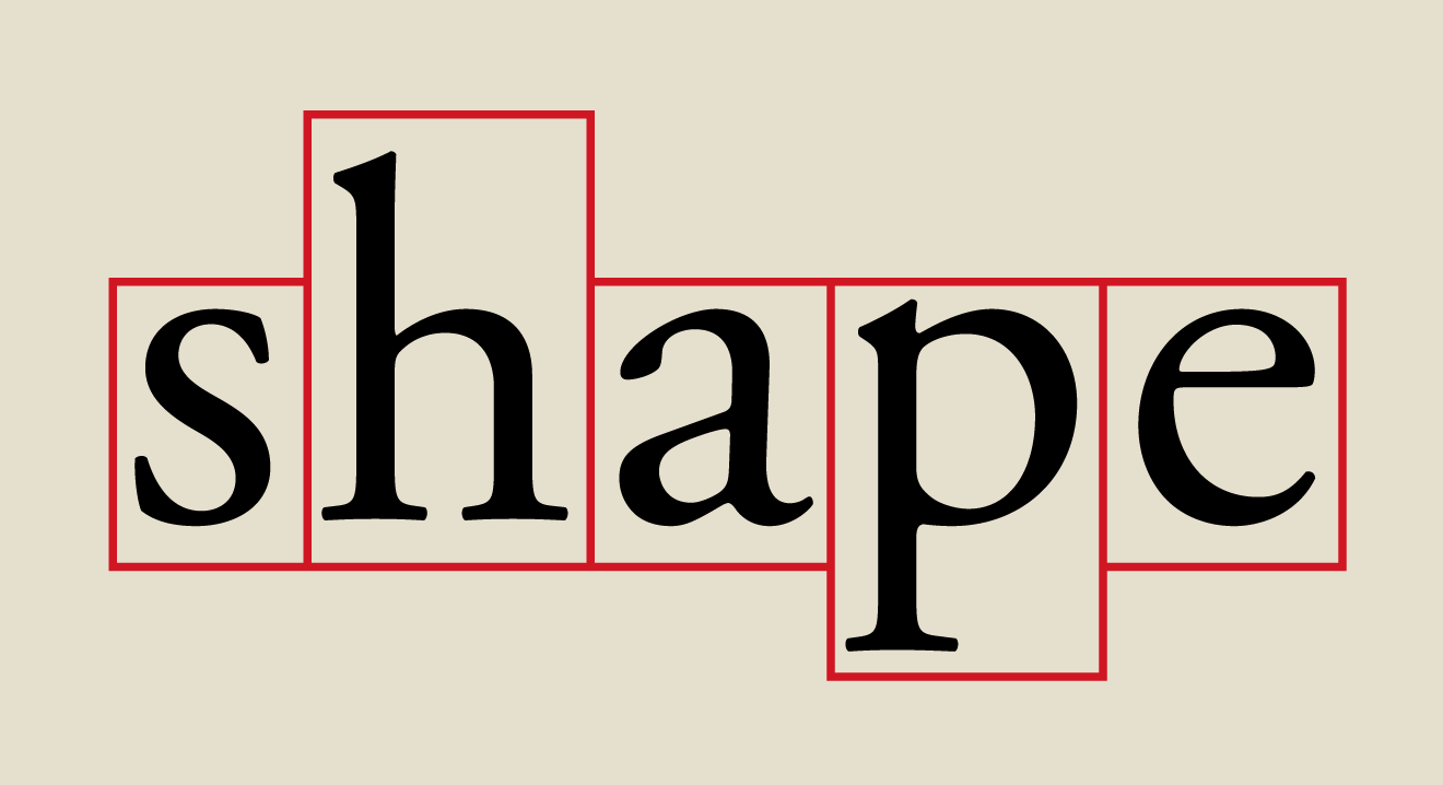
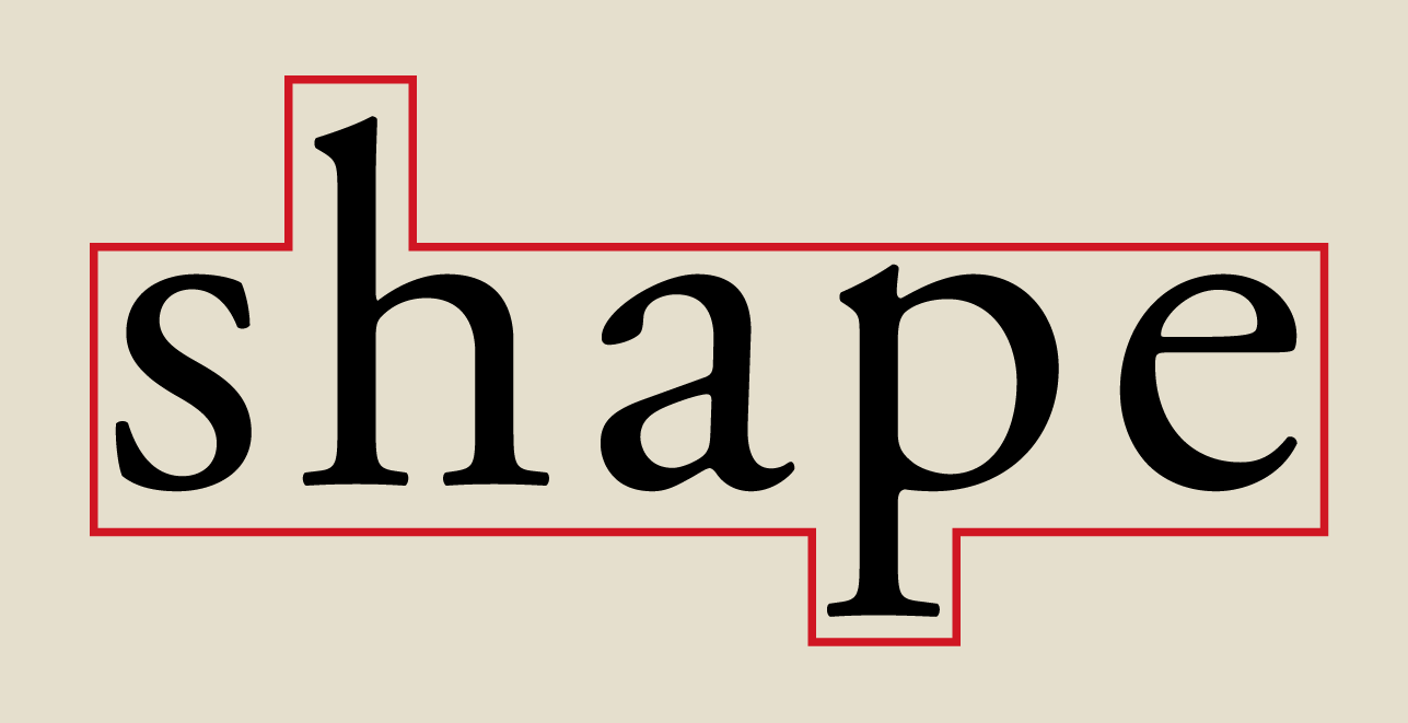
		and Latin writing systems. Two of these main differences are shown in the figure below: 
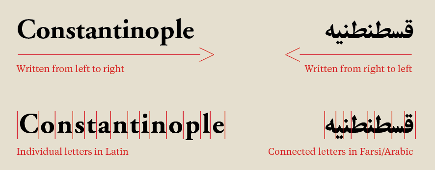
   [Figure.1] Unlike Latin writing systems, Farsi/Arabic is written from right to left. 
    Also, most characters in Farsi/Arabic connect to each other in order to make words.
   
 
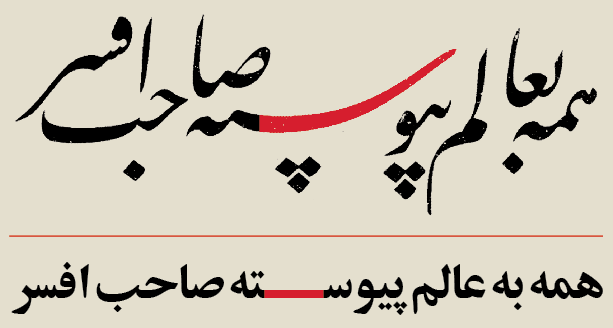
	Furthermore, to be able to find out and highlight the losses in a visual approach, we need to take 
		some examples of Farsi calligraphy, as a good representation of this writing system, compared to 
		current typefaces. [Figure.2] 
	
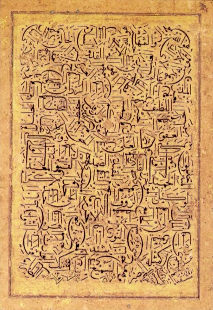
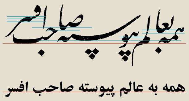
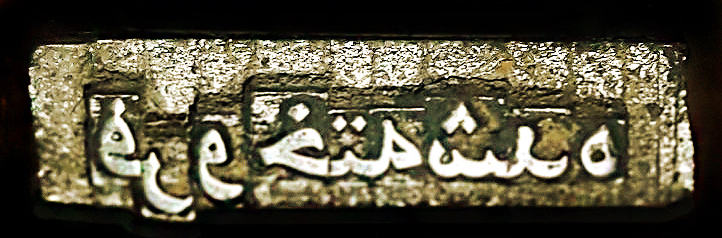
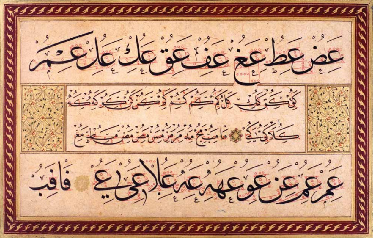
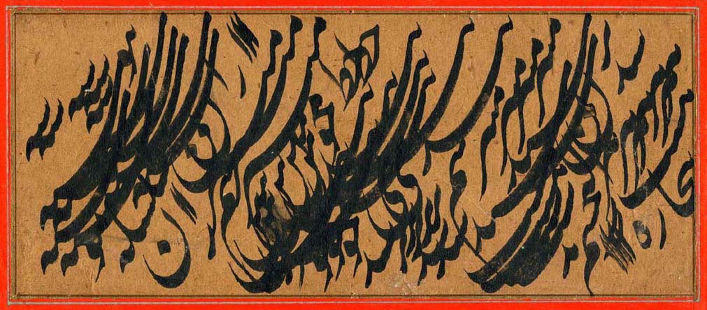
   [Figure.2] Up > Calligraphy, written in Nasta'liq script, by Mirza Gholamreza Esfahani 
    (1830–1886) 
 Low > ‘Zar-Bold’ typeface, by Hossein Abdollahzade Haghighi (1936–2003)


	For non-Persian eyes, it must be unbelievable to know that both figures show the same sentences. 
		Upper one is a calligraphic piece, of course made by hand and the lower one is one of the first 
		typefaces made by an Iranian designers. According to the opinion of many Iranian designers and 
		also its widespread usage among Farsi spoken users, this typeface is one of best typefaces ever 
		designed. 
  Nevertheless, compared to the upper one, there are several considerable problems. 
		First and probably the biggest one, is the reduction of base line from multiple to one. Considering 
		multiple base-lines as a value for this script, we can simply call it “riches-to-rags” which caused 
		by the appearance of type-setting machines in such countries. 
		Followed by, it caused two inappropriate and ungraceful aesthetic issues. Classically, the calligraphers 
		were used to determine the position of letters and words while writing the sentences and according to 
		three principles: 
 
  Letters and words before and after (surrounding letters and words), Meaning of the words 
		and the most significant, the efficacy of a specific letter form in emphasizing the meaning. These 
		all meant that not only one shape for each letter-form, but there were several and even innovative 
		shapes for each letter-form. 
	
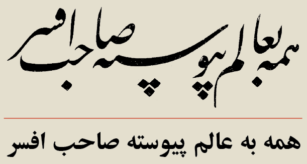
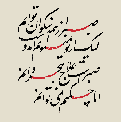
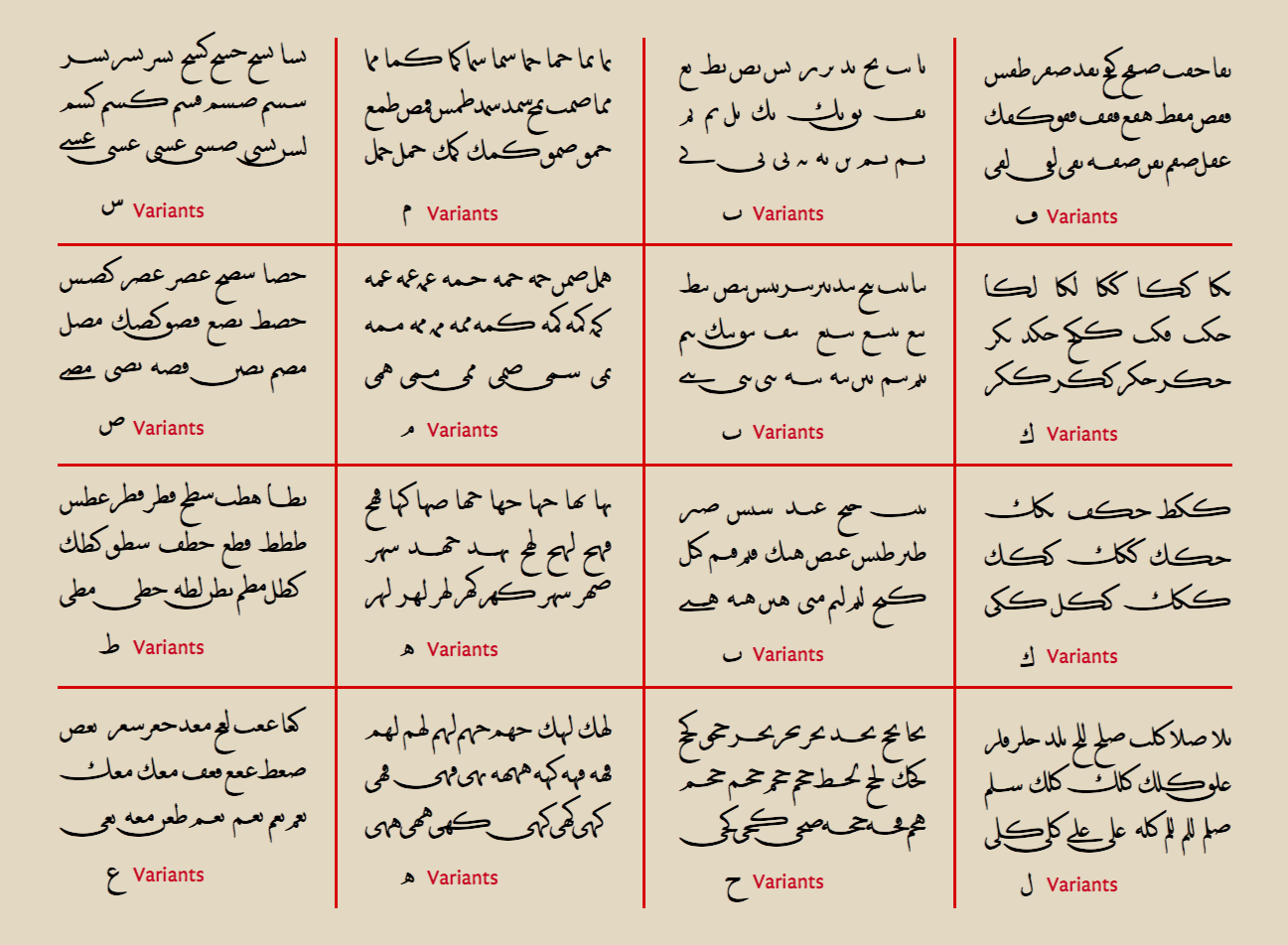
		However, these all disappeared as soon as the punch-cutters started preparing Farsi letters for typesetting 
		machine. They had to choose only one shape for each letter-form and position them in a way that they could 
		connect to each other and since there was only one base-line made for Latin letters, so the multiplicity of 
		base-line was gone. In the figure below, the red lines show the main base-lines and the blue lines show the 
		extra base-lines. [Figure.3] 
		
   [Figure.3] Up > Calligraphy, written in Nasta'liq script, by Mirza Gholamreza Esfahani 
    (1830–1886) 
 Low > ‘Zar-Bold’ typeface, by Hossein Abdollahzade Haghighi (1936–2003)


	Furthermore, they had to position each letter-form in one letter punch which meant the letters intersection 
		had no place anymore. Apart from aesthetic considerations, letters intersection was an important solution 
		for calligraphers to avoid  inappropriate letter and word spacing, but it couldn't happen anymore with the 
		mechanism of the new machines. This also meant that the dots and diacritics of letters also had to be frozen 
		inside the punch together with their related letters. Beside the fact that sometimes the calligrapher could 
		leave out dots of some letters, according to the aesthetics, but with the new system dots were part of 
		letters, rather than separate characters. In the figure below, you can see the differences. Blue and green 
		strokes respectively show the letter and word spacing and rectangles show the position of dots.[Figure.4] 
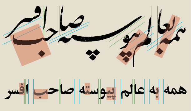
   [Figure.4] Up > Calligraphy, written in Nasta'liq script, by Mirza Gholamreza Esfahani 
    (1830–1886) 
 Low > ‘Zar-Bold’ typeface, by Hossein Abdollahzade Haghighi (1936–2003)


	Perhaps, the most distinguishable sign of the influence of typesetting mechanism on Farsi writing system 
		can be found in a feature called “Kashida”. 
[*]
		 
		Kashida ("extended", "stretched", "lengthened") is a type of justification used in some cursive scripts related 
		to Arabic. In contrast to white-space justification, which increases the length of a line of text by expanding 
		spaces between words or individual letters, Kashida justification is accomplished by elongating characters at 
		certain chosen points. Kashida justification can be combined with white-space justification to various extents.
		The analog in European (Latin-based) typography (expanding or contracting letters to improve spacing) is sometimes 
		called expansion, and falls within micro-typography. Kashida is considerably easier and more flexible, however, 
		because Arabic-Persian scripts feature prominent horizontal strokes, whose lengths are accordingly flexible.
		Source: Wikipedia 


		In classical calligraphy, this feature was used for three purposes: first to elongate the characters in 
		order to justify the sentences, secondly to create intended compositions by stretching some characters on 
		top of the other letters without making inappropriate white spaces and thirdly to emphasize some letters 
		or words according to their meaning and importance in the sentence. New typesetting system could afford 
		only the first purpose and those two other roles, if not completely disappeared, at least couldn't play 
		the same role in the new texts as before. 
		
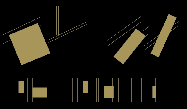
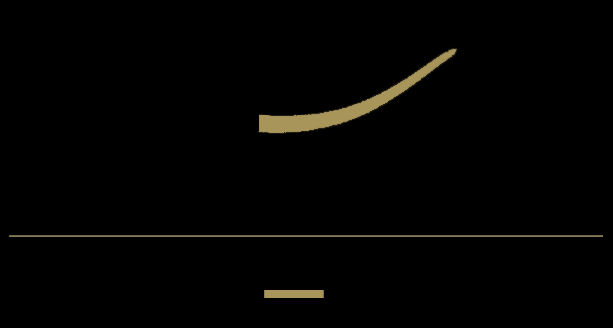
		As it's said before, calligraphers used ‘Kashida’ to stretch the characters according to the letters that were 
		using this feature and the letters that were supposed to connect to it. It meant that like the other characters 
		with several forms, ‘Kashida’ didn't have an absolute shape, but it could create very different curves based on 
		its connection to letters before and after. With the metal type machines, the solution that type setters and 
		designers found to apply ‘Kashida’ to the machines was to make extra lead for this feature. But since the 
		position of all letters in the leads were fixed, this feature had to have an absolute form as well, therefore 
		it lost all different natural curves and became a simple horizontal stroke, sort of a rectangle. Figures below, 
		show the changes of ‘Kashida’ from manuscripts to metal typesetting and digital texts. [Figure.5] 
   [Figure.5] Up > Calligraphy, written in Nasta'liq script, by Mirza Gholamreza Esfahani 
    (1830–1886) 
 Low > ‘Zar-Bold’ typeface, by Hossein Abdollahzade Haghighi (1936–2003)


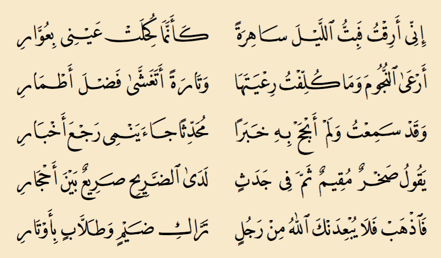
	As it's shown in the figures above, in the calligraphic piece there are much more connection between letters 
		in the composition of the sentence, achieved by characters going on top and underneath each other and ‘kashida’ 
		helps this more by filling the empty white spaces. This is while the second one creates only a horizontal 
		thread of letters which can damage the reading rhythm. This becomes more clear if we look at the larger 
		calligraphic text in compare with the same text made by typesetting or digital typeface. [Figure.6-7] 
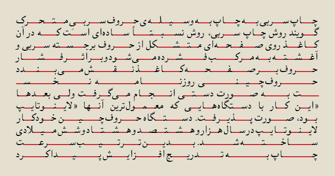
   [Figure.6] Calligraphy, written in Nasta'liq script, by Abdolghaffar Tabrizi, 1854


   [Figure.7] Text, set in ‘Naskh-Bold’ typeface


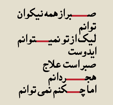
	And it becomes almost unreadable when a Farsi paragraph is fully justified using ‘Kashida’, as you 
		can see in the figure below. ‘Kashida’ is shown by red strokes. [Figure.8] 
   [Figure.8] Text, fully justified, set in ‘Naskh-Regular’ typeface
   
 
	Along with technological developments in the recent decades, designers and font developers tried 
		to achieve better results of non-linear Farsi texts, considering elongation and vertical arrangement 
		of letters. In order to make the texts resemble to calligraphic ancestors as much as possible, 
		they took two steps: First step was to make more ligatures and alternatives to create vertical 
		arrangement of letters and break potentially horizontal structure of Farsi sentences, as you can 
		see below. [Figure.9] 
   [Figure.9] Standard ligatures by ‘Adobe Arabic-Bold’ typeface, by Tim Holloway (2004-2005)
   
 
	The problem with this solution was that the horizontal appearance of the whole text still was there. 
		But the bigger problem was/is that the whole idea of making ligatures for Farsi/Arabic typefaces was/is 
		not a good solution. In Latin, ligatures are limited to a few combination of letters such as  ‘ff’, 
		‘fi’, ‘fl’, ‘ffi’ and ‘ffl’. [Figure. 10] 
 
  In the days of metal fonts, ligatures were invented to solve a practical typesetting problem which was 
		the physical collision of some features of certain characters. Later on, technological problem solved 
		this problem and therefore presence of ligatures in the texts could only have stylistic reasons. 
   [Figure.10] leads showing Ligatures by ‘Garamond’ typeface
   
 
	In Farsi calligraphy, because of the connection between letters, each pair of two letters basically 
		could be considered as a ligature. Therefore, ligatures didn't actually exist or the whole text was 
		made by ligatures and unlike Latin, the appearance of ligatures in Farsi metal type had only 
		aesthetic reasons, but this was assumed as a functional solution to resemble stylistic features of 
		calligraphy. [Figure. 11] 
		
   [Figure.11] Farsi punch-cuts by ‘Ferdousi-Bold’ typeface, 1960s
   
 
	Overall, having too many ligatures (as vertical arrangements of letters) in typefaces not only help 
		the reader to have a fluent reading experience with Farsi text, but caused a lot of fixation and 
		barrier points for Iranian readers. 
		
		Second step that designers together with developers took was to focus on the significant role of 
		‘Kashida’ in creating non-linear threads of letters. Historically, this feature just on its own had 
		a potential capacity to break the linear letter arrangements and add natural and smooth curves to 
		the text. Compared to the first step, this was a better solution for Farsi letters, both aesthetically 
		and functionally. Nevertheless, considering the visual aspects of Iranian calligraphy, combination of 
		both steps would resem that old ancestor the most. A very good example of this kind of approach 
		was ‘Tasmeem’ by Thomas Milo. 
[*]
		 
		Tasmeem is a set of Arabic enhancements for Adobe InDesign ME, developed by WinSoft International 
		and DecoType. Tasmeem allows users to create typographically advanced text in Arabic in the 
		Middle Eastern and North African versions of InDesign, turning it into a typesetting and design 
		tool for Arabic. 
		Source: Wikipedia 
		 To make Arabic as pleasantly legible and beautiful as any script, calligraphers and typographers 
		designed a large number of ingenious improvements and perfections. Tasmeem captures this expertise 
		in the form of simple tools.Tasmeem returns to the sources of the Arabic script traditions, to liberate 
		the new generation of high-tech savvy designers and offer them a real Arabic-friendly environment. 
		Source: [PDF] Tasmeem™ Manual - DecoType


		The essence of Arabic script is to be found not in calligraphy, but in script grammar. Calligraphy 
		refers to the quality of script, script grammar to the structure of script. For Arabic, the key to 
		the successful transition from text manufacture by scribes to mechanized text reproduction by means 
		of movable type was the marriage of integral script expertise with typographic know-how. This involved 
		the collaboration between different personalities and social groups. 
		
		Compared to the previous efforts and products in Farsi/Arabic type design, ‘Tasmeem’ had two big 
		advantages: First, more than being only a package of typefaces, it was a technology, a set of 
		plug-ins for Arabic script that could turn InDesign in a veritable Arabic typesetting system and 
		provide technical and stylistic possibilities for designers to implement most of the calligraphic 
		features, such as natural ‘Kashida’ and vertical letter arrangements, to their typography. 
		[Figure. 12] 
		
	[Figure.12] Arabic script is the result of a millenium and a half of intense and competent design development. 
	Like for Latin script, computer technology should facilitate such a heritage. The first line presents DecoType 
	philosophy in a nutshell. In black, the result. 
	In colors, the letters. In outlines, the structure. The typeface is DecoType's Nastaliq, the language is 
	Persian. The second line, for comparison, shows the same text in OpenType. The typeface is Adobe Arabic.’
   
 
	Although, ‘Tasmeem’ was appreciated in western type design and technology world, it couldn't catch the 
		eyes of designers from the eastern side for three main reasons: First of all, the package was too 
		expensive for the users in Middle-East. Furthermore, it only was only limited to Adobe InDesign ME and 
		was not supported by other common design software companies like Photoshop, Illustrator, etc. And finally 
		and the most important reason was that since the technology of ‘Tasmeem’ was not usable within 
		font-editors such as ‘Glyphs’, ‘Fontlab Studio’, ‘Robofont’, etc. So the type designers couldn't use it 
		in order to create their own typefaces, so it stayed as a package of typefaces with some specific 
		possibilities resembling calligraphic scripts. The figures below, show some possibilities of ‘Tasmeem’:
		[Figure. 13-14] 
		
	[Figure.13] Tasmeem, ‘Naskh’ tyepface, characters variants 
	Variants of letter alternatives are different than ligatures. They offer different forms for each letter, 
	depending on the position of  that letter in the word and the letters before and after.
   
 	
	[Figure.14] Tasmeem, Sample text using ‘Naskh’ tyepface 
	This text shows two advantages of Tasmeem typefaces from the others: 
	First, curved (natural) ‘Kashida’ is applied to some characters that creates smoother connections. 
	And secondly, instead of using ligatures, the text is made by characters variants and in some cases, 
	these alternatives create vertical arrangements of letters which helps to break the linear text and 
	provide dynamic eye movements for the reader.   


	Overall, despite that technological enhancements were applied to Farsi/Arabic scripts, but there 
		were still two things lost: First that logical and somehow improvised connection between form and 
		meaning, that sort of relationship which was the basis for calligraphers works. Secondly, the 
		question that how this relationship was applicable to the new, modern typefaces and how meaning 
		could be used as a design tool. Packages like ‘Tasmeem’ looked necessary and significant to be made, but eventually they stayed 
		as plug-ins to resemble the old scripts rather than adding extra layer of meaning to the modern 
		typefaces. There were gains of this adaptation of Farsi/Arabic letters to western typesetting 
		system, but the losses weighted much more. 
		
		
		The 'four forms' analysis of Arabic script is mistaken, and really represents a particular 
		mechanical solution to typesetting a simplified model of Arabic. In fact, there are two kinds 
		of letters: those that can connect on both sides, and those that only connect on the right. 
		The actual ways in which the letters connect, and hence how many forms they require, depend on 
		the style of the script and what they're connecting to. There is no historical style in which 
		there were only four forms of any given dual-joining letter. 
		 
		
		John Hudson
		 
		John Hudson is a type maker, a term he prefers to type designer, since he spends more time building 
		things than designing. He is co-founder, with Ross Mills, of Tiro Typeworks, a digital foundry 
		specializing in custom font development for multilingual computing and publishing. 


		In the same way, Iranian/Arabic contemporary artists and designers were/are divided to two groups. 
		One follows this idea of adaption, while the other tries to create more suitable and costume system 
		or structure, specifically made for Farsi/Arabic writing system. One still makes typefaces that 
		follows ‘four forms’ idea of simplified Arabic and the other improves the thought behind ‘Tasmeem’. 
		
		
		Persian script is the most important element that Iranian designers should permanently refer to.


		Among these two groups, Reza Abedini is probably the most outstanding designer from the second group.  
		In the following, I will investigate his works as typical examples of this second thought. 
		
		
		There were always two challenges while making my works. First, how to deal with Farsi typefaces 
		and secondly, how to combine them with Latin typefaces. Fundamentally, this challenge still exists 
		for all Iranian designers.


		For many years, there was a common thought among Iranian designers that Farsi script intrinsically 
		is problematic and typesetting in Farsi wouldn't be as appealing as in Latin. Reza who was probably 
		influenced by Ahmed Fardid's philosophical thinking, didn't surrender by this simplistic point of view.
	
		Fardid was and still is generally regarded as a brilliant yet unsystematic thinker who introduced 
		Iranian intellectuals to German philosophy. Since the 1950's he served as Iran's leading authority 
		on the philosophy of Martin Heidegger. Influenced by Heidegger and the German historicist tradition, 
		Fardid gave the Orient/Occident dichotomy a philosophical twist.
	
		Fardid advocates a type of Geisteswissenschaften, or a moral philosophy not bereft of a theosophical 
		introspection. He argues that humans have three dimensions: scientific, philosophical and ethical. 
		Although the first two have been prominent in the Western tradition of thought, the last has been 
		conspicuously absent. 
  As such, Fardid reaches the conclusion that the West has to be abandoned both as an ontology and as 
 		a way of life. He believes that “Gharbzadegi” or “Westernization” is, thus,a transitional phase that 
 		one has to leave behind to reach to the essence of the West. 
  To undertake this intellectual odyssey, however, one has to become Westernized, not in the sense of 
 		becoming alienated from one's own self, but in the more subtle sense of becoming cognizant about the 
 		adversary. To confront the West, Fardid asserts, one needs to get to the very core of its philosophy 
 		and ontology. 
  Getting to know the other became, in Fardid's analysis, a prerequisite for knowing the self. For him, 
 		the main issue was the revival of the authentic Persian traditions and this could not occur without 
 		criticizing the principles of Western culture and technology, namely empiricism, rationalism and humanism. 
	
		Fardid's concept of the West was warmly received by an important segment of the community of Iranian 
		intellectuals eager to reassert their own identity during a time of change both in the East and in 
		the West. 
	
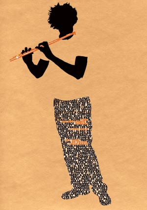
		Instead of conceding the problem to the essence of the Persian script, Reza decided to concentrate on 
		the modern technology which was the foundation of graphic design and that was where he found the 
		problem and the solution. One of the solutions was to make both Farsi and Latin letters by hand in 
		order to incorporate them. [Figure.15] 
		
	[Figure.15] Reza Abedini's handmade letters in Farsi and Latin


 	In his view, the problem was the idea of using ‘four forms’ and ‘separate letters’ typesetting in 
		Farsi script. Historically, the beauty and elegance of Farsi script was the vertical arrangement of 
		letters. In his eyes, the invention of metal typesetting was in compliance with the soul and character 
		of Latin script. But, the form and position of Farsi/Arabic letters in the words was not absolute. 
		Therefore, Iranian/Arabic designers started to think of separate Farsi characters since their first 
		encounter with the mechanism of metal type. For him, the Beauty of Farsi script was sacrificed for 
		the technique. Aesthetics was a big loss, and in return of a minor and defective gain of technique. 
		
		
		Since we've seen and read the newspapers and documents, set in simplified Farsi metal type for many 
		years and calligraphy as our historical source of readability has been replaced by simplified Farsi as 
		a new source, naturally and unconsciously our habit of readability has therefore been simplified as well.  
		Our eyes has become lazy.


		The other important and problematic issue for Reza was the readability. He disassembled and distorted 
		the letters in order to bring back the improvised approach of calligraphy to Farsi typefaces. But this 
		wasn't only limited to the letters, he wanted to acquire a sort of Iranian dialectics and soul in his 
		design, rather than literally using Iranian illustrative elements.
		
		
		Square is not Swiss by itself, but the way of using this element makes it Swiss in Swiss design or 
		Japanese circle in Japanese design. We can easily have Iranian circle.


		To him, using motifs of Iranian ancient potteries, carpets such as the Phoenix, Boteh, etc or even was 
		as worse as to Latinize Farsi typefaces. Also, using of Iranian scripts like ‘Nastaliq’ was not the case. 
		In this case, one of the good examples for him was Polish design that was and still is very recognizable 
		for all the designers, without using any element or symbol of Polish traditional art.
		
		
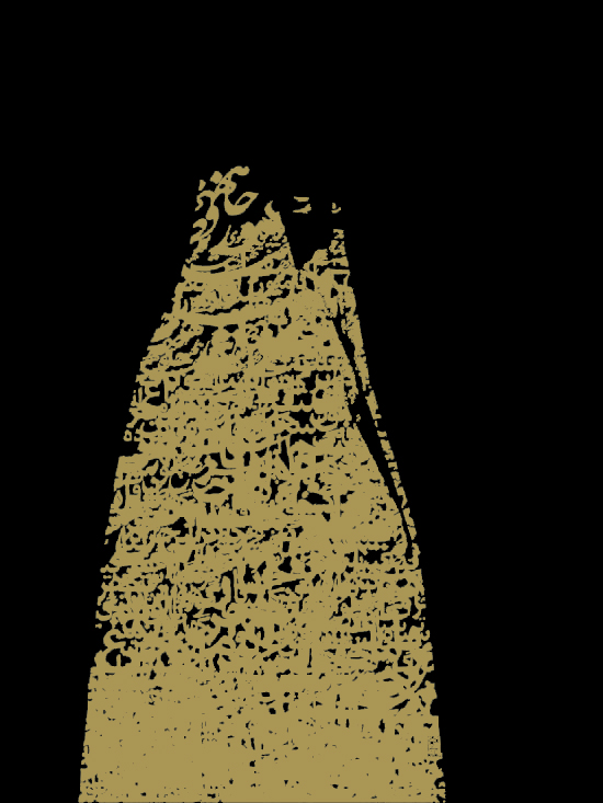
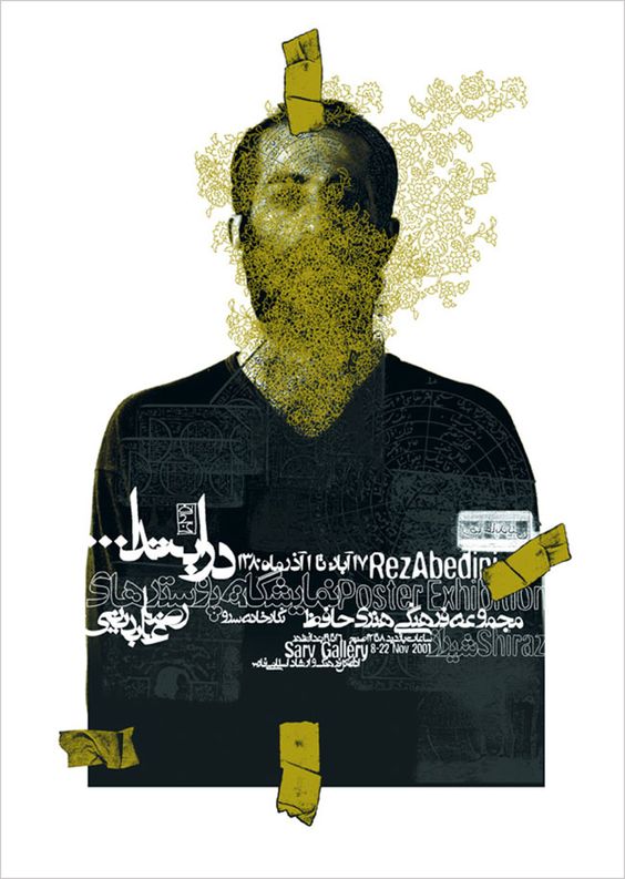
		Reza Abedini's works are utterly modern and contemporary, there is no Boteh, nor is there ‘Nastaliq’. 
		They don't try to resemble The Iranian traditional art, but instead, they utilize the traditions to 
		present that dialectics in a contemporary way. Unlike the designers who use the folklore and native 
		elements –in this case, Iranian designers using ‘Nastaliq’–  to separate their works from the prevalent 
		international design and at the same time highlight them among the others, he takes a different direction 
		in dealing with these elements. By distorting and devaluing classical elements specially ‘Nastaliq’, 
		he ruins the common image of eastern and western eyes about their historical value and consequently 
		re-contextualizes them within his works. Somehow, using ‘Nastaliq’ becomes a statement of his reaction 
		to that common image. [Figure.16]  
		
	[Figure.16] One of Reza Abedini's first works, dealing with combining ‘Nastaliq’ with a Western-like image  


	At this point, his critical encounter with graphic design in Eastern world takes the orientation as same 
		as David Carson's in West. The works of both designers derive from their formalistic point of view of 
		graphic design and their reaction on design conventions. Carson rejects 1960s based grid formats, 
		information hierarchy and consistent layouts and introduces the innovative typographies and distinct 
		layouts. On the other side of the world, Reza Abedini rejects the whole idea of Western-like design in 
		Iran and Latinized typography and layout and takes Iranian classical calligraphy as a study source for 
		his experimental, modern and unconventional designs. [Figure.17-18]
		
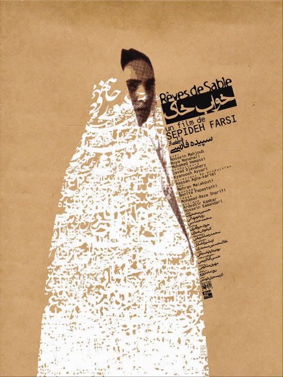
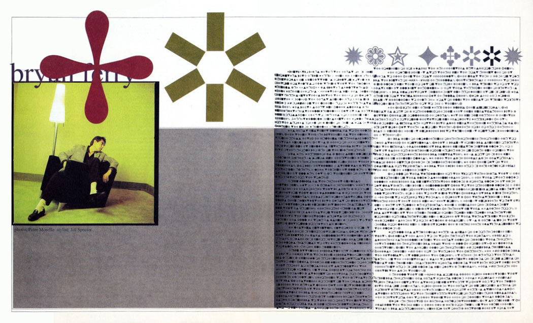
	[Figure.17] The story of dwarfs and longs, book cover, designed by Reza Abedini, 2000
   
 	
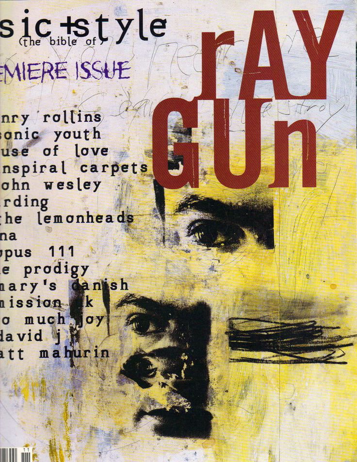
	[Figure.18] Raygun, Issue 01, magazine cover, designed by David Carson, 1992  


	In terms of letters and typography, there are three common procedures in both designers works: 
  First, form of characters. Keeping the bigger image in mind, They both consider a specific form for each 
 		character. For instance, if there are four ‘A’s in a word, each ‘A’ has its own shape, depending on the 
 		characters and words before and after. 
  Secondly, the positioning of characters and words. It means that each character is positioned individually 
 		and different than the same character in the part of one word and the words before and after, depend on 
 		typographic factors such as ascenders and descenders, vertical, horizontal or diagonal strokes, angular or 
 		curved shape of letters and so on and this goes the same for the words. 
  And finally, baseline of the characters and specially the words. Depending the counter-shape of the words, 
 		they go up or come down from the main baseline. Of course these properties are not taken into account 
 		all the time.
		
		It become more interesting, if we think of Iranian calligraphy in which all these three issues are significant. 
		Here, it might be taken as my personal and subjective point of view, but it makes sense to compare their works 
		to Iranian calligraphy and imagine a common source for both designers. In case of Carson, it must be unexpected 
		to imagine him, thinking of or looking at Iranian calligraphy, but here the source that a designer uses is one 
		thing and the interpretation of audience is a completely different issue. Therefore, to clarify this subjective 
		interpretation more, I would like to take two examples from each designer and visualize the common points, in 
		comparison to two calligraphic pieces. [Figure.19-20-21-22-23-24-25-26]
		
		
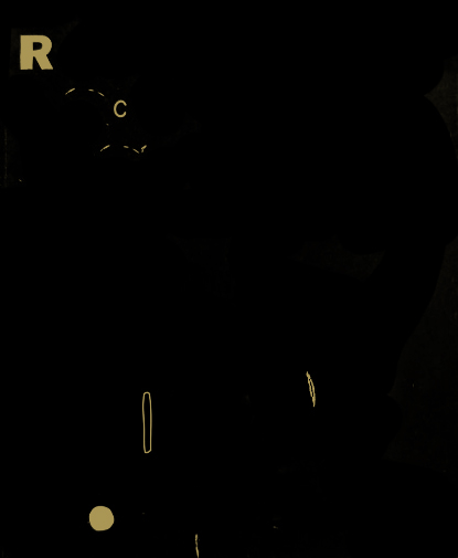
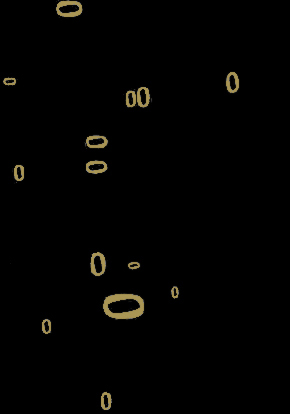
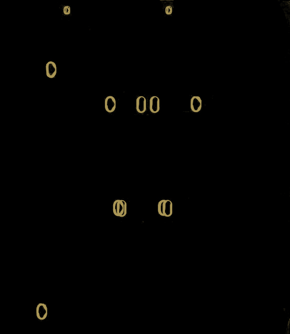
	[Figure.19] Letter ‘Eyn’ variants, Thuluth script, Ottoman calligraphy, by Mehmed Şevkî Efendi (1829-1887)


	[Figure.20] Calligraphy, written in Nasta'liq script, Siahmashgh style, by Mirza Gholamreza Esfahani (1830–1886)  


	[Figure.21] In the beginning, Reza Abedini Poster exhibition, poster, designed by Reza Abedini, 2001   


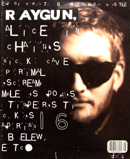
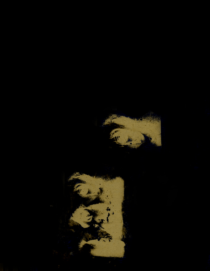
	[Figure.22] Raygun, Issue 05, magazine cover, designed by David Carson, 1994   


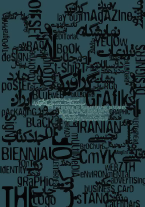
	[Figure.23] 7th Iranian graphic design biennale, poster, designed by Reza Abedini, 2003   


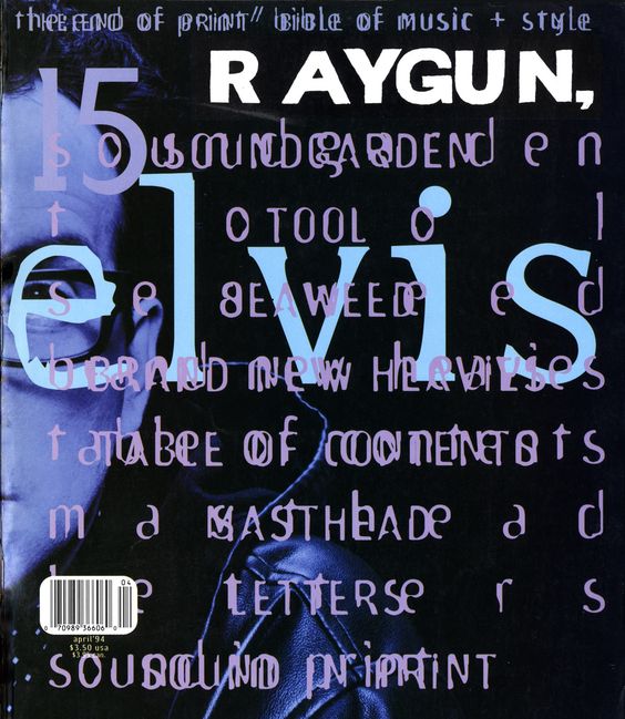
	[Figure.24] Raygun, Issue 15, magazine cover, designed by David Carson, 1994  


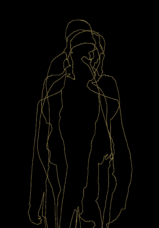
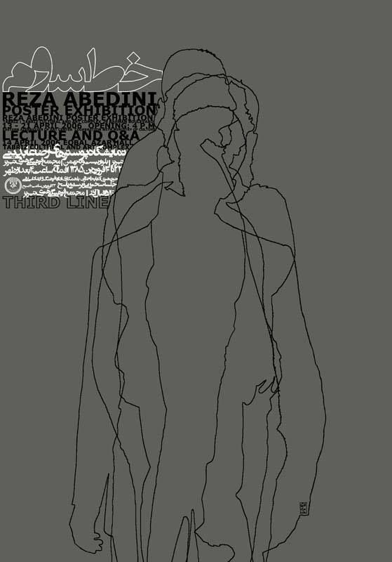
	[Figure.25] Third line, Reza Abedini Poster exhibition, poster, designed by Reza Abedini, 2006  


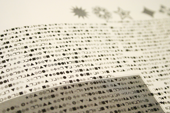
	[Figure.26] Raygun, magazine layout, designed by David Carson, 1994  


		“Do not mistake legibility for communication”
David Carson


		“Try to not to read this text, see it.” 
Reza Abedini 
		 
	 Perhaps, more important than all these, the improvised way of creating typography and dealing with 
	letters and therefore adding extra layer of meaning to the text is most significant connection point 
	between the above contemporary works and their ancestors. 
  
 
 THOUGHT 2 
Philosophy, connotation and metaphor
		
		Theo Van Leeuwen in his article (Typographic meaning, Visual Communication 2005; 4; 137) uses two key 
		semiotic principles to explain how letter forms can become signifiers in their own right: 
		Connotation and metaphor. 
		
		
		Connotation
		
		
		He uses the term connotation in a specific sense, building on Barthes’ concept of ‘myth’
		
[*]
		 
		Connotations come about through the ‘import’ of signs into a specific domain where they have hitherto 
		not formed part of the accepted, conventional repertoire. Their meanings are then formed by the 
		associations that exist, within the domain into which the signs are imported, with the domain from 
		which they are imported.
		
		
		and explains that connotations do not determine meaning in a narrow sense. 
  By applying this to letters, he explains that the connotations form a meaning potential which can be 
		narrowed down when a typeface is used in a specific context. Connotations are a resource for meaning-making 
		and their understanding rests on cultural knowledge. Designers must therefore assume that users of their 
		typefaces will recognize ‘where these signs come from’, and users, in turn, will have to assume the same 
		for their readers or viewers.
		
		He takes two typefaces as typographic examples and says that the signs from the electrical 
		and industrial domains are imported into the domain of letter forms, and it therefore becomes available for 
		uses in which the idea of ‘electricity’ or ‘industriality’ is to be conveyed.  [Figure.1-2]
		
	[Figure.1] Circuit typeface, by Peter Grundy, 1982
   
 	
	[Figure.2] Foundry Fabriek typeface, by The Foundry  


		Bellantoni and Woolman (2000: 6) have written that the printed word has two levels of meaning, the ‘word 
		image’, the idea represented by the word itself, constructed from a string of letters, and the ‘typographic 
		image’, the ‘holistic visual impression’. And Brody Neuenschwander (1993: 13, 31) calls typography ‘a fully 
		developed medium of expression’, possessing ‘a complex grammar by which communication is possible’, and he 
		quotes Hans-Rudolf Lutz who has said that ‘design is also information’.	
		
		To me this idea of Teo van Leeuwen that he looks at letter forms and analyzes them from his writer point of 
		view is very interesting. Such an idea can prepare a platform in which writers and designers can discuss 
		about letters from a common perspective. It usually happens that writers do not talk about typography and 
		designers do not talk about literature and none of these two communities enter each other's domains. 
 	This lack of knowledge can be caused by two reasons: humbleness and carelessness. Although when it comes to 
		practice, the interference, negotiation and in its best the dialogue is always there, between designers and
		writers. 
 	A good example of this dialogue is when a writer r a poet, for instance Stéphane Mallarmé, puts notes for 
		the designer to consider specific layout and hierarchic order of the words according to the meaning and 
		importance of the words. Here, there is of course a dialogue going on. But the starting point which makes 
		this dialogue, between form and meaning, to happen is even more important. 
 	I can imagine a triangle diagram which shows how the problem starts and a circular diagram which shows how 
		such a  dialogue happens. [Figure.3]


		First diagram, shows that most of the writers use the first and second vertices of the triangle to create 
		theirs works and communicate with their readers in a textual way. It also shows how designers usually use 
		the second and third vertices to create typography and communicate with their viewers in a visual way.


		The circular diagram shows how that dialogue can happen between a writer and a designer. But more important 
		it shows how those three parameters can help the a writer, within literature, to become a typographer in a 
		textual way and typographer, within typography, to become a writer in a visual way. 


METAPHOR
		
		Theo van Leeuwen uses the principle of metaphor or the metaphoric potential of specific features of letter 
		forms when it is not possible to ‘place’ typefaces by connotation in order to provide meaning. He applies 
		‘distinctive features’
		
[*]
		 
		In linguistics, a distinctive feature is the most basic unit of phonological structure that may be analyzed 
		in phonological theory.
		
		
		,an idea from phonology, to the letter forms and explains that distinctive features were regarded as building 
		blocks for meaning, but not as meaningful in themselves. He says that this view of the ‘distinctive’ role of 
		speech sounds is quite similar to the view held by many traditional typographers that letter forms have no 
		meaning in themselves and can only be more or less readable and more or less aesthetically pleasing.
		
		However, by giving some examples, he claims that distinctive features can become meaningful and be applied 
		to the distinctive features of letter forms. For instance,  ‘roundness’ of a rounded typeface readily lends 
		itself as a metaphor for ‘organicness’, ‘natural-ness’, ‘femininity’ and other related concepts. Or higher 
		ascenders and lower descenders of a typeface can convey a sense of ‘aspiring’ to “higher” things’. Or the 
		irregularity of these letter forms can therefore be used as a metaphor for other kinds of irregularity, 
		other ways of going against the norms, for instance to represent the unconventionality or rebelliousness 
		of youth subcultures and their music.


MULTI-MODALITY
		
		He also explains that typography is no longer a ‘separate’ semiotic mode. Typographic communication is 
		multi-modal. It uses a variety of semiotic resources. Contemporary typography creates meaning, not just with 
		letter forms, but also with color, three-dimensionality, material texture, and, in kinetic typography, 
		movement. Increasingly many typefaces also incorporate iconic elements, and deliberately blur the boundaries 
		between image and letter-form, thus regaining a connection that has been lost in the course of the development 
		of the alphabet. 
  
 
 THOUGHT 3 
Psychology, letters, habits
		
		In the introduction, I briefly explained about the Reza Abedini's idea of readability of letters and the 
		several influential factors on readability such as the counter-shape of the words apart from the form 
		of the letters, periodical and cultural habits, our literacy rate and knowledge about language, psychology 
		of letters and our vocabulary of words. 
 	Also, I pointed to complex or at least difficult readability of my own works which comes from the similar 
		idea. Here, I would like to take a deep look at some of this factors:
		
		Why the right font layout makes us feel good?
		
		In a study by psychologist and researcher Kevin Larson 
		
[*]
		 
		Kevin Larson is a researcher on Microsoft’s Advanced Reading Technologies team. He works with type designers, 
		psychologists, and computer scientists on improving the on-screen reading experience.
		
		
		, 20 volunteers – half men and half women – were separated into two groups. Eacht group was shown a separate 
		version of The New Yorker, one where the image placement, font, and layout were designed well and one where 
		the layout was designed poorly.
		
		The researchers found that readers felt bad while reading the poorly designed layout. Sometimes, this 
		feeling would be expressed physically with a frown.
		
[*]
		 
		The corrugator supercilii facial muscles that help produce a frown have been linked to the amygdala, 
		an area of your brain responsible for emotion.


  Meanwhile, the participants who read content from the good reading layout, felt like it took less time to 
		read and felt better. People exposed to the well-designed layout were found to have higher cognitive focus, 
		more efficient mental processes, and a stronger sense of clarity.
		
		The researchers concluded that well-designed reading environments don’t necessarily help you understand 
		what you’re reading better, but they do make you feel good, causing you to feel inspired and more likely 
		to take action.
		
		In his article called 
The Science of Word Recognition, Dr. Larson describes three major categories 
		of word recognition models: 
  - Word shape  
  - Serial letter recognition  
  - Parallel letter recognition 
		In relationship with Reza Abedini's works, we might only need to take a look at the first model:
		
		The word recognition model that says words are recognized as complete units is the oldest model in the 
		psychological literature, and is likely much older than the psychological literature. The general idea is 
		that we see words as a complete patterns rather than the sum of letter parts. Some claim that the information 
		used to recognize a word is the pattern of ascending, descending, and neutral characters. Another formulation 
		is to use the envelope created by the outline of the word. [Figure.1-2]
		
	[Figure.1] Word shape recognition using the pattern of ascending, descending, and neutral characters
   
 	
	[Figure.2] Word shape recognition using the envelope around the word  


		The word patterns are recognizable to us as an image because we have seen each of the patterns 
		many times before. 
Kevin Larson 
		 
		 
		We can consider a typeface more readable than the others just because simply we've used to see that typeface 
		or read the texts set in that particular typeface more often than the others. This idea was the initial point 
		for the designers like Abedini and Carson to change the visual habit of their audience. 
  It does not really matter if we take form and concept apart from each other or think that form is concept 
		and apart from all the other parameters involved in readability, we can claim that for both designers form 
		was the most convenient way to communicate with the reader. 
  Here, the meaning of the text shouldn't be taken as same as the concept, but meaning was the initial step 
		of the design process and furthermore an extra layer of typographic meaning added to their design. 
		
		
		Culture impacts your preference for fonts 
		
		 
		For none of these two designers designing for legibility and readability was not to design for saccades 
		and fixations, but the whole idea of readability would be problematic. The way of dealing with text in 
		their design was supposed to change the reading habits first of all. In case of Abedini, the historical 
		habit was the most challenging issue and in international projects, cultural characteristic became 
		significant. For Carson the historical taste of typefaces was the struggling part and then sub-cultural 
		values of his time. 
		
		Reza's approach to deal with this issue was to use connotations such as using the most used Persian 
		typefaces in Iranian newspapers, published during and after the Iranian revolution in 1979, like Zar-Bold 
		to make a bridge between his design and the reader's cultural habits and within this bridge using the 
		historical calligraphic references, which would be counted as the second connotation, was the stimulus 
		way to challenge those habits. But the most important point before getting to design process was the meaning 
		of the text which would determine the design approach and the kind of connotations that could or would be 
		chosen. [Figure.3-4] 
		
	[Figure.3] Ninety nine names of Allah, calligraphy piece written in Thuluth script
   
 	
	[Figure.4] Persian Type and Typography, lecture by Reza Abedini, poster, designed by Reza Abedini, 2003  


		In the poster above, Reza uses two kind of connotations. First one is the typeface which is Zar-Bold and 
		the second connotation is the way he uses this typeface or the layout of the text that refers to the 
		historical calligraphic source. Apart from his manipulation of the letters and words, positioning of the 
		words and multiple baselines of characters within the words- which we can consider as a metaphorical 
		solution- meaning of the text, before the whole typographic approach, becomes a starting point and a tool 
		of design for him to take the concept through the design process. 
  The source of his poster shows ninety nine names and attributes of Allah. It shows that Allah can be powerful, 
		kind, witness, listener, mighty and etc, and this goes the same for his poster that indicates the fact that 
		there are many ways to do typography and type design. Here, it becomes difficult to separate form from 
		concept. Furthermore, we can see that kind of connection between word image, word meaning and typographic 
		impression.	
									
		
		One explanation for why some fonts make you feel a certain way is because of deep links in culture. 
		For instance, ‘Courier’ fonts were designed to resemble old memos written on type writers. Or many people 
		relate ‘Helvetica’ with the US Government because it’s used in tax forms. These associations are difficult 
		to remove and should be considered when deciding on a font choice.


		Because fonts are designed by humans, there is usually some meaning attached to them. You don’t want to 
		choose a font that is easily associated with something in our culture that’s markedly different than the 
		vibe you’re trying to give off. 
		
		
		Abedini takes the same approach for his Latin language based projects.  But here, Iranian historical 
		reading habits are replaced with the designer's distinctive cultural features in the global domain. The 
		challenge is to how to differ the own from the others by cultural values and open a door for bilingual 
		dialogue. [Figure.5-6]
		
	[Figure.5] Flute recital, poster, designed by Reza Abedini, 2005
   
 	
	[Figure.6] Film by Sepideh Farsi, poster, designed by Reza Abedini, 2004  


		This design approach can be explainable about David Carson's works as well. In his case, the neutral spirit 
		of the typefaces like ‘Helvetica’ and the whole idea of the systematic and structured design such as 1960's 
		International Typographic Movement would be the point of struggle. The idea of having a typeface like 
		‘Helvetica’ which could be applicable to any kind of design thoughts and products was problematic. For him, 
		legibility of that kind of typeface didn't exactly mean the communication. For the same reason, a non-legible 
		text could still communicate, but in a different level than the literal meaning of the text. A complete 
		non-readable text could still convey a message and this message sometimes could be even a bigger and more 
		communicative message. [Figure.7/1-7/2]  
		
	[Figure.7/1] Ray Gun, Bryan Ferry interview, magazine spread, designed by 
	David Carson, 1994
	
 
	[Figure.7/2] Ray Gun, magazine spread, set in Hermann Zapf dingbats, detail


		Carson explained later that he did it because the interview was rather dull. Although, the whole text was 
		published in a legible font at the end of the same issue, however his design approach was completely based 
		on the meaning of the text and he used this meaning, in this case a boring and dull text, as the starting 
		point and a tool to convey a bigger message, a metaphoric message to the reader that he/she should not read 
		the text. Although the dingbats might or might not have meaningful distinctive features by themselves, these 
		features, however, are added to the dingbats by the metaphoric message of Carson's design approach.
		
		
		“…[direct] associations refer to the influence of historical precedence on affective response to 
		typography. The typeface Fraktur has many associations with Nazi Germany, and Helvetica is commonly 
		associated with the U.S. government since it is used by the IRS on tax forms. Those fonts acquire meaning 
		through your semantic network. Whenever you see a font (e.g., Fraktur), you associate meaning — based on 
		the context. That includes semantic meaning (e.g., Nazi Germany) and emotional meaning (e.g., disgust).” 
		
		Shaikh, 2007, pp. 21
		
		
		Furthermore, Carson's typography perhaps can not connect us to some certain historical references in the 
		past, but for sure it directly connects us to the general artistic approach in the other fields of 90's 
		like music, fashion and fine-arts. This happens not by our expected connotation of typography, but through 
		the potential semantic network which is provided by Carson's typography itself.