To start with
There is a round painting in the Renaissance collection of the Rijksmuseum in Amsterdam. It is not particularly spectacular. Not really large, not very colourful… but its shape did call my attention one day I was walking through those rooms, probably looking for another exhibition. There is a tower in the middle of the image, and human figures doing various things in a forest. At the first glimpse I did not understand, but the fine detailing was interesting enough to hold my attention. I discovered Adam and Eve eating the apple with the Serpent. Then I discovered them talking to God - I assumed - and then being kicked out from the Paradise by an angel. I was fascinated to discover this very compact but powerful way of telling a story - that of the Creation and Original Sin - that became clear even to a non-religious viewer, from the distance of six centuries. Besides, the nuances of the artwork, the animals, the plants, the landscape and the stars invited to further discovery. I found the image so engaging, that I returned to take a look every time I visited the museum. And this was, where my journey into Medieval visual communication starts.
We do not know much about Medieval history. The resources we have are limited to chronicles and correspondences, some buildings and objects. It is possible to partly reconstruct how life was, but there is always ample space left for imagination. However, most people would agree that it was not the brightest period in human history. A great deal of the antique knowledge and organisation was lost after the fall of the Roman Empire, Europe was tormented by large migrations and wars, famines and plagues. This period is also often stamped as the rule of the Catholic Church, which, in today’s secular society, is often associated with the oppression of free thought and science, and other cruel deeds committed in the name of religion. We tend to picture Medieval society as sad, full of suffering, limited in thinking, isolated and fragmented.
Because of the stereotypes of the Middle Ages its artistic products are usually ignored in contemporary visual practices. Medieval art is often claimed to only represent religion, and therefore declared not interesting, or outdated. In art history lessons we often heard latently degrading pronouncements about it. “Medieval artist did not know yet, how to represent people in a realistic way” or “they could not see space, therefore their figures are flat” or “in the Middle Ages it was all about religion, and artists did not care about the earthly life”...
Even though the popular belief pictures times before the Modern Era as primitive and gruesome, there is a growing number of theorists calling for a more sophisticated vision. Theorist Umberto Eco remarked that among the philosophers of the era we can observe a very strong sense of purpose and optimism. According to him we should turn to think that people of the age did know why they were living, they observed the world around them with curiosity, wonder and admiration, as if observing the reflection of God. 1
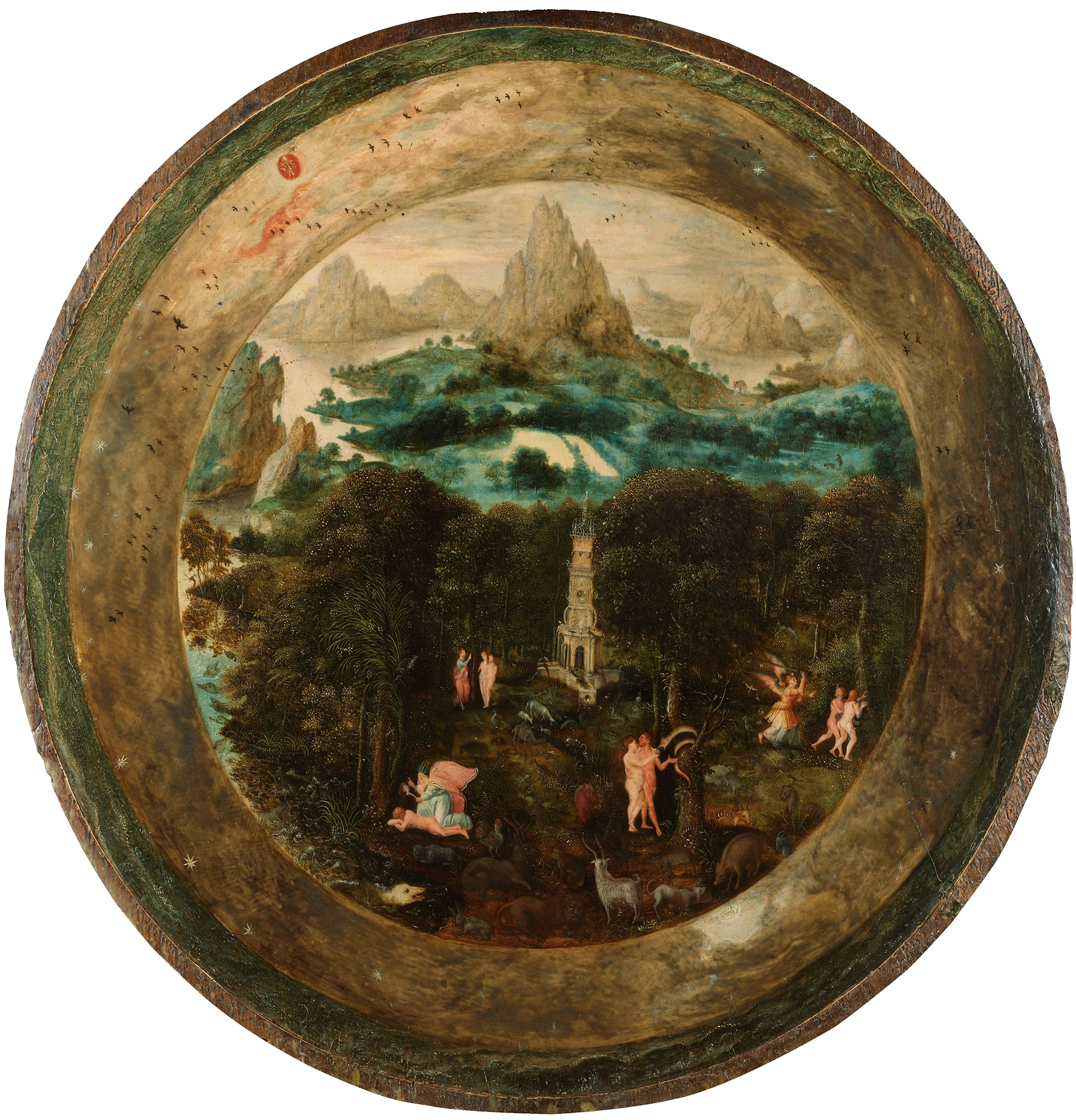
fig. 1. Herri met de Bles, Paradijs, 1541, oil painting on wood, Rijksmuseum, Amsterdam
1. Umberto Eco, Art and Beauty in the Middle Ages (New Haven, London: Yale Press, 1986), p 17.↩︎
Alternative views on Medieval arts have also emerged. According to the art historian Ernst Gombrich, a more plausible approach to the artistic products of this period is to observe them as tools of communication that had to convey a message in the most efficient way possible. 2 Artworks of the era served to get the narrative and the emotional depth of the subject matter across, and they did it in a clear and powerful, yet playful way. Even though personal expression and originality was not held in high esteem back then, often we can observe a fruitful mixture of tradition and individual idea. How can all this be important for the contemporary context?
Today - especially in Western societies - we experience a level of welfare and security that would have been unthinkable five hundered years ago. This has been achieved through the accumulation of a vast amount of knowledge, and using it in an applied way — a process that began in the Middle Ages but had its flowering in Modernity. The key of our welfare is knowledge, organising and clear thinking. This coincides with the promise of the Modernist idea: that science, and applied knowledge would bring welfare to everyone.
Still the validity of the Modernist approach is questioned time and again. In spite of the vast amount of information, it seems more and more difficult to understand the world around us. Fragmented, specialised information prevails without a system that would connect the details into a completeness. Scientific objectivity, which is taken for granted as part of the method, blurs personal agendas. The fragmentation of knowledge into specializations does not allow a diverse, interdisciplinary view on the problems: it would always result in specialist views, which fail to take other points into account. In the meantime, the proliferation of information sources makes it harder to check their reliability. As a result one floats on a sea of information, of which the reliability, the relevance and the approachability are questionable. We have arrived to a time with a loss of orientation.3
4. Gilles Deleuze and Félix Guattari, Capitalism & Schizophrenia: A Thousand Plateaus (London: The Athlone Press, 1988), p 5-9. ↩︎
5. Marshall McLuhan, The Medium is the Message (London: Penguin Books, 1996), p 48-50. ↩︎
Much criticism of this phenomenon came from the postmodernist philosophers. The sctructuralist philosopher Michael Foucault called for an interdisciplinary view of science; Gilles Deleuze and Felix Guattari came up with the concept of the rhizome in order to provide a metaphor for another way of organising knowledge. Taken from the field of botany, rhizome refers to an underground network of roots. The roots grow under the surface, invisibly, but they store nutrition and data in their connections. Dependently on each other, they form a living community, and give rise to new plants. This comparison proposes an integrated world-view. Different fields of knowledge should be intimately interconnected and influence each other in an organically growing system. 4 Some years later the media theorist Marshall McLuhan introduced the term Electric Age to describe the present and future decades, and compared it to oral and scribal cultures in its knowledge structures in opposition to the Gutenberg Era. 5Seeing that postmodern thinkers implicitly or explicitly create parallels between Medieval thought and contemporary needs, makes me wander, if graphic designers have anything to learn from Medieval visual communication.
This thesis explores visual communication in the Middle Ages, and to understand the underlying narratives and principles of hierarchy. I will look at manuscripts, because these contain both image and text, organised into more or less complex systems. This allows us to investigate the elements separately and in relation to each other. A series of images will come under our examination: first details, then page layouts; and finally a complete book. I will analyse the images visually, and put them into a broader technical, theoretical and historical context, in order to understand the concepts behind them. What I would like to find out, is as follows. What kind of visual strategies were used to organise and communicate knowledge? What is the role of specific elements in Medieval manuscripts? How can these findings can be interesting for contemporary designers? Finally, I would like to offer an example for historical research in the field of graphic design, that goes further than the hoarding and copying of mere visuals, but the understanding of layers of meaning and cultural context.
The impossimility of
thinking that
This passage quotes a “certain Chinese encyclopedia” in which it is written that “animals are divided into: (a) belonging to the Emperor, (b) embalmed, (c) tame, (d) sucking pigs, (e) sirens, (f) fabulous, (g) stray dogs, (h) included in the present classification, (i) frenzied, (j) innumerable, (k) drawn with a very fine camelhair brush, (1) et cetera, (m) having just broken the water pitcher, (n) that from a long way off look like flies”. In the wonderment of this taxonomy, the thing we apprehend in one great leap, the thing that, by means of the fable, is demonstrated as the exotic charm of another system of thought, is the limitation of our own, the stark impossibility of thinking that. 6
6. Michael Foucault, The Order of Things (London: Routledge, 1989), p xvii. ↩︎
When looking at a Medieval world map — a Mappamundi — we may experience the same kind of amazement as when trying to understand the above-quoted system of categories. We do see that this is a way to depict the world, but we do not comprehend it. We have to realise that all our assumptions about exact measurement and geological correctness must be left behind, and our obsession with experience and scientific validity will not do any service either. We enter a world, that is structured along different lines.
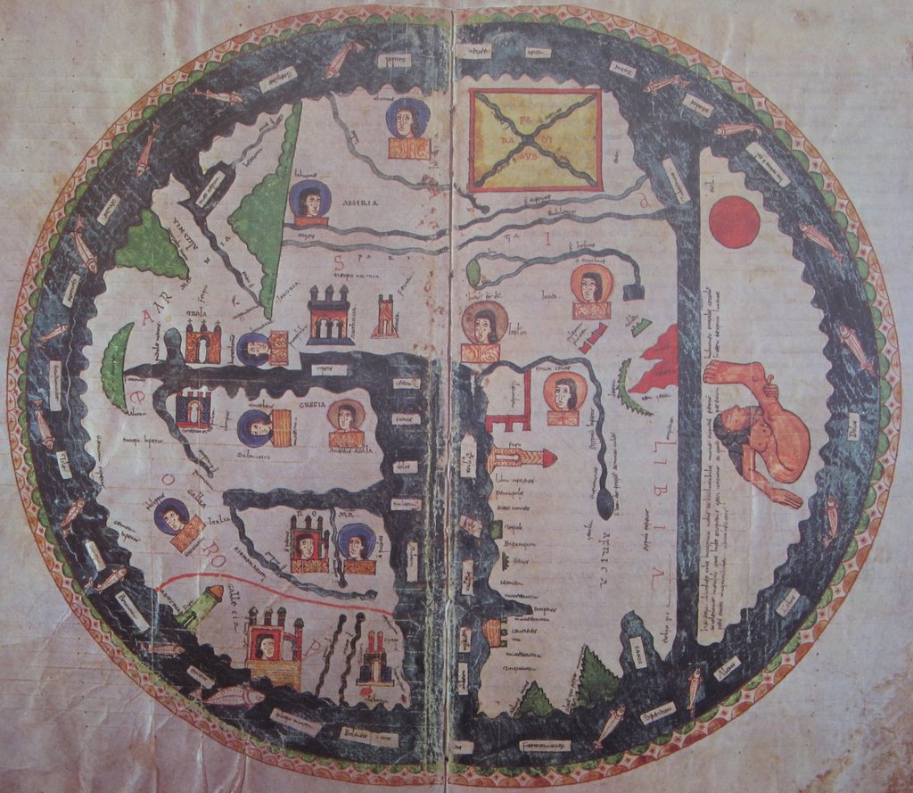
fig. 2. Mappamundi, Codice Num 1. fol 35 v-36 r. Biblioteca de la Catedral del Burgo de Osma-Soria, Osma-Soria
The map has a circular shape with a clear border. On the edge there is the see populated with marine creatures, boats and remote islands.These islands have a different colour than the mainland, similar to the mysterious ocean: they exist on the borders of knowledge. The earth-mass is divided into three parts by the great waters: the Mediterranean, the Nile River and the Aegeus Sea. Hence, the continents are Asia, Europe and Africa. Scattered around the terra firma we see castles, which stand for the important cities. Sometimes with human portrays are attached to the castles, to indicate the ownership of the settlements. Large mountains and rivers are indicated with green zig-zags and blue waves respectively. In the centre of the world we find Jerusalem, and Asia occupies the top part. Unlike today, the map is directed towards the Orient - from where our word “orientation” itself originates. On the very top of the map, thus in the very far East we see the Garden of Eden, where Adam and Eve still contemplating on trying the Apple. This explains why we should all look towards the East: all eyes on the Paradise! Another smaller part of the mainland is cut off on the southern edge by a thinner water. Part of the water is coloured red, therefore we can recognise it: it is the Red Sea. Beyond this a one-legged creature is sitting. He is a skiapode, and he represents the land of the monsters.7 This is the realm of the Unknown, the not-yet-discovered but suspected-to-exist, where fears and desires are displayed.
7. David Williams, Deformed Discourse (Exeter: University of Exeter Press. 1996), p 159-160. Skiapodes are common elements of medieval imagination. They were thought to be shaped like human, but smaller, and with only one leg. However, the foot of this leg is huge, so that they can run very fast on it. When they take a rest, they lay on their back, and put their feet above their heads, using it as an umbrella.↩︎
Between the 9th and 14th century several versions of this map were published. Whereas very detailed, large scale maps of this kind were produced, like the Hereford Mappamundi, absolutely schematic versions existed too, in which we only see a circular disc divided into three parts. Between these extremes several varieties are to be observed, including different amounts and sorts of details. 8 Elements could be added or left out, but the map always suggested the structure in which the world was imagined. Thus, it seems, that the map represents an organising principle, a flexible framework, in which all the knowledge of the Medieval world could be fit in.
8. Naomi Kleine, Maps of Medieval Thought: The Hereford Paradigm (Woodbridge: The Boydell Press, 2001), p 4.↩︎
9. Michael Foucault, The Order of Things (London: Routledge, 1989), p xxiv.↩︎
10. Umberto Eco, Art and Beauty in the Middle Ages (New Haven, London: Yale Press, 1986), p 18, p 53.↩︎
11. Michael Foucault, The Order of Things (London: Routledge, 1989), p 19-33.↩︎
According to Foucault, time periods and cultures can be characterised by epistemes: the limits of what is thinkable in the given culture, and how knowledge is structured. In this, he emphasizes that not only the outcomes of categorisation, or the amount of knowledge gathered are different: the mere principles of organisation are dissimilar. Without taking these into account, it would be hardly possible to relate to the products of this culture.9Medieval thought showed diversity across time. However, there are some characteristic principles, which are typical and strikingly different from our own epoch. Now it is the time to leave behind our preconceptions, and imagine a time which was characterised by the search for meaning and integration. The universe was pictured as an interconnected whole, with God in the centre.10 All was organised by the principle of similarity and metaphor. 11 This is not only to be observed in texts, but also in visual narratives.
The Imagined Library
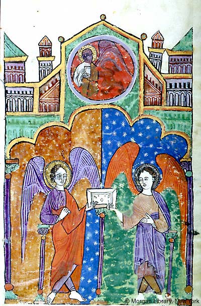
fig. 2. In the Library, M 429 fol 4 r. The Morgan Library, New York
Reader! Now, armed with wonder and prepared for surprise, let us enter this library of Medieval graphic design, which we build throughout this text, in our imagination. In reality, these books are hidden in the most famous archives of the world. Hardly anyone is allowed to touch them. But in the envisioned space of this essay they come together, so that we can marvel at their pages. Do you hear that? The large, rusty key turns in the lock of the thick wooden door, and the hinges creak. Let us enter!
Through the lead glass window a glance of dim light falls onto the wooden desk. Do not imagine a library of today. We are in a small room; the stone walls lined with book cabinets. Small, laying stacks of books fill their numerous compartments. Each shelf a field. Each section a topic. Not alphabetical order, but thematic categorisation defines the arrangement of codices. The titles written on the fore-edges, or on the spines, help us to navigate further. 12
In the zeal of curiosity you grab a book without looking at the title. Be careful! Place it on the desk, support the spine with a pillow. You open the metal clasps that press the book closed, turn the thin wooden cover, and start flipping through the pages. Your fingers send a note to your mind: it is a sensation you have never felt before. It is not paper, it is parchment. One learns about it in history class: almost all Medieval knowledge was written down on parchment, which is the prepared skin of goat, sheep or a cow. The production of parchment included a series of chemical and physical processes, so that, cleaned from hair and fat, it became a thin, smooth and extremely durable writing support. It feels silky and warm, dry and greasy, dead and alive at the same time. Being an organic material, the texture, and sometimes the shape as well, change throughout the book.13 If there was not written anything in it, the sensation would already be interesting enough. Awakening from the tactile delirium, you start looking again, at the pages filled with letters, meticulously shaped by a restless hand.
Exhibitionist sentence-starters
14. Marshall McLuhan, The Gutenberg Galaxy (Toronto: University of Toronto Press, 2011), p 109.↩︎
15. Marshall McLuhan, The Gutenberg Galaxy (Toronto: University of Toronto Press, 2011), p 94.↩︎
16. Marshall McLuhan, The Gutenberg Galaxy (Toronto: University of Toronto Press, 2011), p 16.↩︎
17. Raymond Clemens and Timothy Graham, Introduction to manuscript studies (New York: Cornell University Press, 2007), p. 25.↩︎
18. Marshall McLuhan, The Gutenberg Galaxy (Toronto: University of Toronto Press, 2011), p 123.↩︎
19. Raymond Clemens and Timothy Graham, Introduction to manuscript studies (New York: Cornell University Press, 2007), p. 25-29.↩︎
The first thing that becomes apparent, are the distinctive capitals in the sea of the tiny black letters constituting the text. Red and blue. Larger, and more elaborate than the rest of the letters. One can see from a distance of several meters where the sentences start and end. Looking closer, we see that thin tendrils of ink-lines grow out from these capitals, creating an abstract pattern around the text. You can imagine that the scribe had the reader as much in his mind, as I have you now while writing these lines. The scribe - the designer if you will - was as much a reader as a maker.13 He was, in fact, reading and interpreting while writing, and knew exactly how to translate the text into a visually comprehensible layout: into one that the reader would be able to follow. He also had in mind the way in which the text would be read. One of the most important characteristics of reading in the Middle Ages was recitation: reading out loud, reading together.14 Reading slowly, but continuously, to understand deeply. Manuscripts were often scripts for a performance - imagined or real - so they had to give visual strongholds to their performers to the very detail of their visual appearance.15 This accounts for the presence of these exhibitionist sentence-starters.16
Another significant aspect in Medieval reading was the art of memoria: reading as remembering. Digesting the text in order to memorise it into detail.17 This aspect also party explains, why you find those majestic capitals with abundant decoration in the beginning of each section, my Reader. Letters merged with images are points of orientation and aids for the memory. Let us take some other books from this shelf, and look at the different forms they take: sometimes purely floral, or curving into dragons, other times pregnant with paintings in their bellies.18
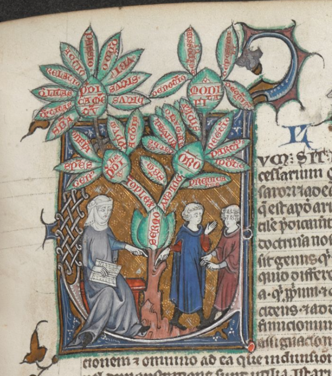
fig. 4. Teacher and her diagram tree, BL Burney MS 275, fol. 166r, British Library, London
Illuminated initials provide an immense field for exploration. We could sit here, dear Reader, days and months, just admiring and deciphering them. Look at this one, for instance: a letter C. We find it in a massive manuscript volume from the 14th century, a collection of Classical and Latin works on the seven liberal arts. In the letter we see a lady, and two young gentleman: the teacher and her students respectively. With a book in her hand, she points to the ground, from where her words grow out as a tree. The leaves and branches of this plant represent the core structure of the Aristotelian logic.20 It is obvious that this initial is more than decoration: it is a visual summary of the following pages, a diagram created in a perfectly human form. You can imagine how much a picture like this sticks in the mind above the sea of text: it prepares you for the reading, it explains, it makes you find your way, it helps you remember.
20. John E. Murdoch, Album of Science I: Antiquity and the Middle Ages (New York: Scribners, 1984), p 51.↩︎
Let us take another book from the pile. A psalter made for Queen Eleonor of Aquitaine in the 12th century. Among its lavish illuminations we find this initial S, starting psalter 69, which goes like “Salvum me fac Deus quoniam intravernut aquae usque ad animam meam”. This translates to “Save me, O God: for the waters are come in even onto my soul”. And what does the illustration show? In the bottom part of the letter, a bearded man in a nice robe and a light tiara is being eaten by a fish. In the top part one man in a simple maroon dress is taking off the robe of another man.21
In-between, a dragon or salamander curves, constituting the bottom of the letter. The holy man with the fish can be easily understood as Jonah, being swallowed by the whale. Whereas the two man may remind us of the people of Nineveh, who, upon hearing from Jonah that God would destroy their city, took up a fast, and changed their fashionable dresses to sackcloth, as a practice of abstinence.22 In Medieval symbolism the dragon stands for the Devil and the temptation into sin, whereas the salamander is a symbol of righteous people, who can withstand fire, and recover from sin. Both interpretations add a meaningful layer to the previous story. When reading the psalter we realise that it contains several hints to the story of Jonah, and thus the initial works as a sort of a hyperlink to reinforce this connection. So, in this case the illumination helps the memory, illustrates the text, but also adds another layer to it, in the form of a visual reference.
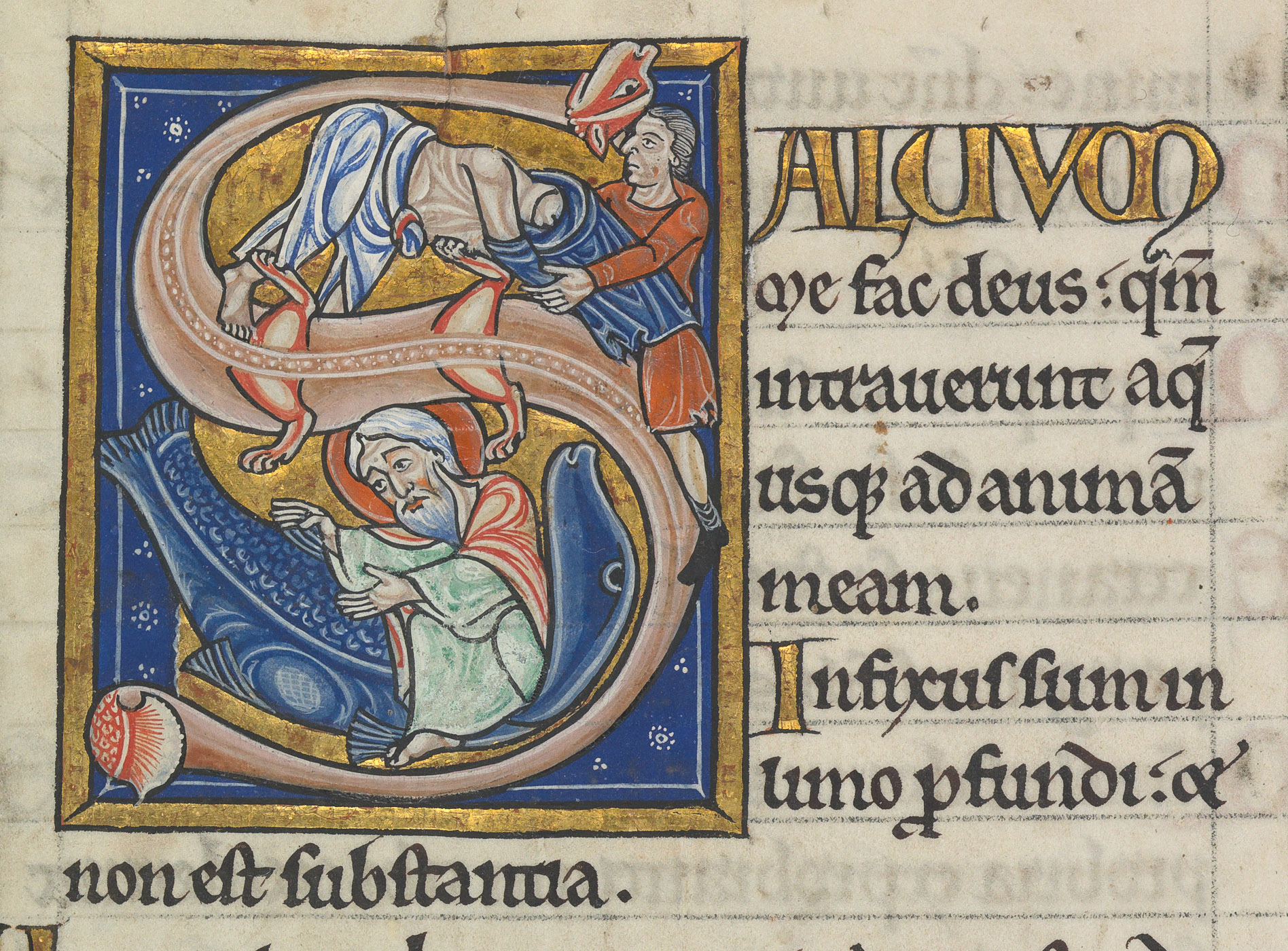
fig. 5. Jonas in the fish, KW 76 F 13, fol. 88r, Koninklijke Bibliotheek, The Hague
21.“Psalter van Eleonore van Aquitanie” Koninklijke Bibliotheek Den Haag: Middeleeuwse Handschriften, accessed 17. 12. 2017. https://www.kb.nl/themas/middeleeuwse-handschriften/psalter-van-eleonora-van-aquitanie-ca-1185↩︎
22.Jonah 1:17 and Jonah 3:8 ↩︎
Bestial Allegories
The fact that the content is explained in a visual way reminds us of the other part of the audience that the medieval designer had to keep in mind: the illiterate viewers. Much of the expressive illustrations were created to make the books comprehensible for them. For another example of this let us look into the Aberdeen Bestiary . This manuscript was created around the same time, in the 12th century, and being a bestiary it stands on the border of a natural history book and a religious treatise. It is a collection of all the supposed-to-be-known creatures of the earth with extensive descriptions of their behaviour, the moral of this, and an illustration.23 This is also a great way to find out more about the beasts mentioned above, so first we will look at the salamander, next the dragon.
23. “The Aberdeen Bestiary” abdn.ac.uk, accessed 17. 12. 2017. https://www.abdn.ac.uk/bestiary/ ↩︎
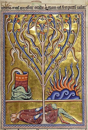
fig. 6. Salamandra, Aberdeen MS 24, fol. 70r, Aberdeen University Library, Aberdeen
From the text we find out that the samalander is a cold creature, it is fire-resistant. Out of all poisonous creatures, it is the most dangerous: when it climbs up the tree, it poisons the apples, and anyone eating them would die. The book explains that it also used to fall into wells, where it poisons the waters. Because he can stand fire, he is an allegory for virtuous people, just as Daniel, who emerged from the fiery furnace.24 In the image, we see an apple tree, covered with salamanders, busy poisoning the apples. One of them is jumping into the well. On the right side we see other salamanders emerging from the fire, and even putting out the fire with blue waves. On the bottom of the drawing - below the ground level we see a dead person - probably he tasted the apples.25
26. David Badke,The Medieval Bestiary: The Dragon. http://bestiary.ca/beasts/
beast262.htm, accessed 07. 12. 2017.↩︎
Turning to the dragon, we learn that it is the largest and most dangerous of all creatures, and its habitat is Ethiopia and India where it’s always warm. It is the greatest enemy of the elephant. The dragon hangs around the routes where the elephant normally walks, and by wrapping its tail around the innocent creature, suffocates it. The dragon is the symbol of the Devil, which tries to entangle humans into sin, drawing them to hell. On the image we see the long, thin, blue dragon with, a nasty face and pointy teeth, strangling and biting into the innocent and desperate elephant.26
Both images are clear representations of the content of the text. In the case of the salamander all its characteristics are expressed visually. The image works as a diagram, showing all the possible stages of the animal’s activity. By contrast, the dragon is represented only in one situation - capturing the elephant. However, this narrative event encompasses nearly all important features of the beast - its strength, its major hunting target and its tactics - and anchors down the moral of this section. As a conclusion we can say, that the combination of text with the narrative images works well for both literate and illiterate audiences. The fingerprints around the images testify about its intense usage for explaining and teaching in the past.27
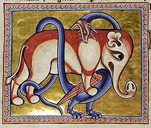
fig. 7. Dragon, Aberdeen MS 24, fol. 65v, Aberdeen University Library, Aberdeen
27. “The Aberdeen Bestiary” abdn.ac.uk, accessed 17. 12. 2017. https://www.abdn.ac.uk/bestiary/ ↩︎
Medieval Speech Bubbles
Initials exemplify a way in which text and image were integrated. On the next shelf we find more instances of the interconnectedness of text and image, where the two flow into each other in a dynamic way. It was not unusual for a text to continue within the image, especially if that text was a conversation between two people. In this case, text was often displayed in “speech bubbles”, looking like paper scrolls, which we can observe in this intense image of a Picture Bible from the early 14th century, written in vernacular French and English. On the left side we can see a monster with scary heads all over his body, facing a man in an elegant toga with a light crown. The monster is the devil, carrying a bunch of souls in his backpack; his opponent is Christ. Their facial expressions testify for their heated discussion, and the text explains that Christ attempts to convince Satan to hand over the souls of the sinners to him. Behind them, in the right corner we see an angel and a lady - they are Angel Gabriel, and Virgin Mary. The image depicts the scene of the Annunciation. The meaning is enriched by symbols like the heart of Mary, displayed next to her, and the Bird, that commonly stands for the soul of the Holy Child, approaching the Virgin. On their scrolls we read the good news that Gabriel is telling, and the reply of Maria, respectively.
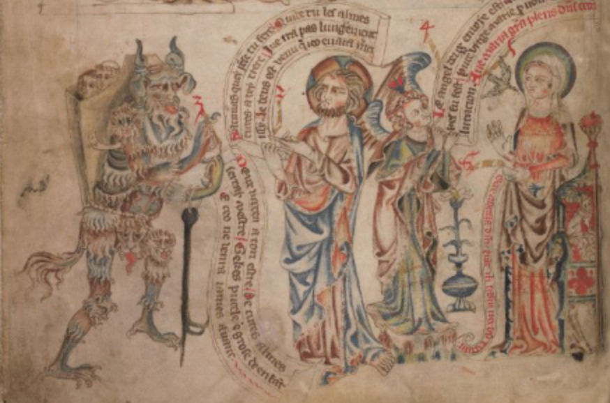
fig. 8. Devil and Christ, Annunciation, Add MS 47682, fol. 11v, British Library, London
Have you ever thought about how you would teach Aristotelian Ethics to Knights? In a 14th century manuscript about the life of Ramon Llull we find an innovative solution for this. Llull was a Catalan monk, missionary, teacher and philosopher, who educated the sons of kings, but also tried to convince Arabs to turn Catholic. He believed that religion should be set on a logical, philosophical base, and in this sense he wrote a number of theoretical books, combining philosophy and theology. 28 He used innovative visuals to make his ideas comprehensible. No wonder, thus, that a book that interpreted his work and narrated his life, came up with it’s own memorable visuals. 29 On the right we see a castle stuffed with scary monsters. Above this a small line reads as Cunai falsitatis: the cradle of falsehood. Long flags stick out from the windows, which list the attributes of impious life: confusion, hatred, weakness, etc. But the castle is not there to stay: An army of Aristotelian virtues is about to destroy it with its argumentation! What each knight stands for, we can read from their shields and flags that decorate their arms. While deciphering these pre-modern protest signs, we can be convinced that this visual metaphor provides, together with the integration of word and image, a powerful tool to explain a complex theory in a comprehensible manner.
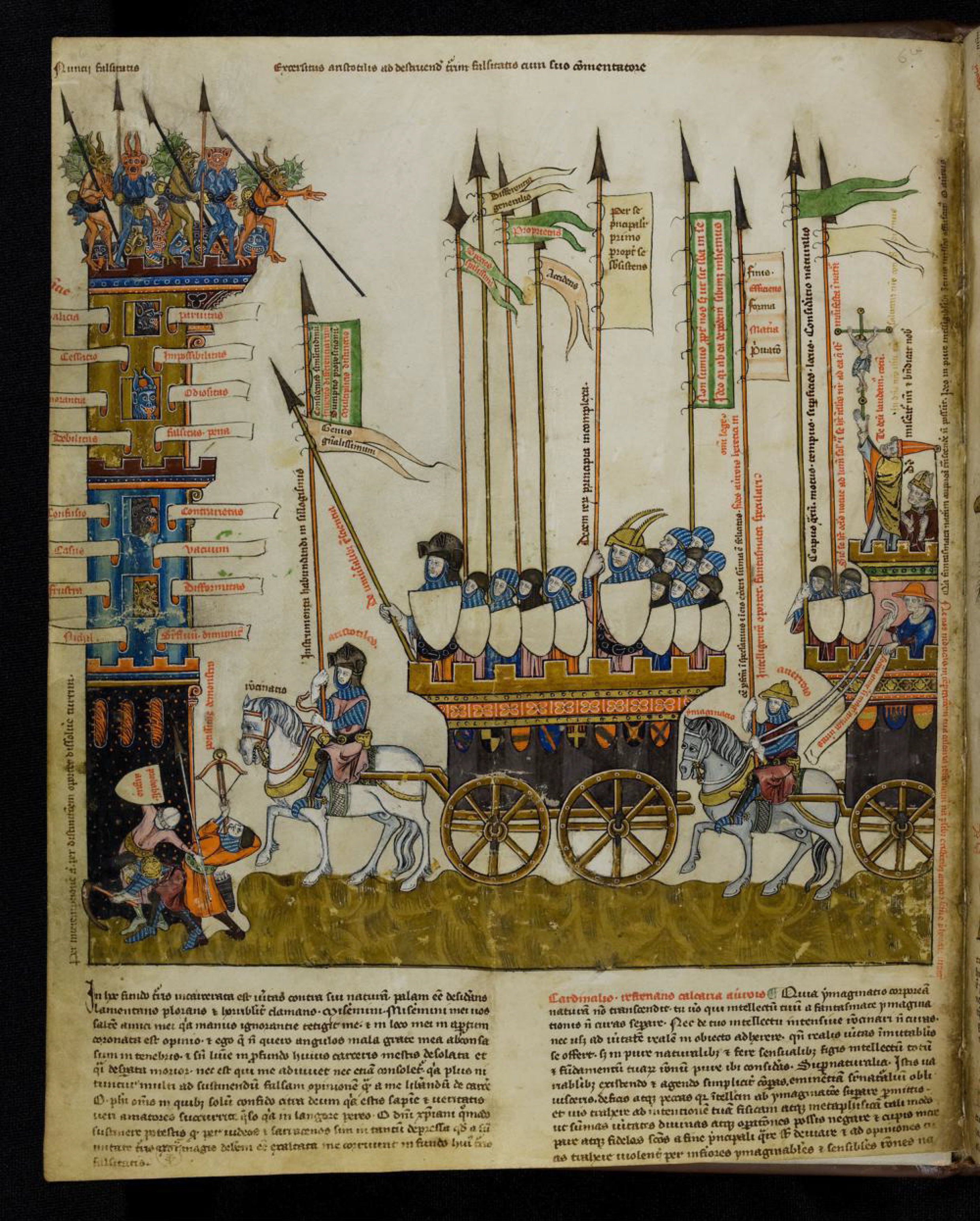
fig. 9. Aristotelian virtues against the devil, St. Peter perg. 92, fol. 7r, Badische Landesbibliotheek, Karlsruhe
Text to Diagram
You may think that topics that already have a narrative, can be easily represented in an interesting way. But what about dry, scientific knowledge? Did they even have that back then, and if so, how did that look like? The next books we will look at will try to satisfy your curiosity on this side. Let us start with philosophy, the mother of all sciences. You may already know, that the favourite philosopher of the Medievals was Aristoteles, whom they also called The Philosopher, and not by accident. Aristoteles was the great systematiser, the first one we remember, who described the world, putting all its details into one big system. 30 This fitted well with the Medieval attempt to see the universe as an interconnected whole. Thus, we find countless examples which show students and scientists striving to understand, to digest and to memorise this material. Tables and diagrams are regular inhabitants of scientific and student books, however they might come in forms, that one would not expect as a modern viewer.
Squares of opposition are practical tools in visualising logical syllogisms, explaining difficult concepts in visually comprehensible forms. This one is an explanation of the Aristotelian theory of syllogisms. The letters in the circles indicate variables, and the outer circles their connections to the predicates. The bars connecting them show the logical connections between the variables, in a shortened version of the main text. Since this table is meant for explaining the text, one can not fully understand it without reading the whole.31
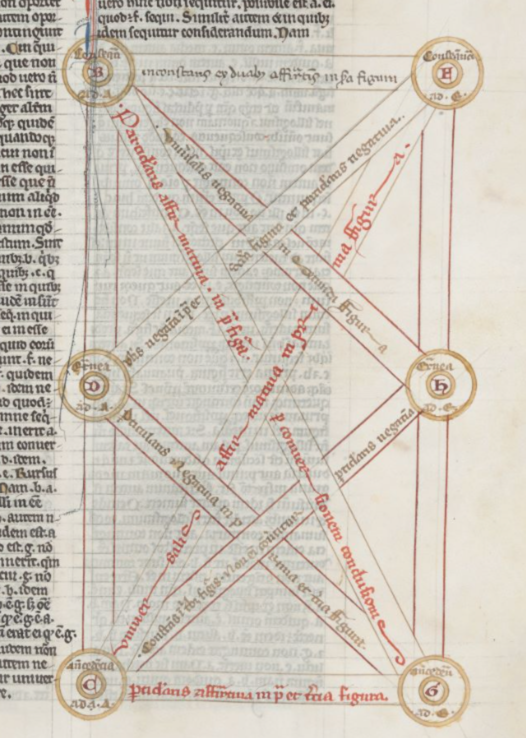
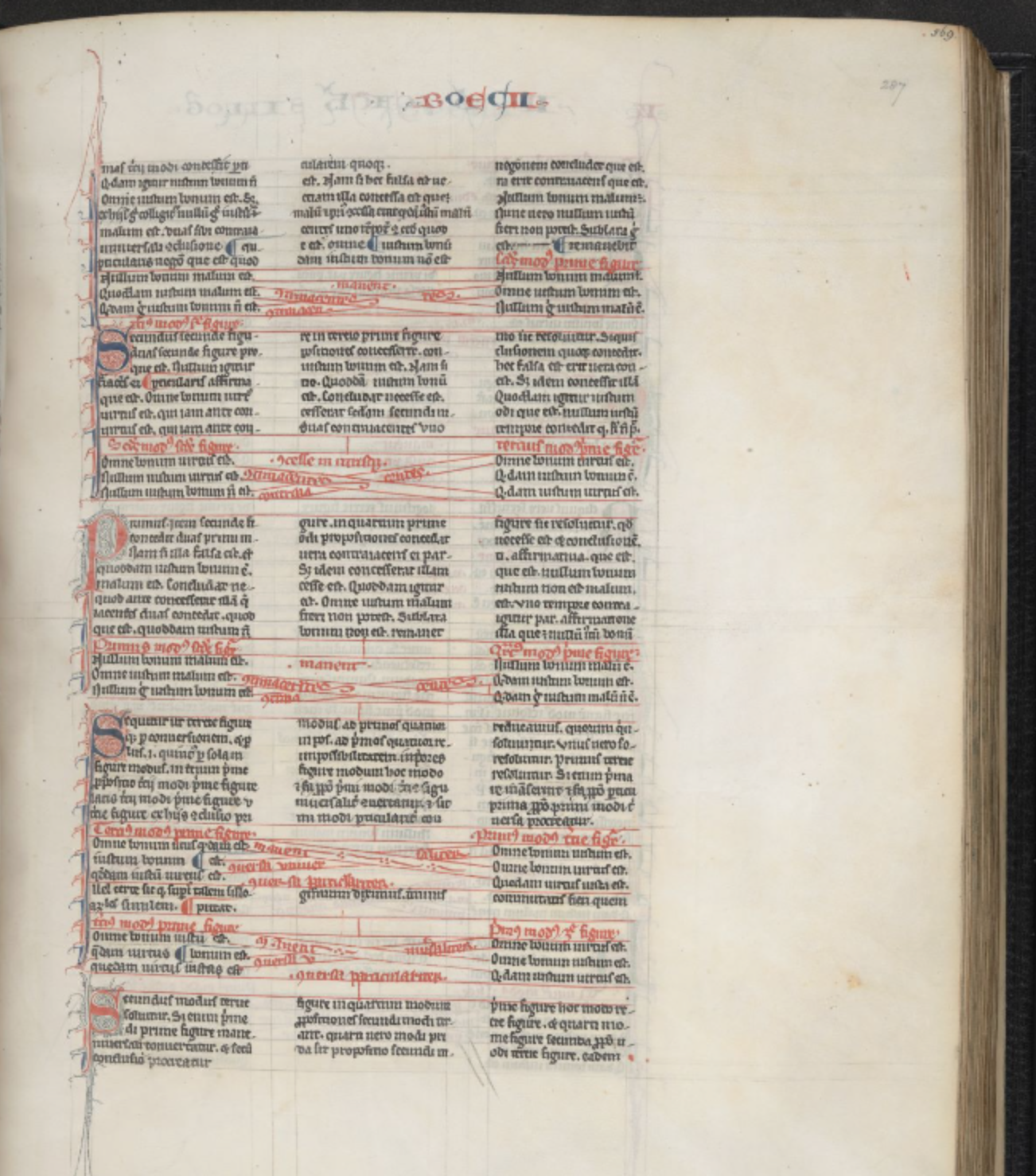
fig. 11. Syllogism in text, BL Burney MS 275, fol. 287r, British Library, London
32. John E. Murdoch, Album of Science I: Antiquity and the Middle Ages (New York: Scribners, 1984), p 66.↩︎
33. Raymond Clemens and Timothy Graham, Introduction to manuscript studies (New York: Cornell University Press, 2007), p. 24.↩︎
In another chapter of the same book, a text of Boethius, we find a more integrated use of the same visual structure. Instead of creating separate tables that would explain the content, the designer decided to integrate the diagram into the text. While the text runs in three columns in black, the logical oppositions in-between the variables mentioned in the text are indicated in red.32 This is also called rubrication, from the latin rubrum, that means red33 This reminds us of a maker, who puts all his effort into comprehending the theory himself, resulting in a lively composition, a graphic interpretation of the text itself.
A proto-computer
St Augustine’s aesthetic theory reads as follows: Equal triangles are more beautiful than scalene triangles because of their greater ‘evenness’. Squares are more beautiful still. Most beautiful is the circle, which has no angles to disrupt the continuous equality of circumference. ,34 In accordance with this, Medievals testified for a high appreciation of the circle in their visualisations. Circular shapes were used to illustrate or organize almost any kind of information. Circles of Fortune, where one moves from normal life to high success, but from there falls into his ruin. Circles of life, a version of the previous example, but more in harmony with Christian ideology, where one moves through the stages of life from birth to death along the circle, and which is supposed to show the wain nature of material life. Calendars. Depictions of the Cosmos. The celestial bodies. World maps. Meteorological diagrams with wind directions. Fortune-telling devices. Theories of logic, and so on.35
34. Umberto Eco, Art and Beauty in the Middle Ages (New Haven, London: Yale Press, 1986), p 40.↩︎
35. See examples in John E. Murdoch, Album of Science I: Antiquity and the Middle Ages (New York: Scribners, 1984), p 52-61. and Naomi Kleine, Maps of Medieval Thought: The Hereford Paradigm (Woodbridge: The Boydell Press, 2001), p 7-48.↩︎
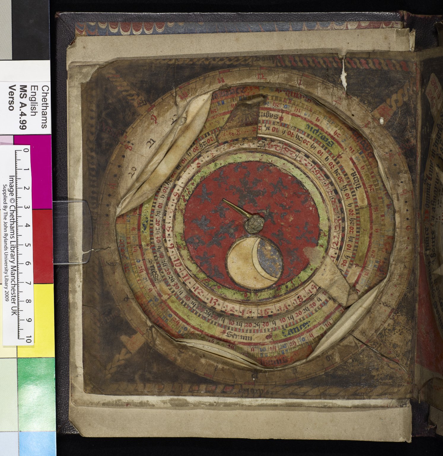
fig. 12. Volvelle, Chetham's MS Mun.A.4.99, fol. 1v, Chetham's Library, Manchester
One interesting example is a handy gadget hidden in a book, a proto-computer, so to say. In the Middle Ages “computatio” referred to the art of calculating the date of Easter. This included complex calculations, and required decent astronomical knowledge.36 And because Easter was an exciting celebration, people were willing to come up with smart solutions for this task. Several static computus are to be found in books, but a number of calendars and astrological calculation tools were fabricated to be interactive. Several layers of circles and pointers are fixed to the page with a pin in the middle. By adjusting these to each other, the reader could count, for instance, the stages of the moon and the astrological constellations for a given day. Many Medieval books were explicitly interactive in this sense. More importantly, manuscripts did not only provided their readers with information, but also with handy tools. This tradition of interactivity and multi-functionality was transferred to the Renaissance to some extent. We find printed books about astrological and navigational tools, for instance the astronomer Edmund Gunter’s De Sectore et Ratio, which contain such a detailed description and accurate image of the tool, that it can basically work as a tool itself.37
36. John E. Murdoch, Album of Science I: Antiquity and the Middle Ages (New York: Scribners, 1984), p 56-57.↩︎
37. Hester Higton. “Instruments and Illustration: The Use of Images in Edmund Gunter’s De Sectore et Ratio,” in Observing the World through Images: Diagrams and Figures in the Early Modern Arts and Sciences, eds. Nicholas Jardine and Isla Fay (Leiden: Brill, 2013), p. 193.↩︎
Use Your Body
When it comes to complex theories and concepts, it is necessary to take them close to the reader and make it human. And what could be closer to the person, if not his own body? Medievals were the masters of metaphors, in fact, according to several theorists this was the main principle according to which they organised their knowledge.38 They envisioned a direct relationship between the macrocosm and the microcosm, that is to say, between the cosmos and the human body. What was present in one, was also represented in the other. Therefore the changes of astronomical objects were considered to have an effect on people’s bodies. Numerous illustrations of the Zodiac Man show how the two were connected. Each organ directly corresponds to a planet, and also to an astrological sign. The zodiac man illustrations are to be found in the so-called doctor’s calendars; small foldable books with time-tables, healing information and illustrations.39 Thus, the Zodiac Man was a memory aid to the physician in choosing the right treatment for the given point in time, by displaying medical and astronomical information simultaneously. On the other hand, it also served as a PR-material, that the doctor could always carry with him, and use it to explain to the patient about the justness of the treatment advised.40
38. See Michael Foucault, The Order of Things (London: Routledge, 1989), p 19-50. and Umberto Eco, Art and Beauty in the Middle Ages (New Haven, London: Yale Press, 1986), p 53.↩︎
39. Sophie Page, Astrology in Medieval Manuscripts (London: The British Library, 2017) p. 56.↩︎
40. Jean A. Givens, “Reading and Writing the Illustrated Tractatus de herbis, 1280-1526,” in Visualizing Medieval Medicine and Natural History 1200-1550, eds. Jean A. Givens, Karen M Reeds and Alain Touwaide (Vermont: Ashgate, 2006), p 10.↩︎
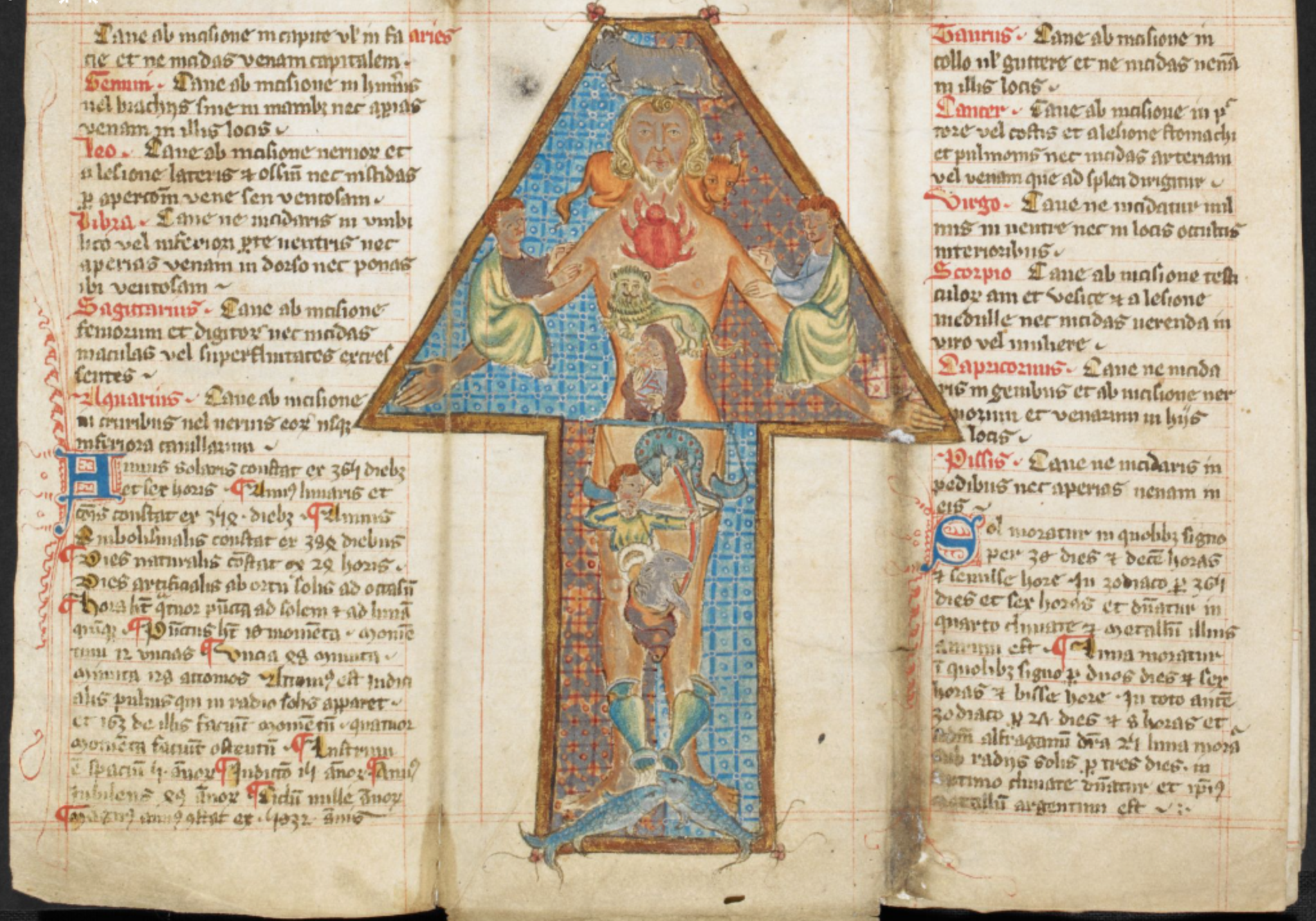
fig. 13. Zodiac Man, BL Harley MS 5311, fol. 5v, British Library, London
While this a rather concrete connection, more abstract information was explained through the body too. In this age before calculators, fingers and other body parts were used to perform complex mathematical calculations. This was done by connecting each small part of the hands, and their various positions to a value, which allowed complex calculations up to the number 10 000!41 Associating the hand with data was a powerful tool in understanding and memorizing. Another example of this is the famous Guidonian hand, developed by Guido of Arrezzo, a music theorist. We see in the image that each segment of the finger is assigned to a specific note. This allowed musicans to visualize the order of tones and their relationships in the hexachord system. Once memorised, it could be used to recall connections, and also to communicate to other musicians.42 The diagram works on several levels: it explains an abstract concept by involving the body of the viewer, it works as a memory aid, and finally, it creates a practical tool of communication out of the very own hand of the musician.
41. John E. Murdoch, Album of Science I: Antiquity and the Middle Ages (New York: Scribners, 1984), p 79.↩︎
42. John E. Murdoch, Album of Science I: Antiquity and the Middle Ages (New York: Scribners, 1984), p 81.↩︎
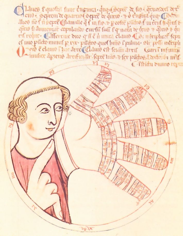
fig. 14. Guidonian hand, MS D75, fol. 6r, Biblioteca Ambrosiana, Milan
Little Hands
Talking about hands, there is another genre of hands we need to mention before we leave behind the details and go further to look at page layouts. This is made by the first instance, when we encounter the reader on the page: the manicules. Manicules are little drawings or scribbles used by the reader to mark the important points or paragraphs.43 They most often take the form of pointing hands. Sometimes the fingers enclose whole sections of text. However, often they take other forms like everyday objects or animals. Without waisting too many words on explaining this, let us rather look at the collection of these scribbles, and imagine what the reader felt when putting these markings in a book, probably more expensive than a house. Because it is an important moment in the life of the book: the reader is drawn into its universe, he becomes part of it. It might make us think about how we become parts of the books we read in the in our time…
43. Raymond Clemens and Timothy Graham, Introduction to manuscript studies (New York: Cornell University Press, 2007), p. 45.↩︎
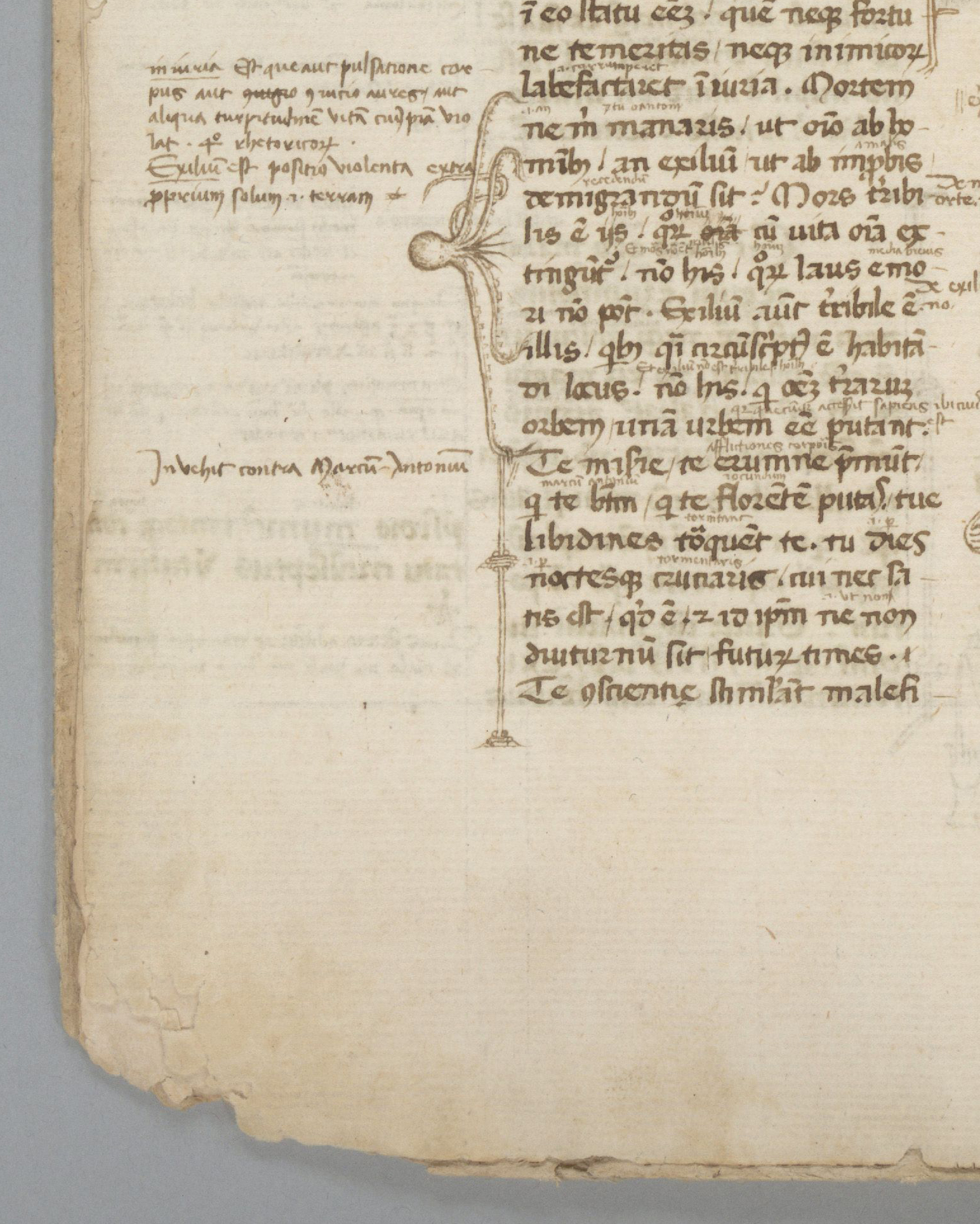
fig. 15. Marking with an octopus, BANC MS UCB 085, fol. 1v, Bancroft Library, Berkerly
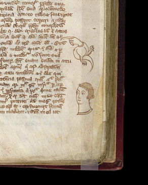
fig. 16. Dragon-hand, Royal MS 12 E.XXV, fol 23 r., British Library, London
fig. 17. Does that ring a bell? Royal MS 14 C VII, fol. 94 r., British Library, London
fig. 18. Little hand, Harley MS 3487, fol. 105r, British Library, London
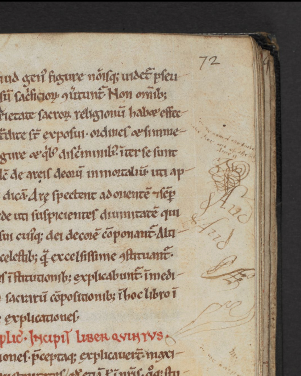
fig. 19. Scribble with strange hand, Add MS 38818, fol 72r, British Library, London
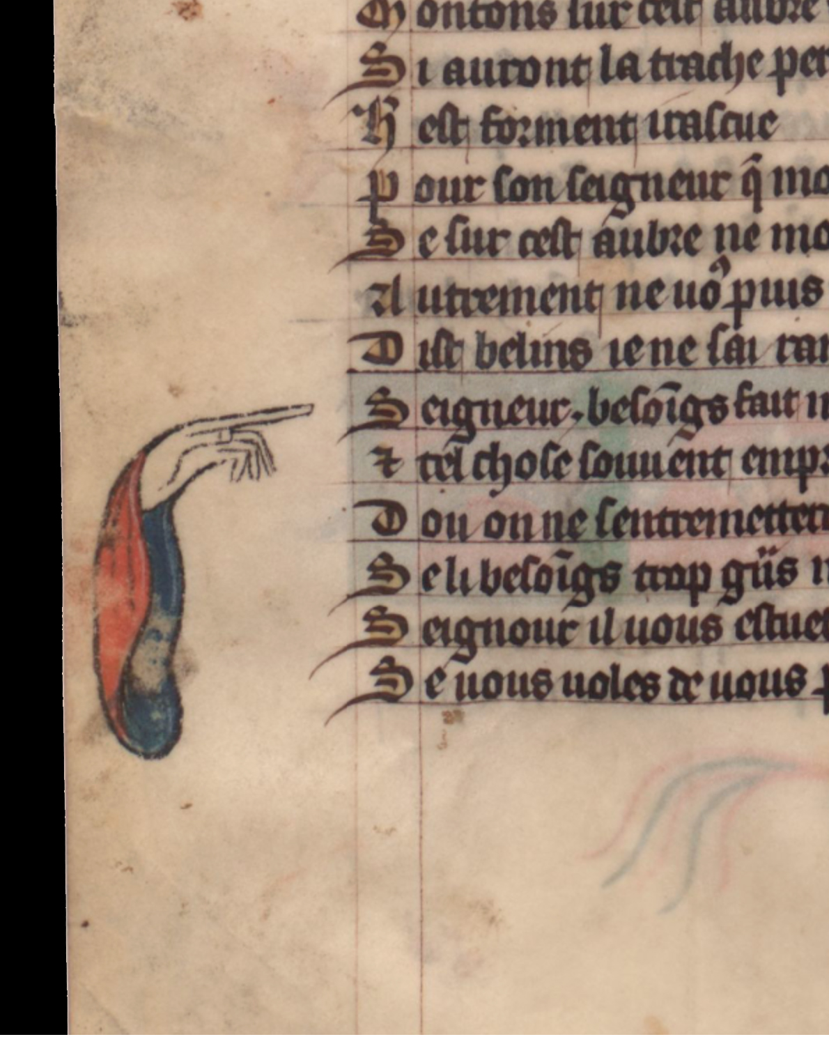
fig. 20. Hand in toga, Français 12584, fol. 37v, Bibliothèque Nationale de France, Paris
Organic Layouts
Now we move on to another section of our library: we will look at complete page layout to investigate how meaning is created through the interplay of the elements. Let us start with the Tractatus Herbis, a herbal from 1280, created in Salerno, mainly for university students. A herbal, in general, is a plant-book, a collection of flowers and weeds, with thorough descriptions of their appearances, characteristics and uses. It is a book of natural science, medicine, and a cookbook combined in one. Images were also often included.44
44. Celia Fisher, Flowers in Medieval Manuscripts. (London: The British Library, 2004.) p. 7.↩︎
In our copy the images are the first ones to attract attention. While the text runs through the folios in a simple but neat, two column layout it leaves some spaces blank. These blanks are occupied by herbs, displayed as if they were flattened on the page, like in an actual plant-collector’s herbarium. Floating between naturalism and artistic freedom, the illustrator exploits the advantages of both styles. He provides us with ample visual information about the plants, but he also includes information about the plant’s use or production, or on other, non-herbal materials. Look at this page with the two filigree plants on the top - the round-rooted birthwort and the long-rooted birthwort - and the huge fish on the bottom: a sperm whale. The whale illustrates the starting paragraph on ambergris, a material extracted from the intestines of this marine animal, used in pharmacy. And there is a small snake next to the plants: this, because their extracts were recommended against snake-bite. Considering the style, the plants are represented as if pressed onto the page. The maker must have considered, that, apart from being a beautiful solution, this presentation is also practical. Since the users of the books were scientists, who experienced the real plants in a similar way - in collections and herbaria - the flat images might have been the most convenient bridge between the content and the real object.45
45. Jean A. Givens, “Reading and Writing the Illustrated Tractatus de herbis, 1280-1526,” in Visualizing Medieval Medicine and Natural History 1200-1550, eds. Jean A. Givens, Karen M Reeds and Alain Touwaide (Vermont: Ashgate, 2006), p 117.↩︎
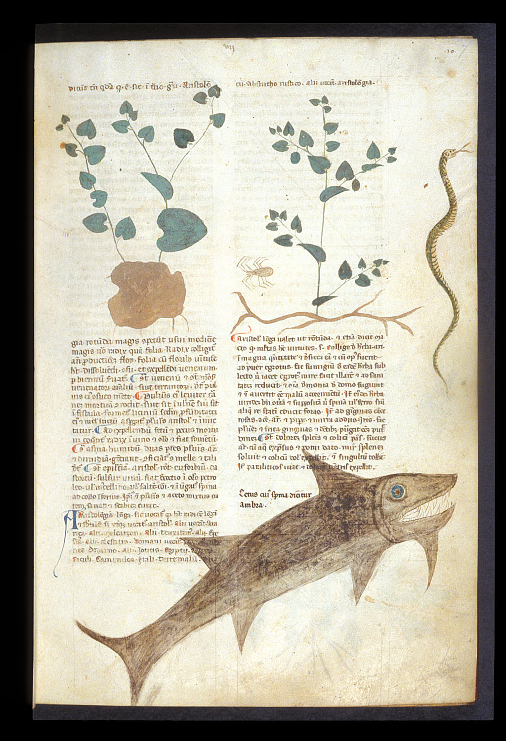
fig. 21. Plants and texts, Egerton MS 747, fol. 7v, British Library, London
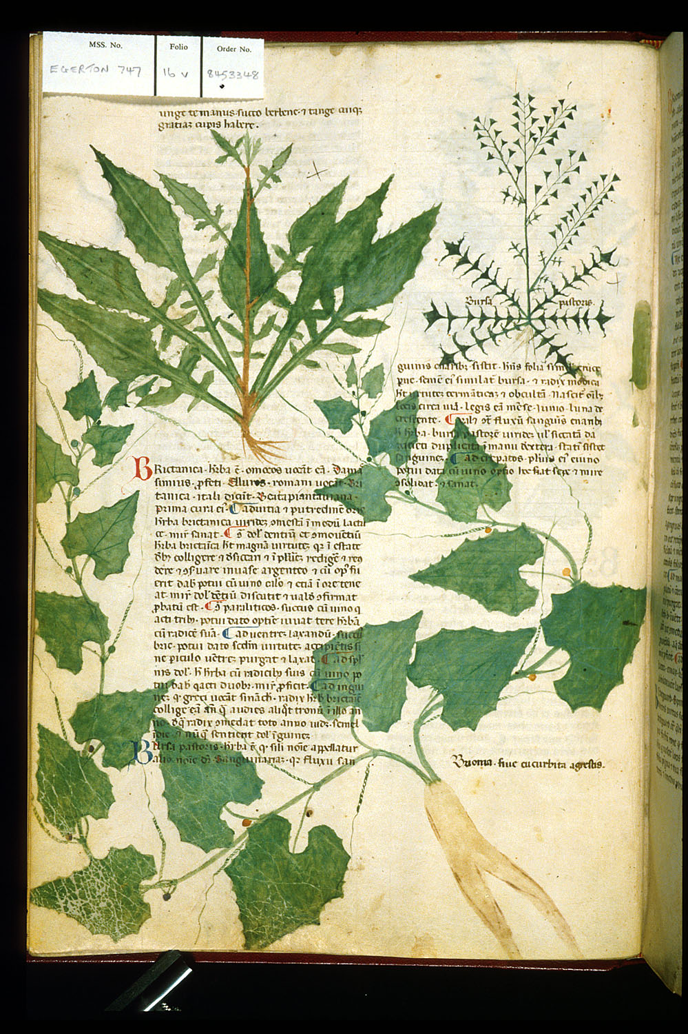
fig. 22. Plants and texts, Egerton MS 747, fol. 16v, British Library, London
If we look at some other pages, we notice the playful, organic layout, that still creates a clear structure. The amount of text, its arrangement, the white space, and the size of the illustrations change page by page. The illustration often overlaps with the text, which reinforces the association to the herbarium, but also creates a visual connection between the two layers: as if the image would grow out from the text. The changing shape and amount of white space gives air to the pages, and keeps the content approachable. In spite of all this play and dynamic in the layout, the essence remains evident throughout the whole text. One does not need any footnotes or references to match the articles with the images. This task is solved in a purely visual way.
fig. 23. Plants and texts, Egerton MS 747, fol. 58v, British Library, London
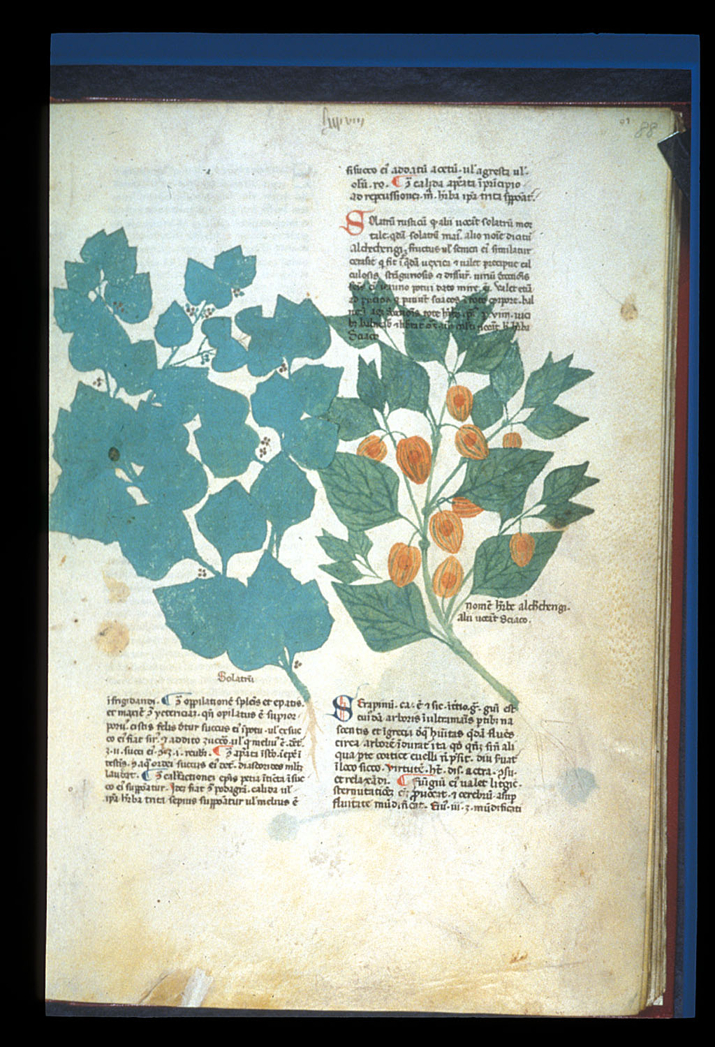
fig. 24. Plants and texts, Egerton MS 747, fol. 88r, British Library, London
Discoursive Pages
Historians call medieval science “livresque”.46 This means, that the base of the research was the book; reading and re-interpreting knowledge that was already written down was the main activity of the scientist. One form of publishing ideas was to simply write them down as commentary next to the original text. In this sense, the book was the platform and tool of the discourse, where source, analysis and reflection were displayed in connection to each other. This happened not only within the content, but also in the form.47 Thanks to the scribes’ careful, hands most of the time the flow of the discourse is visually recognizable even when we don’t understand the language. Starting with an annotated version of the Physica by Aristoteles we can identify the difference between the own text of The Philosopher, written in large letters, that, occupy two lines of the ruling with the line-space. The annotation runs around the blocks of Aristoteles, as you would expect, in taking up the height of one line of the ruling. Scribes strived to match the main texts with the commentaries as well as possible - which you can imagine, my reader, must have been a hell of an editorial job - so that no complex referencing system or tiresome page-turning was necessary for the reader. This resulted in a different layout for each page, a series of interesting geometric compositions.
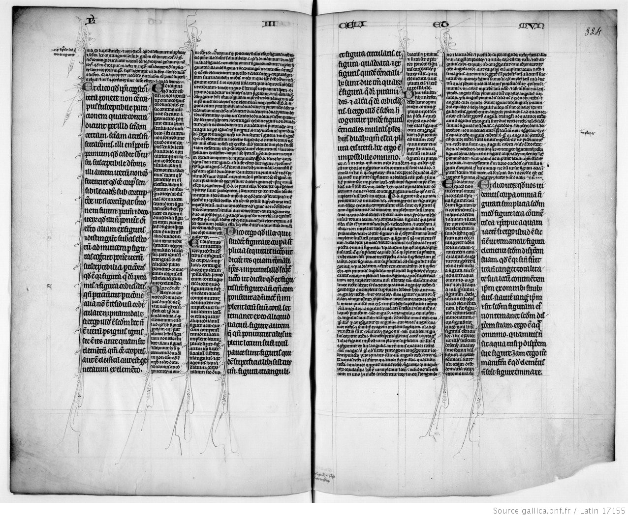
fig. 25. Text and commentary, BNF MS Latin 17155, Bibliothèque Nationale de France, Paris
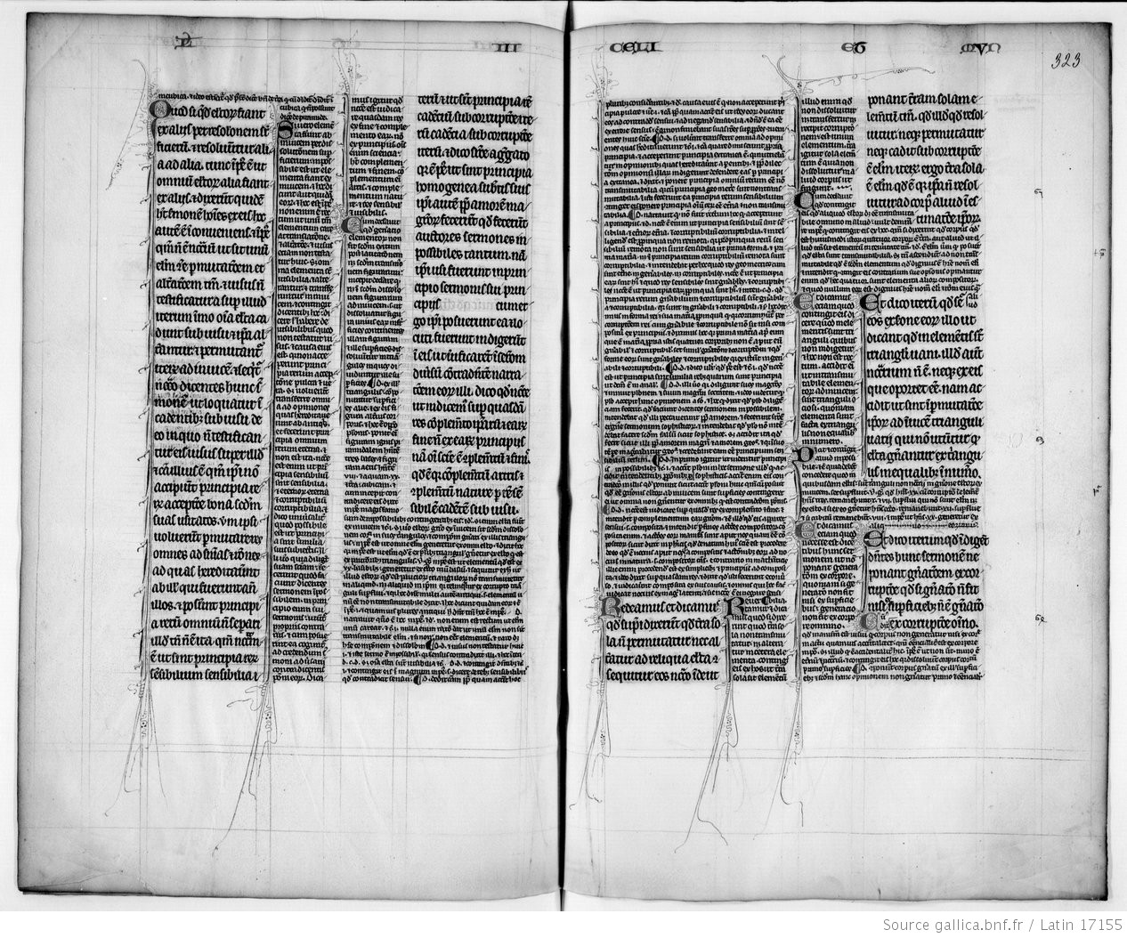
fig. 26. Text and commentary, BNF MS Latin 17155, Bibliothèque Nationale de France, Paris
In the previous work commentaries were abundant, but in this annotated Bible they take over the core text. This was not, however, an unusual practice in Bibles that were made for the purpose of study. Here again, commentaries are placed close to the main text parts that they comment on - the former has half the size as the latter. But we can notice letters in-between these lines, that are even smaller than one line. These are called “gloss”, which served as an implemented vocabulary, to explain the meaning of the words within the text.48
48. Raymond Clemens and Timothy Graham, Introduction to manuscript studies (New York: Cornell University Press, 2007), p. 39.↩︎
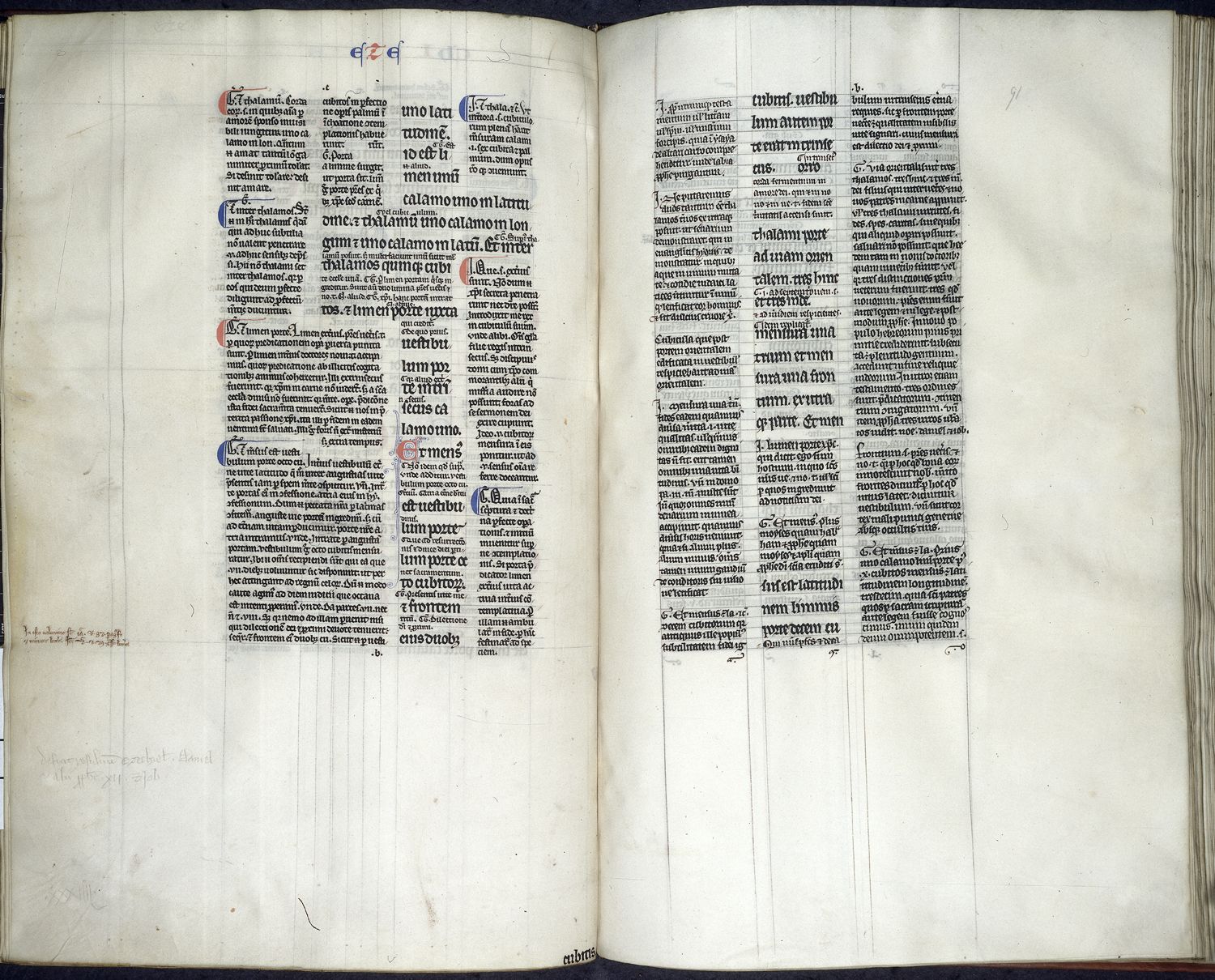
fig. 27. Glossed Text of Ezekiel, Royal 3 E V, fol. 90v-91r, British Library, London
Another copy of Aristoteles’ Physics, produced in the 13th century for Oxford’s scholars, shows a different, more airy and dynamic approach than the previous example. The main text is organised in two columns, written in an elegant Gothic script. Between these lines, tiny letters of gloss explain the meaning of foreign words. On the inside margin we find two more narrow columns, on the outside margin two narrow and one wider column. The commentary is arranged on these, as seen previously, aligned to the position of the reference in the main text. This is written in tiny letters, in a less elaborate, cursive script.
The decorated initials and marginal illustrations - which, in this book, pop up with a reasonable regularity - have another agenda than merely illustrating the text. In the first chapter, in the letter "Q" we see a king. In front of him a crowd including a monk, and in the middle a pile of books thrown into fire. This fire is still being fed by a young boy. Above, a dressed knight is fighting a naked knight. Underneath the text a naked knight with a stupid facial expression is trying to fight a lion. In Medieval symbolic lion stands for courage and nobility, thus we can understand this fight-scene as the struggle of knowledge against dumbness. When turning the leaves further, the illustrations follow these themes: on the next page, in the initial P, a naked man is trying to strangle a beast - a phoenix perhaps, the symbol of renewal and dedication. Or, on folio 22 an astronomer is studying the stars and planets of the sky, in the initial S, but above him a man is pushing a cart with a leprous idiot in it. Apart from the illustrations an intense pen-flourishing forms lions heads and curling dragons around the text throughout the pages. Several fight scenes, references to censorship, clash of knowledge and dumbness, renewal and traditions: this comes as no surprise if we know that the Physica itself evoked quite a controversy among the general public of the 13th century. At the time it had recently been translated into Latin, and during the same century it was banned and publicly burned both in Paris and Oxford.49 Together the elements form an intense, turbulent layout, maybe trying bring the student into a heated mental state, and motivate him to dive into the text, but also warning him: science can be a dangerous venture!
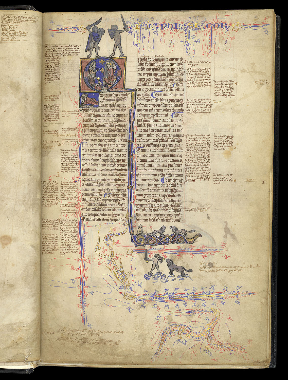
fig. 28. Wisdom against Stupiditiy, BL Harley MS 3487, fol. 4r, British Library, London
49. Michael Camille, Image on the Edge: The Margins of Medieval Art (London: Reaction Books. 1992), p 22.↩︎
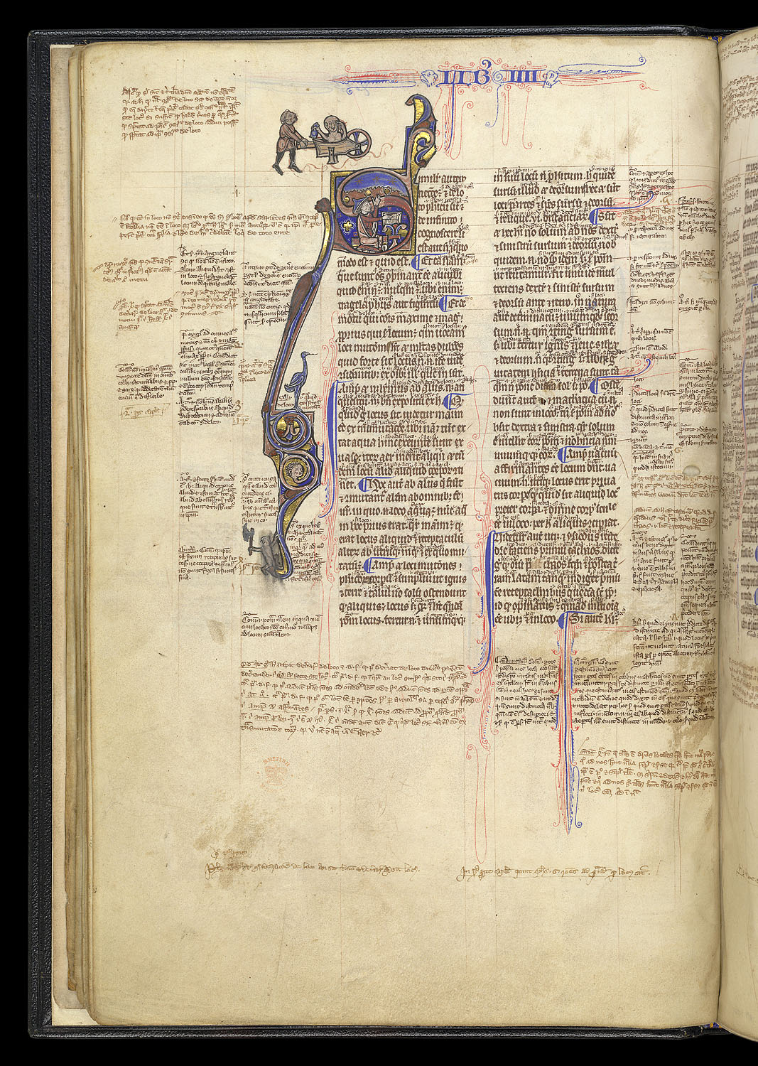
fig. 29. Wisdom against Stupiditiy, BL Harley MS 3487, fol. 22v, British Library, London
Threats did not stop the scholars from engaged reading, and the proof for this is to be discovered among the dragons and annotations. Readers left their own interpretations and markings in the empty spaces - the differences can be identified between different writers in the colour of the ink and the shape of the letters. In fact, the manuscript margin was an inviting surface for the reader to participate in the discourse of the book. In this case, the holes between the annotation-paragraphs worked as an invitation to add to the page. In other cases we find that the grid extended further than the main column of text, all the way to the edge of the page, leaving a prepared place for the reader to interact with the material. Sometimes annotations or translations were not available to the scribe, so he left spaces for these, perhaps with instructions, so that once the missing information was found, it could be added to the book.50 The Medieval page was not a closed work: it was an open question.
50. Raymond Clemens and Timothy Graham, Introduction to manuscript studies (New York: Cornell University Press, 2007), p. 39.↩︎
Ars poetica
Now let me show you a small treasure, dear reader! A book that is pretty mysterious for its design. We are looking at the collected works of Classical Roman poets - Horace, Persius, Theodolus, Cato and Avianus - with annotations, copied in the 12th century. Most parts follow a simple layout, that we could observe before: the main text is displayed in a block, and the notes surround it in one column. But when we get to Horace’s Ars Poetica, something different happens. The main text still runs in the regular manner, but the marginal notations start forming a geometric letter-dance, an early example of concrete poetry if you will. The text is arranged in more or less abstract shapes, compositions of circles, triangles and rectangles, but sometimes even letter-shapes or animals. A different design for each page. Whereas the core text’s authority is preserved by the larger size and line spacing, the frisky margins attract first the attention of the viewer. The margins receive a new kind of importance via the notes displayed in a costume of wit. 51The shapes and compositions do not illustrate the content of the text, and they could be mere decorations. However, we can observe them as a conceptual reflection on the text. Commenting on the Ars Poetica - a poetic statement - the scribe made his own visual statement about the importance play in the visual experience of reading, and about the significance of marginal notes in conversation with the core text.
51. William Schipper, “Textual Varieties in Manuscript Margins” in Signs on the Edge: Space, Text and Margin in Medieval Manuscripts, eds. Sarah Larratt Keefer and Rolf H. Jr. Bemmer (Paris, Leuven, Dudley: Peeters, 2007), p 39.
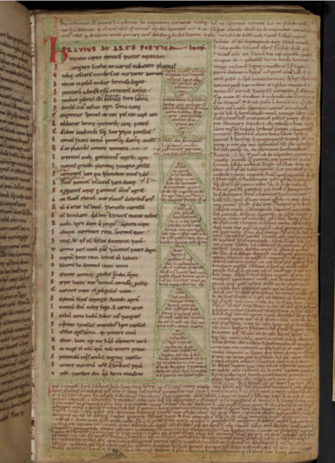
fig. 30. Horace Ars poetica, with annotations, TC O. 3. 57, fol. 21r, Trinity Collage, Cambridge
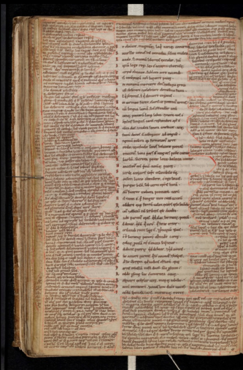
fig. 31. Horace Ars poetica, with annotations, TC O. 3. 57, fol. 21r, 24v, 27v, 33v, Trinity Collage, Cambridge
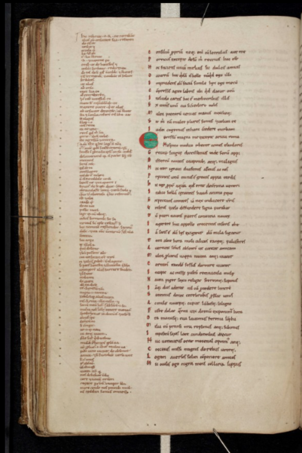
fig. 33. Horace Ars poetica, with annotations, TC O. 3. 57, fol. 27v, Trinity Collage, Cambridge
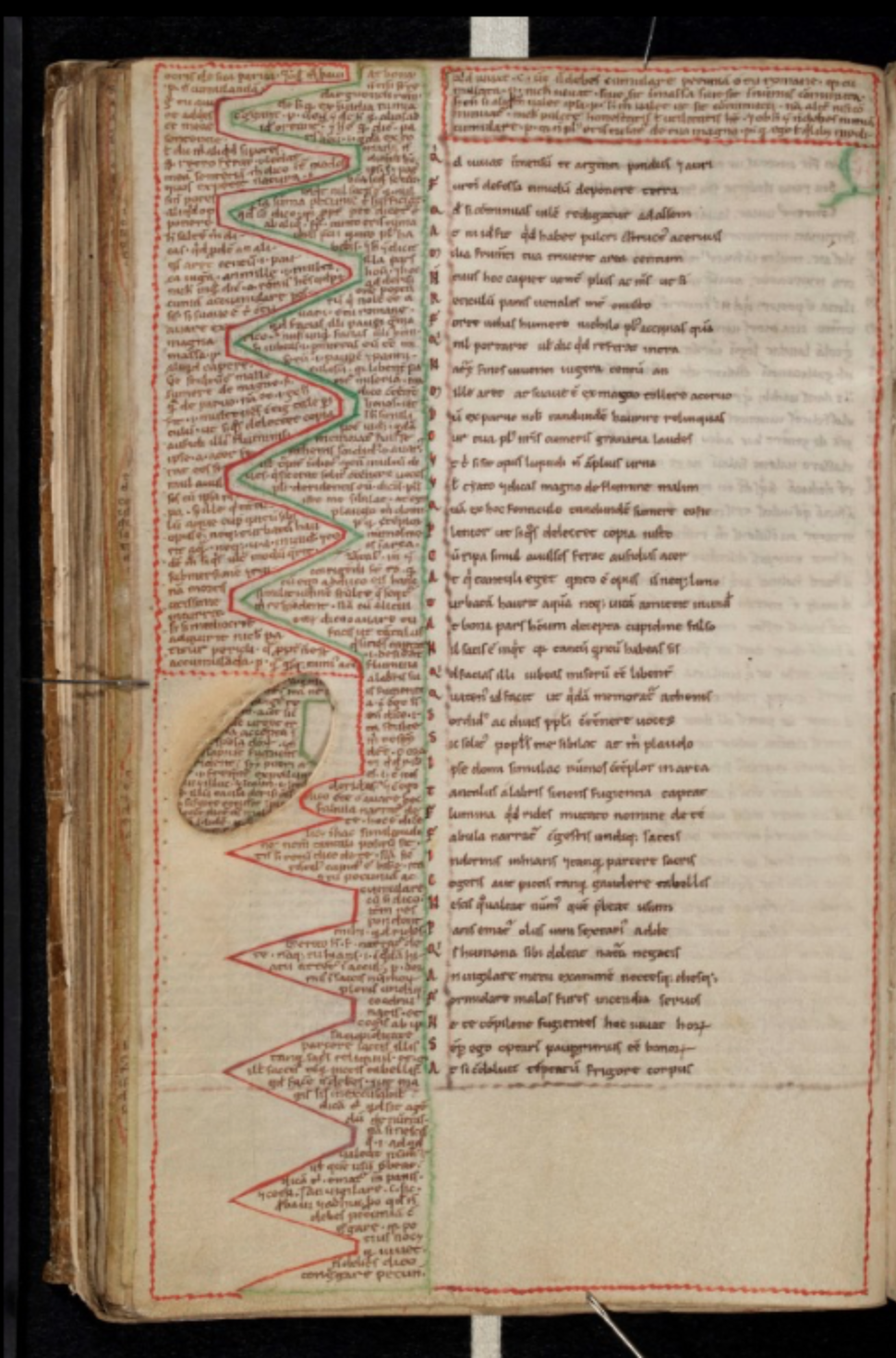
fig. 32. Horace Ars poetica, with annotations, TC O. 3. 57, fol. 24v, Trinity Collage, Cambridge
Shameless Sheets
Leave your prudery behind before you open this book, my fellow. You are holding another prayer book in your hands, but one that asks you to open your mind to a cascade of surreal scenarios, an assemblage of beasts, plants, objects and humans, engaging in unexpected or inglorious activities next to the sacred texts. This Book of Hours, the size of a pocket book. It was made in the 14th century, probably for a woman called Margaret, from Saint-Omer, Northern France, and it is a typical example of Gothic style manuscripts. The holy text is arranged in the middle of the page, in one column. Around, the margins give space to an overwhelming flow of illustrations, which sometimes penetrate the text, through frequent initials and fillers completing short lines. Stylized floral branches surround the text, guide the eye and give platform to the naughty narratives.
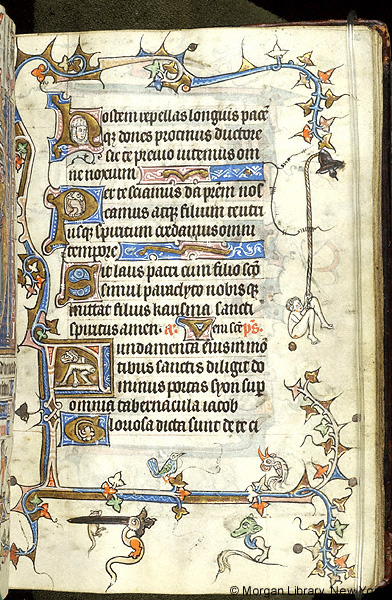
fig. 34. Naked man ringing a bell, MS M 754, fol. 16r, The Morgan Library and Museum, New York
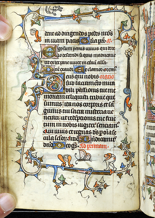
fig. 35. Animals and monsters, MS M 754, fol. 37v, The Morgan Library and Museum, New York
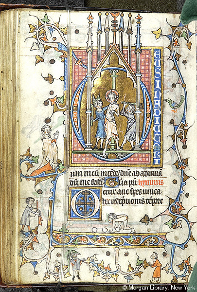
fig. 36. Flagellation of Christ, MS M 754, fol. 65v, The Morgan Library and Museum, New York
On one page we see a bird, a butterfly and a dog, but also two grylli - creatures consisting only of head and legs but no arms - with a monk’s hairstyle, and another gryllus with dog’s head, seemingly hunting for the butterfly. Meanwhil,e a lion-legged tailed bird is chewing on a flower. On yet another page a similar monster is biting on a mouse, next to a dragon-headed hybrid animal. Above them two birds, one of them a rooster sounding his cock-a-doodle-doo. On the outer margin a naked man is ringing a bell while clinging on the rope, and dropping a turd ball. In the initials we see a knight’s head, another hybrid animal and a monkey exposing his anus. Turning to another page we see a central miniature with the flagellation of Christ. Next to this on the margin there is a lady praying - most probably Margaret, the owner of the book, who appears on several folios. Under her a male piper is playing his testicle-shaped instrument, and a naked man rolling eggs or balls of feces, exposing his anus. On the bottom of the page two men stand, one looking like a hunter, other like a monk. Browsing further, we see Christ crucified on the margin. Instead of a grieving crowd we see all the instruments necessary for execution and torture, laid out almost like a do-it-yourself tutorial. The inventory could be continued eternally, since the illustrator made sure that all pages are turned into scenarios reminding us on disturbed dreams. The only question that remains is: why?
The men of the Middle Ages participated in two lives: the official and the carnival life. Two aspects of the world, the serious and the laughing aspect, co-existed in their consciousness. - states the philosopher Mikhail Bakthin.52 These two modes of being were less separated than how we imagine today. They constituted the completeness of life together, through their clashes and contradictions, just as the visual oppositions of holy and profane constitute the Gothic book-page. The Medieval world-image was rigidly structured, and therefore left immense possibilities for critique and ridiculing. In parallel, the solid text column of sacred texts left the margins open for the brush of the illuminator. Margins became the platform where the margins of society and the margins of imagination were represented.53
Fears and desires acquire a form here, everything that was repressed in the other part of the consciousness, will be expressed here. The tools for this are associations, puns, jokes and riddles, just as psychoanalysis described the tools of the mind to express unacceptable content. This also accounts for the unstable nature of the imagery. The core text is written according to standards, copied from one example to the next. So it happened, more or less, with the illuminations included there: an iconographic code defined -more or less - how each scene should be illustrated, and the convention guaranteed the interpretability of the pictures. However, the margins were the places where the illuminator himself re-interpreted, or intentionally mis-interpreted the text. Next to the straight-forward lines of prayers calling for a pious life we see sexuality depicted in the form of a threatening mockery. Grylli, being creatures of a head between two legs, represent lust and desire.54 Birds with sharp and oversized beaks, often threatening the behinds of the characters, provide another mocking reference to sexual aberrations. Being a book created especially for a woman - and at this time women were seen as dangerous creatures who seduce men into lust and ruin, these threats and fears are becoming even more valid. A misspelling or a homonym could be enough to create a grotesque joke. Vernacular sayings and fables were often evoked in associations, and inspired shocking imagery.55
52. Mikhail Bakthin, Rabelais and His World (Indiana: Bloomington, 1984), p 96.↩︎
53. Michael Camille, Image on the Edge: The Margins of Medieval Art (London: Reaction Books. 1992), p 14-16.↩︎
54. David Williams, Deformed Discourse, (Exeter: University of Exeter Press. 1996), p 137-138.↩︎
55. Michael Camille, Image on the Edge: The Margins of Medieval Art (London: Reaction Books. 1992), p 41.↩︎
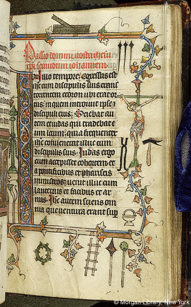
fig. 37. Crucifixion, MS M 754, fol. 105r, The Morgan Library and Museum, New York
This is also the reason why marginal images stay open and resist to interpretation simultaneously. While traditional icons can be deciphered based on convention, Gothic margins create a fluid line of associations and merge elements from long-lost languages and tales. However, they also represent archetypical fears and worries, which still move our imagination. The reason of their presence is ultimately temporary and contextual, but their universal nature recreate their interesting and disturbing character.
56. Michael Camille, Image on the Edge: The Margins of Medieval Art (London: Reaction Books. 1992), p 53.↩︎
And where is the place of the reader on the gothic page? Quite explicitly, there on the margins, where we also see Margaret represented, among all the monsters, lunatics and sodomists. Whereas today we tend to see ourselves in the middle of the world and in the centre of representation, the people lin the Middle Ages saw themselves at the edge, [as] the last agening dregs of a falling off of humanity, the dissipated end of a Golden Age eagerly awaiting the Last Judgement. Everything was worse not better, everything was mere imago, or would be until that great sorting-out at the end of time.56Being a nobleman did not help too much - every living being on earth was part of this mess, which is, once before the great split between high an low culture is honestly represented next to the divine. It is not a merger, that is created here, but a conversing clash, an almost-exploding tension, that has the potential to truly represent the human condition, so that it works as a slap in the face, even from after seven hundred years.
Language of the Flowers
In the Low Countries, around the end of the 14th century, a different kind of flowered border appeared. In the previous decades, floral images were already used to decorate margins of prayer books, these especially based on a interwoven network of stylised grape vines; in-between which other plants, animals, humans or monsters were placed. In these Dutch floral margins, however, the flowers were plucked from their stems, and scattered around the illuminated area; often on a gold or coloured background.57 We can observe a strive for realistic depiction and shadows creating a notion of space. It is important to know, that flowers were crucial parts of the religious practice by the time. Picking flowers itself was considered to be a way of meditation. Furthermore, flowers were displayed in vases, and even more often scattered around the altar, around relics or sculptures. Furthermore, the rosary was an essential part of devotion, where sections of beads or flowers represented certain prayers.
Scattered flowers typically appear in books containing religious texts, for instance in the Book of Hours: books that contained prayers for the specific times of the year, and the specific hours of the day. These books were at the same time devotional objects, and tools to evoke the sense of time in the framework of the Catholic ritual. Next to the fact that they contained information, they were tools for adoration. In this, the flower borders play a great role on several levels.
57. Celia Fisher. Flowers in Medieval Manuscripts. (London: The British Library, 2004), p. 17.↩︎
Open up, for instance, the Hastings Hours, a prayer book commissioned by the Hastings family around 1480. We are looking at the pages where the Hours of the Virgin begin: these are the prayers dedicated to Holy Mary. On the left we see an illumination of the Annunciation, where Mary is told by Angel Gabriel that he will bear a child. The dove above her represents the spirit of Christ descending to the Virgin. The page is surrounded by a great variety of flowers, the most prominent of which are carnation and wild roses. Further on we discover borage, forget-me-not, speedwell and daisies. Roses, daisies, wild roses are commonly considered as the symbol of Virgin Mary.
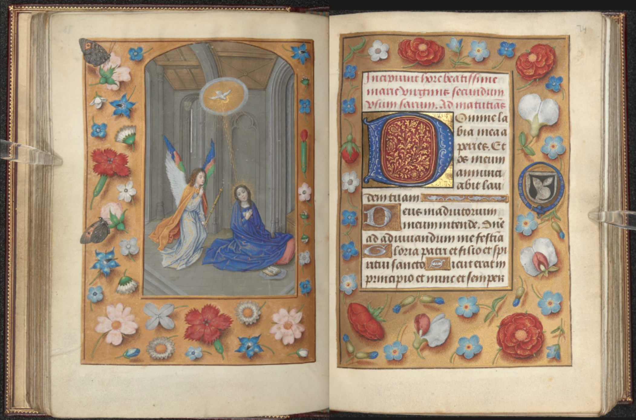
fig. 38. Annunciation, MS 54782, fol, 73v-73r, British Library
58. Anne Margareet W. As-Vijwers, “Bloemen van betekenis. De interpretatie van de randversiering in Zuid-Nederlandse handschriften rond 1500,” in De Groene Middeleeuwen: Duizend jaar gebruik van planten, eds. Linda Ijpelaar and Claudine A. Chavannes-Mazel (Eindhoven: Lecturis, 2015), p 252.↩︎
Interestingly, in the upper corner we see a butterfly landing on the rose, with its wings rhyming to the manner in which the angel landed next to Mary. On the other hand, clove pink or carnatio - in latin carnatio - literally means descension of the body. Besides, the other hand, it’s Greek name is dianthus, which means God’s flower, and was widely understood as the symbol of Christ. When in buds, cloves resemble nails, and because of this they were also associated with the crucifixion. The small blue and white flowers seem to be the reflections of the robes of the two characters in the image. On the opposite page the prayer begins, and a similar selection of flowers is visible. However, here the roses are red, and pea flowers are added instead of the carnation - these also refer to Christ. 58
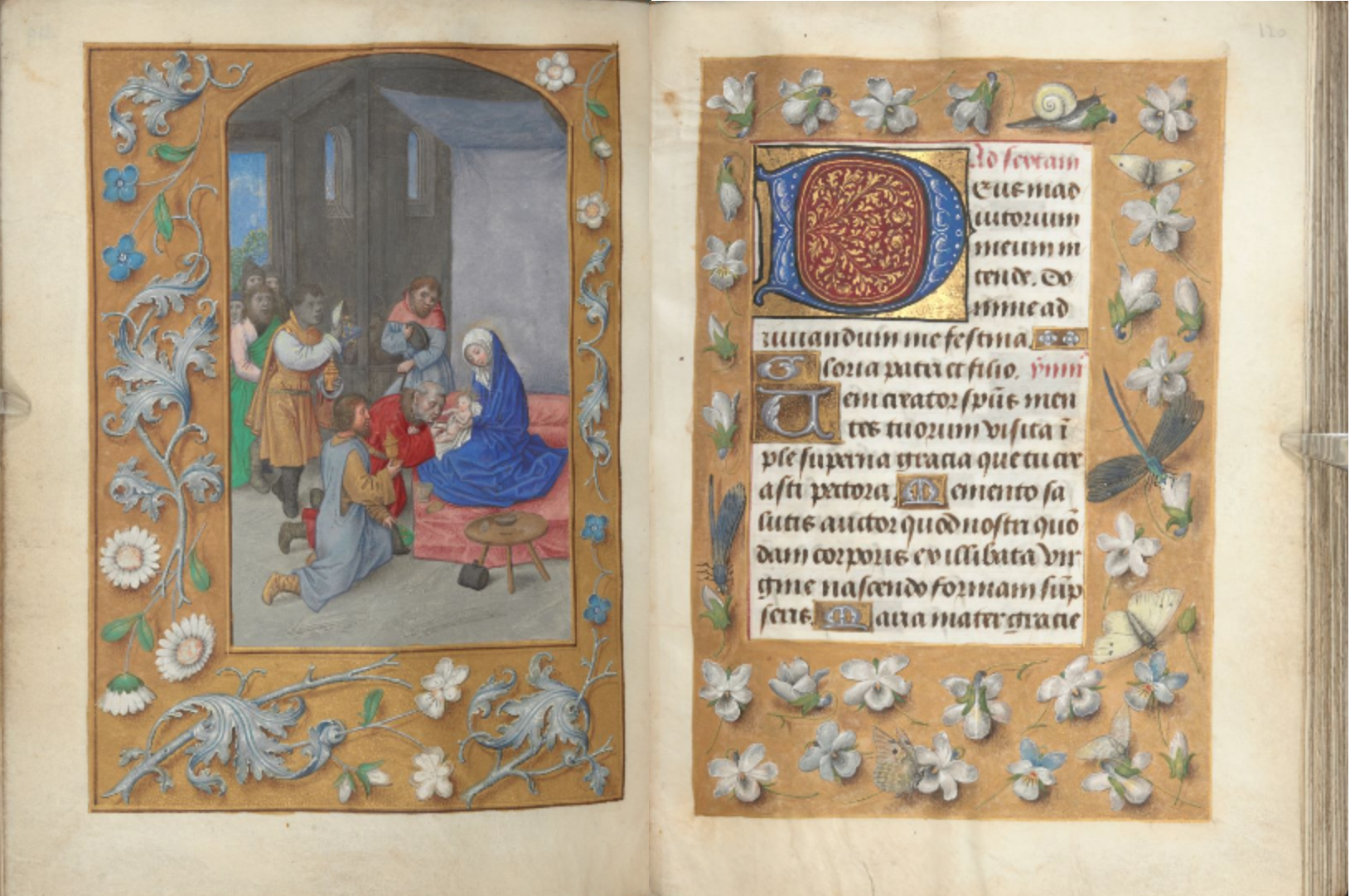
fig. 39. Adoration of the Magi, MS 54782, fol, 119v-120r, British Library, London
Another page further, still amongst the prayers to Holy Mary, we find the adoration of the Magi. In this scene the three Eastern Kings come to visit the Holy Child. The image is surrounded by tiny white flowers, like daisies - for Mary - strawberry flowers - for Christ - and heartsease, which, for its low growth is associated with humbleness and serenity, a characteristic of the Magi, who come to greet the new-born.59 The opposite page, where the text begins, is only filled with white heartsease. In this page almost all plants are white, evoking a sense of purity and delight. The symbolic meaning of plants came from various sources: often they were inherited from Classical tradition, and adapted to Christianity. Often the name implied the signification, which could be both the Greek, Latin or vernacular. But meaning was often derived from the form or habit of the plant, or its role in the folklore. This means, that a perfect explanation of flower-symbolism is very hard to make, since connotation altered according to regions.
59. Anne Margareet W. As-Vijwers, “Bloemen van betekenis. De interpretatie van de randversiering in Zuid-Nederlandse handschriften rond 1500,” in De Groene Middeleeuwen: Duizend jaar gebruik van planten, eds. Linda Ijpelaar and Claudine A. Chavannes-Mazel (Eindhoven: Lecturis, 2015), p 252.↩︎
60. Anne Margareet W. As-Vijwers, “Bloemen van betekenis. De interpretatie van de randversiering in Zuid-Nederlandse handschriften rond 1500,” in De Groene Middeleeuwen: Duizend jaar gebruik van planten, eds. Linda Ijpelaar and Claudine A. Chavannes-Mazel (Eindhoven: Lecturis, 2015), p 259.↩︎
We can conclude that flower decorations were integrated parts of the design concept. Through symbolism they supported the content of the text, through their reference to the physical ritual they invoked the real-life experience. They built a connection between book, ritual, and other objects used in devotional practices, like the rosary. Last but not least, through their aesthetic value and detail they facilitated the sense of wonder and adoration.60
Layers of meaning
I showed you details, we looked at pages and spreads, and the last thing I would like to introduce you to is a complete book. Not a simple “reading machine” as introduced to us by the Gutenberg-era, but a multi-layered, multi-functional object, offering a number of narratives and entry-points to the reader. It is a volume of the Cronica Maiora written the 13th century by Matthew Paris, a Benedictine monk, who lived and worked at the Abbey of St. Albans, a day of walking distance away from London. In his series of chronicle books he was noted down historical events, but as we will see, he did much more.
When we open up the codex, on the first folio we see see a rota, a circular diagram of winds, without any further explanation. On the following page a map starts, but an unconventional one. We see two strips per page, where drawings of castles are connected with lines. The castles stand for cities and settlements, the routes connecting them are marked with the time necessary to make the distance on foot. The first castle is London, the last is Rege (today Reggio Emilia) four pages later. On the opposite page the route continues, but the layout changes. We still see one and half column on the left hand-side, and several borderlines, but the space opens, and the journey becomes less straight-forward. Between the castles more texts appear, running both horizontally and vertically. On top we find a fold-out flap, which is divided by a water with boats, and it shows Sicily. On the right we find another flap, which is the holy city of Rome. On the back side of this page, on the flaps we find descriptions of the latter two, as if they would serve as transit zones to what comes next.
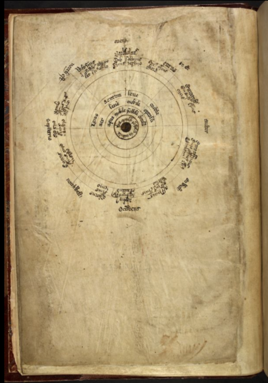
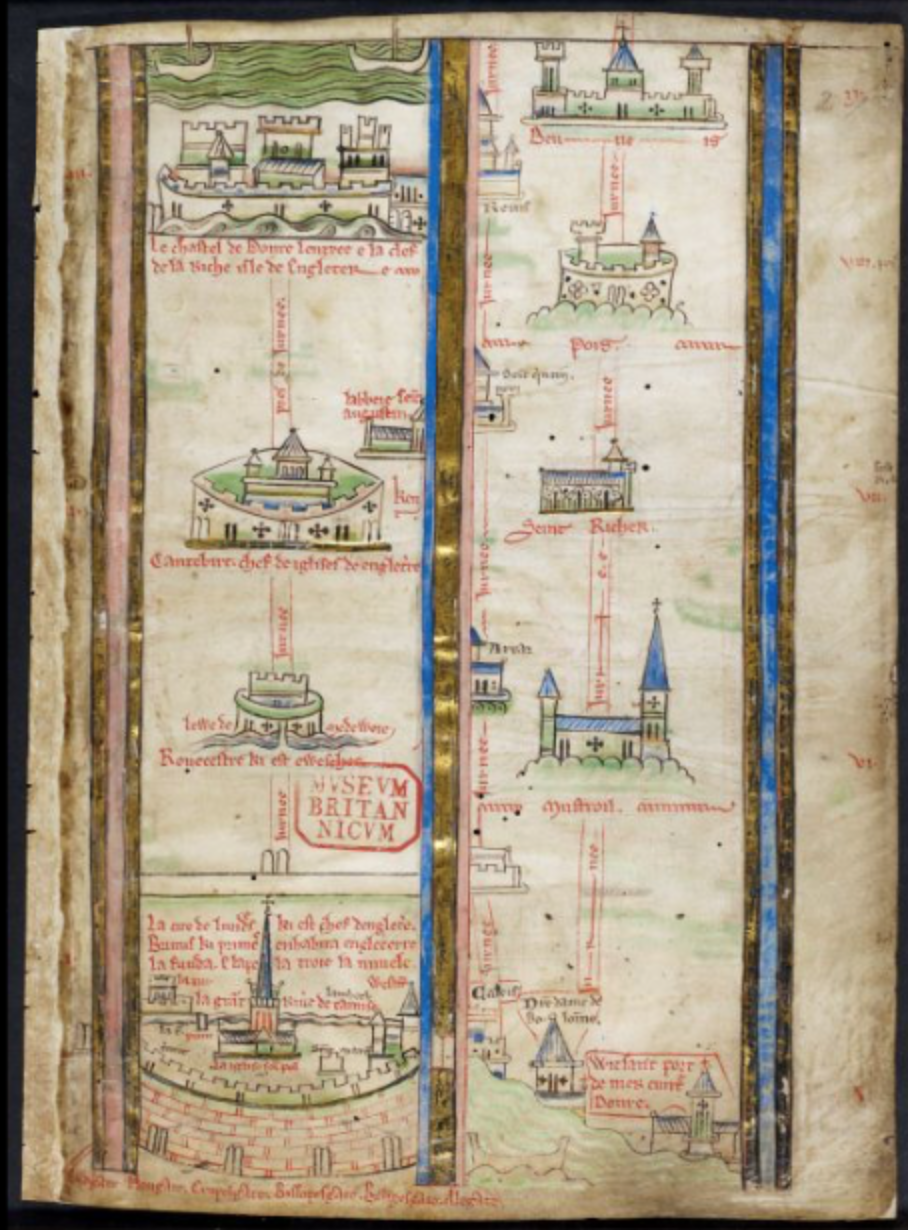
fig. 40. Wind diagram, Royal MS 14 C VII, fol 1v, British Library, London
fig. 41. Starting of the pilgrimage, Royal MS 14 C VII, fol 2r, British Library, London
The map dissolves into a territory where distances are not marked anymore, but stories and descriptions are numerous. Among the castles we see borders, like city-walls, and other drawings like hills, ships, a camel and even a crocodile. On the upper right side of the spread - in the golden section - we see the sacred city: Jerusalem. Here our journey ends, and the next pages show us a more geographically oriented map of the British Isles, a portray of Holy Mary with the Child - and outside the frame Matthew Paris himself praying to them - various calendars, portraits of kings, after which the chronicles start. This latter is almost pure text organised in two columns, with initials, rubrication, markings notations - also by readers. One of the few drawings, on folio 218v shows Matthew Paris himself - again - this time sitting on his deathbed, writing his books. Another fine montage of hardly understandable things, you may think now, but listen!
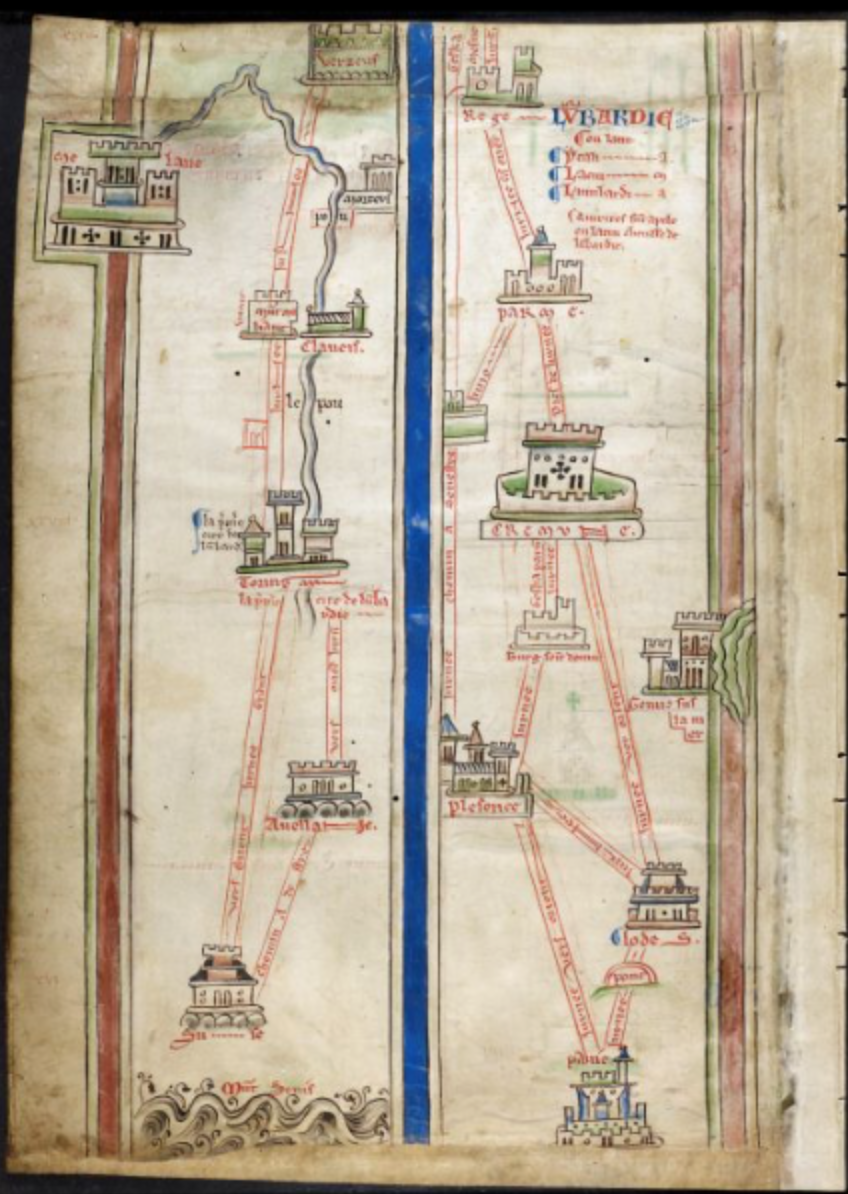
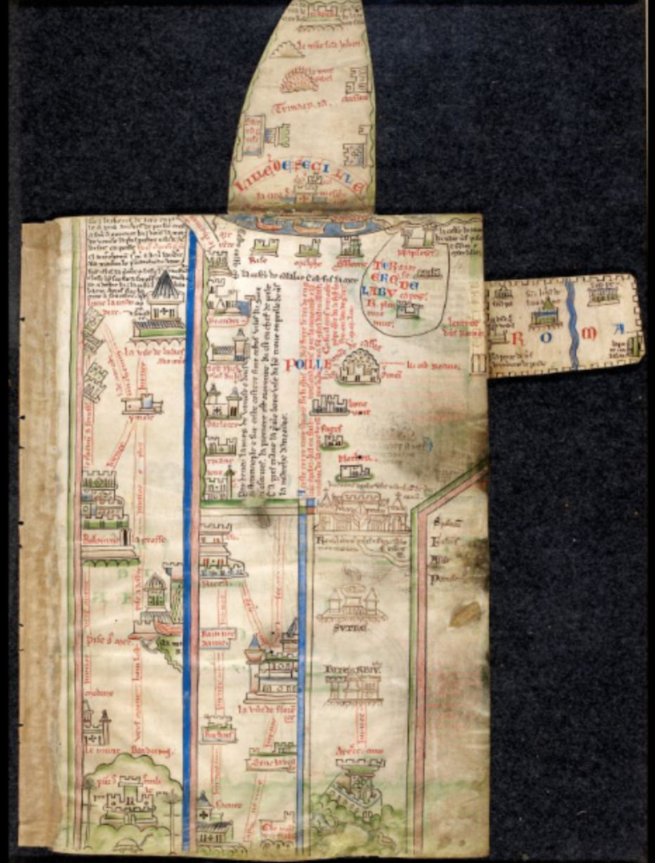
fig. 42. Route map, Royal MS 14 C VII, fol. 3v, British Library, London
fig. 43. Map with flaps, Royal MS 14 C VII, fol. 4r, British Library, London
The map in the front of the book shows a journey from London to Jerusalem. You may still remember, that the end 13th century was the time of the great pilgrimages. It is after the Sixth Crusade, and Jerusalem came under christian rule. Just as the crusades - almost every decade - pilgrimages to sacred places were advertised by the church, and probably every believer in Europe was longing to visit the marvellous cathedrals of Rome, but above all the Holy Land. In St. Albans, which itself was a pilgrim-destination, probably the idea of the sacred journey was a “hot topic”. But the church did not entirely stand behind the idea of the pilgrimage: although the strive for spiritual growth was highly appreciated, such a long journey was a costly venture, and monasteries needed their monks to do the daily jobs there. Therefore the concept of the imagined pilgrimage was invented, a sort of meditation where the monks go through the routes of the pilgrim in their fantasy.61 Let’s place the Cronica Maiora, especially the map parts, in this context.
61. Daniel K. Connolly, The Maps of Matthew Paris (Woodbridge: The Boydell Press, 2009), p 28.↩︎
The book opens with the wind diagram on the first page, laying on the table in front of the monk. This circle reminds us of a compass or similar tools used by the traveller. Turning the leaf, the journey begins. On the bottom of the page, closest to the body of the reader, we see London, drawn from a perspective as would be visible to a traveller from St. Albans. On the fourth day we reach the top of the page, which is Dover and the passage to Mainland Europe. Not just a drawing of the sea, but the spatial arrangement reinforces the sense of the passage: namely that one has to move to the next column. When arriving there, the reader continues walking with the eye and with the imagination, from bottom to up on the page, from close to the body towards further away. Obstacles, like rivers and hills are intentionally placed on page borders, so that physical interaction is required to overcome them. To Rome - the sub-destination of our journey - we can enter through flipping out the attached flap, and so we need to do when we want to cross the Mediterranean at the coasts of Sicily. Through these physical gestures the map becomes a complex meditational tool, which involves several senses in the journey:
the canal-like visual representation channels the path of the sight, and of the thought, recitation feeds the ears, whereas spacial manipulation of the pages invokes the sense of movement.62
62. Daniel K. Connolly, The Maps of Matthew Paris (Woodbridge: The Boydell Press, 2009), p 55.↩︎
The further we arrive, the less certain the route becomes, and while losing its geographical reliability, it gets filled with stories about those faraway places, introducing another level of ecstasy. A large part of the page is occupied by the city of Acre, which was the centre of the Crusader Kingdom, basically the main Christian city of the Middle East, from which Crusaders could advance to Jerusalem. Experiences of saints and biblical cities appear: we see the river Jordan, flowing from Mount Hermon to the Dead Sea, we discover Betlehem with a star shining above it. It is now easier to get lost, but there is also more to discover and to gain. Any way we may take, it will be quirky and hard, but finally we arrive to Jerusalem: a stronghold with several cathedrals, and the holy sepulchre. But careful! If we go too far, we may encounter greater dangers, as the crocodile on the edge symbolically warns us…
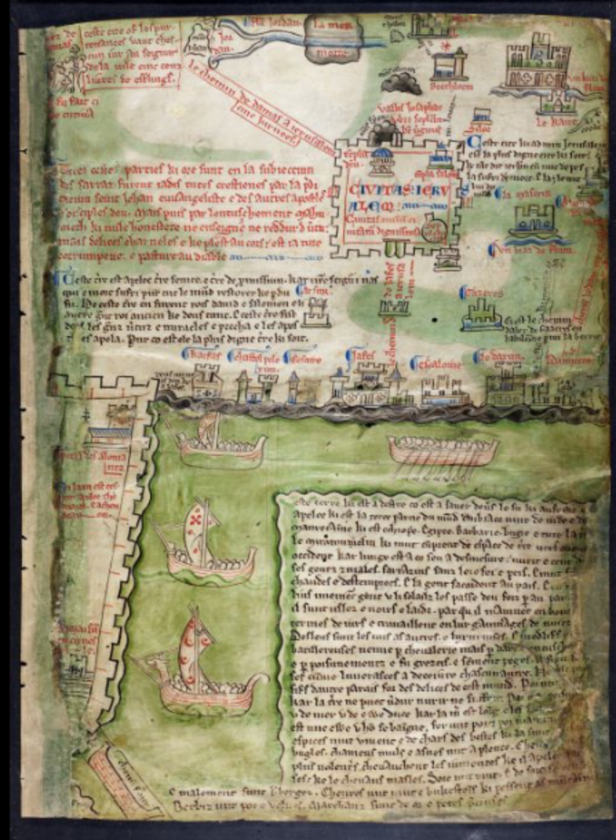
fig. 44. The Holy Land, Royal MS 14 C VII, fol. 5r, British Library, London
Daniel K. Connolly, The Maps of Matthew Paris (Woodbridge: The Boydell Press, 2009), p NO.↩︎
fig. 45. Chronicles, Royal MS 14 C VII, fol. 9v, British Library, London
After the maps, the practical and historical part begins, which has seemingly nothing to do with the imagined pilgrimage. However, curiously, the most popular pilgrimage paths coincided with the most important trading routes and military trails.39 Big cities were also the influential economical centres, and the rulers who took their people to conquest the Holy Land were just as well dictating world politics. Thus, the map does not only serve devotional goals, but also provides an overview of the sites discussed in the second part of the book. We see once again, that life was - as it is today - ultimately interrelated. Personal and political, spiritual and profane aspects were inseparably entangled. This complexity is clearly communicated in a book, that in change, becomes a multifunctional object, and a carrier of numerous narratives.
Coming to an end
Our time together, dear Reader, is about to run out. Let’s take a moment to re-think what we saw, and draw some conclusions. First we looked at details of the design that help to make the content accessible. We have seen capitals that structure the text visually, help the memory, tell stories or make references. Images that summarise texts pictorially. Diagrams that create image from the text, facilitate interaction or work as tools. Metaphors that bring universal topics to a human scale. Afterwards we studied how the elements of the page create meaning together. We observed how text was organised into structures, and we discovered how notes and images were attached with a notion of intuitive clarity. We witnessed how the book became a platform for discourse, how humour had a great role in image-making, how sacred and profane met and clashed to form a new reality. How images, text and decoration formed a multi-layered narrative. Finally we analysed a codex, which exemplified how careful editing and design can turn a book into a multi-functional object. It does not only carry information but tells stories on several levels from personal meditation to world politics.
We may recall the example of the Herbal, where images and text formed an organic, intelligible unity through the placement of images and text. There was no reference system necessary to link the corresponding parts; this was solved through the playful dynamic of the layout. The same could be observed with large amounts of texts and interrelated notations in other examples. Interestingly, this graphical clarity was lost after the invention of printing, exactly in the time period when the amount of knowledge boomed, and these methods could have well been used to keep information approachable. However, the limitations of the printing press gave birth to another way of organising information: displaying text in a dense, linear order, with complex systems of referencing and strictly divided imagery. Although this was necessary due to the technology, namely that the moving type had to be set in rectangular blocks, and images could be added separately, mostly on rectangular plates of etching or woodcut. What was initially a technical boundary, soon became the indicator of authority. Serious texts - be scientific, literary or other - had to be displayed in the given dry, neutral and linear format, otherwise their legitimacy was questioned. While the Medieval page stood open for interpretation, discourse and different levels of engagement, the modern text formed authoritative units, which only pre-determines how it should be approached. Even though the book became available to larger amounts of people than ever before, these books were also produced for a select group of readers, which was defined through their form. The new, uniform layouts facilitated linear, one-direction reading and thinking. The reader was, more or less, banned from inside of the content. The inviting margins disappeared, and because the book ceased to be a public object. Any addition or reaction intended, had to come as a new work. From this an endless proliferation of texts follow, more-or-less interrelated in the content, but ultimately separated by the format, which paved the route to specialisation and fragmentation of the information.
Or may we look back at the floral margins of the 15th century. We observed how the narrative told through images was interlaced with the layers of text, and how this was completed by the symbolism of marginal decorations. In these books stories were told, spiritual practices were tought. Through the invokative references to real life rituals they became experiences, vehicles for devotion. Considering this, floral margins were conceptually integrated parts of the content. Plants as decorative elements did make it to the Gutenberg-era. They were kept to embellish margins and borders in the coming centuries. However, their adaptation to the printing press did something drastic to them.
Whereas in manuscripts plants were carefully chosen and crafted each time they appeared, in the printed book they had to be mass-produced alongside with the letters. The images were simplified, stylised and struck into metal to create movable, mass-producible units. Matching flowers to the content would have been too costly of a venture, but the tradition of having some plants here-and-there seemed to be a nice and friendly idea. Thus floral borders were kept for mere decorative purposes, and the same fate reached the decorated initials. Evidently, deprived from their conceptual function, they were emptied from their meanings, and gradually became obsolete, dated, and finally kitsch.
From this we see, in accordance with McLuhan’s theory, how media can alter the content of communication and influence the way thoughts, and through this societies are structured. All media provides us with different possibilities, and with different trade-offs in return. Before we realise, we tend to fall into these traps, and let our vehicles decide where we drive instead of holding the steering wheel ourselves. This is especially probable when we do not fully understand yet how the medium works. Thus it should sound an ever-ringing alarm-bell for the designer in the age of media-proliferation.
Since the mind-hand-paper axis is the most direct one we can imagine, Medieval manuscripts call attention to a number of instinctive techniques of organising knowledge. They also reflect inherent values of visual communication, that are still - or more than ever - relevant to graphic designers. These are best summarised as the visual layering of story-telling. Multi-layered visual narratives provide several entry-points, and allow various audiences to engage with the design on - their own - different levels. They give opportunities to show a topic from several aspects, and connect these. Consequently, they initiate discourse, and remain open for new readings. A multi-layered narrative shall stay open for interpretations, evoke curiosity, and thus stand as a Reclaiming of Wanderlust. Nevertheless, since the integrated totality of the elements is always more than the sum of these, without interconnecting the elements, messages remain fragmented. As designers, it is our responsibility to remember: the way we tell stories defines what stories are being told.
Bibliography
As-Vijwers, Anne Margareet W. “Bloemen van betekenis: De interpretatie van de randversiering in Zuid-Nederlandse handschriften rond 1500.” In De Groene Middeleeuwen: Duizend jaar gebruik van planten, edited by Linda Ijpelaar and Claudine A. Chavannes-Mazel, (p. 248—259.) Eindhoven: Lecturis, 2015.
Badke, David. The Medieval Bestiary. The Dragon. http://bestiary.ca/beasts/beast262.htm. Accessed 07. 12. 2017.
Badke, David. The Medieval Bestiary. The Salamander. http://bestiary.ca/beasts/beast276.htm.Accessed 07. 12. 2017.
Bakthin, Mikhail. Rabelais and His World. Indiana: Bloomington, 1984.
Camille, Michael. Image on the Edge: The Margins of Medieval Art. London: Reaction Books. 1992.
Clemens, Raymond and Graham, Timothy. Introduction to manuscript studies. New York: Cornell University Press, 2007.
Connolly, Daniel K. The Maps of Matthew Paris. Woodbridge: The Boydell Press, 2009.
Deleuze, G. and Guattari, F. Capitalism & Schizophrenia: A Thousand Plateaus. London : The Athlone Press, 1988.
Eco, Umberto. Art and Beauty in the Middle Ages. New Haven, London: Yale Press, 1986.
Eco, Umberto. Serendipities: Language and Lunacy. London: Weidenfeld & Nicolson, 1999.
Fisher, Celia. Flowers in Medieval Manuscripts. London: The British Library, 2004.
Foucault, Michel. The Order of Things. London: Routledge, 1989.
Galloway, Alexander R. The Interface Effect. Cambridge: Polity Press, 2012.
Givens, Jean A. “Reading and Writing the Illustrated Tractatus de herbis, 1280-1526”. In Visualizing Medieval Medicine and Natural History 1200-1550, edited by Jean A. Givens, Karen M Reeds and Alain Touwaide. (p. 115—146.) Vermont: Ashgate, 2006.
Gombrich, Ernst H. The Story of Art. New York, London: Phaidon, 2006.
Higton, Hester. “Instruments and Illustration: The Use of Images in Edmund Gunter’s De Sectore et Ratio”. In Observing the World through Images: Diagrams and Figures in the Early Modern Arts and Sciences, edited by Nicholas Jardine and Isla Fay. (p. 180—200.) Leiden: Brill, 2013.
Kleine, Naomi. Maps of Medieval Thought: The Hereford Paradigm. Woodbridge: The Boydell Press, 2001.
McLuhan, Marshall. The Gutenberg Galaxy. Toronto: University of Toronto Press, 2011.
McLuhan, Marshall. The Medium is the Message. London: Penguin Books, 1996.
Murdoch, John E. Album of Science I: Antiquity and the Middle Ages. New York: Scribners, 1984.
Murray Jones, Peter. “Image, Word and Medicine in the Middle Ages”. In Visualizing Medieval Medicine and Natural History 1200-1550, edited by Jean A. Givens, Karen M Reeds and Alain Touwaide. (p. 1—24.) Vermont: Ashgate. 2006.
Williams, David. Deformed Discourse, Exeter: University of Exeter Press. 1996.
Page, Sophie. Astrology in Medieval Manuscripts. London: The British Library, 2017.
“Psalter van Eleonore van Aquitanie” Koninklijke Bibliotheek Den Haag: Middeleeuwse Handschriften. Accessed 17. 12. 2017. https://www.kb.nl/themas/middeleeuwse-handschriften/psalter-van-eleonora-van-aquitanie-ca-1185
Schipper, William. “Textual Varieties in Manuscript Margins” In Signs on the Edge: Space, Text and Margin in Medieval Manuscripts, edited by Sarah Larratt Keefer and Rolf H. Jr. (p. 25—56.) Paris, Leuven, Dudley: Peeters, 2007.
Sources of images
fig. 1. Herri met de Bles: Paradijs, ca. 1541, oil painting on wood, Rijksmuseum, Amsterdam
fig. 2. Mappamundi, Codice Num 1. fol 35 v-36 r. Biblioteca de la Catedral del Burgo de Osma-Soria, Osma-Soria
fig. 2. Library, M 429 fol 4 r. The Morgan Library, New York
fig. 4. Teacher and her diagram tree, BL Burney MS 275, fol. 166r, British Library, London
fig. 5. Jonas in the fish, KW 76 F 13, fol. 88r, Koninklijke Bibliotheek, The Hague
fig. 6. Salamandra, Aberdeen MS 24, fol. 70r, Aberdeen University Library, Aberdeen
fig. 7. Dragon, Aberdeen MS 24, fol. 65v, Aberdeen University Library, Aberdeen
fig. 8. Devil and Christ, Annunciation, Add MS 47682, fol. 11v, British Library, London
fig. 9. Aristotelian virtues against the devil, St. Peter perg. 92, fol. 7r, Badische Landesbibliotheek, Karlsruhe
fig. 10. Syllogism, BL Burney MS 275, fol. 193r, British Library, London
fig. 11. Syllogism in text, BL Burney MS 275, fol. 287r, British Library, London
fig. 12. Volvelle, Chetham's MS Mun.A.4.99, fol. 1v, Chetham's Library, Manchester
fig. 13. Zodiac Man, BL Harley MS 5311, fol. 5v, British Library, London
fig. 14. Guidonian hand, MS D75, fol. 6r, Biblioteca Ambrosiana, Milan
fig. 15. Marking with an octopus, BANC MS UCB 085, fol. 1v, Bancroft Library, Berkerly
fig. 16. Dragon-hand, Royal MS 12 E.XXV, fol 23 r., British Library, London
fig. 17. Does that ring a bell? Royal MS 14 C VII, fol. 94 r., British Library, London
fig. 18. Little hand, Harley MS 3487, fol. 105r, British Library, London
fig. 19. Scribble with strange hand, Add MS 38818, fol 72r, British Library, London
fig. 20. Hand in toga, Français 12584, fol. 37v, Bibliothèque Nationale de France, Paris
fig. 21. Plants and texts, Egerton MS 747, fol. 7v, British Library, London
fig. 22. Plants and texts, Egerton MS 747, fol. 16v, British Library, London
fig. 23. Plants and texts, Egerton MS 747, fol. 58v, British Library, London
fig. 24. Plants and texts, Egerton MS 747, fol. 88r, British Library, London
fig. 25. Text and commentary, BNF MS Latin 17155, Bibliothèque Nationale de France, Paris
fig. 26. Text and commentary, BNF MS Latin 17155, Bibliothèque Nationale de France, Paris
fig. 27. Glossed Text of Ezekiel, Royal 3 E V, fol. 90v-91r, British Library, London
fig. 28. Wisdom against Stupiditiy, BL Harley MS 3487, fol. 4r, British Library, London
fig. 29. Wisdom against Stupiditiy, BL Harley MS 3487, fol. 22v, British Library, London
fig. 30. Horace Ars poetica, with annotations, TC O. 3. 57, fol. 21r, Trinity Collage, Cambridge
fig. 31. Horace Ars poetica, with annotations, TC O. 3. 57, fol. 21r, 24v, 27v, 33v, Trinity Collage, Cambridge
fig. 32. Horace Ars poetica, with annotations, TC O. 3. 57, fol. 24v, Trinity Collage, Cambridge
fig. 33. Horace Ars poetica, with annotations, TC O. 3. 57, fol. 27v, Trinity Collage, Cambridge
fig. 34. Naked man ringing a bell, MS M 754, fol. 16r, The Morgan Library and Museum, New York
fig. 35. Animals and monsters, MS M 754, fol. 37v, The Morgan Library and Museum, New York
fig. 36. Flagellation of Christ, MS M 754, fol. 65v, The Morgan Library and Museum, New York
fig. 37. Crucifixion, MS M 754, fol. 105r, The Morgan Library and Museum, New York
fig. 38. Annunciation, MS 54782, fol, 73v-73r, British Library
fig. 39. Adoration of the Magi, MS 54782, fol, 119v-120r, British Library, London
fig. 40. Wind diagram, Royal MS 14 C VII, fol 1v, British Library, London
fig. 41. Starting of the pilgrimage, Royal MS 14 C VII, fol 2r, British Library, London
fig. 42. Route map, Royal MS 14 C VII, fol. 3v, British Library, London
fig. 43. Map with flaps, Royal MS 14 C VII, fol. 4r, British Library, London
fig. 44. The Holy Land, Royal MS 14 C VII, fol. 5r, British Library, London
fig. 45. Chronicles, Royal MS 14 C VII, fol. 9v, British Library, London