— Introduction —
Graphic design is the practice of connecting people with information, solving visual problems through academic and visual research by critical thought. A designer may employ myriad skills and techniques, while incorporating a collected body of knowledge both design and life related. A designer should not separate the two, they are inseparable. The 20th century definition of a graphic designer no longer applies. A graphic designer today can no longer hide behind the mask of traditional design. He has to adapt his profession, skills and mentality to the potential needs of society within a larger context. A graphic designer is someone who needs to think strategically, critically and beyond established habits. Providing an interdisciplinary perspective influences the design practice. The graphic designer is an agent of change in a rapidly developing practice.
Typography is simply understood as the art and technique of arranging letters. The legibility of information is central to the work and skills of a designer to communicate information. Technological advancement was the cause of a more rapid information exchange. During the digitalization of the profession, typography and graphic design made a demanding shift from an analogue to a digitalized form. The digitalization of typography created possibilities for interactive communication. Motion and speed became an important factor in the typographic practice. Migrating analogue typography to the digital created a new perspective. The migration questioned the presence of letters in the new digital media. The acknowledgement within the typographic practice to change direction in order to fit typography into multiple media sizes demanded a change in designing typefaces. However, digital typography remained mostly a two-dimensional representation of information on a screen. Futuristic advancement, such as virtual reality glasses, carefully suggests that digital typography could shift from a two-dimensional to a three-dimensional perspective.
Today, the rapid development of various three-dimensional software makes it easier for designers to work within a three-dimensional atmosphere. A three-dimensional representation of information could have a huge impact on the role of typography and communication in the design practice. Successful alteration of typography in order to answer to a three-dimensional environment could potentially be found within the acquisition of a different perspective. The layeblue perspective of a “parallax” plays with different motions and distances of information. The usage of typography as a gateway in virtual reality drew my attention. It brought me to the question;
“How could virtual reality change typography?”
In order to be able to answer this question, we first have to understand the question itself. Within the thesis I address the potential migration of typography to a three-dimensional atmosphere while additionally touching upon social, conceptual and philosophical considerations.
—In the first chapter I elaborate on the current state of virtual reality. I discuss the implementation of virtual reality in the design practice. Why and how is this implementation needed? Seeing in different perspectives, a parallax, is clarified.
—In the second chapter I focus on practical knowledge, potential problems and the adaptability
of typography. I address the ways in which typography could change within a three-
dimensional environment.
— In the third chapter I focus on earlier attempts to create typography in a three-dimensional way. I address the recent usage of three-dimensional effects and information landscapes. Futuristic perspectives in graphic and type design are discussed as well as expectations, changing landscapes and narratives. I will be touching upon social impact, semiotics, language systems and decoration.
—In the fourth chapter I talk about philosophical considerations on the ways in which virtual reality blends with reality. Hyper reality, resistance,gamification and the reinvention of the environment as themed entertainment are topics that are tackled. I will give special attention to the potential dangers, limitations and possibilities of this unclear boundary between reality and virtual reality.
—In the fifth chapter I give a presumption of a solution to the question, I will explain the relevance of the gestalt theory for designers and will discuss its potential application. By addressing practical knowledge of layeblue information, the emerging problems of typography in a three-
dimensional atmosphere can be discussed.
—In the sixth chapter I provide the reader with a recap of the thesis and will briefly discuss topics that are beyond the scope of this research but are worth further discussion and research.
—Finally, I conclude with my answer to the question and explain how designers could manage typography in virtual reality.
Chapter 1
— Virtual reality? —
The first references to the concept of a digital three-dimensional space came from science fiction around 1950. The term “virtual reality” refers to technology that replicates a real environment while actually providing the user with a simulation of a physical presence within a three-dimensional environment. The interactive experiences stimulate the human senses. Virtual reality introduces the user to a digital world by replacing the stimuli of reality with digital content. The beauty and power of virtual reality is that a designer can create all kinds of worlds with typography, images and sound.
The experience of virtual reality could be compablue with the experience of a dream. Hypnotized by this experience, people rapidly become more willing to be manipulated. Just like in the early 2000s when we could not yet fully fathom the political, economic and societal implications of the invention of the mobile phone, we can only speculate what virtual reality could bring us in the near future. Users thought that the mobile device could grant them an amazing technological advancement in communication. The millions of mobile apps that were created enabled the user to communicate in a more individual, impersonal and abstract way. Digital media became a wave of endless possibilities. In the last ten or fifteen years the computer seems to have slowly been replaced by the smartphone. The possibilities of technological advancement seem endless. Introducing or popularizing virtual reality within society could trigger a new wave of interactive and social possibilities. However, we have to question the influence of technology on our social behaviour. Did we become lazy, isolated beings who are too dependent on technological advancement? Rapid communication enables us to connect in an impersonal way. People are bound to their devices. Is there a way to activate our current society and stimulate social behaviour? The usage of typography within a three-dimensional environment and the usage of three-dimensional design in a meaningful way could play a key role in developing a new form of social behaviour. How can we, as designers and participators, stimulate our current society? Virtual reality could be an answer with typography as binding element.
— The current state of virtual reality —
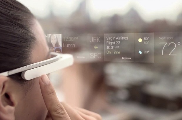
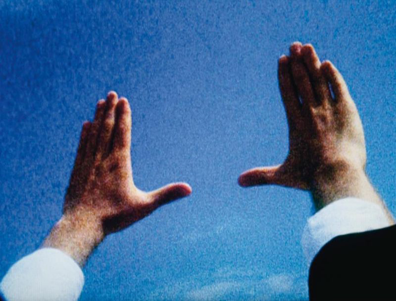
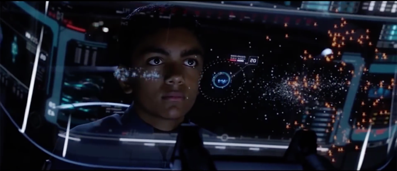
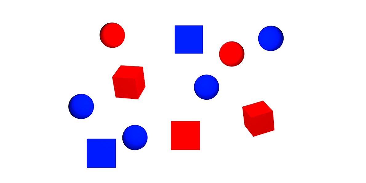
It is exciting to see the development of virtual reality today. It might lead to important changes in human life and activity. Virtual reality already attempts to integrate into our daily life and activities, currently sold to the masses through virtual reality “experiences”. Clear and well-known examples are Google glasses and VR glasses. Both are head-mounted, portable computers shaped as a pair of eyeglasses that display information in a smartphone like hands-free format (See image
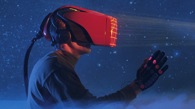 and
2
and
2
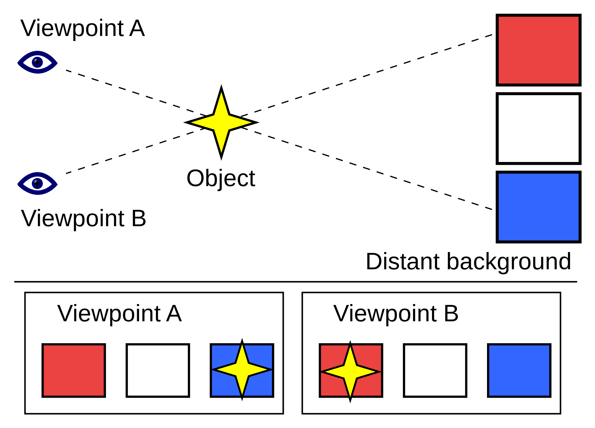
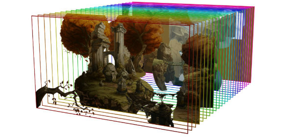
The parallax
Within a three-dimensional world, the displacement or difference in the apparent position of an object is called a “parallax”. A parallax is seeing objects in different perspectives from different points of view (see image
Chapter 2
— Typography —
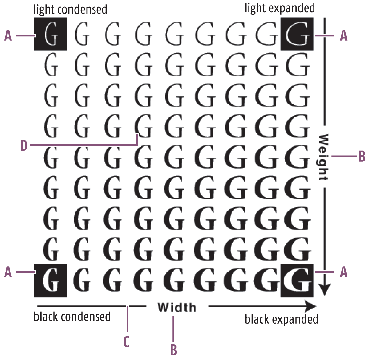
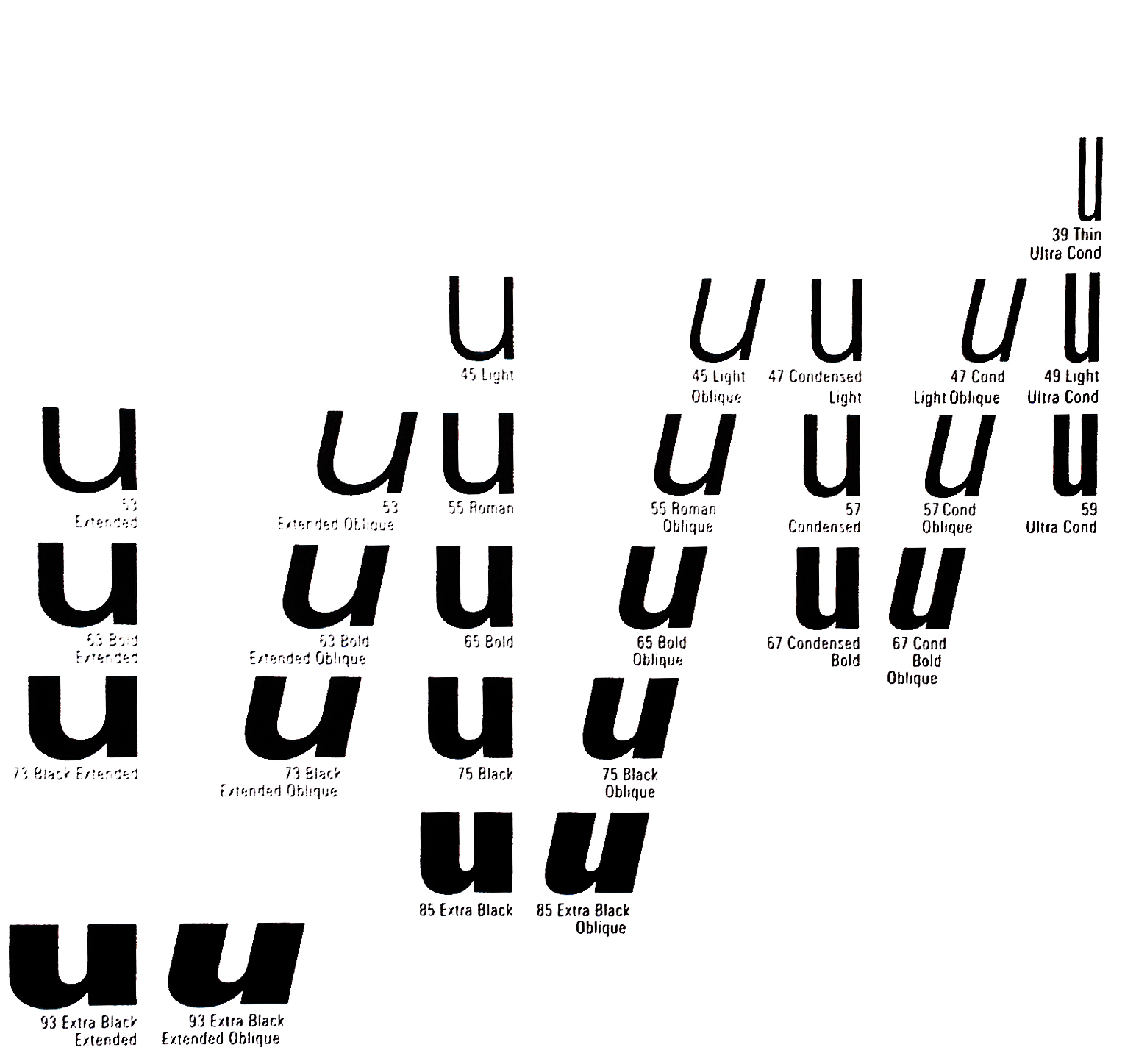
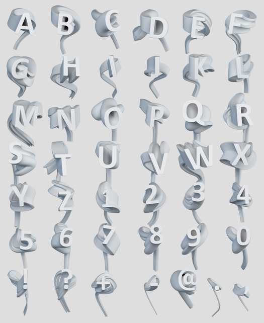
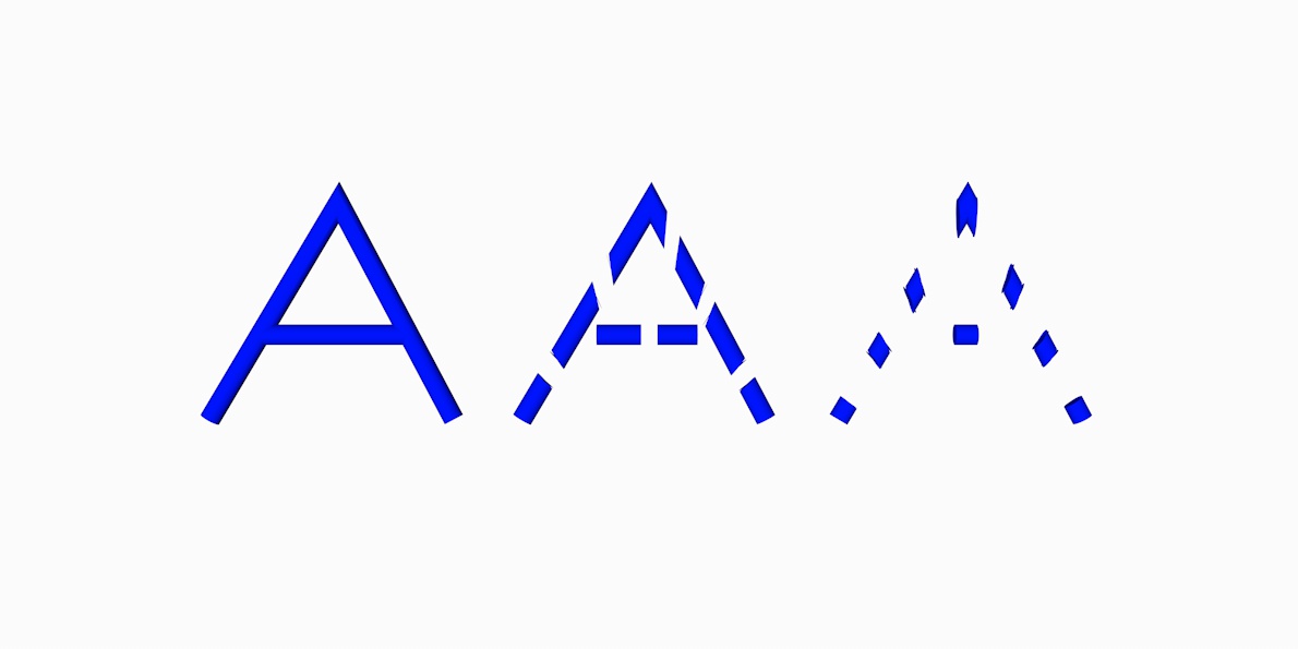
The shift to digital media changed what we could do with analogue type design. The alteration of typography addressed a very basic problem: font interpolation, which means that a fonts design is modified in such a way that it is usable in multiple media sizes. Media such as print or a computer screen have their practical limits. The translation of the style of a font represents the same challenge to inherent breakpoints: by scaling typography set in a certain font, the legibility is compromised. Scaling scentences from a 50 cm by 100 cm print to a 13-inch computer screen negatively influences the readability. Directly translating the print itself to fit the screen makes the words unreadable. The print has to be “scaled down” to ensure the correct appearance of the sentences. To make the words readable on the screen the information has to be altered and transformed. The medium break sentences and words so that they fit the medium and become readable. Within the typographic practice, this problem can be solved to a certain extent in a 2D spectrum (see image
Interpolation influenced the way that type was designed and set in its time. An attempt was made to display a three-dimensional view by using typographic motion in film. However, this was still a 2D display of a 3D world. A layered environment attempts to solve this problem, although legibility is still an issue. 3D
typography is in need of more significant adjustments. It can be placed in an ever-changing environment in which the user
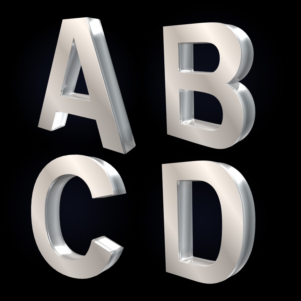
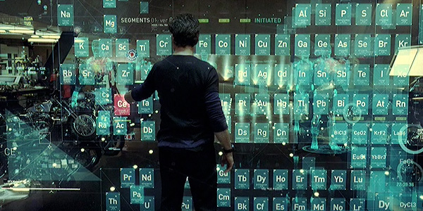
participates. Typography depends on the parallax, the motion, position and perspective of the viewer. Alteration, range and hierarchy in a three-dimensional perspective become inevitable. The role of the graphic designer becomes relevant as he plays with these. A new hierarchy in the exchange of information could be introduced. A traditional hierarchy, to display typography, as argued by Erik Blokland; “Book - page - layout - column - paragraph - line - word - letter - shape” could be re-considered within a virtual 3D environment. “Virtual reality - 360° environment - depth - layers - word - letter - shape - gateways”. Setting type on a line has a width that comes from the page, a word has a width that comes from its shapes, the hierarchy is broken when implementing typography in a virtual environment. Words with an infinite width become unreadable. Our eyes cannot separate type from shape anymore. All sentences and word “objects” have their own problems and requirements. As argued by type designer Gerrit Noordzij; “typography is writing with prefabricated letters.” Prefabricated in the sense of not knowing where they will be used. This is why common sizes were introduced. Applying prefabricated typography to a 3D environment might “damage” a fixed font as prefabricated shapes have limited adaptability. Legibility of typography in an infinite dimension becomes the main focus.
— Coding typography —
The mathematical position of the parametric points of a typographic letter create a fixed structure. In order to be able to recognize the letter “P” as such, it needs predefined points. The points separate a “P” from an “A”. However, if the font data/appearance is not positioned as a fixed shape of points, undefined rules tempt to do their work by logic/math. If there are no rules defined in 2D and 3D, the typeface rescales in all points in all directions, out of bounds. Scaling or stretching a font in 3D to create interpolation, distances and type-appearances, could result in overlapping shapes. The code defined by the designer becomes a rule to limit the typography and its behaviour to ensure readability in a three-dimensional atmosphere. Traditional prefabrication is no longer useful, the font itself is able to adjust to the peculiarities of a third dimension. Of course you could argue that the construction of the font in such a way is also prefabrication. Prefabrication could be useful to 3D typography; geometric shapes have to deal with the relation towards each other. However, the floating type exists with infinite boundaries in virtual reality and is only limited by defined rules. When the extremes are defined they can be controlled.
Interpolation allows for precise size-specific adjustments
in order to take into account the different distances at which a reader can perceive type. The “letters” in depth could be too far away to be readable. Far away distances of typography or captions in small sizes simply lose detail as the eye cannot distinguish typography from shape anymore. A font’s legibility and readability adjustments must be linked to accessible options. Accessible options can be points or signs to access information positioned on an x-y and z grid. A challenge is rendering interpolated type quickly and smoothly. Smooth transitions in a font lined up with the original shape can minimize the optical and visual change rather than rapid flashy size changes. The typography becomes a never ending movement. There is never one “standard” view.
Has typography lost its validity in a three-dimensional world? A 3D letter is not particularly necessary to communicate information in a three-dimensional atmosphere. The designer has to start to think in accessible layers, distances and motion. This is where a parallax comes in, a layered view of information accessible to the user at any time. Like browsing through a website, the exposure of layers becomes the main focus. A three-dimensional parallax could provide an overview of layers that provide a gateway to various virtual worlds.
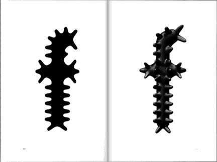
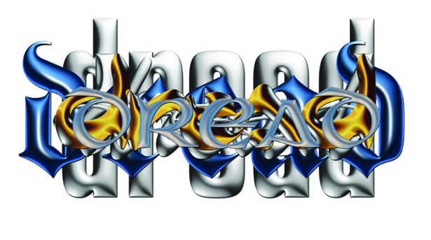
High-contrast or low-contrast letters often require separately drawn poles between the extremes to help maintain the relationship between thick and thin within the letters. In some situations where rescaling takes place, elements of a letter are forced to get thin, for example the crossbar of the lowercase ‘e’. By rescaling or moving it to different distances the thin bar could disappear in the background. Some type designs could get so extreme that the letter shape is forced to change, such as replacing a combined form (as an example “oe”) with a custom and single glyph (“œ”) for various sizes. Typography will most likely change in virtual reality as different perspectives change how it is seen by a user. By adding a third dimension to the typographic practice, type-designers as well as graphic designers have to adjust their approach to design rather than to treat typography in a traditional way. The perception of multiple perspectives of typography requires a break with established rules. A designer has to look for useful three-dimensional usage of typography in various “landscapes” of media instead of importing a two-dimensional typeface to a three dimensional perspective (see image
Chapter 3
— Narrative systems —
Virtual reality is able to create a new narrative form. One that current technical and stylistic norms are unable to. The designer could introduce a new way of communicating information in a virtual environment through the use of image, symbols or even a new genre in typography itself. Providing great typographic experiences with the wide range of devices that exist nowadays is hard to do considering the current state of 3D typography. Users are served poor reading experiences that do not adapt to the environment in which the reading takes place. Currently no third dimension exists that could interact with the user. Screens are still a two-dimensional representation of a three-dimensional environment. This is also one of the central issues discussed in modern literary theory. To summarize: it is the opposition between a presumably passive reading of a text and an active, deconstructive reading that imaginatively participates in the text’s creation.
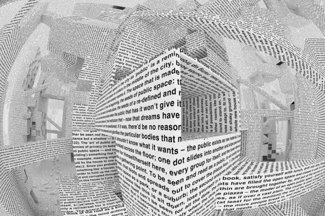
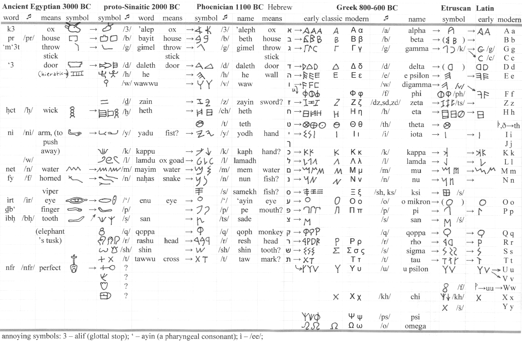
The relationship between information and decoration has always been at the centre of research on a graphic design and scientific level. Depending on appearance, information and decoration are close to an image. Structure, harmony, frequencies, appearance, composition and rhythm binds them. A typographic language possesses a system of signs communicating in space and time through several formats. The oddity of typography is its existence under several states and times. Written or performed, changing its own visibility as communication advanced (see image
A linear narrative, such as reading a book or scrolling through the web, has evolved to break down the limitations posed by time and emotive viewpoint. A narrative placed in a virtual reality could apply the concept of immersion, engaging the perceiver to be focused on the information by concentrating on one course of instruction, subject, navigation symbol or project to exclude other stimuli. Interactivity can develop a new system of reading and thereby navigation. The trap is the spectacle; applied effects that look impressive but do not communicate the message. By applying predefined effects (see image
— Information landscapes —
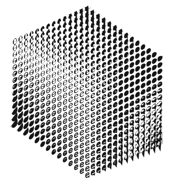
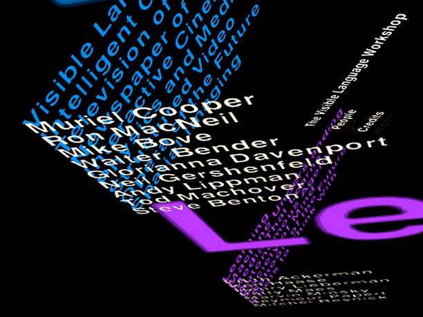
Muriel Cooper introduced the “information landscapes”. She was one of the first designers that applied responsive informational landscapes to 3D topological spaces (see image
— Language —
When it comes to content, form and vocabularies, the semiotics (the study of signs and symbols and their use or interpretation) and semantics (logic) could be revised within a three-dimensional world. Migrating information to a three-dimensional environment has to be done in a meaningful way. The translation of a dictionary requires a different approach from one that is required for the translation of a simple hand sign. For a dictionary, the connections have to be logical, alphabetical order has to be implemented. A simple hand sign could serve as a navigation tool; the symbol only needs recognition or interaction in order to know what to do. Providing significance of navigation through information becomes the task of the designer. By blending semiotics and semantics together the designer could blend an informative and decorative world of interactive tools. The representation of information could become a three-dimensional landscape of navigation through knowledge (see image
Chapter 4
— Hyper reality and philosophical considerations —
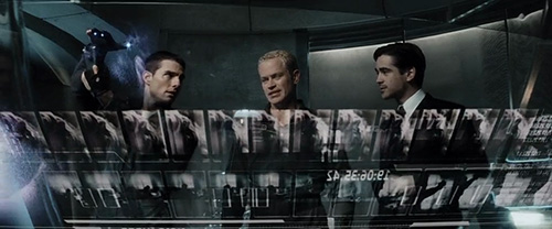
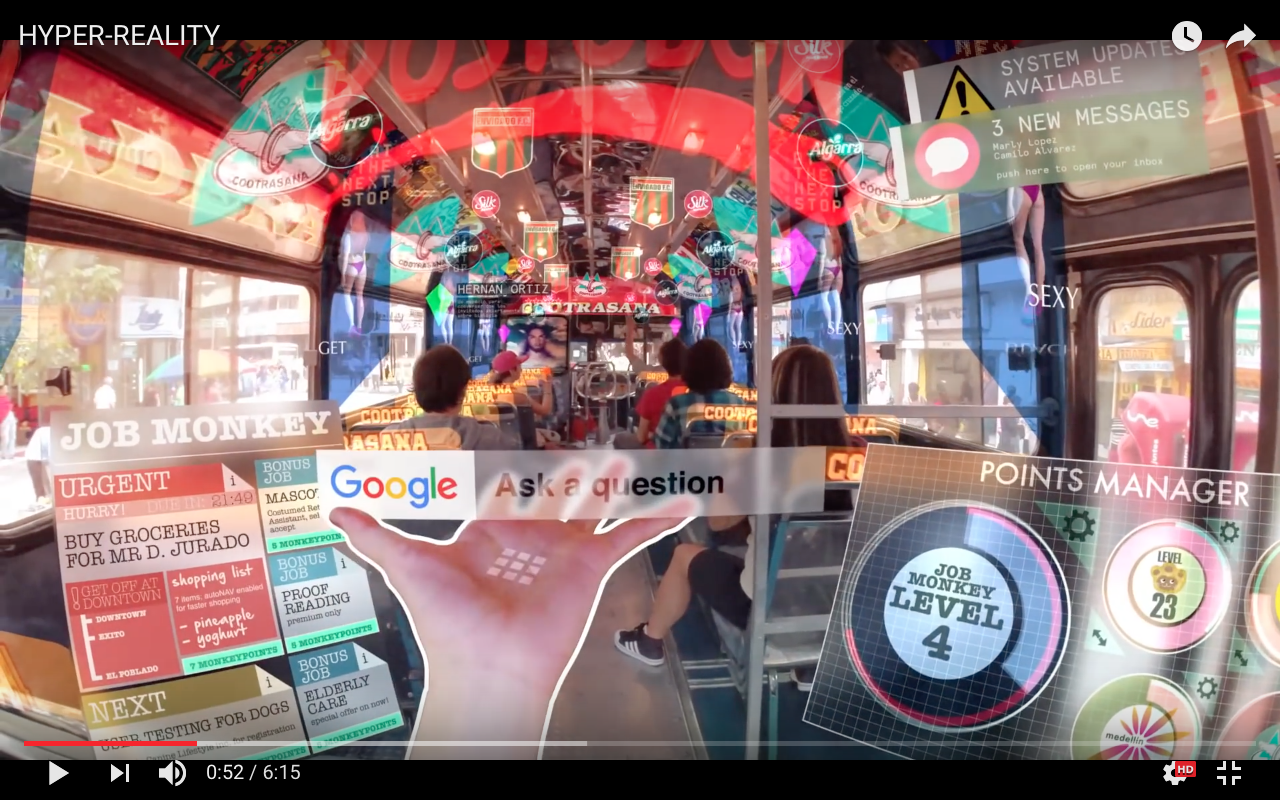
Hyper reality, “the inability of consciousness to distinguish reality from a simulation of reality”, requires a watchful eye on future design practices. The notion of the audience shifts as it encounters the virtual world. Social, cultural, philosophical, materialistic and political contexts of the contemporary design field are in need of a critical, post-modern look in virtual reality. Hyper reality could become a dangerous aspect of virtual reality, especially in technologically advanced postmodern societies. Hyper reality is seen as a condition in which what is real and what is fiction blend so well together that there is no clear distinction between where one ends and the other begins. A clear example of this is the speculative movie of Keiichi Matsuda named “HYPER-REALITY”
(see video / frame

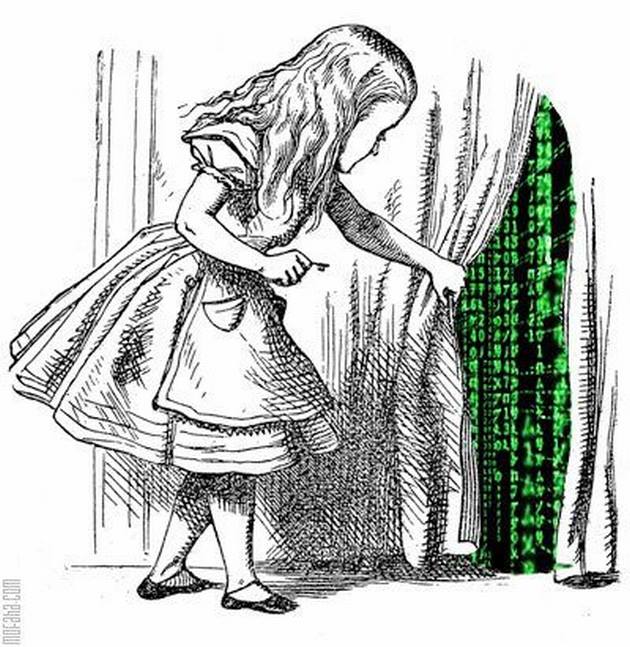
Virtual reality changes the role of typography as the shapes become an entrance to a virtual and “hidden” world. Letters could act as a gateway to enter a simulated reality, a matrix (see image
Game-based interactive learning shows that man learns best by doing or by being. A growing number of gamers find themselves, for different reasons, more involved with the hyper-real game world and less with the physical world. This “disconnection from reality” shows how virtual reality requires a different approach to typography. Gamification of typography could become a distraction to the actual information. By making reality a game, we play with our consciousness. By adapting our senses and placing a virtual layer in reality, “visual pollution” and “over-stimulation” could take place. By this I mean that it could lead to a certain desperation of endless visual options, blurring our vision. The distinction between information and decoration becomes blurred. Reality could become a visual dump. Spatial awareness could become very powerful, and very specific signifiers of common ideas.
This world’s reality might change, considering how every typographic shape can be applied within a virtual layer. Virtual reality should however not lose the awareness of spatial perception. In the movie “HYPER REALITY”, navigation systems are taken to the next level by their ability to literally draw a road of where you have to go. By introducing virtual worlds into physical spaces, we can endlessly speculate about how our reality can be adapted or even enhanced in an ever-present overlay of layers. Virtual reality becomes subjective. Everybody has its own perception of what it could be. Additionally, the virtual layer could become a customizable landscape as a reflection of someone’s personal taste and interest. However, the designer imposes his projection of information on the public, whether the public is invited or not. Designers have to make sure virtual information does not exclude the user of the environment. Our environment could transform us into an egocentric isolated self (See video / frame 15).
(see video / frame
A film is a kind of virtual reality too, except for the fact that you do not walk through it, you are guided through it. Like virtual reality, film could appear and disappear in total transparency. What is interesting is that virtual reality allows you to create your own digital habitat. If you lose your body, you have still got your eyes. But what happens if you are really involved? If you can really keep a distance while taking people in? To engage physically might be dangerous. To witness a murder is a terrifying experience, even though it is your mind in there, not your body. Still, it is the mind that more or less represents the soul. Your mind is your ego; you bring it along. One of the traps of the virtual world is that we can no longer distinguish virtual from physical reality. Some people have enough problems in this reality, so that when confronted with another reality they might not be able to distinguish between the two anymore. The consciousness of people will change. It is time to adapt, technically as well as mentally. Typography is already integrated into “physical” objects used as a medium to communicate. A book, screen or a print could be seen as physical object where typography is the gateway to information. The world could be seen as a canvas, open to a virtual communicative layer.
Chapter 5
— The unified whole, a potential solution —
Movie interfaces seen in “Minority Report” , “Iron Man” and “Star Trek” look fantastic
(see image
17
18
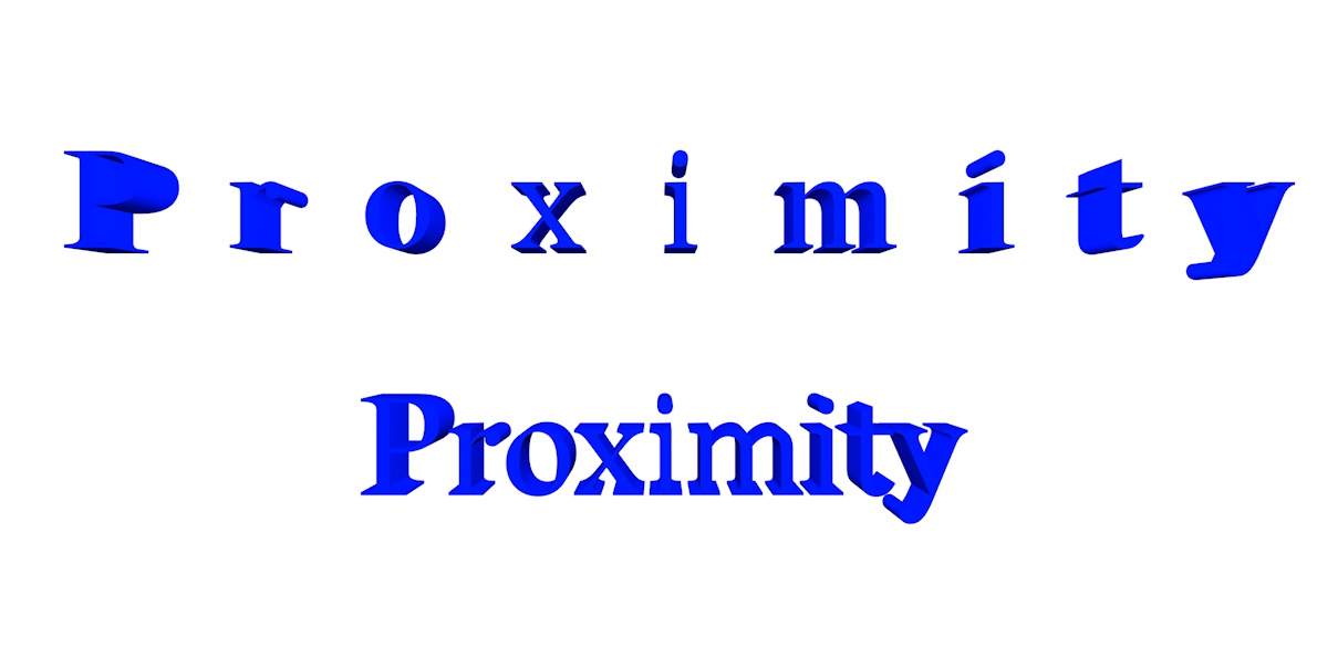
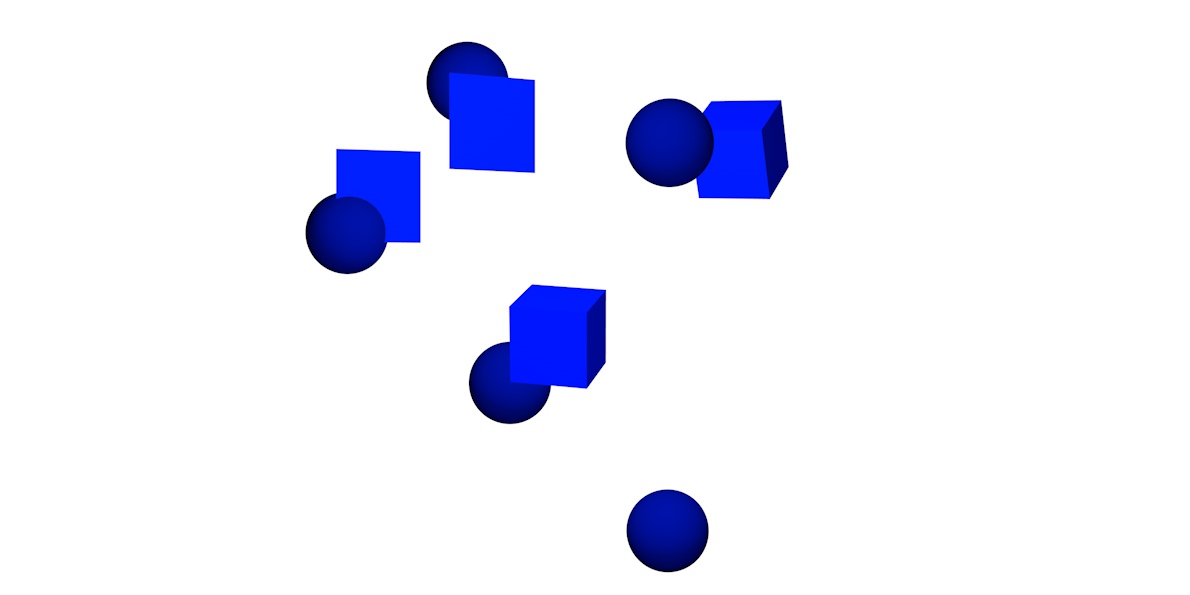
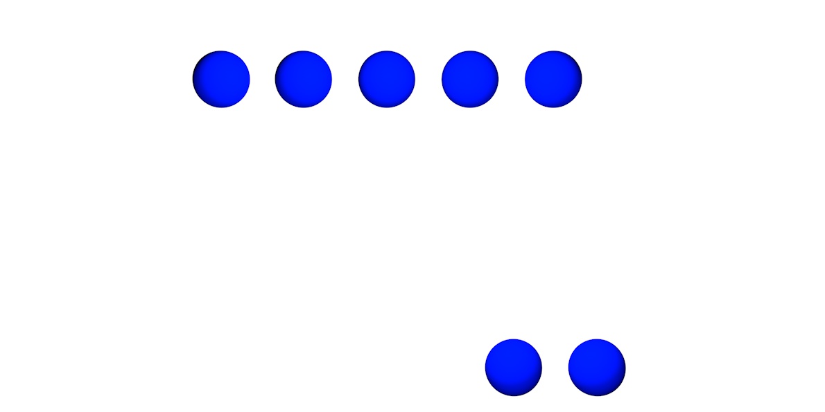
By grouping objects, the mind effectively simplifies recognizable parts by making it a single object. Applying the Gestalt theory to design in a virtual world creates unity within a piece. The stronger the relationship between elements in a three-dimensional world, the better the communication. Using the principles of cognitive behaviour helps the designer to influence the viewer by controlling how typography is viewed. Designers working with virtual reality have to make use of proximity, similarity, continuity, closure and figure.
Proximity refers to objects placed close together that are then perceived as a group. When spaced far apart
(see example
Chapter 6
— Recap & discussion —
The implementation of virtual reality within the contemporary design practice stands
at the beginning of a futuristic era. Virtual reality attempts to integrate into our current
society; sold to the masses through the use of rapid “VR experiences”. Our current state of design and typographic representation is challenged to switch from a 2D to a 3D perspective.
Designers could activate society and social behaviour by connecting people to spatial information. Virtual reality provides a glimpse of a futuristic perspective, with typography as its binding element. Typography is evolving over time. Graphic designers are aware of the necessity to focus on the readability of information. Typefaces will have to adapt quickly in order to keep up the pace with new technologies.
No one really knows what the future holds for virtual reality and how typography will change in its behaviour. What we do know is that graphic designers should re-examine their current knowledge to the virtual field. They should integrate virtual reality into their work more so that they become familiar with the visual problems and possibilities virtual reality poses to the graphic designer. The problems of typographic interpolation that exist in virtual reality have to become a point of focus. Established optical rules have to be reformed. Letter shapes and the position of the viewer need to interact to ensure readability of fonts. The limitations of 3D typography are actually the limitations of our own brain to make sense of depth. In order to get past this, it is necessary to use certain tools that enhance the human ability to perceive. Current extensions as phones and screens could be replaced with glasses or lenses to see the virtual layer. One’s ability to digest information in a virtual world depends on one’s ability to accept a parallax. Different distances and motion challenge the user to embrace a layered view. The readability of fonts is dependent on predefined rules. Typography has to make use of a parallax; the position, perspective of the viewer and interactivity determines how the the letters are perceived. Alteration and movement in typography becomes inevitable. The third dimension demands of designers to approach the “canvas” differently. By designing in virtual reality, new hierarchies can be introduced and value can be added to the typographic experience through the use of interactive representations of typography. By interacting with typography in a three-dimensional way, passive reading can be turned into an active reading experience.
Visual representations of information could change in the three-dimensional world; integration of current typographic appearances into virtual reality could be the first step. Although skeuomorphism (a visual representation of the previous medium) is not yet the answer, this slow transition to a more workable integration of typography into virtual reality is necessary for the public to get used to the radically new narratives that are made possible by virtual reality. With their current knowledge of design, designers must test how typography could behave. By establishing significance in navigation both information and decoration could become a blend of powerful tools. The third dimension becomes meaningless and hollow if it is not able to actually add value to our life in some way.
The reinvention of the environment solely as a source of entertainment could become a pitfall in post-modern society. “Visual pollution” could occur. Through hyper reality and gamification, we could become over-simulated and over-stimulated. Mixing the virtual layer with physical reality could create a visual dump that blurs our vision. The designer has to keep in mind that a distinction between virtual reality and physical reality should be made. The possible “disconnection” that could ensue between the user and reality could become dangerous; the designer should not stimulate an actual separation from reality. Virtual typography plays with our consciousness. Our senses should be encouraged to offer resistance. Without resistance, we separate our mind from our body and could become lost in a never-ending flow of information. We have to adapt technically as well as mentally.
The gestalt theory could possibly be used to approach typography within virtual reality in a practical way. Cognitive behaviour has to be stimulated. The gestalt theory offers a unified whole rather than an accumulation of separate and incoherent objects. The viewer is not in despair but creates unity and order to understand the environment. A layered viewpoint could provide an extra value in processing virtual information. The parallax of typography becomes a key factor in design that involves virtual reality. The future relevance of typography in virtual reality is bound to the ability of designers to use the parallax as a means to successfully integrate current typography into a third dimension.
Conclusion
An evolution of typography is dependent on the interactivity and usability of the virtual layer by the user. As long as the public is ready to adapt and change known habits, it will be ready for typography in virtual reality. Designers must look forward as new technologies emerge. Even though the borders of the graphic design profession blur, the standards, certainties and limitations provide security. If the graphic designer holds on to traditional typographic rules, the profession is threatened to settle into a comfortable but confusing stagnated state and will suffer a disconnection from new media. The graphic designer has to integrate virtual reality into the current field. Combining virtual reality with other design disciplines pushes the boundaries of graphic design even more. Changing typographic rules, such as adapting its appearance by grouping, can create new possibilities for the use of typography in a virtual environment. The role of typography is changed by virtual reality, the parallaxes that occur through the use of multiple layers in a virtual environment requires an alteration in speed and movement of layers. The way in which the layered three-dimensional view presents type is different from the way in which it is presented in a two-dimensional world. In a three dimensional word, we can literally place ourselves in the content. Applying typography in virtual reality does not necessarily change the appearance of typography itself. The role of typography is based on three-dimensional visibility and the motion of virtual layers. By applying proximity, similarity, continuity, closure and figure the designer could reinvent traditional ways to interpret typographic design in a three-dimensional atmosphere. The pitfall of virtual reality is that it could create a shallow commercial dump of layers that blurs the vision of the user.
A parallax, the motion of and distance between different layers of information, provides an active environment of navigation in virtual reality. By inviting the user to easily expose layers instead of accepting surface assumptions, curiosity is stimulated and an active and in-depth deconstruction of information is created. The usage of a parallax in virtual reality is the opposition between a presumably passive reading of a text and an active reading. The imagination of the user actively participates in the creation of an information landscape. Virtual reality encourages typography to act not only as a representation of words and letters, but also as a gateway to expose hidden worlds of information. Different groups of virtual information could blend through a change of the appearance of typography. Typefaces could transform into other typefaces whereby faster connections could be made in layered information. The use of a parallax to display information in layers could create clear connections in a three-dimensional space.
The tools to design in virtual reality are already being developed. If the designer loses his interest in technological development within the design field, the designer himself becomes irrelevant. The task of the graphic designer remains the same; to connect people with information and solve visual problems through research. I would argue that, by looking at the development of virtual reality, the designer has to adapt to emerging virtual environments. He can do this by entering into a virtual work-space where he can learn about the various possibilities and limitations of virtual reality.
The designer today lives in an in-between state caught between reality and virtual reality. By truly engaging with the medium, the designer could enrich reality with a virtual reality layer. Both layers move at a different speeds but are bound by design. A parallax of technological advancement and reality. Implementing typography in the virtual layer using the current knowledge of design as starting point requires the ability of the designer to think ahead of his time. Virtual reality already attempts to integrate into reality, but there is still a long way to go before virtual reality is fully embraced by larger audiences. I think that these are exciting times for graphic designers as we could reshape our profession into one that operates in a three-dimensional and multi-layered context. Are we ready?
— "Follow the white rabbit" —
— Remco Blom, Thesis 2017
— Acknowledgments —
I would like to mention some amazing people for their great morale, support, boldness and encouragements that gave me confidence.
Thesis supervision:
Dirk Vis
Marjan Brandsma
Philosophical supervision:
Maarten Cornel
Technical supervision:
Eric Schrijver
Special thanks to my family:
Han Blom
Ingrid Blom
And my cornerstones of the KABK life daily life madness:
Pascal Schilp
Thijmen van Brunschot