PRINT THIS THESIS
TEXT BIGGER | TEXT SMALLER

A research upon the influence
of the digital era on typography

TEMPORAL

RANDOM

INTERACTIVE

FLUID

RESPONSIVE

TEMP
ORAL

RAN
DOM

INTERA
CTIVE

FL
UID

RESPO
NSIVE

LUC EGGENHUIZEN GRAPHIC DESIGN KABK, BA THESIS 2016

IIIIIINNNNNNNTTTTTRRRRRRROOOOOOODDDDDDUUUUUUUCCCCCCCCCCTTTTTIIIIIIIIOOOOOOONNNNNN

TTTTTHHHHHHHHHHEEEEEEEEE HHHHHHHHIIIIIIIISTTTOOOOOOOOORRRRIIIIIIIICCCCCCCCCAAAAAAALLLLLL MMMMMMMMMMUUUUUUUUUTTTAAAATTTTTIIIIIIIIOOOOOOOOOONNNNNN
TTTTHHHHHHHHEEEEEEEEEE HHHHHHHHIIIIIIISTTTTTTTOOOOOOOOOOORRRRRRIIIIIICCCCCCCAAAAALLL EEEEEEVVVVVVOOOOOOOOOLLLLLLUUUUTTTTTTTIIIIIIIOOOOOOOOONNNNNNN OOOOOOOOOOFFFFF TTTTTTTYYYYPPPPOOOOOOOOOOGGGGGGRRRRRRRAAAAAPPPPPHHHHHHHHHHYYYYY AAAAAAANNNNNNNDDDDDDDD TTTTTYYYYYPPPPPEEEEEEEEEEE DDDDDDDDDDEEEEEEESIIIIIIIGGGGGGGNNNNN

DDDDDDEEEEEETTTTTEEEEEEEEERRRRMMMMMMMMIIIIIIIIIINNNAATTTIIIOOOOOOOOOOONNNNNNN FFFFFOOOOOOOORRRRRRR CCCCCCCHHHHHHHHHHAAAANNNNGGGGGGGGEEEEEEE OOOOOOOOFFFFF CCCCCCCUUUUUUUULLLLTTTTUUUURREEEEEEE

NNNNNEEEEWWWWWWW TTTTTYYYYPPPPOOOOOOOOOOGGGGGGRRRRAAAAAAPPHHHHHHHHHHIIIIIIICCCCCCC MMMMMMMMMMOOOOOOOOOOOVVEEEEEEMMMMMMMMMEEEEEEENNNNNNNTT IIIIIIINNNNN TTTTTTHHHHHHHHHHEEEEEE MMMMMMMMMMAAKKKKKKIIIIIIINNNNNGGGGGGGGG

TTTHHHHHHHHEEEEEEE CCCCCCCCCCLLLAAAAAAASSSSSSSSIIIIIIIFFFFIICCCCCCCAAAATTTTTTIIIIIIIOOOOOOOOONNNNN OOOOOOOOOOFFFFFFF TTTTTEEEEEEEMMMMMMPPPPPOOOOOOOOOOORRRRRAAAALLLL TTTTTTYYYYPPPOOOOOOOOGGGGGGGGRRRAAAPPPPHHHHHHHHYY
UUUNNNNNNNDDDDDDEEEEEEFFFFFFIIIIIIIINNNEEEEEEEEEDDDD TTTTTTYYPPPOOOOOOOOOOOGGGGGGRRRRRAAPPPHHHHHHHYY

TTTTHHHHHHHHHHEE CCCCCCCUUUUUUUUPPRRRREEEEEEEEEENNNNNTTT SSSSSSSTTTAAATTTTTEEEEEE OOOOOOFFFFF TTTTEEEEEEMMMMMMMMMMPPPPOOOOOOOOOORRRRRAAAALLLLL TTTTTTYYPPPPPOOOOGGGGGGGGRRRRAAPPPPPHHHHHHHHHHYYYY

EEEEEEXXXXXPPPEEEEEERRRRRRIIIIIIIIEENNNNNCCCCCCCCCCIIIIIIINNNNNNGGGGGG MMMMMMMMOOOOOOOOORRRRREEEE TTTTTTHHHHHHHHAANNN TTTTTTHHHHEEEEEE RRRRREEEEEEEEEEAADDDDDDDDIIIIIIINNNNNNNGG

TTTTTTRRRRRAAANNNNNNNSSSSSSSSFFFFFOOOOOOOOOOORRRRRRMMMMMMMMMMIIIIIIIINNNNNGGGGGGGG TTTTTTYYPPPPPOOOOOOOOOGGRRRAAAAAAAPPHHHHHHHHHHYYYYY TTTRRRRAANNNNSSSSSSSSSFFOOOOOOORRRMMMMMMMMMMIIIIIIINNGGGGG VVIIIIIIIISSSUUUUUUUUUAAAALLL CCCCCCCCUUUULLLLTTTUUURRRRREEEE
TTHHHEEEE CCCCCCCHHHHHHHAAANNNGGGGGGEEEEEE OOOOOOOOOOFFFFF AA VVVVVIIIIIISSSSSSSSUUUAAAAAALLL CCCCCCCCCCCUUUUUULLLTTTTTUURRREEEEEE

SSSSSSSSUUUUUUPPPPPEERRRRFFFFIIIIIIICCCCIIIIIIIAAAAAAALLLLL VVVVEEEEEERRRRRSSUUUUUUUSSSSSSS CCCCCCCOOOOOOONNNNNNNTTTTTTTEEEEEEENNNNNNNTTTTT

CCCCCCCOOOOOOOOOOONNNNCCCCCCCCCLLLUUUUUUSSSIIIIIIOOOOOONNNNNNN

CCCCOOOOOOLLLLOOOOOOOPPPHHHOOOOOOOOONN

BBBBBIIIIIIIBBBBLLLLLLIIIIIOOOOOOOGGGGGGGGRRRAAPPPHHHHYY

INTRODUCTION
TTTHHHEEEEEE HHHHHHIIISTTTTTOOOOOORRRIIIIIICCCCCCCAAAAALLLLL MMMMUUUUUUUUTTTTTAAAAAATTTTTTTIIIIOOOOOOOOONNNNN
TTTHHHEEEEEEEE HHHHHHHIIIIIIIISTTTTTOOOOOOOOOORRRIIIICCCCAL EEEEVVVVVOOOOOOOOOOOLLLLLUUUUUUTTIIIOOONNN OOOFFFF TTYYPPPOOGGGGGGGGRRRRRRAAPPPPHHHHHHHHHYYYY AAAANNNNNDDDDDD TTTYYYPPEEEEEEE DDDDEEEEEEEEESIIIIIIGGGNNNNNN
DDDEEEETTTEEERRRRRMMMMMMIIIINNNNNNNAAAAATTTTTIIIIIIIOOOONNNNN FFFFFFOOOORR CCCHHHHAAAAAAANNNNNGGGGEEEEEEEEEEE OOOOFFFFFFF CCCCUUULLLLLLTTTTTTUUUUUURRRRRRREEEEEEEE
NNNNEEEEEEWWWWWW TTTYYPPPOOOOOOOOOGGGGGGGGGRRRAAAPPPPPHHHIIIIIICCCC MMMMMMMMMOOOOVVVVVVEEEEMMMMMEEEEEENNNTTTTTTT IIIIIIIIIINNNN TTTTHHHHEEEEEEE MMMMMMMAAAAAKKKKIIIIIINNNNNNGG
TTTTTHHHEE CCCCLLLLLAAAASSIIIIIIFFFFFIIIIIIIIICCCCAATTTTTIIIIIIOOOOOOOONNNN OOOFFFFF TTTEEEEEEEEMMMMMMMMPPPOOOORRRRAAAAAAALLLLLL TTTYYYYYPPPPOOOOGGGGGGRRRRAAAAAAPPPPPHHHHHHHYYYYYY
UUUUUUUUNNNDDDDDEEEEEEEFFFFFIINNNNNNNEEEDDDDDDDDDD TTTTYYYYYYPPPPOOOOOOGGGGGRRRRAAAAAPPPPHHHHYYY
TTTTTTHHHEEEEEEE CCCCUUURRRRRRRRRRRREEEEENNNNTTTTT STTTTTAAAATTTEEEE OOOOOFFFFFF TTTTTTEEEEEEEMMMMPPPOOOOOOORRRRAAAAAAALLL TTTTTYYYYPPPPOOOOOOOOOOOGGGGRRRRRAAAPPPPHHHHHYYY
EEEEXXXPPPPEEEEEEEEEERRRIIIIEEEEEEENNNNCCCCCCIIIIIINNNNNGGGGGGGG MMMMMMOOOOORRRRRREEEEEE TTTTHHHHHHHAAAAANNNNNNN TTTTHHHHHHHEEEEEEE RRRREEEEEAAAAADDDDDDIIIIIINNNNNGGGGGGGGG
TTTTRRRRAANNNSFFFFOOOOORRRMMMMIIIINNNNGGGG TTTTYYYYPPPPOOOOOOOOGGGGRRRRRRAAAAPPPPPHHHHYYYY TTTTTRRRRRAAAANNNSFFFFFFFOOOOOORRRRRRMMMMMMMIIIIIINNNNNNGGGGGG VVVVIIIISUUAAAAAAALLLLL CCCCCUUUUUULLLLLLTTTTTUUUUUUUURRRREEEEEE
TTTTHHHHEEEEEE CCCCHHHHAANNNNNNNGGGEEEE OOOOOFFFF AAA VVVIIIIISUUUUUUUUAAAAALLLL CCCCCUUUUULLLLTTTTTTUUUUUUUUURRRRRREEEEEEE
SUUUUUPPPEEEEEEERRRFFFFFIIICCCCCCCIIIIIAAAALLL VVVEEEERRRRSUUUUS CCCOOOONNNTTEENNNTTT
CCCOOOONNNNNCCCCLLLLUUUUSIIIIIOOOOOOONNNNNN
CCCCCCCOOOOOLLLOOOOOOPPPPPHHHHOOOOONNNNNN
BBBBBBIIIBBLLIIIIIIOOOOOOGGGGRRRRAAAPPPPPHHHHHHHYYYY

IIIIIINNNNNNNTTTTTRRRRRRROOOOOOODDDDDDUUUUUUUCCCCCCCCCCTTTTTIIIIIIIIOOOOOOONNNNNN
THE HISTORICAL MUTATION
THE HISTORICAL EVOLUTION OF TYPOGRAPHY AND TYPE DESIGN
DDDEEEETTTEEERRRRRMMMMMMIIIINNNNNNNAAAAATTTTTIIIIIIIOOOONNNNN FFFFFFOOOORR CCCHHHHAAAAAAANNNNNGGGGEEEEEEEEEEE OOOOFFFFFFF CCCCUUULLLLLLTTTTTTUUUUUURRRRRRREEEEEEEE
NNNNEEEEEEWWWWWW TTTYYPPPOOOOOOOOOGGGGGGGGGRRRAAAPPPPPHHHIIIIIICCCC MMMMMMMMMOOOOVVVVVVEEEEMMMMMEEEEEENNNTTTTTTT IIIIIIIIIINNNN TTTTHHHHEEEEEEE MMMMMMMAAAAAKKKKIIIIIINNNNNNGG
TTTTTHHHEE CCCCLLLLLAAAASSIIIIIIFFFFFIIIIIIIIICCCCAATTTTTIIIIIIOOOOOOOONNNN OOOFFFFF TTTEEEEEEEEMMMMMMMMPPPOOOORRRRAAAAAAALLLLLL TTTYYYYYPPPPOOOOGGGGGGRRRRAAAAAAPPPPPHHHHHHHYYYYYY
UUUUUUUUNNNDDDDDEEEEEEEFFFFFIINNNNNNNEEEDDDDDDDDDD TTTTYYYYYYPPPPOOOOOOGGGGGRRRRAAAAAPPPPHHHHYYY
TTTTTTHHHEEEEEEE CCCCUUURRRRRRRRRRRREEEEENNNNTTTTT STTTTTAAAATTTEEEE OOOOOFFFFFF TTTTTTEEEEEEEMMMMPPPOOOOOOORRRRAAAAAAALLL TTTTTYYYYPPPPOOOOOOOOOOOGGGGRRRRRAAAPPPPHHHHHYYY
EEEEXXXPPPPEEEEEEEEEERRRIIIIEEEEEEENNNNCCCCCCIIIIIINNNNNGGGGGGGG MMMMMMOOOOORRRRRREEEEEE TTTTHHHHHHHAAAAANNNNNNN TTTTHHHHHHHEEEEEEE RRRREEEEEAAAAADDDDDDIIIIIINNNNNGGGGGGGGG
TTTTRRRRAANNNSFFFFOOOOORRRMMMMIIIINNNNGGGG TTTTYYYYPPPPOOOOOOOOGGGGRRRRRRAAAAPPPPPHHHHYYYY TTTTTRRRRRAAAANNNSFFFFFFFOOOOOORRRRRRMMMMMMMIIIIIINNNNNNGGGGGG VVVVIIIISUUAAAAAAALLLLL CCCCCUUUUUULLLLLLTTTTTUUUUUUUURRRREEEEEE
TTTTHHHHEEEEEE CCCCHHHHAANNNNNNNGGGEEEE OOOOOFFFF AAA VVVIIIIISUUUUUUUUAAAAALLLL CCCCCUUUUULLLLTTTTTTUUUUUUUUURRRRRREEEEEEE
SUUUUUPPPEEEEEEERRRFFFFFIIICCCCCCCIIIIIAAAALLL VVVEEEERRRRSUUUUS CCCOOOONNNTTEENNNTTT
CCCOOOONNNNNCCCCLLLLUUUUSIIIIIOOOOOOONNNNNN
CCCCCCCOOOOOLLLOOOOOOPPPPPHHHHOOOOONNNNNN
BBBBBBIIIBBLLIIIIIIOOOOOOGGGGRRRRAAAPPPPPHHHHHHHYYYY

IIIIIINNNNNNNTTTTTRRRRRRROOOOOOODDDDDDUUUUUUUCCCCCCCCCCTTTTTIIIIIIIIOOOOOOONNNNNN
TTTHHHEEEEEEEE HHHHHHHIIIIIIIISTTTTTOOOOOOOOOORRRIIIICCCCAL EEEEVVVVVOOOOOOOOOOOLLLLLUUUUUUTTIIIOOONNN OOOFFFF TTYYPPPOOGGGGGGGGRRRRRRAAPPPPHHHHHHHHHYYYY AAAANNNNNDDDDDD TTTYYYPPEEEEEEE DDDDEEEEEEEEESIIIIIIGGGNNNNNN
DETERMINATION FOR CHANGE OF CULTURE
NNNNEEEEEEWWWWWW TTTYYPPPOOOOOOOOOGGGGGGGGGRRRAAAPPPPPHHHIIIIIICCCC MMMMMMMMMOOOOVVVVVVEEEEMMMMMEEEEEENNNTTTTTTT IIIIIIIIIINNNN TTTTHHHHEEEEEEE MMMMMMMAAAAAKKKKIIIIIINNNNNNGG
TTTTTHHHEE CCCCLLLLLAAAASSIIIIIIFFFFFIIIIIIIIICCCCAATTTTTIIIIIIOOOOOOOONNNN OOOFFFFF TTTEEEEEEEEMMMMMMMMPPPOOOORRRRAAAAAAALLLLLL TTTYYYYYPPPPOOOOGGGGGGRRRRAAAAAAPPPPPHHHHHHHYYYYYY
UUUUUUUUNNNDDDDDEEEEEEEFFFFFIINNNNNNNEEEDDDDDDDDDD TTTTYYYYYYPPPPOOOOOOGGGGGRRRRAAAAAPPPPHHHHYYY
TTTTTTHHHEEEEEEE CCCCUUURRRRRRRRRRRREEEEENNNNTTTTT STTTTTAAAATTTEEEE OOOOOFFFFFF TTTTTTEEEEEEEMMMMPPPOOOOOOORRRRAAAAAAALLL TTTTTYYYYPPPPOOOOOOOOOOOGGGGRRRRRAAAPPPPHHHHHYYY
EEEEXXXPPPPEEEEEEEEEERRRIIIIEEEEEEENNNNCCCCCCIIIIIINNNNNGGGGGGGG MMMMMMOOOOORRRRRREEEEEE TTTTHHHHHHHAAAAANNNNNNN TTTTHHHHHHHEEEEEEE RRRREEEEEAAAAADDDDDDIIIIIINNNNNGGGGGGGGG
TTTTRRRRAANNNSFFFFOOOOORRRMMMMIIIINNNNGGGG TTTTYYYYPPPPOOOOOOOOGGGGRRRRRRAAAAPPPPPHHHHYYYY TTTTTRRRRRAAAANNNSFFFFFFFOOOOOORRRRRRMMMMMMMIIIIIINNNNNNGGGGGG VVVVIIIISUUAAAAAAALLLLL CCCCCUUUUUULLLLLLTTTTTUUUUUUUURRRREEEEEE
TTTTHHHHEEEEEE CCCCHHHHAANNNNNNNGGGEEEE OOOOOFFFF AAA VVVIIIIISUUUUUUUUAAAAALLLL CCCCCUUUUULLLLTTTTTTUUUUUUUUURRRRRREEEEEEE
SUUUUUPPPEEEEEEERRRFFFFFIIICCCCCCCIIIIIAAAALLL VVVEEEERRRRSUUUUS CCCOOOONNNTTEENNNTTT
CCCOOOONNNNNCCCCLLLLUUUUSIIIIIOOOOOOONNNNNN
CCCCCCCOOOOOLLLOOOOOOPPPPPHHHHOOOOONNNNNN
BBBBBBIIIBBLLIIIIIIOOOOOOGGGGRRRRAAAPPPPPHHHHHHHYYYY

IIIIIINNNNNNNTTTTTRRRRRRROOOOOOODDDDDDUUUUUUUCCCCCCCCCCTTTTTIIIIIIIIOOOOOOONNNNNN
TTTHHHEEEEEEEE HHHHHHHIIIIIIIISTTTTTOOOOOOOOOORRRIIIICCCCAL EEEEVVVVVOOOOOOOOOOOLLLLLUUUUUUTTIIIOOONNN OOOFFFF TTYYPPPOOGGGGGGGGRRRRRRAAPPPPHHHHHHHHHYYYY AAAANNNNNDDDDDD TTTYYYPPEEEEEEE DDDDEEEEEEEEESIIIIIIGGGNNNNNN
DDDEEEETTTEEERRRRRMMMMMMIIIINNNNNNNAAAAATTTTTIIIIIIIOOOONNNNN FFFFFFOOOORR CCCHHHHAAAAAAANNNNNGGGGEEEEEEEEEEE OOOOFFFFFFF CCCCUUULLLLLLTTTTTTUUUUUURRRRRRREEEEEEEE
NEW TYPOGRAPHIC MOVEMENT IN THE MAKING
TTTTTHHHEE CCCCLLLLLAAAASSIIIIIIFFFFFIIIIIIIIICCCCAATTTTTIIIIIIOOOOOOOONNNN OOOFFFFF TTTEEEEEEEEMMMMMMMMPPPOOOORRRRAAAAAAALLLLLL TTTYYYYYPPPPOOOOGGGGGGRRRRAAAAAAPPPPPHHHHHHHYYYYYY
UUUUUUUUNNNDDDDDEEEEEEEFFFFFIINNNNNNNEEEDDDDDDDDDD TTTTYYYYYYPPPPOOOOOOGGGGGRRRRAAAAAPPPPHHHHYYY
TTTTTTHHHEEEEEEE CCCCUUURRRRRRRRRRRREEEEENNNNTTTTT STTTTTAAAATTTEEEE OOOOOFFFFFF TTTTTTEEEEEEEMMMMPPPOOOOOOORRRRAAAAAAALLL TTTTTYYYYPPPPOOOOOOOOOOOGGGGRRRRRAAAPPPPHHHHHYYY
EEEEXXXPPPPEEEEEEEEEERRRIIIIEEEEEEENNNNCCCCCCIIIIIINNNNNGGGGGGGG MMMMMMOOOOORRRRRREEEEEE TTTTHHHHHHHAAAAANNNNNNN TTTTHHHHHHHEEEEEEE RRRREEEEEAAAAADDDDDDIIIIIINNNNNGGGGGGGGG
TTTTRRRRAANNNSFFFFOOOOORRRMMMMIIIINNNNGGGG TTTTYYYYPPPPOOOOOOOOGGGGRRRRRRAAAAPPPPPHHHHYYYY TTTTTRRRRRAAAANNNSFFFFFFFOOOOOORRRRRRMMMMMMMIIIIIINNNNNNGGGGGG VVVVIIIISUUAAAAAAALLLLL CCCCCUUUUUULLLLLLTTTTTUUUUUUUURRRREEEEEE
TTTTHHHHEEEEEE CCCCHHHHAANNNNNNNGGGEEEE OOOOOFFFF AAA VVVIIIIISUUUUUUUUAAAAALLLL CCCCCUUUUULLLLTTTTTTUUUUUUUUURRRRRREEEEEEE
SUUUUUPPPEEEEEEERRRFFFFFIIICCCCCCCIIIIIAAAALLL VVVEEEERRRRSUUUUS CCCOOOONNNTTEENNNTTT
CCCOOOONNNNNCCCCLLLLUUUUSIIIIIOOOOOOONNNNNN
CCCCCCCOOOOOLLLOOOOOOPPPPPHHHHOOOOONNNNNN
BBBBBBIIIBBLLIIIIIIOOOOOOGGGGRRRRAAAPPPPPHHHHHHHYYYY

IIIIIINNNNNNNTTTTTRRRRRRROOOOOOODDDDDDUUUUUUUCCCCCCCCCCTTTTTIIIIIIIIOOOOOOONNNNNN
TTTHHHEEEEEEEE HHHHHHHIIIIIIIISTTTTTOOOOOOOOOORRRIIIICCCCAL EEEEVVVVVOOOOOOOOOOOLLLLLUUUUUUTTIIIOOONNN OOOFFFF TTYYPPPOOGGGGGGGGRRRRRRAAPPPPHHHHHHHHHYYYY AAAANNNNNDDDDDD TTTYYYPPEEEEEEE DDDDEEEEEEEEESIIIIIIGGGNNNNNN
DDDEEEETTTEEERRRRRMMMMMMIIIINNNNNNNAAAAATTTTTIIIIIIIOOOONNNNN FFFFFFOOOORR CCCHHHHAAAAAAANNNNNGGGGEEEEEEEEEEE OOOOFFFFFFF CCCCUUULLLLLLTTTTTTUUUUUURRRRRRREEEEEEEE
NNNNEEEEEEWWWWWW TTTYYPPPOOOOOOOOOGGGGGGGGGRRRAAAPPPPPHHHIIIIIICCCC MMMMMMMMMOOOOVVVVVVEEEEMMMMMEEEEEENNNTTTTTTT IIIIIIIIIINNNN TTTTHHHHEEEEEEE MMMMMMMAAAAAKKKKIIIIIINNNNNNGG
THE CLASSIFICATION OF TERMPORAL TYPOGRAPHY
UNDEFINED TYPOGRAPHY
TTTTTTHHHEEEEEEE CCCCUUURRRRRRRRRRRREEEEENNNNTTTTT STTTTTAAAATTTEEEE OOOOOFFFFFF TTTTTTEEEEEEEMMMMPPPOOOOOOORRRRAAAAAAALLL TTTTTYYYYPPPPOOOOOOOOOOOGGGGRRRRRAAAPPPPHHHHHYYY
EEEEXXXPPPPEEEEEEEEEERRRIIIIEEEEEEENNNNCCCCCCIIIIIINNNNNGGGGGGGG MMMMMMOOOOORRRRRREEEEEE TTTTHHHHHHHAAAAANNNNNNN TTTTHHHHHHHEEEEEEE RRRREEEEEAAAAADDDDDDIIIIIINNNNNGGGGGGGGG
TTTTRRRRAANNNSFFFFOOOOORRRMMMMIIIINNNNGGGG TTTTYYYYPPPPOOOOOOOOGGGGRRRRRRAAAAPPPPPHHHHYYYY TTTTTRRRRRAAAANNNSFFFFFFFOOOOOORRRRRRMMMMMMMIIIIIINNNNNNGGGGGG VVVVIIIISUUAAAAAAALLLLL CCCCCUUUUUULLLLLLTTTTTUUUUUUUURRRREEEEEE
TTTTHHHHEEEEEE CCCCHHHHAANNNNNNNGGGEEEE OOOOOFFFF AAA VVVIIIIISUUUUUUUUAAAAALLLL CCCCCUUUUULLLLTTTTTTUUUUUUUUURRRRRREEEEEEE
SUUUUUPPPEEEEEEERRRFFFFFIIICCCCCCCIIIIIAAAALLL VVVEEEERRRRSUUUUS CCCOOOONNNTTEENNNTTT
CCCOOOONNNNNCCCCLLLLUUUUSIIIIIOOOOOOONNNNNN
CCCCCCCOOOOOLLLOOOOOOPPPPPHHHHOOOOONNNNNN
BBBBBBIIIBBLLIIIIIIOOOOOOGGGGRRRRAAAPPPPPHHHHHHHYYYY

IIIIIINNNNNNNTTTTTRRRRRRROOOOOOODDDDDDUUUUUUUCCCCCCCCCCTTTTTIIIIIIIIOOOOOOONNNNNN
TTTHHHEEEEEEEE HHHHHHHIIIIIIIISTTTTTOOOOOOOOOORRRIIIICCCCAL EEEEVVVVVOOOOOOOOOOOLLLLLUUUUUUTTIIIOOONNN OOOFFFF TTYYPPPOOGGGGGGGGRRRRRRAAPPPPHHHHHHHHHYYYY AAAANNNNNDDDDDD TTTYYYPPEEEEEEE DDDDEEEEEEEEESIIIIIIGGGNNNNNN
DDDEEEETTTEEERRRRRMMMMMMIIIINNNNNNNAAAAATTTTTIIIIIIIOOOONNNNN FFFFFFOOOORR CCCHHHHAAAAAAANNNNNGGGGEEEEEEEEEEE OOOOFFFFFFF CCCCUUULLLLLLTTTTTTUUUUUURRRRRRREEEEEEEE
NNNNEEEEEEWWWWWW TTTYYPPPOOOOOOOOOGGGGGGGGGRRRAAAPPPPPHHHIIIIIICCCC MMMMMMMMMOOOOVVVVVVEEEEMMMMMEEEEEENNNTTTTTTT IIIIIIIIIINNNN TTTTHHHHEEEEEEE MMMMMMMAAAAAKKKKIIIIIINNNNNNGG
TTTTTHHHEE CCCCLLLLLAAAASSIIIIIIFFFFFIIIIIIIIICCCCAATTTTTIIIIIIOOOOOOOONNNN OOOFFFFF TTTEEEEEEEEMMMMMMMMPPPOOOORRRRAAAAAAALLLLLL TTTYYYYYPPPPOOOOGGGGGGRRRRAAAAAAPPPPPHHHHHHHYYYYYY
UUUUUUUUNNNDDDDDEEEEEEEFFFFFIINNNNNNNEEEDDDDDDDDDD TTTTYYYYYYPPPPOOOOOOGGGGGRRRRAAAAAPPPPHHHHYYY
THE CURRENT STATE OF TEMPORAL TYPOGRAPHY
EEEEXXXPPPPEEEEEEEEEERRRIIIIEEEEEEENNNNCCCCCCIIIIIINNNNNGGGGGGGG MMMMMMOOOOORRRRRREEEEEE TTTTHHHHHHHAAAAANNNNNNN TTTTHHHHHHHEEEEEEE RRRREEEEEAAAAADDDDDDIIIIIINNNNNGGGGGGGGG
TTTTRRRRAANNNSFFFFOOOOORRRMMMMIIIINNNNGGGG TTTTYYYYPPPPOOOOOOOOGGGGRRRRRRAAAAPPPPPHHHHYYYY TTTTTRRRRRAAAANNNSFFFFFFFOOOOOORRRRRRMMMMMMMIIIIIINNNNNNGGGGGG VVVVIIIISUUAAAAAAALLLLL CCCCCUUUUUULLLLLLTTTTTUUUUUUUURRRREEEEEE
TTTTHHHHEEEEEE CCCCHHHHAANNNNNNNGGGEEEE OOOOOFFFF AAA VVVIIIIISUUUUUUUUAAAAALLLL CCCCCUUUUULLLLTTTTTTUUUUUUUUURRRRRREEEEEEE
SUUUUUPPPEEEEEEERRRFFFFFIIICCCCCCCIIIIIAAAALLL VVVEEEERRRRSUUUUS CCCOOOONNNTTEENNNTTT
CCCOOOONNNNNCCCCLLLLUUUUSIIIIIOOOOOOONNNNNN
CCCCCCCOOOOOLLLOOOOOOPPPPPHHHHOOOOONNNNNN
BBBBBBIIIBBLLIIIIIIOOOOOOGGGGRRRRAAAPPPPPHHHHHHHYYYY

IIIIIINNNNNNNTTTTTRRRRRRROOOOOOODDDDDDUUUUUUUCCCCCCCCCCTTTTTIIIIIIIIOOOOOOONNNNNN
TTTHHHEEEEEEEE HHHHHHHIIIIIIIISTTTTTOOOOOOOOOORRRIIIICCCCAL EEEEVVVVVOOOOOOOOOOOLLLLLUUUUUUTTIIIOOONNN OOOFFFF TTYYPPPOOGGGGGGGGRRRRRRAAPPPPHHHHHHHHHYYYY AAAANNNNNDDDDDD TTTYYYPPEEEEEEE DDDDEEEEEEEEESIIIIIIGGGNNNNNN
DDDEEEETTTEEERRRRRMMMMMMIIIINNNNNNNAAAAATTTTTIIIIIIIOOOONNNNN FFFFFFOOOORR CCCHHHHAAAAAAANNNNNGGGGEEEEEEEEEEE OOOOFFFFFFF CCCCUUULLLLLLTTTTTTUUUUUURRRRRRREEEEEEEE
NNNNEEEEEEWWWWWW TTTYYPPPOOOOOOOOOGGGGGGGGGRRRAAAPPPPPHHHIIIIIICCCC MMMMMMMMMOOOOVVVVVVEEEEMMMMMEEEEEENNNTTTTTTT IIIIIIIIIINNNN TTTTHHHHEEEEEEE MMMMMMMAAAAAKKKKIIIIIINNNNNNGG
TTTTTHHHEE CCCCLLLLLAAAASSIIIIIIFFFFFIIIIIIIIICCCCAATTTTTIIIIIIOOOOOOOONNNN OOOFFFFF TTTEEEEEEEEMMMMMMMMPPPOOOORRRRAAAAAAALLLLLL TTTYYYYYPPPPOOOOGGGGGGRRRRAAAAAAPPPPPHHHHHHHYYYYYY
UUUUUUUUNNNDDDDDEEEEEEEFFFFFIINNNNNNNEEEDDDDDDDDDD TTTTYYYYYYPPPPOOOOOOGGGGGRRRRAAAAAPPPPHHHHYYY
TTTTTTHHHEEEEEEE CCCCUUURRRRRRRRRRRREEEEENNNNTTTTT STTTTTAAAATTTEEEE OOOOOFFFFFF TTTTTTEEEEEEEMMMMPPPOOOOOOORRRRAAAAAAALLL TTTTTYYYYPPPPOOOOOOOOOOOGGGGRRRRRAAAPPPPHHHHHYYY
EXPERIENCING MORE THAN THE READING
TTTTRRRRAANNNSFFFFOOOOORRRMMMMIIIINNNNGGGG TTTTYYYYPPPPOOOOOOOOGGGGRRRRRRAAAAPPPPPHHHHYYYY TTTTTRRRRRAAAANNNSFFFFFFFOOOOOORRRRRRMMMMMMMIIIIIINNNNNNGGGGGG VVVVIIIISUUAAAAAAALLLLL CCCCCUUUUUULLLLLLTTTTTUUUUUUUURRRREEEEEE
TTTTHHHHEEEEEE CCCCHHHHAANNNNNNNGGGEEEE OOOOOFFFF AAA VVVIIIIISUUUUUUUUAAAAALLLL CCCCCUUUUULLLLTTTTTTUUUUUUUUURRRRRREEEEEEE
SUUUUUPPPEEEEEEERRRFFFFFIIICCCCCCCIIIIIAAAALLL VVVEEEERRRRSUUUUS CCCOOOONNNTTEENNNTTT
CCCOOOONNNNNCCCCLLLLUUUUSIIIIIOOOOOOONNNNNN
CCCCCCCOOOOOLLLOOOOOOPPPPPHHHHOOOOONNNNNN
BBBBBBIIIBBLLIIIIIIOOOOOOGGGGRRRRAAAPPPPPHHHHHHHYYYY

IIIIIINNNNNNNTTTTTRRRRRRROOOOOOODDDDDDUUUUUUUCCCCCCCCCCTTTTTIIIIIIIIOOOOOOONNNNNN
TTTHHHEEEEEEEE HHHHHHHIIIIIIIISTTTTTOOOOOOOOOORRRIIIICCCCAL EEEEVVVVVOOOOOOOOOOOLLLLLUUUUUUTTIIIOOONNN OOOFFFF TTYYPPPOOGGGGGGGGRRRRRRAAPPPPHHHHHHHHHYYYY AAAANNNNNDDDDDD TTTYYYPPEEEEEEE DDDDEEEEEEEEESIIIIIIGGGNNNNNN
DDDEEEETTTEEERRRRRMMMMMMIIIINNNNNNNAAAAATTTTTIIIIIIIOOOONNNNN FFFFFFOOOORR CCCHHHHAAAAAAANNNNNGGGGEEEEEEEEEEE OOOOFFFFFFF CCCCUUULLLLLLTTTTTTUUUUUURRRRRRREEEEEEEE
NNNNEEEEEEWWWWWW TTTYYPPPOOOOOOOOOGGGGGGGGGRRRAAAPPPPPHHHIIIIIICCCC MMMMMMMMMOOOOVVVVVVEEEEMMMMMEEEEEENNNTTTTTTT IIIIIIIIIINNNN TTTTHHHHEEEEEEE MMMMMMMAAAAAKKKKIIIIIINNNNNNGG
TTTTTHHHEE CCCCLLLLLAAAASSIIIIIIFFFFFIIIIIIIIICCCCAATTTTTIIIIIIOOOOOOOONNNN OOOFFFFF TTTEEEEEEEEMMMMMMMMPPPOOOORRRRAAAAAAALLLLLL TTTYYYYYPPPPOOOOGGGGGGRRRRAAAAAAPPPPPHHHHHHHYYYYYY
UUUUUUUUNNNDDDDDEEEEEEEFFFFFIINNNNNNNEEEDDDDDDDDDD TTTTYYYYYYPPPPOOOOOOGGGGGRRRRAAAAAPPPPHHHHYYY
TTTTTTHHHEEEEEEE CCCCUUURRRRRRRRRRRREEEEENNNNTTTTT STTTTTAAAATTTEEEE OOOOOFFFFFF TTTTTTEEEEEEEMMMMPPPOOOOOOORRRRAAAAAAALLL TTTTTYYYYPPPPOOOOOOOOOOOGGGGRRRRRAAAPPPPHHHHHYYY
EEEEXXXPPPPEEEEEEEEEERRRIIIIEEEEEEENNNNCCCCCCIIIIIINNNNNGGGGGGGG MMMMMMOOOOORRRRRREEEEEE TTTTHHHHHHHAAAAANNNNNNN TTTTHHHHHHHEEEEEEE RRRREEEEEAAAAADDDDDDIIIIIINNNNNGGGGGGGGG
TRANSFORMING TYPOGRAPHY TRANSFORMING VISUAL CULTURE
THE CHANGE OF A VISUAL CULTURE
SUUUUUPPPEEEEEEERRRFFFFFIIICCCCCCCIIIIIAAAALLL VVVEEEERRRRSUUUUS CCCOOOONNNTTEENNNTTT
CCCOOOONNNNNCCCCLLLLUUUUSIIIIIOOOOOOONNNNNN
CCCCCCCOOOOOLLLOOOOOOPPPPPHHHHOOOOONNNNNN
BBBBBBIIIBBLLIIIIIIOOOOOOGGGGRRRRAAAPPPPPHHHHHHHYYYY

IIIIIINNNNNNNTTTTTRRRRRRROOOOOOODDDDDDUUUUUUUCCCCCCCCCCTTTTTIIIIIIIIOOOOOOONNNNNN
TTTHHHEEEEEEEE HHHHHHHIIIIIIIISTTTTTOOOOOOOOOORRRIIIICCCCAL EEEEVVVVVOOOOOOOOOOOLLLLLUUUUUUTTIIIOOONNN OOOFFFF TTYYPPPOOGGGGGGGGRRRRRRAAPPPPHHHHHHHHHYYYY AAAANNNNNDDDDDD TTTYYYPPEEEEEEE DDDDEEEEEEEEESIIIIIIGGGNNNNNN
DDDEEEETTTEEERRRRRMMMMMMIIIINNNNNNNAAAAATTTTTIIIIIIIOOOONNNNN FFFFFFOOOORR CCCHHHHAAAAAAANNNNNGGGGEEEEEEEEEEE OOOOFFFFFFF CCCCUUULLLLLLTTTTTTUUUUUURRRRRRREEEEEEEE
NNNNEEEEEEWWWWWW TTTYYPPPOOOOOOOOOGGGGGGGGGRRRAAAPPPPPHHHIIIIIICCCC MMMMMMMMMOOOOVVVVVVEEEEMMMMMEEEEEENNNTTTTTTT IIIIIIIIIINNNN TTTTHHHHEEEEEEE MMMMMMMAAAAAKKKKIIIIIINNNNNNGG
TTTTTHHHEE CCCCLLLLLAAAASSIIIIIIFFFFFIIIIIIIIICCCCAATTTTTIIIIIIOOOOOOOONNNN OOOFFFFF TTTEEEEEEEEMMMMMMMMPPPOOOORRRRAAAAAAALLLLLL TTTYYYYYPPPPOOOOGGGGGGRRRRAAAAAAPPPPPHHHHHHHYYYYYY
UUUUUUUUNNNDDDDDEEEEEEEFFFFFIINNNNNNNEEEDDDDDDDDDD TTTTYYYYYYPPPPOOOOOOGGGGGRRRRAAAAAPPPPHHHHYYY
TTTTTTHHHEEEEEEE CCCCUUURRRRRRRRRRRREEEEENNNNTTTTT STTTTTAAAATTTEEEE OOOOOFFFFFF TTTTTTEEEEEEEMMMMPPPOOOOOOORRRRAAAAAAALLL TTTTTYYYYPPPPOOOOOOOOOOOGGGGRRRRRAAAPPPPHHHHHYYY
EEEEXXXPPPPEEEEEEEEEERRRIIIIEEEEEEENNNNCCCCCCIIIIIINNNNNGGGGGGGG MMMMMMOOOOORRRRRREEEEEE TTTTHHHHHHHAAAAANNNNNNN TTTTHHHHHHHEEEEEEE RRRREEEEEAAAAADDDDDDIIIIIINNNNNGGGGGGGGG
TTTTRRRRAANNNSFFFFOOOOORRRMMMMIIIINNNNGGGG TTTTYYYYPPPPOOOOOOOOGGGGRRRRRRAAAAPPPPPHHHHYYYY TTTTTRRRRRAAAANNNSFFFFFFFOOOOOORRRRRRMMMMMMMIIIIIINNNNNNGGGGGG VVVVIIIISUUAAAAAAALLLLL CCCCCUUUUUULLLLLLTTTTTUUUUUUUURRRREEEEEE
TTTTHHHHEEEEEE CCCCHHHHAANNNNNNNGGGEEEE OOOOOFFFF AAA VVVIIIIISUUUUUUUUAAAAALLLL CCCCCUUUUULLLLTTTTTTUUUUUUUUURRRRRREEEEEEE
SUPERFICIAL VERSUS CONTENT
CCCOOOONNNNNCCCCLLLLUUUUSIIIIIOOOOOOONNNNNN
CCCCCCCOOOOOLLLOOOOOOPPPPPHHHHOOOOONNNNNN
BBBBBBIIIBBLLIIIIIIOOOOOOGGGGRRRRAAAPPPPPHHHHHHHYYYY

IIIIIINNNNNNNTTTTTRRRRRRROOOOOOODDDDDDUUUUUUUCCCCCCCCCCTTTTTIIIIIIIIOOOOOOONNNNNN
TTTHHHEEEEEEEE HHHHHHHIIIIIIIISTTTTTOOOOOOOOOORRRIIIICCCCAL EEEEVVVVVOOOOOOOOOOOLLLLLUUUUUUTTIIIOOONNN OOOFFFF TTYYPPPOOGGGGGGGGRRRRRRAAPPPPHHHHHHHHHYYYY AAAANNNNNDDDDDD TTTYYYPPEEEEEEE DDDDEEEEEEEEESIIIIIIGGGNNNNNN
DDDEEEETTTEEERRRRRMMMMMMIIIINNNNNNNAAAAATTTTTIIIIIIIOOOONNNNN FFFFFFOOOORR CCCHHHHAAAAAAANNNNNGGGGEEEEEEEEEEE OOOOFFFFFFF CCCCUUULLLLLLTTTTTTUUUUUURRRRRRREEEEEEEE
NNNNEEEEEEWWWWWW TTTYYPPPOOOOOOOOOGGGGGGGGGRRRAAAPPPPPHHHIIIIIICCCC MMMMMMMMMOOOOVVVVVVEEEEMMMMMEEEEEENNNTTTTTTT IIIIIIIIIINNNN TTTTHHHHEEEEEEE MMMMMMMAAAAAKKKKIIIIIINNNNNNGG
TTTTTHHHEE CCCCLLLLLAAAASSIIIIIIFFFFFIIIIIIIIICCCCAATTTTTIIIIIIOOOOOOOONNNN OOOFFFFF TTTEEEEEEEEMMMMMMMMPPPOOOORRRRAAAAAAALLLLLL TTTYYYYYPPPPOOOOGGGGGGRRRRAAAAAAPPPPPHHHHHHHYYYYYY
UUUUUUUUNNNDDDDDEEEEEEEFFFFFIINNNNNNNEEEDDDDDDDDDD TTTTYYYYYYPPPPOOOOOOGGGGGRRRRAAAAAPPPPHHHHYYY
TTTTTTHHHEEEEEEE CCCCUUURRRRRRRRRRRREEEEENNNNTTTTT STTTTTAAAATTTEEEE OOOOOFFFFFF TTTTTTEEEEEEEMMMMPPPOOOOOOORRRRAAAAAAALLL TTTTTYYYYPPPPOOOOOOOOOOOGGGGRRRRRAAAPPPPHHHHHYYY
EEEEXXXPPPPEEEEEEEEEERRRIIIIEEEEEEENNNNCCCCCCIIIIIINNNNNGGGGGGGG MMMMMMOOOOORRRRRREEEEEE TTTTHHHHHHHAAAAANNNNNNN TTTTHHHHHHHEEEEEEE RRRREEEEEAAAAADDDDDDIIIIIINNNNNGGGGGGGGG
TTTTRRRRAANNNSFFFFOOOOORRRMMMMIIIINNNNGGGG TTTTYYYYPPPPOOOOOOOOGGGGRRRRRRAAAAPPPPPHHHHYYYY TTTTTRRRRRAAAANNNSFFFFFFFOOOOOORRRRRRMMMMMMMIIIIIINNNNNNGGGGGG VVVVIIIISUUAAAAAAALLLLL CCCCCUUUUUULLLLLLTTTTTUUUUUUUURRRREEEEEE
TTTTHHHHEEEEEE CCCCHHHHAANNNNNNNGGGEEEE OOOOOFFFF AAA VVVIIIIISUUUUUUUUAAAAALLLL CCCCCUUUUULLLLTTTTTTUUUUUUUUURRRRRREEEEEEE
SUUUUUPPPEEEEEEERRRFFFFFIIICCCCCCCIIIIIAAAALLL VVVEEEERRRRSUUUUS CCCOOOONNNTTEENNNTTT
CONCLUSION
CCCCCCCOOOOOLLLOOOOOOPPPPPHHHHOOOOONNNNNN
BBBBBBIIIBBLLIIIIIIOOOOOOGGGGRRRRAAAPPPPPHHHHHHHYYYY

IIIIIINNNNNNNTTTTTRRRRRRROOOOOOODDDDDDUUUUUUUCCCCCCCCCCTTTTTIIIIIIIIOOOOOOONNNNNN
TTTHHHEEEEEEEE HHHHHHHIIIIIIIISTTTTTOOOOOOOOOORRRIIIICCCCAL EEEEVVVVVOOOOOOOOOOOLLLLLUUUUUUTTIIIOOONNN OOOFFFF TTYYPPPOOGGGGGGGGRRRRRRAAPPPPHHHHHHHHHYYYY AAAANNNNNDDDDDD TTTYYYPPEEEEEEE DDDDEEEEEEEEESIIIIIIGGGNNNNNN
DDDEEEETTTEEERRRRRMMMMMMIIIINNNNNNNAAAAATTTTTIIIIIIIOOOONNNNN FFFFFFOOOORR CCCHHHHAAAAAAANNNNNGGGGEEEEEEEEEEE OOOOFFFFFFF CCCCUUULLLLLLTTTTTTUUUUUURRRRRRREEEEEEEE
NNNNEEEEEEWWWWWW TTTYYPPPOOOOOOOOOGGGGGGGGGRRRAAAPPPPPHHHIIIIIICCCC MMMMMMMMMOOOOVVVVVVEEEEMMMMMEEEEEENNNTTTTTTT IIIIIIIIIINNNN TTTTHHHHEEEEEEE MMMMMMMAAAAAKKKKIIIIIINNNNNNGG
TTTTTHHHEE CCCCLLLLLAAAASSIIIIIIFFFFFIIIIIIIIICCCCAATTTTTIIIIIIOOOOOOOONNNN OOOFFFFF TTTEEEEEEEEMMMMMMMMPPPOOOORRRRAAAAAAALLLLLL TTTYYYYYPPPPOOOOGGGGGGRRRRAAAAAAPPPPPHHHHHHHYYYYYY
UUUUUUUUNNNDDDDDEEEEEEEFFFFFIINNNNNNNEEEDDDDDDDDDD TTTTYYYYYYPPPPOOOOOOGGGGGRRRRAAAAAPPPPHHHHYYY
TTTTTTHHHEEEEEEE CCCCUUURRRRRRRRRRRREEEEENNNNTTTTT STTTTTAAAATTTEEEE OOOOOFFFFFF TTTTTTEEEEEEEMMMMPPPOOOOOOORRRRAAAAAAALLL TTTTTYYYYPPPPOOOOOOOOOOOGGGGRRRRRAAAPPPPHHHHHYYY
EEEEXXXPPPPEEEEEEEEEERRRIIIIEEEEEEENNNNCCCCCCIIIIIINNNNNGGGGGGGG MMMMMMOOOOORRRRRREEEEEE TTTTHHHHHHHAAAAANNNNNNN TTTTHHHHHHHEEEEEEE RRRREEEEEAAAAADDDDDDIIIIIINNNNNGGGGGGGGG
TTTTRRRRAANNNSFFFFOOOOORRRMMMMIIIINNNNGGGG TTTTYYYYPPPPOOOOOOOOGGGGRRRRRRAAAAPPPPPHHHHYYYY TTTTTRRRRRAAAANNNSFFFFFFFOOOOOORRRRRRMMMMMMMIIIIIINNNNNNGGGGGG VVVVIIIISUUAAAAAAALLLLL CCCCCUUUUUULLLLLLTTTTTUUUUUUUURRRREEEEEE
TTTTHHHHEEEEEE CCCCHHHHAANNNNNNNGGGEEEE OOOOOFFFF AAA VVVIIIIISUUUUUUUUAAAAALLLL CCCCCUUUUULLLLTTTTTTUUUUUUUUURRRRRREEEEEEE
SUUUUUPPPEEEEEEERRRFFFFFIIICCCCCCCIIIIIAAAALLL VVVEEEERRRRSUUUUS CCCOOOONNNTTEENNNTTT
CCCOOOONNNNNCCCCLLLLUUUUSIIIIIOOOOOOONNNNNN
COLOPHON
BBBBBBIIIBBLLIIIIIIOOOOOOGGGGRRRRAAAPPPPPHHHHHHHYYYY

IIIIIINNNNNNNTTTTTRRRRRRROOOOOOODDDDDDUUUUUUUCCCCCCCCCCTTTTTIIIIIIIIOOOOOOONNNNNN
TTTHHHEEEEEEEE HHHHHHHIIIIIIIISTTTTTOOOOOOOOOORRRIIIICCCCAL EEEEVVVVVOOOOOOOOOOOLLLLLUUUUUUTTIIIOOONNN OOOFFFF TTYYPPPOOGGGGGGGGRRRRRRAAPPPPHHHHHHHHHYYYY AAAANNNNNDDDDDD TTTYYYPPEEEEEEE DDDDEEEEEEEEESIIIIIIGGGNNNNNN
DDDEEEETTTEEERRRRRMMMMMMIIIINNNNNNNAAAAATTTTTIIIIIIIOOOONNNNN FFFFFFOOOORR CCCHHHHAAAAAAANNNNNGGGGEEEEEEEEEEE OOOOFFFFFFF CCCCUUULLLLLLTTTTTTUUUUUURRRRRRREEEEEEEE
NNNNEEEEEEWWWWWW TTTYYPPPOOOOOOOOOGGGGGGGGGRRRAAAPPPPPHHHIIIIIICCCC MMMMMMMMMOOOOVVVVVVEEEEMMMMMEEEEEENNNTTTTTTT IIIIIIIIIINNNN TTTTHHHHEEEEEEE MMMMMMMAAAAAKKKKIIIIIINNNNNNGG
TTTTTHHHEE CCCCLLLLLAAAASSIIIIIIFFFFFIIIIIIIIICCCCAATTTTTIIIIIIOOOOOOOONNNN OOOFFFFF TTTEEEEEEEEMMMMMMMMPPPOOOORRRRAAAAAAALLLLLL TTTYYYYYPPPPOOOOGGGGGGRRRRAAAAAAPPPPPHHHHHHHYYYYYY
UUUUUUUUNNNDDDDDEEEEEEEFFFFFIINNNNNNNEEEDDDDDDDDDD TTTTYYYYYYPPPPOOOOOOGGGGGRRRRAAAAAPPPPHHHHYYY
TTTTTTHHHEEEEEEE CCCCUUURRRRRRRRRRRREEEEENNNNTTTTT STTTTTAAAATTTEEEE OOOOOFFFFFF TTTTTTEEEEEEEMMMMPPPOOOOOOORRRRAAAAAAALLL TTTTTYYYYPPPPOOOOOOOOOOOGGGGRRRRRAAAPPPPHHHHHYYY
EEEEXXXPPPPEEEEEEEEEERRRIIIIEEEEEEENNNNCCCCCCIIIIIINNNNNGGGGGGGG MMMMMMOOOOORRRRRREEEEEE TTTTHHHHHHHAAAAANNNNNNN TTTTHHHHHHHEEEEEEE RRRREEEEEAAAAADDDDDDIIIIIINNNNNGGGGGGGGG
TTTTRRRRAANNNSFFFFOOOOORRRMMMMIIIINNNNGGGG TTTTYYYYPPPPOOOOOOOOGGGGRRRRRRAAAAPPPPPHHHHYYYY TTTTTRRRRRAAAANNNSFFFFFFFOOOOOORRRRRRMMMMMMMIIIIIINNNNNNGGGGGG VVVVIIIISUUAAAAAAALLLLL CCCCCUUUUUULLLLLLTTTTTUUUUUUUURRRREEEEEE
TTTTHHHHEEEEEE CCCCHHHHAANNNNNNNGGGEEEE OOOOOFFFF AAA VVVIIIIISUUUUUUUUAAAAALLLL CCCCCUUUUULLLLTTTTTTUUUUUUUUURRRRRREEEEEEE
SUUUUUPPPEEEEEEERRRFFFFFIIICCCCCCCIIIIIAAAALLL VVVEEEERRRRSUUUUS CCCOOOONNNTTEENNNTTT
CCCOOOONNNNNCCCCLLLLUUUUSIIIIIOOOOOOONNNNNN
CCCCCCCOOOOOLLLOOOOOOPPPPPHHHHOOOOONNNNNN
BIBLIOGRAPHY

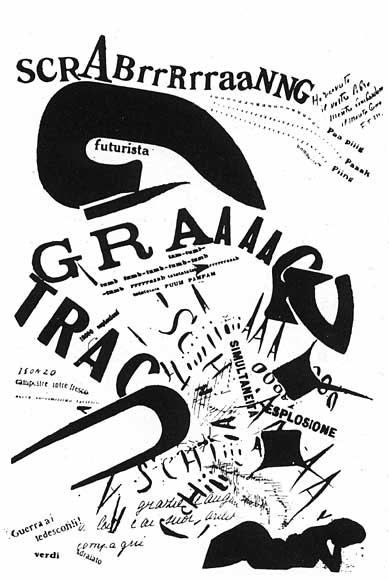
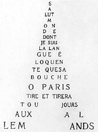
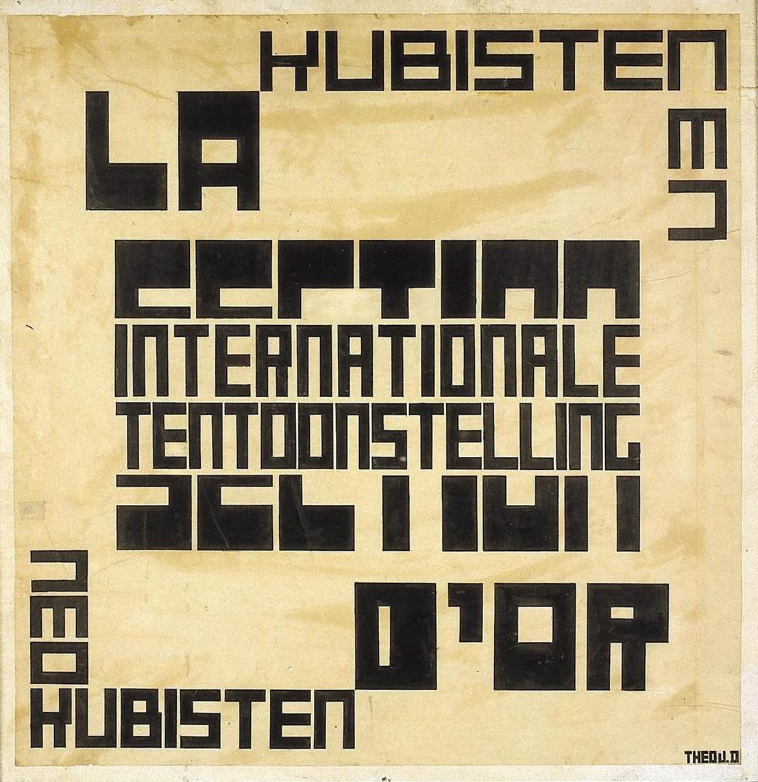
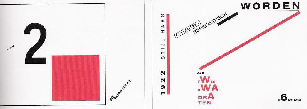
From the very first signs of writing to our contemporary digital era, typefaces and typography have been having a tight relationship with the evolution of tools and techniques. This is even more true today, where we can experience daily typography and type design on screens, a new “technique” or media that was not even existing 50 years ago. How was typography present in the streets of Amsterdam at that time? While nowadays screens and smart phones have been replacing “static” matters. The evolution of tools is not simply changing the way typography and type design are being experienced, it is also influencing the way they are being conceived. No matter where we are or what we are looking at, phones, TV’s, shops etc. the use of digital techniques to animate typography is becoming more part of our daily landscape. The fact we are dealing with more and more moving images in our society has lead to a significant change in typographic use. Typography could not stay in a “static” state, but had to adapt to the change of time in order to stay of signifigance.
The research question leading this thesis is the following : In which ways is the digital era increasing the dynamic aspects of typography? This thesis has been constructed into three chapters, analyzing the trajectory that typography and type design are taking. The first chapter “The historical mutation”, describes key moments in history where typography and type design has been showing any form of movements or dynamics, and this from the industrial revolution on. From the time where the Futurists were consciously constructing suggestive movement in their poetry, to the introduction of computers and the actual translation of movement into typography and type design. The second chapter “The classification of typography”, will examine the current state of theories trying to classify this development in typography, as well as the actual implementation and use of the “moving” typography. As an example, the possibility of choice within typefaces as an experience with type for both reader and user. Finally, the third chapter “Transforming typography, transforming image culture”, is questioning the status of this “moving” typography, asking whether it consits of an enrichment for our visual culture or if it functions solely as a decoration.

From the eightienth century on, typography and type design received a more prominent role within society, since the Industrial Revolution1. The Industrial Revolution was the transition to new manufacturing processes in the period from about 1760 to sometime between 1820 and 1840. brought greater human equality leading to an increase of public education and literacy. More and more demand for print to distribute informations in all possible ways and needs, asked for more bold and outspoken type design and typography. Printers setting type by hand received fierce competition from the lithographic printers, whom could project an artwork directly into print, giving a dynamic impression from the artist’s hand. Contrary to printers which had to set type with cast letters, the lithograph could directly transfer an artwork to a poster. This artwork could contain handwritten lettering, which can be considered as the definition of dynamic typography since it contains inconsistancy between the same letters, this resulting in different styles of the same character. At the same time, type foundries started to experiment with sand casting big and bold type. This resulting into the invention of fat faces (fig.1).

fig.1. Robert Thorne, fat-face types, 1821. He is thought of to be the first designer of the fat-face type in 1803.

Machine like type design achieved by the thickening of the serif to resemble the same thickness as the strokes, or slab-serifs as known now (fig.2).

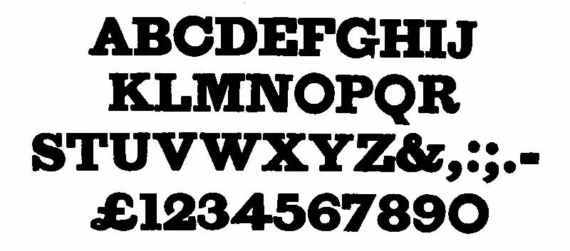
fig.2. Vicnent Figgins, two lines pica, Antique c.1815. It is believed to be the first slab serif font.

More developments were to be made regarding type design, almost as if every possibility had to be experimental and type foundries continued their explorations in contrasts, modification of forms, proportions and adding all kinds of different ornaments. Those examples are first illustrations of how the developments of techniques have been influencing the design of typography and typefaces. By exploring many possibilities depending on their range of tools, they created typefaces which design was directly coming from the restrictions of the tools. At this stage, the ‘moving’ aspect of typography and type design was not literally to be found since the medium was still static (paper), but rather the effort was put into the research of the expressivity: new letter shapes allowing for more contrast and rythm. A new step in the research of dynamic through type design appeared with the first typeface giving the illusion of 3D, developed by Vincent Figgins2. Vincent Figgins was a British punch-cutter and type-founder. Born in Peckham, England, 1766 — 1844. in 1815 (fig.3).

fig.3. Vicnent Figgins, Five lines Pica. The first 3D font ever to be made.

This typeface became so popular that many typefaces with all kinds of shading or striping evolved from it. By creating the illusion of a 3D shape, the letter was suggesting more dynamics, standing more out on the paper. The font had a feeling of shading, giving a direction to where the typeface was pointing towards. Looking back at the previous examples, it seems that many efforts were put into the innovation of lettershapes. Let’s think about a time where the only way of advertising was made through letters painted on signs or printed matters. With his new 3D typeface, Figgins was offering the possibility to stand out from the crowd. As standing out from one another as well as the demand of bigger advertising were growing necessities, the process of casting big tall letters became more and more challenging to printers and foundries : molds were imperfect since the metal would not stay liquid enough to fill all cavities. An American printer, named Darius Wells3. Darius Wells was an American printer.
Born 1800 — 1875.
, started experimenting with hand-carved wooden types and later on invented a lateral router which allowed for the mass manufacturing of wooden type for display printing. This opened up new possibilities in terms of taller letters and condensing the design, this leading to the first condensed type designs (fig.4).

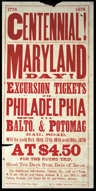
fig.4. Handbill for an train excursion, 1876. In the top the example of condensed type is used.

The letters created had an appearance of a tall structure, giving an impression of height. Because of its condensed quality, the letters suggested a certain importance and were demanding more antention on the page. Saving space for longer words on one line created the opportunity to go bigger with the font. The feeling of the font had an intense and almost demanding tone to it, as if it was obligatory to look at it, giving the sensation of raising the voice and yelling out the message.
After the massive impact of the Industrial Revolution, where somewhat bombastic design was the tone of voice, the run on typefaces and printing techniques became more fine tuned, allowing artists to make more refined work. Subsequently, in Art Nouveau ( 1890 — 1910), typography and type design did not follow anymore a need for mass communication through texts. Typography and type design in Art Nouveau became adaptive to their surroundings: integrating into the work of the artist and following the same style throughout the type design (fig.5).

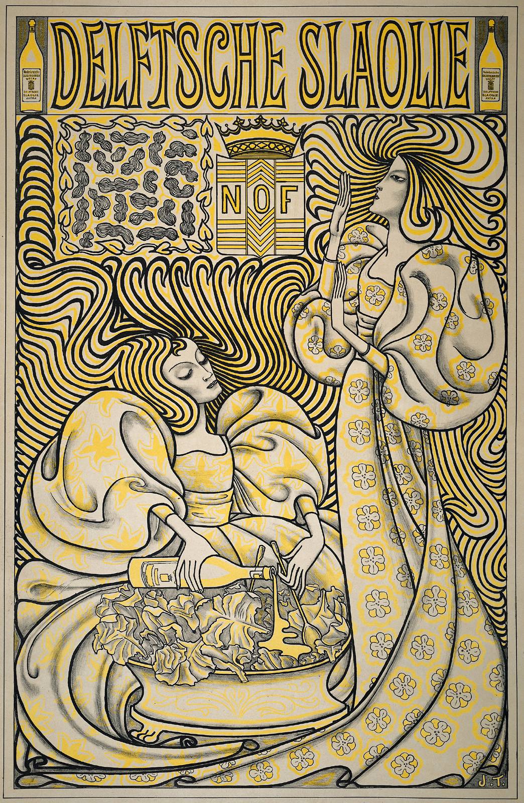
fig.5. Jan Toorop, poster for Delftsche Slaolie 1894.

Typefaces were not produced on a large scale, but specifically made for each particular work (fig.6).

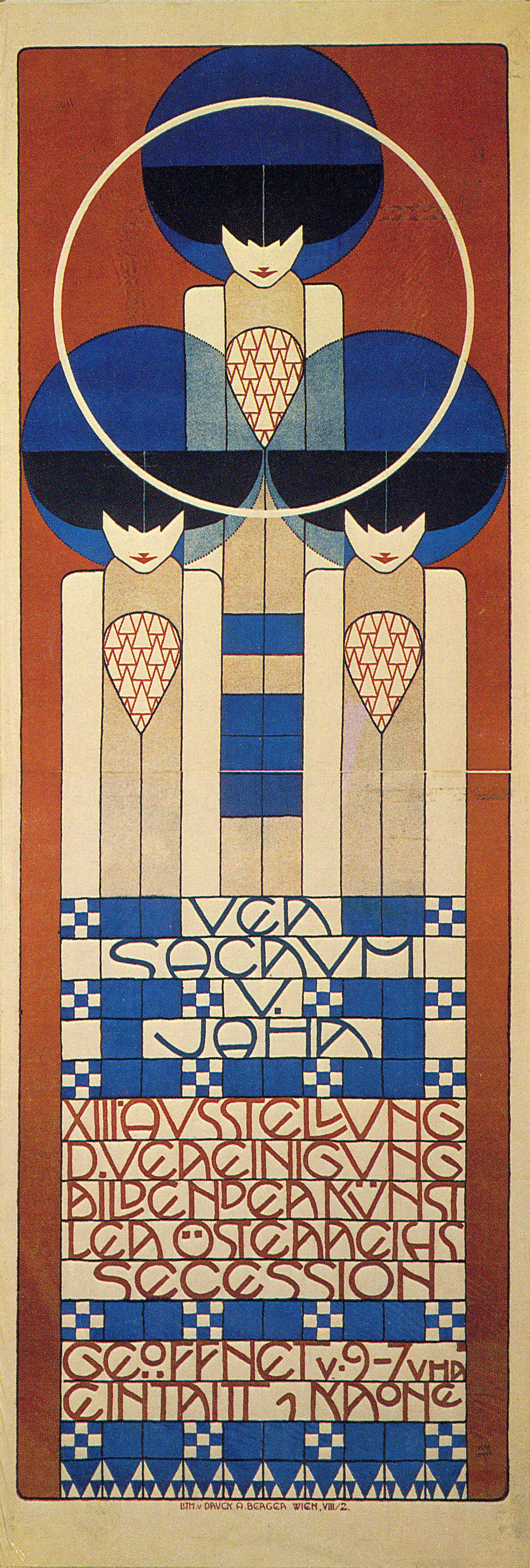
fig.6. Koloman Moser, poster for the thirteenth Vienna Secession.

The dynamics of the typography and the fonts were to be found in their ability to blend with the organical style practiced by Art Nouveau.
To conclude from those examples, it is clear that many ways of developing dynamic through typography and type design have appeared in the context of the Industrial Revolution. However, not willing to produce yet a sense of movement, but more of an aesthetic through shapes, contrasts and rythm. However, in the early 20th century, The Futurists developped a whole new sense of creating movement. The system of movable type, developped in the early days by Johannes Gutenberg,4. Technical improvement on the movable type, invented by Gutenberg back in 1450. was considered by the Futurists as a simple fixed block of horizontal lines of texts, held in a boxed shape structure. According to them, this system was restricting possibilities and had to be broken down in order to let the typography move freely.

In fact, the Futurists5. Futurism was an artistic and social movement that originated in Italy in the early 20th century. had a completely different look upon typography than what had been made previously in History. They started to experiment with letting letters flow over a page expressing an abundance of movement rather than fixed paragraphs. Giovanni Papini6. Giovanni Papini was an Italian journalist, essayist, literary critic, poet, and novelist. Born in Florence, 1881 — 1956. started to publish the journal Lacerba in Florence, in which the artist and foreman of the Italian Futurist movement Fillippo Marinetti7. Filippo Tommaso Emilio Marinetti was an Italian poet and editor, the founder of the Futurist movement. Born in Alexandria, Egypt 1876 — 1944. contributed to. The magazine was closely related to the Futurist movement and had no official editor, but fead by Ardengo Soffici8. Ardengo Soffici was an Italian writer, painter, poet, sculptor and intellectual. Born in Rignano sull’Arno, near Florence, 1879 — 1964. and Papini himself as principal contributors (fig.6).

fig.6. The weekly magazine Lacerba by Giovanni Papini and Ardengo Soffici. First published on 1 Junuary 1913.

A passage in the book of Philip B. Meggs & Alston W. Purvis9. Meggs, P., Purvis, A. and Meggs, P. (2006). Meggs’ history of graphic design. Hoboken, N.J.: J. Wiley & Sons. Philip Baxter Meggs was an American graphic designer, professor, historian and author of books on graphic design. Born in Newberry, South Carolina, 1942 – 2002. highlights how this publication was a break-through from historical ways of dealing with typography: “The June 1913 issue published Marinetti’s article calling for a typographic revolution against the classical tradition. Harmony was rejected as a design quality because it contradicted ‘the leaps and bursts of style running through the page’.” (fig.7)

fig.7. The article that Filippo Marinetti wrote as a contribution to Lacerba, in which he calles for an typographic revolution.

The typographic image changed from an orderly and harmonized craft into the expression of the disorganized minds of the poets, translated into a typographic poems. The poems depicted very heavy typography that was placed in a controlled chaos, creating a visual map of the poets intentions. The choice of typefaces were ranging from sans serif to serif fonts, from which the weights were taken in account. For the Futurists, writing and typography could potentially become an expressive visual form, that directly communicates through the linguistics, but carries a lot of definition in the placement and use of non linguistic expression (fig.8,9,10).

fig.8. Filippo Marinetti “Une assemblée tumultueuese” (A Tumultuous Assembly). A foldout from Les mots en liberté futuristes, 1919.fig.9. Après la Marne, Joffre visita le front en auto (After the Marne, Joffre Visited the Front by Car), by Marinetti, 1915.fig.10. Futuristic typographic poem of 1919 by Filippo Tommaso Marinetti.

As the work of Marinetti was very outspoken and daring, the work of Guillaume Apollinaire10. Guillaume Apollinaire was a French poet, playwright, short story writer, novelist, and art critic of Polish descent. Born in Rome, Italy, 1880 ­— 1918. was more modest and refined in its typographic choices. Apollinaire was considered as one of the foremost poets in the early 20th century, as well as being an impassioned advocate of the Cubism (fig.11).

fig.11. Salut monde (Hello World). Calligram about the Eiffel Tower by Guillaume Appolinaire, 1918.

He is most known for his poetic calligrammes: a phrase or poem typographically structured into an image. The arrangement of letters and words were depicting the topic of the phrase or poem, creating a contextual image of the poem. His letters were placed in a very delicate manners, enhancing the dynamics within the poetic text itself. It seems that the work on poerty became a whole new playground for artists, writers and designers. Indeed, the Dada movement11. Dada or Dadaism was an art movement of the European avant-garde in the early 20th century. developed sound poetry that was comparable to the work of Apollinaire. The Dada movement was more interested in the pure visual qualities of typography and deconstructed letters to be seen as a pure visual form (fig.12).

fig.12. Kurt Schwitters, a spread from Merz 11, 1924. Ads for Pelikan Tusche and inks.

By using typography to note down the pure sounds, they took away the linguistic meaning from words. As an addition to their work, color was of an importance to build one more layer of dynamics. By using the full space of the page as well as different fonts but also colors and orientations, they managed to create highly dynamical compositions where the elements seem to literaly move on the page. The function of typography had clearly changed and became a tool of visual expression. As typography integrated more with the visual aspect of the design, a more dynamic layout was achieved. Where the freedom was taken by the Futurists and the Dadaists, El Lissitzky12. El Lissitzky was a Russian artist, designer, photographer, typographer, polemicist and architect. Born in Pochinok, 1890 — 1941. was moving forward into a more structured approach to typography using basic shapes and elements of typography in his work (fig.13).

fig.13. El Lissitzky’s title page for Veshch No.3, 1921-1922.

El Lissitzky’s ideas changed the course of graphic design. In fact, by using his background as an architect to construct his work as a graphic designer, he made use of grid systems in order to place infromation in different hierarchies. His works were based on a hidden construction of grid systems, with which he tried to achieve dynamic and exciting designs. De Stijl13. De Stijl, Dutch for “The Style”, also known as neoplasticism, was a Dutch artistic movement founded in 1917 in Amsterdam. was starting along side the Russian movements of Suprematism14. Suprematism is an art movement, focused on basic geometric forms, such as circles, squares, lines, and rectangles, painted in a limited range of colors. and Constructivism15. Constructivism was an artistic and architectural philosophy that originated in Russia beginning in 1919 and was a rejection of the idea of autonomous art. , which had similar ideas about the typography and type design from the Dada movement. Following movements such as the Russian avant-Garde as well as De Stijl continued elaborating on those already established guidelines: basic shapes, colors and letters combined into dynamic compositions (fig.14,15)

fig.14. Theo van Doesburg, exhibiton poster, 1920. fig.15. El Lissitzky, cover and page for De Stijl, 1922. El Lissitzky was invited by Theo van Doesburg to design and edit a double issue of De Stijl.

However, a shift can be witnessed during the span of the two world wars where the focus seemed to have moved towards propaganda. The compositions created at that time are light years away from the somewhat free and open graphic experiments of the Futurists or the Dadaists. From the early 1920’s, compositions seemed to be condemned to their political context. The first attempts of moving typography were not to be present till well after the second world war, when the designer Saul Bass together with the movie industry did actually put movement into letters.

The first obvious attempts to make typography really move has been implemented into the title sequences by the movie industry together with American graphic designer Saul Bass16. Saul Bass was an American graphic designer and Academy Award winning filmmaker, best known for his design of motion picture title sequences, film posters, and corporate logos. Born in Bronx, New York, 1920 — 1996. who has been playing a leading role in this process. In 1955 he was asked to design an introduction title for the movie The Man with the Golden Arm17. Directed by Otto Preminger in 1955. Strung-out junkie deals with daily demoralizing drug addiction while crippled wife and card sharks continue to pull him down. directed by Otto Preminger18. Otto Ludwig Preminger was an Austrian American theatre and film director. Born in Wiznitz, Ukrain, 1905 — 1986. (fig.16).

fig.16. The Man with the Golden Arm, title sequence. An example of the implementation of typography with kinetic charateristics.

The title sequence contains simple line graphics which are accompanied by texts. These texts appear and dissapear from the screen, others slide into the frame to their final position. The use of different ways of animating the text into the screen manages to surprise the spectator since none of the moves are the same or contain the same textual image. The graphics appear and disappear together or replace the text, giving a notion of hierarchy. Here, the term ‘dynamic’ does not apply anymore since the typography is moving over time. Terms such as ‘Motion’ or ‘Kinetic’ are more appropriate to describe the characteristics of this title sequence. After this movie Saul Bass has been collaborating with more famous moviemakers such as Alfred Hitchcock, 19. Sir Alfred Joseph Hitchcock, was an English film director and producer, often nicknamed “The Master of Suspense”. Born in Leytonstone, London, 1899 — 1980. Stanley Kubrick, 20. Stanley Kubrick was an American film director, screenwriter, producer, cinematographer, editor, and photographer. Born in Manhattan, New York City, 1928 — 1999. Edward Dmytryk21. Edward Dmytryk was a Canadian-born American film director. He was known for his 1940s films noir and received an Oscar nomination for best director for Crossfire (1947). Born in Grand Forks, British Columbia, Canada, 1908 — 1999. and Michael Anderson. 22. Michael Joseph Anderson, Sr. is an English film director, best known for directing the Second World War film The Dam Busters (1955), the epic Around the World in 80 Days (1956) and the dystopian sci-fi film Logan’s Run (1976). Born in London, England, 1920. In his title sequences, he believed that typography had to play a role within the title sequence, a role that would tease and evoke. In his sequences typography plays a more important role, prior to the start of the actual movie, displaying the creators, the cast etc. Not only that was happening in the sequences Saul Bass made, but also his work contained a short summary of the movie in such a way that the spectator’s curiosity would be triggered. The movements used to animate the typography ranged from sliding in and out of screen, coming out of objects and fading in and out again. Throughout the years, different techniques were used in the title sequences, ranging from cut-outs to tangible use of typography. By creating a short story of the movie, he was able to re-use certain elements from the movie and play typographically with it. Another Graphic Designer that was active in the field of designing title sequences was Robert Brownjohn, 23. Robert Brownjohn was an American graphic designer known for blending formal graphic design concepts with wit and sixties pop culture. Born in Newark, New Jersey, 1925 — 1970 who designed From Russia with Love24. James Bond willingly falls into an assassination ploy involving a naive Russian beauty in order to retrieve a Soviet encryption device that was stolen by SPECTRE.(1963) and Altered States25. A Harvard scientist conducts experiments on himself with a hallucinatory drug and an isolation chamber that may be causing him to regress genetically.(1980) . The title sequence From Russia with Love is an interaction between surroundings and typography, where the first one is changing the appearance of the other. (fig.17)

fig.17. From Russia with Love, title sequence. An example of the implementation of typography with kinetic charateristics where the surroundings are interacting with the typography.

In the intro sequence, a woman is bellydancing and playing with the typography in various dance moves. The dances are ranging from fast to slow, changing the typography with her body. In this case, it is not the typography itself that is moving but its appearance is altered by the dancing woman. On the other hand, in the title sequence Altered States, the letters composing the title are moving through each others, sliding from left to right and right to left, allowing for the shapes of the letters to intertwine momentarily. (fig.18)

fig.18. Altered States, title sequence. An example of the implementation of typography with kinetic charateristics where the typography is interacting with itself.

By slowly zooming out, the title is reveiled. Both examples of title sequences are forms of Kinetic Typography since the letters are moving over time. The developments in the movie industries were not the only ones actively trying to make typography more “dynamic” in temporal media. The computer scientists were also making progress in creating programs that would dynamize the typography. Donald Knuth, 26. Donald Ervin Knuth is an American computer scientist, mathematician, and professor emeritus at Stanford University. Born in Milwaukee, Wisconsin, 1938. a mathemetician and computer scientist, primarily working on writing computer programs. He is the creator of the TeX27. TeX is a typesetting system designed and mostly written by Donald Knuth, released in 1978. (released 1978) computer typesetting system, and the related METAFONT28. Metafont is a description language used to define vector fonts, which has been designed by Donald Knuth. (released 1984) font definition language. Basically TeX is a typesetting system allowing for quick and easy way of setting text while METAFONT was the description language for vectorization of fonts. The attention in METAFONT goes primarily towards the rasterization on bitmapped displays. With his TeX program, Knuth had in mind that anybody could make high quality books by using a minimal amount of effort, and to give the same results on any computer at any given time. The working method of METAFONT is to describe the pens path, rather than the outline of the letters. In 1980, the first desktop was launched and was allowing individuals to work with powerfull software to create bitmap graphics. As the computer became more accessible for the general public, artists, designers and writers started to explore the new tool. Komninos Zervos29. Komninos Zervos is a Greek-Australian performance poet and teacher. Born in Richmond, Melbourne,1950. is a poet and has been also publishing poetry by the use of internet, creating mulitmedia poems. Within his work there is movement can be found, in the poem BEER a morphing effect is used to transform the letters between words. (fig.19)

fig.19. The work of Komninos Zervos, where the letters are morphing into other letters producing new words. This form of typography is known as metamorphisis or Dynamic Typography.

His work on the internet is called Cyber Poetry where he is searching for new ways of reading and experiencing poetry. On one of his archived websites, he says the following about his own work;

"Cyberpoetry30. (http://pandora.nla.gov.au/
nph-wb/19970512130000/http://
student.uq.edu.au/~s271502/
index.html)

poetry that can not be published in the traditional print media,
poetry that moves in time and space,
poetry that requires new ways of reading,
poetry that allows interaction,
poetry that is moving digital, aural, visual, and animated.”

This dates back from 1996. His visual aesthetics have a lot to do with the early stages of the internet, where strong colors dominated the internet.

Graphic design has come to a point where it is mastering the suggestive power of dynamics in printed matter, composing typography and image onto static sheets of paper. Since the introduction of digital media, a noticable change is taking place. Typography and type design are both in a shift, ensuring the quality of print onto digital media. To keep track of all this, theorists try to come up with specifications for these new forms of typography. There are some forms that have settled in what defines them, such as Kinetic– and Motion typography. Both define the same effects. Because digital media changes compared to print media, the term of temporal and non-temporal started to separate typography into a term. The difference is significant, where non-temporal does not change over time and temporal does. Non-temporal media such as print have only one kind of simularity to temporal media, which is dynamic typography.

TEMPORAL TYPOGRAPHY
Temporal typography changes or moves over time, and normally appears in screen–based media in particular title sequences, TV station identities, and advertising. Temporal letterforms have the ability to manifest themselves in both static and kinetic ways, as well as physical and digital ways. Therefore it can’t be assessed by the same functional factors of traditional typography: legibility and readability.

KINETIC TYPOGRAPHY
Kinetic typography is moving within the container and not the surrounding. The text has to move itself to become kinetic. Kinetic typography can only manifistate itself when the text is in movement, the container or the carrier of the message does not comply to the movement of the typography such as billboards, car adverts etc. The typography can interact directly with its surroundings and/ or interact with itself. It is not able for the typography to transform, that would be classified as metamorphosis. In the title sequense From Russia with love, which was designed by Robert Brownjohn and directed by Terence Young, typography is interacting with its surrounding (fig.20).

fig.20. From Russia with Love, title sequence. An example of the implementation of typography with kinetic charateristics where the surroundings are interacting with the typography.

The typography itself is not changing, but is being changed by the interaction. As an example of inter–action by itself the title sequense of Altered States, directed by Ken Russell and designed by Richard Greenberg, clearly shows this form (fig.21).

fig.21. Altered States, title sequence. An example of the implementation of typography with kinetic charateristics where the typography is interacting with itself.


FLUID TYPOGRAPHY
The artist Eduardo Kac31. Eduardo Kac is a contemporary American artist and professor of Art and Technology Studies at the School of the Art Institute of Chicago. Kac was born in 1962, in Rio de Janeiro, Brazil. http://www.ekac.org/ (1962) produced a series of works called Holopoetry, which are halograms with poetry (fig.22).

fig.22. The holo poem Limbo with three different view angles.

In her essay “Fluid Typography : Construction, Metamorphosis and Revelation”, Barbara Brownie32. Dr Barbara Brownie leads online postgraduate study for MA Graphic Design and MA Illustration, and is director of the professional doctorate programmes DFA (Doctor of Fine Art) and DDes (Doctor of Design), at the University of Hertfordshire. quotes Eduardo Kac over a possible definition of fluid typography: Kac describes his works as containing “fluid signs”, or signs that alter over time, “therefore escaping the constancy of meaning a printed sign would have”. They are capable of metamorphoses between a word and an abstract shape, or between a word and a scene or object. This is text that does not have a fixed identity or a reliable, constant meaning. It is constantly in flux, presenting multiple identities over time.

DYNAMIC TYPOGRAPHY
Motion and kinetic typography are terms used wide spread to define all kinds of effects, this tho, is often miss interpreted. The problem however is that when motion and kinetic are used to describe the action, the single characteristic is “motion” of temporal typography. There are other effects such as distortion and transformation, which suit better the term dynamic typography (fig.23).

fig.23. The work of Komninos Zervos, where the letters are morphing into other letters producing new words. This form of typography is known as metamorphisis or Dynamic Typography.

Still this term is rather vague in its range of descriptions. Dynamic is described in both temporal and non–temporal forms, where the text is static but suggesting movement.

RESPONSIVE TYPOGRAPHY
Responsive design for websites is a form that does not change over time, it is changed the moment the user needs it to change (fig.24).

fig.24. Call for Type, website. When scrolling the text changes, the viewer is changing the typography.

The idea of responsiveness within the website is to optimize the design for different screen formats, from computers, tablets to mobile phones. The text frame for the computer will be wider than that of a phone, in order to display the text accordingly. By setting breakpoints for the typography, the textbox will change according to the set width of a breakpoint. Responsive typography allows typography to be set in a flexible frame, words can jump to the next line, hence the term “responsive”. The responsiveness makes sure that the text will always be readable till certain limits, whenever the browser window is narrowed for instance. Designers can control the outcome of the appearance of the text more, giving the user an optimal reader experience digitally. This is compared to print a benifit for the digital format, since the container is not fixed. It allows the user to adjust the comfort of reading to its own needs.

The computer has become a tool for type designers in the sense of the actual designing and adding more features to a font such as alternates. The designer can create more variations of a font in shorter time period, in which the computer allows to compare and put the font next to eachother for the designer to optimize the process. By making use of coding, the font can be told what to do when, what alternates to use and when these should be applied. The implementation of new features into the design of typefaces has lead to new exiting designs which can be small features or clearly visible features. The reader experiences another way of reading and for designers other options to choose from. These features are explored in printed matter as well as in the digital platform, ranging from literally changing the alternates to implementing them in plain texts and coming across them while reading. Maybe during the reading of this thesis this it came to realization that the text is actually containing contextual alternates, which are alternates that change whenever certain letters follow up after another: like in better and keep. The typeface used in this thesis has been designed by me personally for the purpose to illustrate the Dynamics, and to experience a different kind of typography and type design. (fig.25)

(fig.25)
contextual alternates
used in this font are:

aaa ccc eee f f f

ggg jjj rrr sss yyy

Use the button below to turn it off & on to see the difference.


By using the contextual alternates, it is possible to create different appearances of the same letter. Resulting in a typeface that contains a dynamic property, this illustrates the flexibilty of the computer as a tool within digital and print. Another example with contextual alternates is the work of Remco van Bladel33. Remco van Bladel is a graphic designer, based in Amsterdam. He is the co-founder of noise band/art collective ‘Sonido Gris’, Dutch art book publisher ‘onomatopee’ and ‘WdW Review’ (witte de with, Rotterdam). Born in Amersfoort, the Netherlands, 1977. http://www.remcovanbladel.nl and his typeface Natura which he made for the artist herman de vries34. herman de vries is a dutch artist. De vries works and lives with his wife susanne in Eschenau near Knetzgau, Germany. Born in Alkmaar, the Netherlands, 1931. http://www.hermandevries.org who has represented the Dutch Pavilion of the Venice Biennale35. The Venice Biennale was founded in 1895 and it is now one of the most famous and prestigious cultural organizations in the world. The Biennale takes place every two years in Venice, Italy. http://www.labiennale.org/en/Home.html in 2015. This typeface is making use of different characters of the same letter, making miniscule differences within the same letter. The visual impact of the differences becomes an exploration within the text, allowing the reader to experience more than the written story. In fact the case of Natura is a conceptual based idea built up from the work of herman de vries, where nature and human nature have a close relationship (fig.26).

fig.26. The font Natura and its contextual alternates featured in this specimen. Designed by Remco van Bladel for the Dutch Pavilion of the Venice Biennale, 2015, which was featuring the work of the dutch artist herman de vries.

The idea behind the typeface was to take the geometric font Futura and adjust the typeface in a more organic but geometric letters. Differences in length of the ascenders/ descenders and changing the width of some letters give away it has been customized. In contrary to print, the website for the exhibition Call for Type36. The contest «Open Call for Type», which was set up by the Gutenberg-Museum in Mainz and the Institut Designlabor Gutenberg, attracted enormous international interest: 290 type designs from more than 17 countries, ranging from «A» like Argentina to «U» like USA, could impressively show the status of up-to-date type design. http://callfortype.de/ which was initiated by the Gutenberg Museum37. The Gutenberg Museum is one of the oldest museums of printing in the world, located in the old part of Mainz, Germany. It is named after Johannes Gutenberg, the inventor of printing from moveable metal type in Western Europe. http://www.gutenberg-museum.de/ in Mainz features another kind of reading experience achieved by alternates. The website’s text is changed by the reader scrolling down, whose action writes and erases information. Because the reader is in control of the movement, this phenomenon is not classified as kinetic but dynamic, here again time is not changing the typography. The contextual alternates are used on the same possition and when scrolled they replace themselves in a random order according to what is written (fig.27).

fig.27 Call for Type, website. When scrolling the text changes.
— Designers : Matthias Dufner & David Dusanek
— Programming : Matthias Dufner & Christian Hansen

It seems there has been made a clear decision in hierarchy and where the animation is applied and where not. To keep a good legibility in the longer texts, there is no animation creating a calm text image. For the headers, it is less important to have good legibility since they are considerably bigger. In the font Natura, this effect is applied throughout all the text, however in this website, only the headers have the effect. The choice to only apply it to the headers seems to create enough of an effect, which works very nicely together with the content. Picture, having to read the whole webpage like that. And as it goes for Natura, it is not in continues motion, which does not harm the legibility of the font. The work of Radim Peško,38. Radim Peško who runs RP Digital Type Foundry is a small scale type foundry established in 2009. http://www.radimpesko.com is also often containing the possibility of choice. His practice in type design is somewhat more experimental and out of the ordinary compared to more traditional foundries. For example, some of his typefaces contain a variety of different designs within the same font, not designign a regular and a bold but two different styles of fonts. The possibility to choose different styles from the same font family is a different way of looking at type design compared to the traditional regular, bold and italic styles. Within the fonts Boymans, Pomelo and LYNO there are only different styles availible, as the fonts do not express a weight or angle, but more a style with different characteristics. In the typeface LYNO which Radim designed together with Karl Nawrot,39. Karl Nawrot is a French graphic designer based in Amsterdam. http://www.voidwreck.com/ it was the aim as Radim Peško states on his own website: “The characters of Ulys(ses 31), Stan(ley Kubrick), Jean (Arp) and Walt (Disney) negotiate the digital freedoms of their production through playful typologies of form. They are open and various, and their spirit is this: to resist normative tendencies and to reject the idea of definitive form.” (fig.28)

fig.28. The font LYNO containing four different styles which all have their iconic reference to famous people.

Such forms of alternates are adapted widely by type foundries, such as Grilli Type.40. Grilli Type is an independent Swiss type foundry. https://grillitype.com/ In their font GT Haptik, which contains certain modesty in the alternates put into it, their type specimen clearly illustrates the effects of these alternates. (fig.29)

fig.29. The font GT Haptik, an extract from the type specimen by Grill Type. Displaying the alternates availible within the typeface.

Offering choice within a font gives the user the possibility to apply the font to different situations. By giving more choice from a type design level, the typography can adapt itself more without having to find a similar font to replace on another. This makes the font more multi functional and attractive, but can also be pure element of decoration and not necessarely a function.

In identities it is clearly used, typography that becomes a moving element in which the logo also can take part. The work of Stefan Sagmeister41.& 42. Stefan Sagmeister born in 1962, is a New York-based graphic designer and typographer. Sagmeister co-founded a design firm called Sagmeister & Walsh Inc. with Jessica Walsh whom is graphic designer, art director and illustrator, born in 1986. http://www.sagmeisterwalsh.com/ and Jessica Walsh41. 42. Stefan Sagmeister born in 1962, is a New York-based graphic designer and typographer. Sagmeister co-founded a design firm called Sagmeister & Walsh Inc. with Jessica Walsh whom is graphic designer, art director and illustrator, born in 1986. http://www.sagmeisterwalsh.com/ contain such examples where the movement is taken into account for the identities they create. The identity for Fugue43. Fugue is an Operating System for the Cloud. Fugue builds, optimizes, and enforces cloud infrastructure—continuously and automatically. https://fugue.co/ has been based upon animation, not only typographically but also pictographically. The typography is dynamic since it does not change over time and the appearance changes because of the dots (fig.30).

fig.30. An overall animation of the Fugue identity displaying the animation used in the identity.

The dots covering the letters change the appearance of the logo in countless possibilities, making the identity highly dynamic but also a flexible identity. The identity can carry many different appearances and still be recognizable, but this could possibly be also the weakness. As a big part of the visual is determined by the random appearance of the dots, there is a loss of control over the appearance of the visual. In the case of Sagmeister and Walsh, it seems to become more of a decorative feature than saying something about the identity. The relation to the purpose of the company and the visual is not visible.In contrary, the identity of the mit media lab,44. The MIT Media Lab is an interdisciplinary research laboratory at the Massachusetts Institute of Technology devoted to projects at the convergence of technology, multimedia, sciences, art and design. Established in 1985. http://www.media.mit.edu/ actually makes perfect use of the flexibility of an identity to fulfill the needs. The grid applied in the logo became the basis for the letters within the grid system, for every department another playfull combination is made. By using a system to show every department of the school, different visuals with a purpose are made. The logos formed by the first letters of the words are possibly at the border of abstraction, creating a visual language of its own (fig.31).

fig.31. The different logos which are used in the identity of MIT media lab.

By continuing to use the abstract typography generated into visuals there appears to be a visual aspect to the logo in a more abstract form. The work of Philippe Apeloig45. Philippe Apeloig is a graphic designer based in Paris, France. http://apeloig.com/ goes a little further with animation, and creates animated videos acompanying a few of his works (fig.32).

fig.32. The poster made for Hermes displaying the suggestive animation of jumping typography.

His work seems to reverse the process of making, by first creating the video and after the actual work itself. His videos are compositions of typography, shapes, colors and implements these into a moving image. Some other animations he made are a deconstruction of typography and type design, by transforming the typographic elements from one shape into another. Some deconstructions of the type design come with different end results, but in terms of animation do not go further than just playing with the shapes and making them compose different images. And for that it raises the question if the animation is adding something more to the work than just an exploration of the possibilities of the work. The animation is a litteral translation of what the poster is suggesting, potentially leading to the deminishing of the suggestive power of the poster (fig.33).

fig.33. The video that was made accompanying the poster made for Hermes. Here the typography is literally jumping.

The works of Felix Pfäffli46. Studio Feixen is the graphic design work of Felix Pfäffli. Born in 1986. http://www.feixen.ch/ have another approach to the use of animation, he made two works displayed on his website as posters which are meant to be presented in another way. The first poster is actually meant for the biggest LED screen in Shanghai, and the other is an experiment for the splash page of Wired magazine. But what also is happening, is that the work is questioning the purpose of the poster and the way it can be used for moving typography. Pfäffli’s work is an outstanding example of mastering typography as an image, and also is making use of motion in his work. The two posters he made are small videos of typographic experiment in motion, both of them within the kinetic typography. The poster of letters falling like blocks from the top has a somewhat Tetris approach to the work, a rahter straight forward animation (fig.34).

fig.34. The falling letters for the Shanghai LED screen.

This poster is a little more sophisticated and playing with the illusionistic effect of a loop, turning the readable text into a more abstract play of lines and colours. This work is a little more complex animation and is in terms of graphics more exiting, not only giving a complex structure but also containing a message to be found (fig.35).

fig.35. The endless rotating animation that weirdly intertwines with itself.

The format and way this is presented is unmistakable to be a poster, mounted on a wall with holding clips pinned to the wall. The surprising effect of poster1 to learn it is a moving poster contains a nice element of surprise. For the other poster the complexity of the image is more appealing. As these examples describe a more functional related design question, the work of Lust47. LUST is a multidisciplinary graphic design practice established in 1996 by Jeroen Barendse, Thomas Castro, and Dimitri Nieuwenhuizen, based in The Hague, Netherlands. http://lust.nl is trying to explore what else is possible with the technology we’re presented with every day. The Type/Dynamics48. This exhibition is inspired by the publication of the doctoral thesis by Frederike Huygen on the graphic designer, photo-book pioneer, art director, teacher, arts administrator, and environmental artist Jurriaan Schrofer. http://www.stedelijk.nl/en/exhibitions/typedynamics-jurriaan-schroferlust#sthash.uzbSFbND.dpuf exhibtion from Stedelijk Museum Amsterdam,49. The Stedelijk Museum Amsterdam is an international museum dedicated to modern and contemporary art and design. http://www.stedelijk.nl/ is an exhibition about the work of Jurriaan Schrofer.Jurriaan Willem Schrofer (The Hague, 15 april 1926 – Amsterdam, 1 juli 1990) was a Dutch Graphic Designer, typographer, book designer and teacher. As this installation is showing kinetic typography, the spectator is also influencing the typography through kinetic sensors (fig.36).

fig.36. The installation within the Stedelijk showing typography out of the grid.

The installation visualizes the continues stream of information surrounding us daily, this data are also data that we can access daily. The software is searching for these physical locations and translating the images from Google streetview into abstract grids, which on their turn contain the information and typographic layer. What is interesting about this form is that the kinetic typography is affected by the human presence in the space, adapting the typography to the movements and whereabouts of the person (fig.37).

fig.37. The installation within the Stedelijk showing typography built out of the grid.

These examples are some of many, displaying the differences of temporal typography. The classification of such typography does not come easy, as there is not much defined yet. As kinetic and temporal found their foothold, other characteristics are brought under temporary definitions.

The visuals fed through digital media seem to make people more repellent towards the impact of “static” images, this resulting in ignorant behavior towards them. Nowadays, the standard for attention/ attraction seems to have shifted to screens in the shops windows, showing full advertorial videos of products being sold. A part of Typography evolved into a moving medium that does not just display the message but tries to attract the attention by using movements such as falling, fading, pulsing, etc. Moreover, the visual function of certain medias such as news, TV and websites seems to slowly change because of the introduction of new digital techniques. The poster for example, served for a long time as the main advertorial piece reaching out to the public. The message spread by the poster could serve for any kind of purpose: products or events. The poster was trying to inform the public, attracting its attention to it: visibly dynamic and displaying harmoniously the informations on it. However, since Internet has become such an important media giving numerous possibility to anybody owning a laptop, the function of the poster has changed. It appears that the poster is no longer the main advertorial piece towards the public but that it rather functions as a reminder in the streets or at a location, just as a beacon. Social media, mailing and other digital means have taken over the main advertorial function of the poster. Nowadays, it appears that typography and images need to move in order to become more attractive and obviously medias have to change to keep up to date. In this case, the image culture is shifting into a more active moving culture, where simple typography might not be able to do the job anymore.

However, in relation to what we perceive in a day, typography is probably one of the biggest carriers of communication/ information. The infrastructure has embedded typography in its landscape: no matter where you look, it is to be found. This implementation is for instance strongly visible in TV channels, where logo sequences are introducing a new subject or continuing the program. The use of movement in typographic elements has found a prominent role in the communication on what these channels seem to have in common is the use of animation, making their logos move in a slightly different way. Whenever there is a commercial break it is most likely that an add will display bouncing typography and others like moving, dangling or anything else. Temporal typography finds its way into any home through television, tablets, computers and mobile phones, continuously exposing shops the viewer to moving content. In the infrastructure, it is found back along highways through large bilboards, whereas public transport frequently switches the information screens to commercials. In places such as train stations, it is also possible to find some digital screens that will most likely display videos of commercials. On social media, moving typography is transmitted through the liking and sharing of videos. Videos designed with the purpose to instruct can contain elements of animation, like in airplanes where you think you just escaped every form of visual impulses. Cultural institutions are also taking part in using moving typography, trying to find their way of using the temporal typography. They as well channel their moving typography through their own website and one or more social media accounts. The use of moving typography goes for everything that is temporal media, thinking of videos, websites, movies and so on. But not only in the design world this is used, it counts for anything that has to deal with temporal media. Some effects achieved by the animation will be considered as a stylistic choice, even maybe as far as a fashion. The relation of the animation and the content can make it superficial and straight forward, as the animation would not do more than just illustrating what is said. Some other animations may push boundaries and create new works, possibly leading to a new movement in graphic design.

It often happens that typographic styles are being copied and used over and over again, this resulting into fashions within design. The practice of a graphic designer is to give shape to content, but also to understand this content and to find a fitting solution. Nowadays graphic designers also involve themselves with self initiated projects for which they find a fitting design solution. They try to push the boundaries of graphic design and give content to choices they make. Since graphic designers are getting more involved into the animation of their own work, typography in animation could possibly be better understood.
In some commercial contexts, typographic animations are also copied over a variety of different media. Obviously, TV programs have a tendency to copy each other styles, where animation of logos and typography are an often used technique. It looks like there are some styles that have evolved and are altered for different channels, for which some of the effects appear to be similar to others. It seems to be that the frequently used version is the build up of the logo or deterioration of it. For example, the CNN world sport’s51. CNN is an American news channel which has a sister network which is CNN international, where they broadcast World Sport. http://edition.cnn.com/sport identity sequence is the build up of the visual where typography appears as if written onto the shield. The contructing scene takes place in a zoomed-in mode, where it is only possible to see some details taking shape. The typography is coming onto the shield in an illuminated outline, which snakes the path of the letters. At the same time some trims are added in layers, which follow eachother. When the typography is completely layed out in outline, all the sudden fillers stack on top of eachothers, creating a 3D effect to the typography. At almost completion of the shield and decoration on it, the focus goes to a zoom out, where at last the logo of CNN is added on top (fig.38).

fig.38. The title sequence at the start of the news.

It occures that the angle is always somehow shot from underneath, giving a sensation of importance whilest the news in this case is sports. All these effects and angles just took place in about four seconds of intro. As for the NOS52. The NOS is the state owned tv news program from the Netherlands, which is a program from De Nederlandse Publieke Omroep. http://nos.nl/ their animated logo, the approach is a more simple one. The letter "O" functions as the animations platform and starts to empty out in differently segmented pieces (fig.39).

fig.39. The title sequence at the start of the news.

As this empties out some decorative rings in the background start to appear, which rotate slightly while appearing. When the letter is empty, it start to fill up again in the same way but different order of filling. When this is complete, the same kind of animation in a large perspective starts to fill the screen. The filling of the screen is used to make a transition between the NOS image and the actual news. Here the angle is dead ahead on the logo and creates a feeling of equalty between the program and the viewer. Both animations are forms of dynamic typography, and more precisely kinetic, since the typography is appearing out of nowhere. The CNN logo might be considered as over expressive and has a lot of effects, whilest the NOS took a subtle approach to the used effects.
Within TV commercials, kinetic typography is an often used technique in an attempt to attract the attention of the spectator, using different kinds of effects in order to have difference within the commercials. The movement in relation to the content of the commercial does not add anything else than just movement and emphasize to certain sentences. In this case it is more of a fashion to add kinetic typography to the content of the commercial, rather than actually making a point out of what is being said.
For what the commercial side of design is trying to do with moving typography, some cultural institutions are also exploring the integration of typographic animations. The Stedelijk has made a video displaying their current and the permanent exhibitions in the museum, as a teaser to the public to see what is there. The video starts with the introduction of the logo consisting of two main effects. The first is the writing of the logo in three lines (fig.40):

fig.40. The title sequence at the start of the video.

the words appear word by word of which the outline is placed first in red and after becomes black and filled in. Two lines are introduced next to the typography framing the text into a box. Suddenly the text starts to expand and curve. This is the start of part two: with a fast movement the letters place themselves into the final form of the logo. The typography bounces a little after of the speed it has changed in, an effect that seems to make it feel more lively. After this introduction of the identity of the Stedelijk, it continues with highlighting some information about the museum (fig.41).

fig.41. The animations within the video.

A white transparant gradient is layed over the video in which the typography is appearing, just like it did in the introduction. By every change of shot, the white layer has changed into the perspective of the shot in which the typography also in perspective is animated. The visual quality of the perspective makes it feel a little dated, where in the 90’s early 2000 picture and typographic perspective were used in graphic design.
De Pont53. Museum De Pont is a contemporary art museum in Tilburg, which is situated in an old wool factory. http://www.depont.nl/ has announced a competition though the use of a video launched on their social media, in which they are calling out for applications of people that have written about their experiences in De Pont. Right from the start, the kinetic typography is rather hectic and shaky, swiftly going from one angle to another (fig.42).

fig.42. The title sequence at the start of the video.

The effects are in abundance, where rotation, perspective and drop-ins are at display. So far for an introduction, where the rest of the content is existing out of still images which slightly shake continuesly. The typography is appearing from nowhere in different angles and effects, creating a restless image (fig.43).

fig.43. The animations within the video.

The animation techniques used in these two examples are not more special than others, it is a common used technique. The cultural field is just as much experimenting with the animation as the advertising, in which both are trying to find their ground. As for advertising it seems as to be natural and logical, as the purpose is to add it as a stylistic layer. For the cultural field, it maybe feels as if the potential of the animations has not been found yet.
Graphic designers are dealing on a daily base with the question of knowing if an element is purely aesthetic or based on content. The justification of the choices a graphic designer makes are resembled within a work he or she creates, if it is an identity for an art institution or a commercial company. This does not only apply to just identities but everything else created by designers, such as posters, books, websites etc. There will always be the question if the choices made are justified by the content of the work, or that it was a aesthetic choice.

As seen in this essay, the dynamical characteristics of typography and type design can take many different expressions. If “dynamic” is a characteristic that was already excisting in the 19th century with the Industrial Revolution, it is obvious that the introduction of the computer as well as Internet marked a turning point in the evolution of typography. Thanks to those new tools, the ways of “dynamizing” typography expanded to the possibility of adding movement, time and many other effects.
However, it is clear that this practice is very new and needs to find its grounds. The fact that many designers and theorists are struggeling to put definite designations on the multiple forms of temporal, dynamic and kinetic typography is a good illustration of the novelty of the practice. Through the examples that have been analyzed, it seems that both commercial and cultural sectors are eager to implement moving typography in their works. Regretably, sometimes with a lack of legitimacy regarding the content being designed.
Yet, some new experimentations are pushing boundaries and opening exciting new fields that are just asking to be explored. In this way, the moving typography is probably at the dawn of its excistence, and the future of typography and type design promises to be full of unexpected creations.

With special thanks to Nina Couvert, Marjan Brandsma & Dirk Vis for guiding me through this thesis.
To Eric Schrijver for technical help.

The typefaces are designed by Luc Eggenhuizen in order to illustrate certain elements of the thesis.

BOOK
Berger, J. (1973). Ways of seeing. London: British Broadcasting Corp.

Blauvelt, A., Lupton, E. and Giampietro, R. (2011). Graphic design. Minneapolis, MN: Walker Art Center.

Bringhurst, R. (2004). The elements of typographic style. Point Roberts, WA: Hartley & Marks, Publishers.

Gill, E. (1988). An essay on typography. Boston: D.R. Godine.

Jacobs, B. (2015). Webtypografie klinkt goed maar ziet er niet uit. Amsterdam: Grrr/De Buitenkant.

Ludovico, A. (2012). Post-digital print. Eindhoven: Onomatopee.

Meggs, P., Purvis, A. and Meggs, P. (2006). Meggs’ history of graphic design. Hoboken, N.J.: J. Wiley & Sons.

McLuhan, M. and Fiore, Q. (1967). The medium is the message. Harmondsworth: Penguin Books.

Sabatier, R. and Gangloff, P. (2014). Rules of hypergraphy. Nijmegen: Extrapool.

E-BOOK OR PDF
Brownie, B. (2011). Fluid Typography: Construction, Metamorphosis and Revelation. 1st ed. Oxford, Berg: Barbara Brownie, p.15. Available at: http://www.s106222365.websitehome.co.uk/writingdesign.pdf

Brownie, B. (2007). One Form, Many Letters: Fluid and transient letterforms in screen-based typography artifacts. 1st ed. Hertfordshire: Barbara Brownie, p.13. Available at: http://fluidtype.org/MeSSCA_Brownie_FluidType.pdf

C. Hostetler, S. (2016). Integrating Typography and Motion in Visual Communication. 1st ed. Department of Art University of Northern Iowa: Soo C. Hostetler, p.9. Available at: http://www.units.miamioh.edu/codeconference/papers/papers/soo%20hostetler-2006%20idmaa%20full%20paper.pdf

Knoth, C. (n.d.). Computed type design. 1st ed. Christoph Knoth. Available at: http://christoph-knoth.com/shared/computed_type_-_christoph_knoth.pdf

FILMS
Altered States. (1980). Ken Russell.

Catch me if you can. (2002). Steven Spielberg.

From Russia with Love. (1963). Terence Young.

WEBSITE
Atissuejournal.com, (2015). Prague School of Design’s Morphing Identity | @Issue Journal of Business & Design. Available at: http://www.atissuejournal.com/2015/10/15/prague-school-of-designs-morphing-identity/

Ekac.org, (2016). KAC. Available at: http://www.ekac.org/

Callfortype.de, (2016). Call for Type. Neue Schriften. Available at: http://callfortype.de/

It’s Nice That, (2015). Natasha Jen’s mutable, moving typeface for AIA gala expands and contracts. Available at: http://www.itsnicethat.com/articles/natasha-jen-pentagram-aia-heritage-ball

Lava.nl, (2016). Lava - Amsterdam/Beijing. Available at: http://lava.nl/projects/artez

Lipas.uwasa.fi, (2016). Available at: http://lipas.uwasa.fi/~mj/mmp/mmp2.htm

Lipas.uwasa.fi, (2016). Available at: http://lipas.uwasa.fi/~mj/mmp/mmp3.htm

Myfonts.com, (2016). MyFonts: Fonts for Print, Products & Screens. Available at: https://www.myfonts.com/

Pandora.nla.gov.au, (2016). komninos. Available at: http://pandora.nla.gov.au/nph-wb/19970512130000/http://student.uq.edu.au/~s271502/index.html

Pentagram.com, (2016). Available at: http://www.pentagram.com/#/projects/118579

Remcovanbladel.nl, (2016). Home Studio Remco van Bladel. Available at: http://remcovanbladel.nl/

Studio Philippe Apeloig, (2016). Studio Philippe Apeloig - Studio Philippe Apeloig. Available at: http://apeloig.com/studio-philippe-apeloig/

Showinfo.rietveldacademie.nl, (2016). Meta font. Available at: http://showinfo.rietveldacademie.nl/programmed-fonts/

Teamthursday.com, (2016). Team Thursday. Available at: http://www.teamthursday.com/anke-van-esch/

Teamthursday.com, (2016). Team Thursday. Available at: http://www.teamthursday.com/house-crying-yellow-tears/

T-y-p-o-g-r-a-p-h-y.org, (2016). T-Y-P-O-G-R-A-P-H-Y. Available at: http://www.t-y-p-o-g-r-a-p-h-y.org/index.html

Zero’s, K. (2016). KOMNINOS ZERVOS POET. Komninos.com.au. Available at: http://www.komninos.com.au/